This is a solution to the Calculator app challenge on Frontend Mentor. Frontend Mentor challenges help you improve your coding skills by building realistic projects.
Users should be able to:
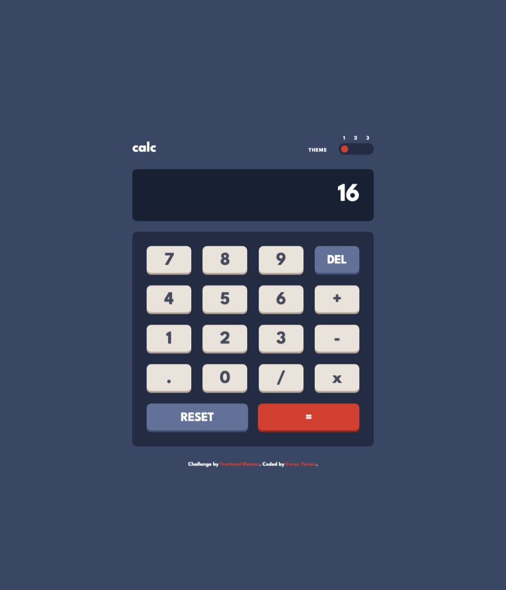
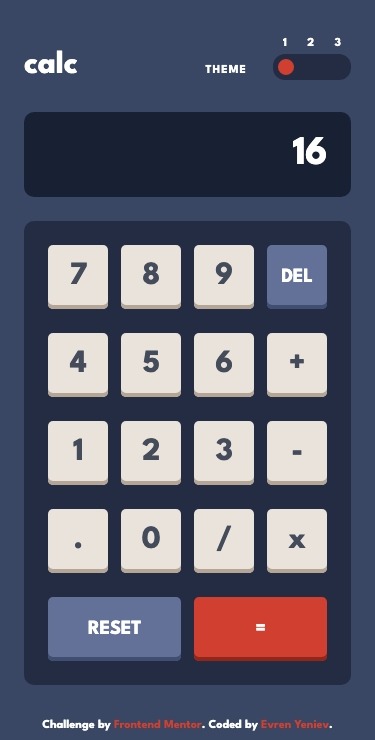
- View the optimal layout for the site depending on their device's screen size
- Solution URL: @github
- Live Site URL: @github pages
VSCode + Volar (and disable Vetur) + TypeScript Vue Plugin (Volar).
See Vite Configuration Reference.
npm installnpm run devnpm run buildLint with ESLint
npm run lintI started by reviewing the design specification. I then started markup knowing that the mobile and desktop layouts would use the same cards, with different page layouts. From there, I stated the styling with mobile-first workflow and then created two media queries to handle the transition from the mobile to the desktop layouts.
- Vue3 with Vite
- Semantic HTML5 markup
- Mobile-first workflow
- SCSS preprocessing
- CSS custom properties
- Flexbox
This project was an excellent excercise in JS and CSS. I learned how to add theme support using JS and CSS. Also helped me take my JS knowledge to the next level.
I am looking forward to the next project to build on the JS and CSS experience for an additional challenge.
- Kevin Powell - Kevin Powell is an excellent teacher and I relied heavily on the notes that I took from his CSS courses taught on scrimba.com.
- A Complete Guide to Flexbox - I have found css.tricks.com to be a valuable resourse for flexbox, and all things CSS.
- Vue3 Offical Documentation