Draft: Revise HTML for Tabbed extension #1415
Comments
I think this is fine as it is a feature request "improve tabs". How to get there is a perfect discussion for this issue.
Personally, I've never had a problem with the old behavior, but I'm open to exploring alternatives to see how it feels. On the one hand, the old way is nice because you can see all the tabs no matter what. I imagine with the new way, you can have tabs overflow in such a way that you don't know there are overflows, also you have to scroll around to get to them, but I can see how it can be perceived to be nicer as it keeps the header contained to a single line. I haven't looked at the HTML yet, but I'll probably get a chance this weekend to explore it more. I'm interested to try it out and see how it feels. |
 gir-bot
added
S: needs-decision
gir-bot
added
S: needs-decision
I think my initial proposal which we used as a basis for implementation rendered them as an accordion on mobile, which might also be something to consider, but IMHO it adds too much vertical space, especially when you have many instances on one page. We could indicate that the container is scrollable to signal that to the user. I'm not completely sold, so let's let that sink in for a while and maybe implement or abandon it. Nonetheless, it might be a viable option that is now documented here. |
Yep, understood. I am completely fine with exploring. It's one of those things that I think would be best experienced before really weighing in on whether it is good or not. I think a prototype is going to be appropriate. I was mainly just giving my initial thoughts, not really a definitive opinion. |
|
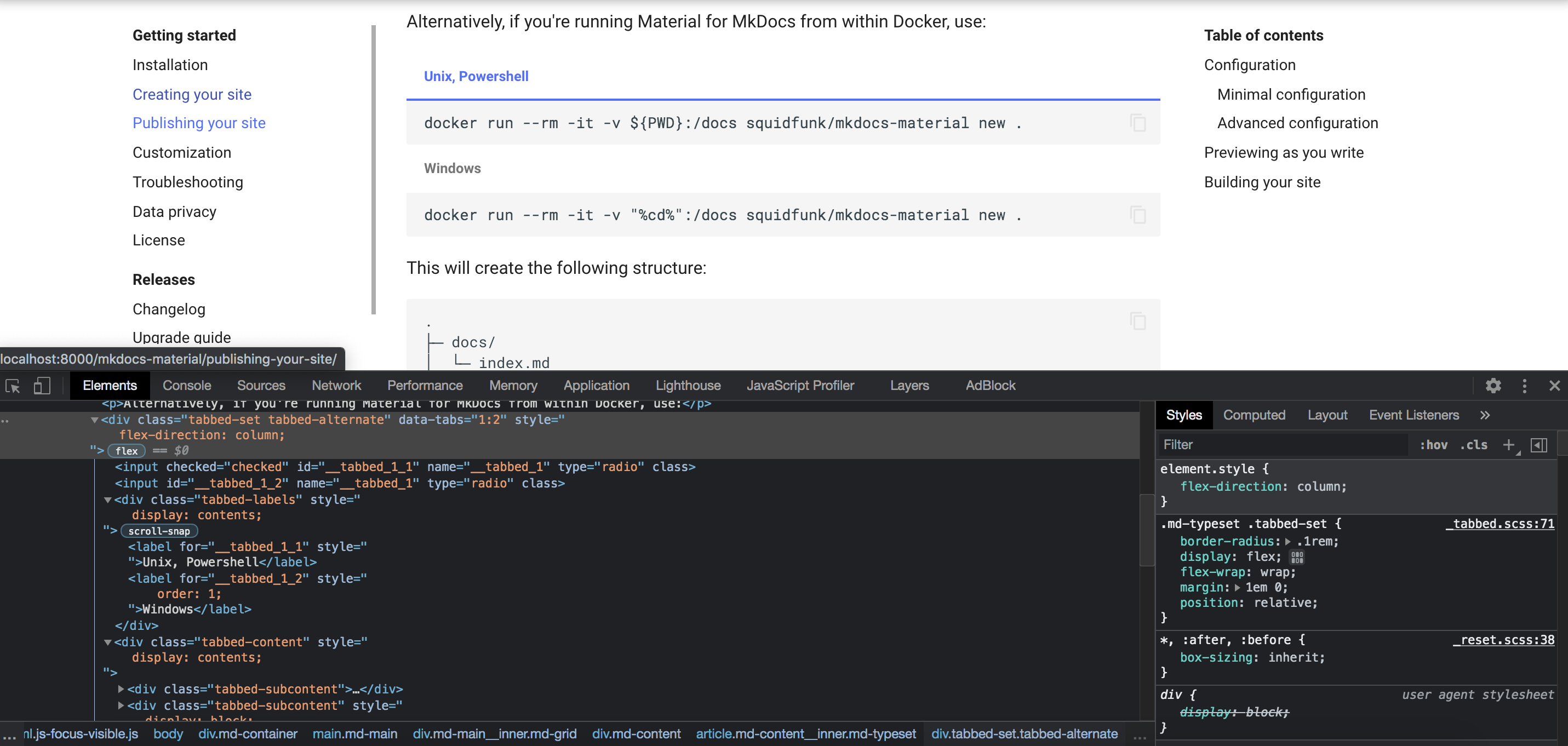
I've updated the HTML and video example:
Some further ideas:
This should address at least some of the concerns you raised. The points marked with (JS) demand JavaScript to function, but I regard them as "nice to have". They improve the user experience, but it should be quite good without them. Also, they won't introduce content-shift on slow connections, which is always a primary concern. |
|
I see in the prototype that you've added a shadow border and provided padding around the content. Is the intent moving forward to make them feel more like a container as opposed to inline alternate content? Or is that just to illustrate the boundaries in this test example? The padding, not the shadow border, is something that I've always done in the past as a personal modification. This is more a question of curiosity, not really a criticism or suggestion. Looking at the HTML structure, it will probably be a bit more complex to handle for sure. I need to take a look at the source and see how complex it would be to mirror the structure you are proposing. |
Correct, that was just to better illustrate the enclosing container for the demo. In the end, they should look the same as they currently do.
The HTML elements and CSS classes are not final. If you think it's generally feasible, we can discuss semantics. Why is the structure more complex? I would imagine that, after parsing, you would just need to "put the stuff together in a different way", but I'm not an expert in your code base 😉 If we can make it any easier while retaining functionality, I'm happy to assist. |
|
So, I was playing around with some rough code (not confident that all corner cases are handled yet), but here is my concern. This is not generalized. You have to specify every /* Active tab */
.tabbed-set input:nth-child(1):checked ~ .tabbed-content > :nth-child(1),
.tabbed-set input:nth-child(2):checked ~ .tabbed-content > :nth-child(2),
.tabbed-set input:nth-child(3):checked ~ .tabbed-content > :nth-child(3) {
display: block;
padding: 10px;
} |
|
No, that is one downside of this approach, but I think it's bearable. As I said, it should compress pretty well with |
|
Hmm, so you have to pick some arbitrarily larger number, and if people exceeded that, too bad. |
|
I think 10 should be enough, as I wrote in my original post. |
Ah, yeah, I forgot about that part. Yeah, not quite as flexible as the original, but 10 feels like a lot of tabs 🙂. |
|
I'm running through existing test cases. As long as there are no unexpected, crazy difficult edge cases, I imagine I'll throw up an experimental branch that you can play with locally. |
|
Just an FYI, I'll be wrapping the individual contents in <div class="tabbed-content">
<div class="tabbed-subcontent">
<p>whatever</p>
</div>
<div class="tabbed-subcontent">
<p>more</p>
</div>
</div> |
|
I wouldn't count on it until maybe Sunday at the earliest🙂. I need to abstract old logic and new logic as right now I am just wholesale replacing the old logic. I should be done verifying tests later today. We'll just see how much I get through. |
|
Sounds great! Im happy to try the experimental branch and provide an experimental implementation as part of Material for MkDocs. Maybe we could temporarily add another discernible CSS class on the outermost container, so I can use that for targeting to add experimental support on Material’s |
|
Yeah, I may tag it with |
|
Got it done much sooner than I thought: https://github.com/facelessuser/pymdown-extensions/tree/feature/tabbed-alternate. Use the option |
|
Perfect, thanks for implementing this so quickly! I'll add support for Material for MkDocs asap. If we decide that it looks and feels good, we could move forward in the following way:
|
|
I've finished the implementation, it was quite straight-forward: squidfunk/mkdocs-material#2915 We still need to think about the print view. I think adding a |
|
I'm open to new CSS class names. If you have suggestions, feel free to make suggestions. As far as |
|
Before I attempt to add |
|
Yeah, I don't think you can pass raw HTML in a |
|
That is indeed a problem. However, I just had the idea that we could use flex ordering and
That's even better than duplicate content/HTML. I'll provide a fix in the PR asap. |
|
Cool. Look forward to checking it out. |
|
That's cool! I think it's much better than |
|
So, when you found the time (no hurry) to evaluate the solution I propose in the PR, I'd say we could follow the plan outlined in #1415 (comment). I'd update the recommended Tabbed configuration in the docs to include |
|
Before I can make a release, I would also need to provide a simple CSS setup for non-Material people. The alternate style, while tailored as an alternative for Material, must be documented in such a way that anyone could make use of it. If not, I'd have to push it to the "material extra" plugin. |
|
That makes sense! I thought we first test it on Material for MkDocs before it is publicly announced, but I can totally understand if you want to explain to non-Material users how to use it 😊 |
|
We could keep it undocumented at first. Assuming this turns into something we wish to formally support long-term, If you're willing to help put together a basic CSS example for the future, that is basically all I'd need. It just has to be something generally accessible. |
|
The easiest way is to take the CSS output of Material and remove the .tabbed-alternate {
position: relative;
display: flex;
flex-wrap: wrap;
flex-direction: column;
margin: 1em 0;
border-radius: 0.1rem;
}
.tabbed-labels {
display: flex;
width: 100%;
overflow: auto;
box-shadow: 0 -0.05rem var(--md-default-fg-color--lightest) inset;
scrollbar-width: none;
}
.tabbed-labels::-webkit-scrollbar {
display: none;
}
.tabbed-labels > label {
width: auto;
padding: 0.9375em 1.25em 0.78125em;
color: var(--md-default-fg-color--light);
font-weight: 700;
font-size: 0.64rem;
white-space: nowrap;
border-bottom: 0.1rem solid transparent;
scroll-snap-align: start;
border-top-left-radius: 0.1rem;
border-top-right-radius: 0.1rem;
cursor: pointer;
transition: background-color 250ms, color 250ms;
}
.tabbed-labels > label:hover {
color: var(--md-accent-fg-color);
}
.tabbed-alternate .tabbed-content {
width: 100%;
}
.tabbed-alternate input:nth-child(1):checked ~ .tabbed-content > :nth-child(1),
.tabbed-alternate input:nth-child(2):checked ~ .tabbed-content > :nth-child(2),
.tabbed-alternate input:nth-child(3):checked ~ .tabbed-content > :nth-child(3),
.tabbed-alternate input:nth-child(4):checked ~ .tabbed-content > :nth-child(4),
.tabbed-alternate input:nth-child(5):checked ~ .tabbed-content > :nth-child(5),
.tabbed-alternate input:nth-child(6):checked ~ .tabbed-content > :nth-child(6),
.tabbed-alternate input:nth-child(7):checked ~ .tabbed-content > :nth-child(7),
.tabbed-alternate input:nth-child(8):checked ~ .tabbed-content > :nth-child(8),
.tabbed-alternate input:nth-child(9):checked ~ .tabbed-content > :nth-child(9),
.tabbed-alternate input:nth-child(10):checked ~ .tabbed-content > :nth-child(10) {
display: block;
}
.tabbed-alternate .tabbed-subcontent {
display: none;
}
@media screen {
.tabbed-alternate input:nth-child(1):checked ~ .tabbed-labels > :nth-child(1),
.tabbed-alternate input:nth-child(2):checked ~ .tabbed-labels > :nth-child(2),
.tabbed-alternate input:nth-child(3):checked ~ .tabbed-labels > :nth-child(3),
.tabbed-alternate input:nth-child(4):checked ~ .tabbed-labels > :nth-child(4),
.tabbed-alternate input:nth-child(5):checked ~ .tabbed-labels > :nth-child(5),
.tabbed-alternate input:nth-child(6):checked ~ .tabbed-labels > :nth-child(6),
.tabbed-alternate input:nth-child(7):checked ~ .tabbed-labels > :nth-child(7),
.tabbed-alternate input:nth-child(8):checked ~ .tabbed-labels > :nth-child(8),
.tabbed-alternate input:nth-child(9):checked ~ .tabbed-labels > :nth-child(9),
.tabbed-alternate input:nth-child(10):checked ~ .tabbed-labels > :nth-child(10) {
color: var(--md-accent-fg-color);
border-color: var(--md-accent-fg-color);
}
}
@media print {
.tabbed-labels {
display: contents;
}
.tabbed-labels > label:nth-child(1) {
order: 1;
}
.tabbed-labels > label:nth-child(2) {
order: 2;
}
.tabbed-labels > label:nth-child(3) {
order: 3;
}
.tabbed-labels > label:nth-child(4) {
order: 4;
}
.tabbed-labels > label:nth-child(5) {
order: 5;
}
.tabbed-labels > label:nth-child(6) {
order: 6;
}
.tabbed-labels > label:nth-child(7) {
order: 7;
}
.tabbed-labels > label:nth-child(8) {
order: 8;
}
.tabbed-labels > label:nth-child(9) {
order: 9;
}
.tabbed-labels > label:nth-child(10) {
order: 10;
}
.tabbed-alternate .tabbed-content {
display: contents;
}
.tabbed-alternate .tabbed-subcontent {
display: block;
}
.tabbed-alternate .tabbed-subcontent:nth-child(1) {
order: 1;
}
.tabbed-alternate .tabbed-subcontent:nth-child(2) {
order: 2;
}
.tabbed-alternate .tabbed-subcontent:nth-child(3) {
order: 3;
}
.tabbed-alternate .tabbed-subcontent:nth-child(4) {
order: 4;
}
.tabbed-alternate .tabbed-subcontent:nth-child(5) {
order: 5;
}
.tabbed-alternate .tabbed-subcontent:nth-child(6) {
order: 6;
}
.tabbed-alternate .tabbed-subcontent:nth-child(7) {
order: 7;
}
.tabbed-alternate .tabbed-subcontent:nth-child(8) {
order: 8;
}
.tabbed-alternate .tabbed-subcontent:nth-child(9) {
order: 9;
}
.tabbed-alternate .tabbed-subcontent:nth-child(10) {
order: 10;
}
} |
|
Also note that some CSS selectors could be reduced when we drop the old tabs implementation, due to new semantics. For example |
|
Perfect, that gives me something to play with. I'm assuming, if someone technically wanted unlimited tabs, some of this could be done with JavaScript, right? I'm not asking for such a solution, but I am assuming we could note that as a possibility and just leave it up to the user if they were so motivated? |
|
I've updated the example and reduced it further.
I think so. You could just set the |
|
Cool. Can't wait to play with this more. With the info I have, I think the basic documentation is possible now. I'll play around with all of this and let you know when things are ready. |
|
Awesome! I really love how this turned out and how we solved the problems on the way. I think it will be a great improvement and superior to the current solution. Thanks for your continued attention to this project! I will also revisit improving the UI even further, maybe indicating the possibility to scroll via chevrons or something similar. I'll play around with it after we managed to push it out. |
|
Renamed I did notice that sometimes when you have multiple tabs, and the tab to right is overflowing, it won't snap into view fully when selected. |
This seems to not be a real big deal. It's not always reproducible, and it seems to occur with only a slight overflow of the active tab. It's just a quirk of the browser and nothing that could really be "fixed". Overall the snapping seems to work good. |
|
Overall, I like it. The one thing I don't is how tabs can get hidden with overflow. I know with JS we could add some pagination buttons on overflow, but without them, it can be hard to tell sometimes that there are more tabs.
|

|
Thanks for testing!
If you could manage to provide a reproducible case, I can look into it. It might be related to
That's basically the same problem as already exists for code blocks and tables, which also overflow on mobile, or anything else that is not wrappable in its entirey. We could stretch the
Unfortunately, indicating overflow, there is not |
Yep, but they do have visual indicators that things are overflowing in these two cases (as you mentioned). It makes all the difference when talking about intuitiveness. Is it always the most attractive? Maybe not, but I can tell it is overflowing.
Yep, and I am aware that JS is the only way. We'll probably never see an
Honestly, I'm not really that concerned with this case. I initially noticed this, cycled through the different snap options, and settled that I think I like it better with than without.
I may experiment with this. The visual indicator of overflow, even if the end result is not aesthetically the best is probably more important, but I need to see how bad it looks first 🙃 . |
|
The only other thing I can think of is having the tab line expand past the tabs, so when you select a tab, the highlight underline won't reach the far left or far right, so there is a visual indicator that you aren't fully left or fully right. I'm not saying it's great, but you can see when you are not at the edge.
|

That's a clever idea, but I think it looks a little off. I would go for removing the left and right margin on mobile (as GitHub) and add visual indicators with JS that tabs are overflowing and more tabs hide behind that. In the end, the user has to learn that tabs are scrollable. However, I would like to collect some feedback first. Sometimes somebody else comes up with a better idea. Another idea - the background attachment hack: |
|
Yeah, since I indent text and such to the start of the tab label, it actually doesn't look too bad:
But yeah, it makes sense to get more ideas too. |
|
Overall, I think the new implementation is so much better than what we currently have, because when tabs break it appears to be completely broken. There's nearly no reminiscence of the concept of tabs when they break onto multiple lines. |
|
I agree that the behavior is better. I may use the extended line method in my personal documentation (disabling snapping to ensure that the extended line is always seen at first) as the default unless/until a better visual indicator comes along. I just don't want occasions to arise where a person misses (especial on mobile) a useful tab. |
|
The latest commit on the feature branch now stretches top-level tab labels containers just like code blocks when the viewport is below 480px: Ohne.Titel.mp4Furthermore, |
I might do that everywhere by enabling it globally. Having a clear indicator everywhere that you are at the start or end of tabs is useful.
|

|
As far as I can tell (after doing some research as well) what you've done is probably the best pure CSS tab implementation that really can be done. I have some other feature things I need to finish for the next release, so I'll probably look into those while I think about whether I turn on the new style by default in pymdown docs and, if so, what styling tweaks I settle on to make overflow tabs noticeable everywhere. I think I've done everything in this pull needed to enable the feature. I'll document and settle on whether to turn it on and what style to use once I have everything else ready for the next release. |
|
Perfect! As soon as you pushed out the new release, I'll adjust my PR (mainly to rename |
|
@squidfunk, so I think I've come up with a solution I am okay with. I'm not sure what you have in mind, but at the very least, this could probably work for me. This gives me confidence that the solution is workable. I can put together a pure vanilla example for users, document the caveats (tabs are limited to CSS I'm not sure if I'll ever drop the original as it can be useful if people want to allow an undetermined number of tabs. I'm not going to limit people, but I can see myself finally switching over to this implementation. I don't really think the indicators need to be buttons that scroll you, them simply being indicators is honestly enough for me and alleviates all my concerns about usability.
Basically, on export default selector => {
const checkScroll = e => {
const target = e.target.closest('.tabbed-labels')
target.classList.remove('tabbed-scroll-left', 'tabbed-scroll-right')
if (e.type == "mouseover") {
let scrollWidth = target.scrollWidth - target.clientWidth
let hscroll = target.scrollLeft
if (!hscroll) {
target.scrollLeft = 1
hscroll = target.scrollLeft
target.scrollLeft = 0
if (hscroll) {
target.classList.add('tabbed-scroll-right')
}
} else if (hscroll != scrollWidth){
target.classList.add('tabbed-scroll-left', 'tabbed-scroll-right')
} else if (hscroll) {
target.classList.add('tabbed-scroll-left')
}
}
}
const labels = document.querySelectorAll(selector)
labels.forEach(el => {
console.log('Added ', el)
el.addEventListener('mouseover', checkScroll)
el.addEventListener('mouseout', checkScroll)
})
}With a little CSS, we can add some indicators: .tabbed-labels {
&.tabbed-scroll-left::before {
position: absolute;
padding-right: 0.5em;
top: 0.5em;
left: 0;
content: "\25C0";
display: inline-block;
color: var(--md-default-fg-color--light);
background-color: var(--md-default-bg-color);
}
&.tabbed-scroll-right::after {
position: absolute;
padding-left: 0.5em;
top: 0.5em;
right: 0;
content: "\25B6";
display: inline-block;
color: var(--md-default-fg-color--light);
background-color: var(--md-default-bg-color);
}
} |

|
Looks great! The HTML stayed the same? I'll look into it as soon as I find some time. |
|
Yeah, HTML didn't change. Some way of knowing that there were more tabs was my main concern. I tweaked the scroll JS a little and probably some CSS. The minimal example is all demonstrated here in this codepen: https://codepen.io/facelessuser/pen/VwWdBQX. I imagine if we wanted functional buttons that did something more than indicate "hey, there's more here" on mouseover/link click on mobile, then maybe something would have to change. I needed something decent enough to release with and figured you'd probably do something similar or propose something even better. It's marked as experimental, so if I need to change something later, that's fine. |
TL;DR: this is a draft to improve on the current implementation of the Tabbed extension. It is by no means ready for implementation. It should serve as a base for further discussion to learn whether we can gravitate towards a better solution than we currently have. There are still problems with this approach.
The problem
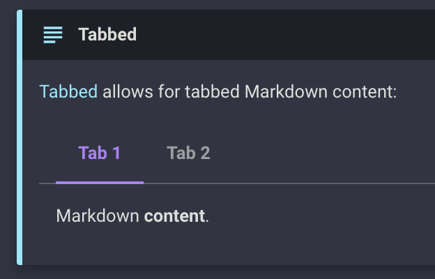
The Tabbed extension is pretty awesome and many users love it. It provides a lot of value, especially to Material for MkDocs. However, it suffers from some problems that are not solvable without additional JavaScript. The main problem is that on narrower screen sizes, tabs are broken onto separate lines, like here for example "Hide both":
This cannot be mitigated, as the tabs markup is defined as follows:
In order to make the labels overflow and scrollable, they would need to be located inside a container. With my knowledge of HTML and CSS, I'm very certain that there's no way to solve this problem without changing the underlying HTML. Furthermore, this would break the current tabs activation approach which relies entirely on co-location of
inputandlabelelements.A solution attempt
I've re-architected the tabs HTML and found a solution that allows us to overflow the tabs label container. It looks like this:
Ohne.Titel.mp4
The HTML can be found here, so just drop it into a
*.htmlfile and play with it:Show revised HTML
Here's how it works:
input+labelelements are targetted with:nth-child(...)selectors. While this seems unnecessarily bloated it is, AFAIK, the only viable approach. Furthermore, when transferred over the wire, it should compress very well, because the markup is largely the same, sogzipand friends should work very efficiently. We can provide, let's say, 10 selectors. That should be sufficient for 99.9% of all use cases. The CSS can be extended if more is necessary.Constraints
The print view of Material for MkDocs currently just expands all tabs and renders them below each other. A possible solution for this could be to add the tabs' title as an attribute to the content element and use a pseudo-element to render a label before the content container. I haven't tested this thoroughly, but it might be a start:
HTML:
CSS:
Downside: some duplicate HTML (i.e. the tabs title), but personally, I could live with that.
We definitely shouldn't start relying on JavaScript for this functionality. The current CSS-only solution is pretty awesome, because it works on slow connections and when the site is partly ready due to missing JavaScript. For a comparison, try Docusaurus's tabs implementation after disabling JavaScript - it doesn't work at all.
We might need to keep the old implementation for older clients for some time.
Any feedback is greatly appreciated. If you don't wish to go down this path for whatever reason, feel free to close this issue. I've had this on my mind for a long time and wanted to give it a shot and publish it to get some feedback and ideas. I don't expect this to land quickly, since there is some stuff to work out.
Also, if GitHub issues is not the right place to discuss, feel free to move this to a discussion.
The text was updated successfully, but these errors were encountered: