


- About the Project
- Getting Started
- Api Reference
- Examples of Usage
- Roadmap
- Contributing
- License
- Contact
Package to configure an Animated Progress Bar with multiple variations. You can use animated dots in the middle of each step or not using any of them at all and you can put a range number on each step. You can also create a bar or a dot with LinearGradient if you want something more customizable.
Installation can be done through npm or yarn:
npm i react-native-progress-step-bar --saveyarn add react-native-progress-step-bar| Prop | Type | Required(Default Value) | Description |
|---|---|---|---|
steps |
number |
required | The number of steps that the progress bar will support. If you are using dots, the bar will have (steps + 1) dots. |
width |
number |
required | The width of the progress bar. |
height |
number |
required | The height of the progress bar |
dotDiameter |
number |
optional | If you are using dots, you can set the diameter of each dot using this prop |
ranges |
string[] |
optional | If you want to implement ranges and put a string below each dot (or without dots), you will have to use this prop. |
currentStep |
number |
required | This is the currentStep of the progress bar. You will have to control it in order to avoid it to be less than 0 and also avoid it to be greather than the number of steps that you have set. |
backgroundBarStyle |
StyleProp<ViewStyle> |
optional | This is useful if you want to set another backgroundColor to the bar when it is not filled. You can also set a borderRadius here if you want the bar to have borderRadius on the corners. |
filledBarStyle |
StyleProp<ViewStyle> |
optional | This is useful if you want to set a different backgroundColor to the filled bar (the progress bar). |
filledBarContainerStyle |
StyleProp<ViewStyle> |
optional | If you want to add some borderRadius to the filledBar, you will have to add that borderRadius to the container, and not to the filledBarStyle. This is the proper place to add borderRadius to the filledBar. |
backgroundDotStyle |
StyleProp<ViewStyle> |
optional | This is useful if you want to modify the backgroundColor of the dot when it is not filled |
filledDotStyle |
StyleProp<ViewStyle> |
optional | This is useful if you want to set another backgroundColor of the dot when it is filled. |
stepToStepAnimationDuration |
number |
optional - Default to 1000ms | If you want to use another animation duration on the bar when it is moving between steps, you can modify this prop. It is in ms. |
withDots |
boolean |
optional - Default to true | With this props you can configure if the bar will have dots or not. Not setting this prop will cause the bar to support dots. |
rangeTextContainerWidth |
number |
optional - default is 40 | In case you want to put bigger numbers or bigger strings on the ranges, you will have to increase this value since the default is 40. You will rarely use this prop. |
rangeTextStyle |
StyleProp<ViewStyle> |
optional | With this prop, you will be able to add styles to the Text Range. This is necessary if you are implementing ranges in your progress bar |
CustomizedFilledBar |
ReactNode |
optional | This is useful if you are implementing a complex progress bar with LinearGradient for example. If you want your filled bar to be implemented with LinearGradient, you will probably want to use this prop. |
CustomizableDot |
ReactNode |
optional | This is useful if you are implementing a complex dot with LinearGradient for example. If you want your filled dot to be implemented with LinearGradient, you will probably want to use this prop. |
import * as React from 'react';
import { StyleSheet, View, Text, TouchableOpacity } from 'react-native';
import AnimatedDotsCarousel from 'react-native-progress-step-bar';
export default function App() {
const [currentStep, setCurrentStep] = useState(0);
const handlePrevStep = useCallback(() => {
setCurrentStep((prevStep) => prevStep - 1);
}, []);
const handleNextStep = useCallback(() => {
setCurrentStep((prevStep) => prevStep + 1);
}, []);
return (
<View
style={{
flex: 1,
justifyContent: 'center',
alignItems: 'center',
backgroundColor: 'black',
}}
>
<View style={{ marginBottom: 50 }}>
<ProgressBar
steps={6}
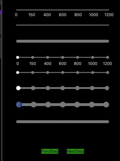
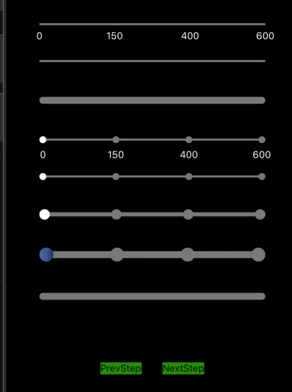
ranges={['0', '150', '400', '600', '800', '1000', '1200']}
width={325}
height={3}
currentStep={currentStep}
stepToStepAnimationDuration={1000}
withDots={false}
/>
</View>
<View
style={{
flexDirection: 'row',
width: 400,
alignItems: 'center',
justifyContent: 'center',
marginTop: 40,
}}
>
<TouchableOpacity
onPress={handlePrevStep}
style={{ backgroundColor: 'green', marginRight: 30 }}
>
<Text>PrevStep</Text>
</TouchableOpacity>
<TouchableOpacity
onPress={handleNextStep}
style={{ backgroundColor: 'green' }}
>
<Text>NextStep</Text>
</TouchableOpacity>
</View>
</View>
);
}import * as React from 'react';
import { StyleSheet, View, Text, TouchableOpacity } from 'react-native';
import AnimatedDotsCarousel from 'react-native-progress-step-bar';
export default function App() {
const [currentStep, setCurrentStep] = useState(0);
const handlePrevStep = useCallback(() => {
setCurrentStep((prevStep) => prevStep - 1);
}, []);
const handleNextStep = useCallback(() => {
setCurrentStep((prevStep) => prevStep + 1);
}, []);
return (
<View
style={{
flex: 1,
justifyContent: 'center',
alignItems: 'center',
backgroundColor: 'black',
}}
>
<View style={{ marginBottom: 50 }}>
<ProgressBar
steps={6}
width={325}
height={10}
currentStep={currentStep}
stepToStepAnimationDuration={1000}
filledBarStyle={{ borderRadius: 10, backgroundColor: 'white' }}
backgroundBarStyle={{ borderRadius: 10, backgroundColor: '#777777' }}
filledBarContainerStyle={{ borderRadius: 10 }}
withDots={false}
/>
</View>
<View
style={{
flexDirection: 'row',
width: 400,
alignItems: 'center',
justifyContent: 'center',
marginTop: 40,
}}
>
<TouchableOpacity
onPress={handlePrevStep}
style={{ backgroundColor: 'green', marginRight: 30 }}
>
<Text>PrevStep</Text>
</TouchableOpacity>
<TouchableOpacity
onPress={handleNextStep}
style={{ backgroundColor: 'green' }}
>
<Text>NextStep</Text>
</TouchableOpacity>
</View>
</View>
);
}import * as React from 'react';
import { StyleSheet, View, Text, TouchableOpacity } from 'react-native';
import AnimatedDotsCarousel from 'react-native-progress-step-bar';
export default function App() {
const [currentStep, setCurrentStep] = useState(0);
const handlePrevStep = useCallback(() => {
setCurrentStep((prevStep) => prevStep - 1);
}, []);
const handleNextStep = useCallback(() => {
setCurrentStep((prevStep) => prevStep + 1);
}, []);
return (
<View
style={{
flex: 1,
justifyContent: 'center',
alignItems: 'center',
backgroundColor: 'black',
}}
>
<View style={{ marginBottom: 50 }}>
<ProgressBar
steps={6}
ranges={['0', '150', '400', '600', '800', '1000', '1200']}
dotDiameter={10}
width={325}
height={3}
currentStep={currentStep}
stepToStepAnimationDuration={1000}
withDots
/>
</View>
<View
style={{
flexDirection: 'row',
width: 400,
alignItems: 'center',
justifyContent: 'center',
marginTop: 40,
}}
>
<TouchableOpacity
onPress={handlePrevStep}
style={{ backgroundColor: 'green', marginRight: 30 }}
>
<Text>PrevStep</Text>
</TouchableOpacity>
<TouchableOpacity
onPress={handleNextStep}
style={{ backgroundColor: 'green' }}
>
<Text>NextStep</Text>
</TouchableOpacity>
</View>
</View>
);
}import * as React from 'react';
import { StyleSheet, View, Text, TouchableOpacity } from 'react-native';
import AnimatedDotsCarousel from 'react-native-progress-step-bar';
export default function App() {
const [currentStep, setCurrentStep] = useState(0);
const handlePrevStep = useCallback(() => {
setCurrentStep((prevStep) => prevStep - 1);
}, []);
const handleNextStep = useCallback(() => {
setCurrentStep((prevStep) => prevStep + 1);
}, []);
return (
<View
style={{
flex: 1,
justifyContent: 'center',
alignItems: 'center',
backgroundColor: 'black',
}}
>
<View style={{ marginBottom: 50 }}>
<ProgressBar
steps={6}
dotDiameter={10}
width={325}
height={3}
currentStep={currentStep}
stepToStepAnimationDuration={1000}
withDots
/>
</View>
<View
style={{
flexDirection: 'row',
width: 400,
alignItems: 'center',
justifyContent: 'center',
marginTop: 40,
}}
>
<TouchableOpacity
onPress={handlePrevStep}
style={{ backgroundColor: 'green', marginRight: 30 }}
>
<Text>PrevStep</Text>
</TouchableOpacity>
<TouchableOpacity
onPress={handleNextStep}
style={{ backgroundColor: 'green' }}
>
<Text>NextStep</Text>
</TouchableOpacity>
</View>
</View>
);
}If you want to implement a bar with LinearGradient you will have to install the library react-native-linear-gradient in your project, and then implement something like this:
import React, { useState, useCallback, useMemo } from 'react';
import { View, Text, TouchableOpacity } from 'react-native';
import ProgressBar from 'react-native-progress-step-bar';
import LinearGradient from 'react-native-linear-gradient';

export default function App() {
  const [currentStep, setCurrentStep] = useState(0);
  const handlePrevStep = useCallback(() => {
    setCurrentStep((prevStep) => prevStep - 1);
  }, []);

  const handleNextStep = useCallback(() => {
    setCurrentStep((prevStep) => prevStep + 1);
  }, []);

  const CustomizableFilledBar = useMemo(
    () => (
      <LinearGradient
        start={{ x: 0, y: 0 }}
        end={{ x: 1, y: 0 }}
        colors={['#4c669f', '#3b5998', '#192f6a']}
        style={{ width: 325, height: 10 }}
      />
    ),
    []
  );
  const CustomizableDot = useMemo(
    () => (
      <LinearGradient
        start={{ x: 0, y: 0 }}
        end={{ x: 1, y: 0 }}
        colors={['#4c669f', '#3b5998', '#192f6a']}
        style={{ width: 20, height: 20, borderRadius: 20 }}
      />
    ),
    []
  );
  return (
    <View
      style={{
        flex: 1,
        justifyContent: 'center',
        alignItems: 'center',
        backgroundColor: 'black',
      }}
    >
        <ProgressBar
          steps={6}
          dotDiameter={20}
          width={325}
          height={10}
          currentStep={currentStep}
          stepToStepAnimationDuration={1000}
          filledBarContainerStyle={{ borderRadius: 10 }}
          backgroundBarStyle={{ borderRadius: 10, backgroundColor: '#777777' }}
          withDots={true}
          CustomizedFilledBar={CustomizableFilledBar}
          CustomizableDot={CustomizableDot}
        />
      <View
        style={{
          flexDirection: 'row',
          width: 400,
          alignItems: 'center',
          justifyContent: 'center',
          marginTop: 40,
        }}
      >
        <TouchableOpacity
          onPress={handlePrevStep}
          style={{ backgroundColor: 'green', marginRight: 30 }}
        >
          <Text>PrevStep</Text>
        </TouchableOpacity>
        <TouchableOpacity
          onPress={handleNextStep}
          style={{ backgroundColor: 'green' }}
        >
          <Text>NextStep</Text>
        </TouchableOpacity>
      </View>
    </View>
  );
}
If you want to implement a progress bar without dots, just set the withDots prop to false and do not use the CustomizableDot prop.
See the open issues for a list of proposed features (and known issues).
If you want to suggest a new feature, please create an issue and we will check it.
Contributions are what make the open source community such an amazing place to be learn, inspire, and create. Any contributions you make are greatly appreciated.
- Fork the Project
- Create your Feature Branch (
git checkout -b feature/AmazingFeature) - Commit your Changes (
git commit -m 'Add some AmazingFeature') - Push to the Branch (
git push origin feature/AmazingFeature) - Open a Pull Request
Distributed under the MIT License. See LICENSE for more information.
Project Link: https://github.com/felire/react-native-progress-step-bar