This repository contains the JSON datafiles and code that were mode for the course Data visualization in data science of the KU Leuven.
For this project we will be exploring three different research questions:
-
How did the different song characteristics evolve over time?
-
How does music vary over the four different seasons? and
-
How do new music genres come into existence and fade away?
In order to answer these wicked questions a spotify dataset is used to create visualizations. This dataset contains a total of 755 000+ data points. The dataset contains information on roughly 33 000 songs that are published on Spotify. For all of these songs the dataset contains a title, the album the song belongs to, the release date, the artist, the genre and a bunch of music characteristics like duration, tempo, instrumentalness etc. A more thorough description of these music characteristics can be found here: https://developer.spotify.com/documentation/web-api/reference/tracks/get-audio-features/.
The following sketches were made to answer these research questions:
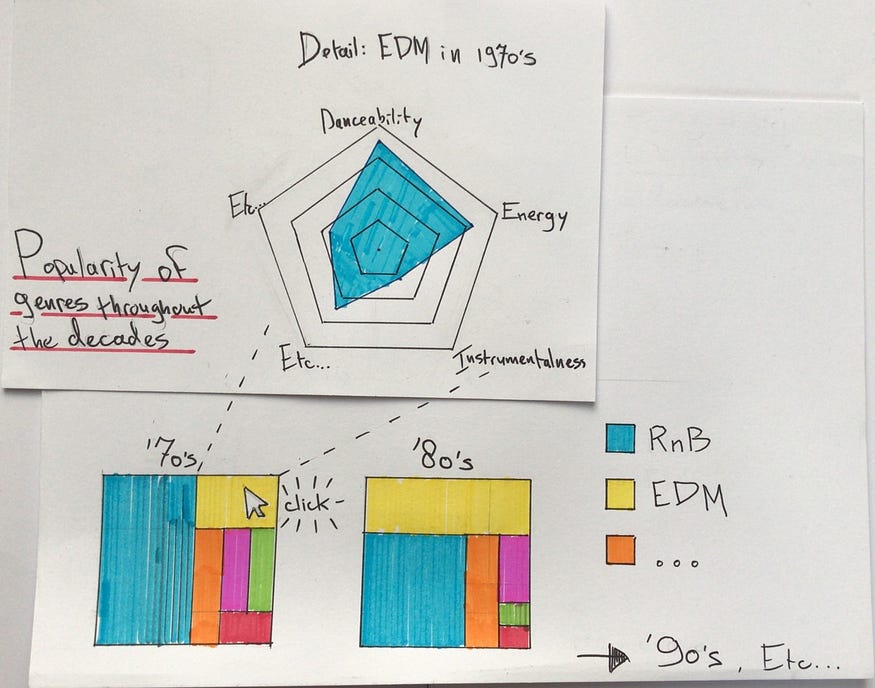
An initial design combines two kinds of plots in an interactive way, providing an insight into both the first and third research questions. The bottom half of the plot shows how relatively popular the different music genres have been throughout the decades. This gives a partial answer to the third research question: it helps to see in what period a particular genre was most important and how it relates to other genres.
Clicking on one of the music genres’ individual rectangles subsequently causes the top plot to open, showing the make-up of that specific genre in that decade. The make-up of a genre can hence be studied through its average song characteristics.
In the implementation of this design we have a few additional considerations. A feature that is not visible in the bottom half of the visualization, is that the size of each decade’s square could reflect the total amount of songs for that decade in our dataset. We might add this once we start implementing the design.
A second consideration is that the radar chart might be replaced by an alternative. As noted by Yan Holtz, the radar chart has a couple of problems. Beyond his general considerations on the radar chart, we also would like to show as much detail as possible, graphing individual data points instead of averages per decade per genre. Therefore Holtz’ suggestion of the ‘parallel coordinate plot’ might be used.
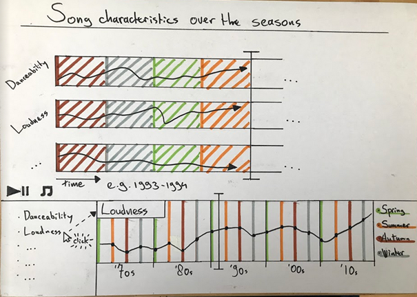
The second design is a first effort to show how the music in our dataset changes both over time in general (top half) and per season per decade (bottom half). The temporal variable is again based upon the date specific songs came out.
The general idea of this visualization is that the top half can be played automatically as the arrow race through the seasons and the years. The development of the different song characteristics can hence be followed ‘live’; the x-axis here spans one year. The bottom half, meanwhile, provides insight in the average development of at least one song characteristic per season per decade. With the vertical marker one can follow how the situation in a particular year differs from the average of that decade.
The chart might lead to conclusions about differences between the seasons when it comes to musical production, whether that is in an individual year, or on average per decade.
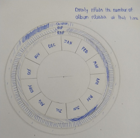
A third design is a static alternative to answer the question of song characteristics per season or per month. For every month, per genre, there is an additional notch per song or album added to the genre’s ring. Tweaking different aspects of the design, such as colour, these circular notches might make the design look like a CD or a vinyl disc.
Although there are many benefits to the amount of detail that can be provided in the interactive and animated design II, the current CD-like static chart may lead to alternative conclusions, especially because it can provide an overview of the entire dataset at once instead of focusing on different decades.
The different sketches shown above have been implemented using vega or vega lite. The code of these sketches and an example image can be found in this repository as well.
Tree plot implementation - Code - gist
Parallel coordinates plot implementation - code - gist
Line plot over years implementation - code - gist
Line plot over months implementation - code - gist