Contrasting text outline, shadow or border #1249
Comments
|
Seem's straightforward enough. I'd like this to be integrated into the side menu with the other font effects (bold, strikethrough, etc). I want to focus on other issues right now but I'll happily merge this. Here is some documentation from QT on how to do it: https://doc.qt.io/qt-5/qgraphicsdropshadoweffect.html |
|
@borgmanJeremy I just whipped up this little demo, and idk if the shadow effect would work super well. Maybe some other effect? |

|
@Samuel-Martin23 thanks for taking up this task, as the original requestor this means a lot to me. If I can throw a suggestion from my side - it's important to keep in mind that the shadow is just a mean to obtain what I've showcased in the original post - namely the visibility independent of the background. That said I'd consider making the shadow a bit less blurry (more opaque), and more "centered" under the text. |
|
Ok, I think the biggest thing for me is if you make the blur too big the letters look like they are glowing instead of having an outline/border.
|

|
You would have to make |
|
So create two shadows then? One being the color and the other being a black shadow? |
|
I don't think we need the colour. Only a black. opaque shadow with minimal blur, centered. |
|
The top one is just normal text and the bottom one has the black blur on it. |

|
Hey folks. I'm a designer by trade and spend a lot of time with color theory and calculations. To make sure the colors always works you'll want to apply both a stroke and a shadow. You should decide which color to apply (black or white) as the stroke based upon the luminance of the color of the text. Here's a way to calculate luminance. The stroke color can differ, but the shadow color is OK to always be a level of black.
|

|
Gotcha, idk if the current effects lib has a stoke effect. I'll look around with the style sheets maybe? |
|
If you have the ability to apply multiple shadows, you can likely fake a stroke by applying two shadows. One with a 0 blur radius to mimic the stroke, and then another with a higher value for the soft shadow. I don't know much about QT (I'm a CSS nerd) but if you need help fiddling once you get it in PR I'm happy to help. TY SO MUCH for attacking this one. This iwill make me so excited |
|
I don't think you can combine graphics effects tho. Also, thank you all for helping me walk through this. |
|
@snide @Samuel-Martin23 Thanks for working on this! By the way we have a luminosity calculation here: flameshot/src/utils/colorutils.cpp Line 11 in 71d595f We currently use it to figure out if the text in the incrementing bubbles should be white or black. If you need any help or guidance from me let me know! |
|
Thanks, @borgmanJeremy! I have been looking around to see if I could use the Qpainter effect for the text, but I don't think it will work. We have the black shadow effect recommend by @snide but we need the border/stroke effect around the text. |
|
To me, this is the only feature that I miss. The readability of the text is quite terrible, especially when using the red color - the one I use almost exclusively. The same contrasting effect should also be optionally used at least with arrows. Another helpful thing to know is the color wheel and the way complementary (high contrast and high impact; together, these colors will appear brighter and more prominent) colors. Here is a short and nice overview of the color wheel: |

|
This is also something I miss a lot from other tools (Like ShareX), in general the drawing elements (Arrows, text, rectangles...) don't look too good if the background isn't a solid color... |
|
Heya, just started using Flameshot and stumbled upon this issue after noticing there's no stroke/border option for text. Curious if this is still under consideration. |
It's very important for me for the text to be clearly visible when added to a screenshot. This is usually easily achieved by using black text with white background or white text with black background - but other colours usually look good with either (except maybe for very dark and very light colours).
I know that usually the implementations involve:
I do realise I can put a rectangle under text, but it's ugly and obscures a lot more of the image.
As a humorous reference: 😄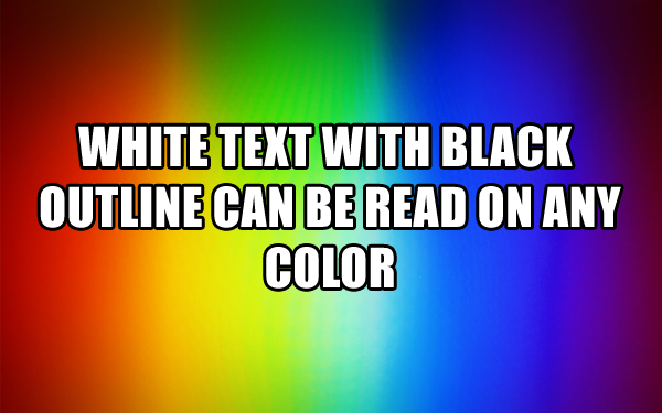
The text was updated successfully, but these errors were encountered: