A component library template to store your CSS code
To install CrysaliCSS just clone it:
git clone https://github.com/ideatosrl/crysalicss.git component-library && rm -rf component-library/.git
This script will create a folder named component-library where the template is ready to be used to host your CSS components. This also removes the .git folder to ensure it is correctly tracked into your project.
Then install it's node packages:
npm install
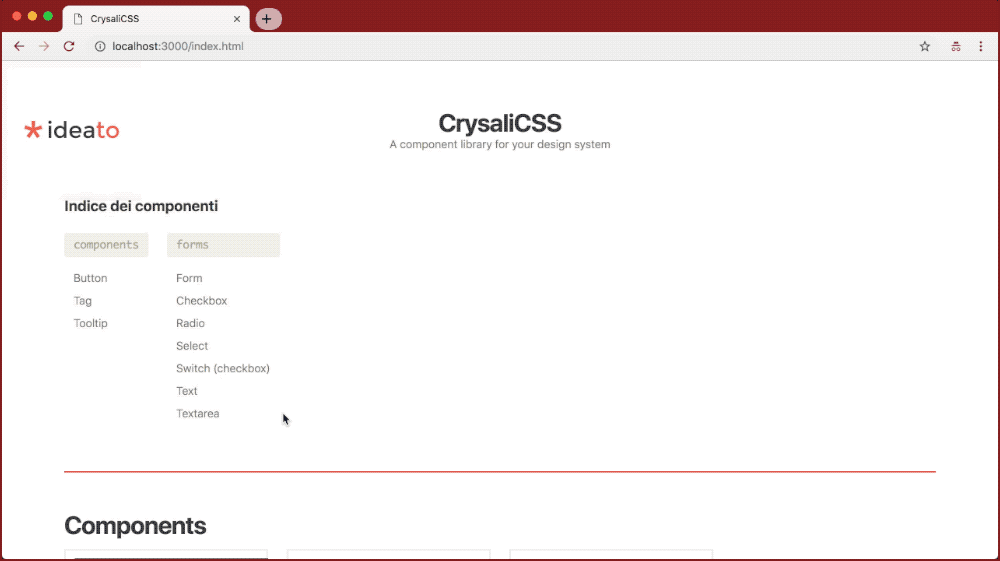
To test locally the component library usually at this address:
npm run dev
This script will run watchers and browser sync to ensure everything you update will be detected, so twig templates, sass styles, md posts, js scripts, assets and also metalsmith.js and metalsmith.yml files.
If you are working with a virtual machine and you don't need browser sync, you can run watchers only with this:
npm run watch
To build your library without run any watchers / HTTP servers:
npm run build
The library will be built inside build folder with relative paths, this means it should run without the HTTP server.
This is the configuration of CrysaliCSS component library ONLY.
To let your CSS source run inside the component library, you'll need to customize the source-styles npm script stored here.
| File | Description |
|---|---|
metalsmith.yml |
This is the main Metalsmith configuration used inside metalsmith.js, there is background and viewports configuration, then all the stuff you need to customize. Be sure your CSS source is correctly set here. The icons are based on Material design icons codes. |
Some info about the project folders
| Folder | Description |
|---|---|
assets |
Where all images are stored. |
js |
Where all JavaScript files are stored, like iframe nav or clipboard interaction. |
posts |
Where all Markdown documentation posts are stored. You will add HTML components and how they work with markdown syntax. |
sass |
The component library styles, you can customize it's main colors here in combination with the selected logo. |
src |
Just source files, not used inside the build. |
twig |
The HTML templates written with Twig. |
You should put your CSS documentation inside posts folder, in the code below you'll see how a page should be written.
Front matter structure
| Variable | Optional | Description |
|---|---|---|
collection |
✗ | Used to group components. |
date |
✓ | The date of the documentation page created. |
title |
✗ | The title of the documentation page created. |
view |
✗ | The template page used, it should be used with example.twig template. |
snippets |
✓ | An array of code snippets, used to display all the components of this page. |
snippets[0].title |
✓ | A title of the component. |
snippets[0].text |
✓ | A description of the component (markdown is supported). |
snippets[0].cover |
✓ | Used to choose which snippet is showed on index page. |
snippets[0].code |
✗ | The code snippet of the component, will be copied in the clipboard and rendered on the page if render is not defined. |
snippets[0].render |
✓ | The rendered HTML of the component's code snippet, this is used just to improve render with additional html which should be not copied as code snippet. |
snippets[0].syntax |
✓ | Defines the language used by code to be properly colored. The file metalsmith.yml contains the defined available languages for prismjs which is used to color your code. Find prism.languages and check if your languages are included. You can checkout the available list of languages used in the prismjs website. |
A template page as example:
---
collection: buttons
date: 2018-09-13T10:29
title: Button
view: example.twig

snippets:
  -
    title: 'The main buttons'
    text: 'A basic button, used all around the app.'
    code: |
      <a href="#" class="button">
        A simple button
      </a>
  -
    title: 'The main buttons'
    text: 'You can define color syntax like in this example.'
    cover: true
    code: |
      <a href="#" className="button">
        A simple button
      </a>
    syntax: haml
    render: |
    <a href="#" class="button">
      A simple button
    </a>
  -
    text: 'Button used to cancel actions. You can use `render` field to display a different content to make better explanations on how components are displayed.'
    code: |
      <a href="#" class="button button--cancel">
        Cancel
      </a>
    render: |
      <div style="display: flex;">
        <a href="#" class="button button--cancel">
          Cancel
        </a>
        <a href="#" class="button">
          Do it!
        </a>
      </div>
---

This is the optional markdown block with additional documentation.
CrysaliCSS is made with ❤ by vitto @ ideato.