Skip to content
New issue

Have a question about this project? Sign up for a free GitHub account to open an issue and contact its maintainers and the community.

By clicking “Sign up for GitHub”, you agree to our terms of service and privacy statement. We’ll occasionally send you account related emails.

Already on GitHub? Sign in to your account

[Statistic] Statistic with percentage/general label #1595

Open
jamessampford opened this issue Jul 18, 2020 · 5 comments
Open

[Statistic] Statistic with percentage/general label #1595

jamessampford opened this issue Jul 18, 2020 · 5 comments
Labels
Hacktoberfest Issues for Hacktoberfest! type/feat Any feature requests or improvements

Comments

@jamessampford
Copy link
Contributor

jamessampford commented Jul 18, 2020

I’m thinking that the statistic could be expanded to include a label that looks and works better than applying a general floating label to it (https://jsfiddle.net/2cxuhvfg/). The top of the label should be aligned with the top of the numbers with it as well as not covering up any of the numbers

The label could alternatively be applied to the text line, where required, as well as being able to place on either the left or the right, and aligning to the top, middle, or bottom

Having a transparent label may be useful in order to not have a border nor a solid background, where coloured text could be applied as required

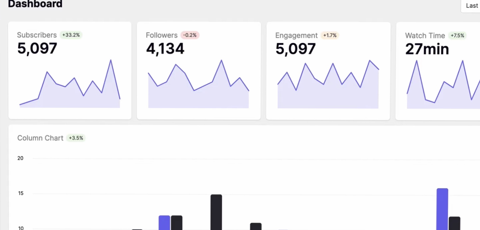
This feature would normally be useful for showing percentage changes that one would normally find on a dashboard, like below
3D8B1324-F90C-4083-99A1-197665956244

@jamessampford jamessampford added state/awaiting-triage Any issues or pull requests which haven't yet been triaged type/feat Any feature requests or improvements labels Jul 18, 2020
@lubber-de lubber-de removed the state/awaiting-triage Any issues or pull requests which haven't yet been triaged label Jul 18, 2020
@jamessampford
Copy link
Contributor Author

Started having a go at this, and so far have https://jsfiddle.net/hgnc63k4/2/

Probably having some margin to space the change from the value would make it a little better, though the statistic label looks odd

I had then thought possibly to take the change out as its own class .change wrapping the change label inside using flex https://jsfiddle.net/kq5haecy/ - this could then allow the width of the statistic label to match the value (and not look odd) and the change label could then be aligned as required. However, I do not have that much flex experience to make the columns appear as either (bad diagram follows...)

image

Where 1=value or label; 2=label or value; 3=change

I believe one could use the order flex property to define the order whether .value or .label is first child of .statistic

@lubber-de lubber-de added the Hacktoberfest Issues for Hacktoberfest! label Sep 22, 2020
@jamessampford
Copy link
Contributor Author

Perhaps this should be called a .substatistic (or .trend) where .label could be used to style the substatistic/trend as a label, otherwise render like below

A7713D93-800A-4079-9B0A-08553C4970EB

@jamessampford
Copy link
Contributor Author

jamessampford commented Nov 26, 2021

Possibly came up with a solution - may be a bit crude, but works...

https://jsfiddle.net/xLgsn6e4/

Would be good if it could perhaps be refined and included - there're probably better ways that it could be done/laid out

Could possibly also be nice if the statistic .label could (optionally) be made lighter (same/similar colour as sub header?) and (optionally) left/right aligned rather than always being centred

I think we possibly need more "dashboard" components available and quite possibly have some examples of including things like charts with chart.js (ie. a wrapper so padding, etc, looks better in like a segment, card, etc etc, preventing overflow/overspill, etc etc)

@ben-ekw
Copy link

ben-ekw commented Mar 24, 2023

I think we possibly need more "dashboard" components available and quite possibly have some examples of including things like charts with chart.js (ie. a wrapper so padding, etc, looks better in like a segment, card, etc etc, preventing overflow/overspill, etc etc)

Sorry to resurrect this old issue, but I see it's still open. Does FUI have graphing capability or a charting library preference? Ref #1910

@lubber-de
Copy link
Member

@ben-ekw
For the moment just use any chart lib you like / are familiar with / suits your needs. Those libraries are mature and offer tons of features. We won't start an own charting JS module because of that.

What i can only think of (and tried... 😉 ) are small simple CSS only "chart" components. Those would be limited of course.

Sign up for free to join this conversation on GitHub. Already have an account? Sign in to comment
Labels
Hacktoberfest Issues for Hacktoberfest! type/feat Any feature requests or improvements
Projects
None yet
Development

No branches or pull requests

3 participants