fix: introducing cropper in session speaker form for speaker #3819
Conversation
|
@kushthedude , i think we can't use that cropper model, as that crops image in 2:1 300x150. And we need 300 x 300px. And i don't think it's a good idea to messup that cropper that is used for event images , as that is a core cropper. |
Duplication is worse |
ok, trying to resole it . |
|
@kushthedude please review, removed duplication very much as possible. |
|
@maze-runnar Just confirm if I am correct about the dimensions(300*300) required for proper rendering of Speaker Image ! |
|
Why do you need to check if it is speaker form or not?
…On Sat, 18 Jan, 2020, 22:17 Sundaram Dubey, ***@***.***> wrote:
***@***.**** commented on this pull request.
------------------------------
In app/components/widgets/forms/image-upload.js
<#3819 (comment)>
:
> @@ -8,6 +8,7 @@ export default Component.extend({
selectedImage : null,
allowDragDrop : true,
requiresDivider : false,
+ speakerimg : false,
@kushthedude <https://github.com/kushthedude> , it is needed , added in
imageupload to check if it is in speaker form or not.
Other wise have to write a whole computed property.
—
You are receiving this because you were mentioned.
Reply to this email directly, view it on GitHub
<#3819?email_source=notifications&email_token=AKQMTLX5KYL4NZ65UX6JHL3Q6MXAZA5CNFSM4KISNYBKYY3PNVWWK3TUL52HS4DFWFIHK3DMKJSXC5LFON2FEZLWNFSXPKTDN5WW2ZLOORPWSZGOCSHYXFY#discussion_r368236254>,
or unsubscribe
<https://github.com/notifications/unsubscribe-auth/AKQMTLUVYMTMWVP2LSRGS7LQ6MXAZANCNFSM4KISNYBA>
.
|
|
@kushthedude , final video after making changes : https://youtu.be/dlgZSIjnGdI |
oh ! got that , i was checking it when i had made two croppers now i have only one cropper-modal so no need to check . |
|
Now tell me which is better, initial 250+ lines of change or current <50
lines of change !
…On Sat, 18 Jan, 2020, 22:51 Niranjan Rajendran, ***@***.***> wrote:
[image: Codacy]
<https://camo.githubusercontent.com/b72992711a855bd9a03bfbdfc5ef7fcf528482f5/68747470733a2f2f6170702e636f646163792e636f6d2f6173736574732f696d616765732f66617669636f6e2e706e67>
Here is an overview of what got changed by this pull request:
Complexity increasing per file
==============================- app/components/modals/cropper-modal.js 1
See the complete overview on Codacy
<https://app.codacy.com/manual/fossasia/open-event-frontend/pullRequest?prid=4844788&bid=16081810>
—
You are receiving this because you were mentioned.
Reply to this email directly, view it on GitHub
<#3819?email_source=notifications&email_token=AKQMTLXQTQORKWOBZNKSUP3Q6M3B3A5CNFSM4KISNYBKYY3PNVWWK3TUL52HS4DFVREXG43VMVBW63LNMVXHJKTDN5WW2ZLOORPWSZGOEJJ5QAI#issuecomment-575920129>,
or unsubscribe
<https://github.com/notifications/unsubscribe-auth/AKQMTLUX7SDYB3E24JUQUDTQ6M3B3ANCNFSM4KISNYBA>
.
|
|
Ya , its easy to write code but writing easy code is hard. thanks for continues suggestions. |
|
Final video showing the cropper is workin ? |
|
|
Squash the commits, if possible. |
|
Implement center cropping for old pics |
@iamareebjamal ,it should be done in this PR , or another ? |
|
No it will not be reverted |
|
@iamareebjamal it's not looking efficient to use center cropping , it is degrading the image quality very much, and not working properly too . |
|
Definitely 300 is more better, introduce some margin between them.
…On Thu, 23 Jan, 2020, 21:32 Sundaram Dubey, ***@***.***> wrote:
@kushthedude <https://github.com/kushthedude> please approve and merge .
—
You are receiving this because you were mentioned.
Reply to this email directly, view it on GitHub
<#3819?email_source=notifications&email_token=AKQMTLRIJVUII47RNMQKHHDQ7G5P5A5CNFSM4KISNYBKYY3PNVWWK3TUL52HS4DFVREXG43VMVBW63LNMVXHJKTDN5WW2ZLOORPWSZGOEJX3QEI#issuecomment-577746961>,
or unsubscribe
<https://github.com/notifications/unsubscribe-auth/AKQMTLWNIAL4T2QT62HUTN3Q7G5P5ANCNFSM4KISNYBA>
.
|
margin won't work as the right side space if for external link and other things and defining margin , messed everything up for mobile screen. |
|
Will test tonight and let you know if 220 is the only option.
On Thu, 23 Jan, 2020, 21:54 Sundaram Dubey, <notifications@github.com>
wrote:
… Definitely 300 is more better, introduce some margin between them.
… <#m_-2471622681149532336_>
On Thu, 23 Jan, 2020, 21:32 Sundaram Dubey, *@*.***> wrote: @kushthedude
<https://github.com/kushthedude> https://github.com/kushthedude please
approve and merge . — You are receiving this because you were mentioned.
Reply to this email directly, view it on GitHub <#3819
<#3819>?email_source=notifications&email_token=AKQMTLRIJVUII47RNMQKHHDQ7G5P5A5CNFSM4KISNYBKYY3PNVWWK3TUL52HS4DFVREXG43VMVBW63LNMVXHJKTDN5WW2ZLOORPWSZGOEJX3QEI#issuecomment-577746961>,
or unsubscribe
https://github.com/notifications/unsubscribe-auth/AKQMTLWNIAL4T2QT62HUTN3Q7G5P5ANCNFSM4KISNYBA
.
margin won't work as the right side space if for external link and other
things and defining margin , messed everything up for mobile screen.
—
You are receiving this because you were mentioned.
Reply to this email directly, view it on GitHub
<#3819?email_source=notifications&email_token=AKQMTLTXZIVRLPPFIAZKD2TQ7HAEVA5CNFSM4KISNYBKYY3PNVWWK3TUL52HS4DFVREXG43VMVBW63LNMVXHJKTDN5WW2ZLOORPWSZGOEJX6A5I#issuecomment-577757301>,
or unsubscribe
<https://github.com/notifications/unsubscribe-auth/AKQMTLWTEXU3N2Z6HMPB5MTQ7HAEVANCNFSM4KISNYBA>
.
|
may be this will make more clear , the width of accordian - |
|
|
SCSS Warning if you cant replicate are : styles/components/speaker-list.scss
19:11 warning Space expected after `:` space-after-colon
25:3 warning Expected `height`, found `position` property-sort-order
27:3 warning Expected `position`, found `top` property-sort-order
28:3 warning Expected `top`, found `height` property-sort-order
29:3 warning Expected `transform`, found `width` property-sort-order
30:3 warning Expected `width`, found `transform` property-sort-order
✖ 6 problems (0 errors, 6 warnings) |
I can't see this type of error oob my local computer, every image is fine .also what about the image size , do you find the way to replace 220 px to 300 as suggested yesterday. |
|
This error should be on every computed see the css properties width is set
to auto hence it will automatically adjust it, and images will have
different width which abides the complete sense of center cropping. Test
your center cropping on old images uploaded not the new one and if you dont
have sufficient data go to Summit 2020 speaker page.
…On Fri, 24 Jan, 2020, 14:00 Sundaram Dubey, ***@***.***> wrote:
- Mobile view has lot of empty space.
- Not all old images are getting scaled, there is still an issue of
uneven widths. See here:
[image: Screenshot 2020-01-24 at 1 07 05 PM]
<https://user-images.githubusercontent.com/44091822/73052156-7403f400-3eaa-11ea-9bb8-a0ee670e2fdd.png>
I can't see this type of error oob my local computer, every image is fine
.also what about the image size , do you find the way to replace 220 px to
300 as suggested yesterday.
—
You are receiving this because you were mentioned.
Reply to this email directly, view it on GitHub
<#3819?email_source=notifications&email_token=AKQMTLVSKI45U2LR3GURRYTQ7KRJLA5CNFSM4KISNYBKYY3PNVWWK3TUL52HS4DFVREXG43VMVBW63LNMVXHJKTDN5WW2ZLOORPWSZGOEJ2CQWY#issuecomment-578037851>,
or unsubscribe
<https://github.com/notifications/unsubscribe-auth/AKQMTLRD2FXJJGUFTMU4QSDQ7KRJLANCNFSM4KISNYBA>
.
|
@kushthedude i think i have to use , following for speaker image besides cropping. |
|
Leave the image size case, That's very rare just checked on summit 2020 website only 1 out of 10 images was misaligned. IMO just fix the warnings and mobile spacing. |
|
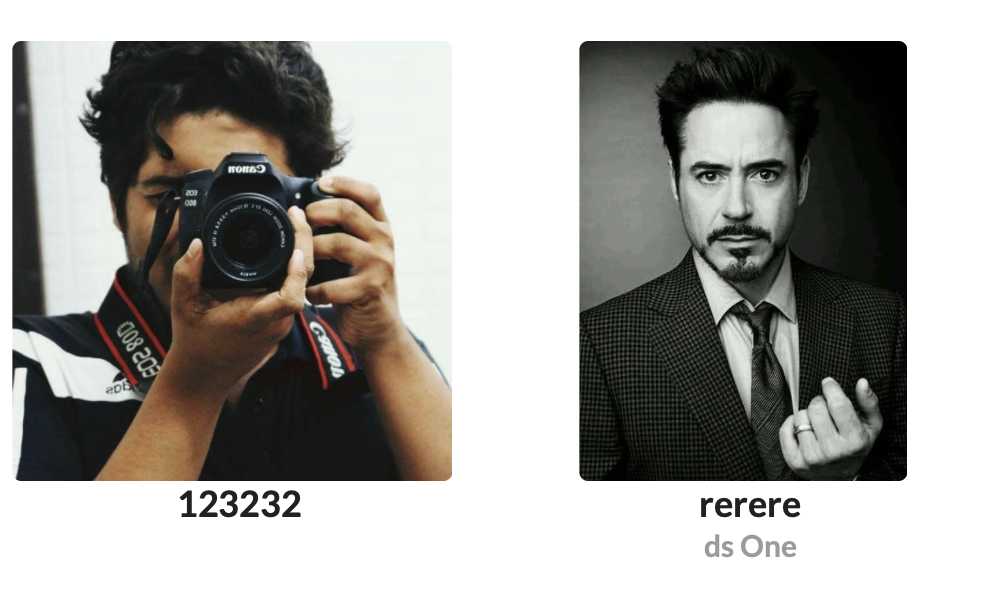
@kushthedude is it ok?
|

|
It looks nice.
…On Fri, 24 Jan, 2020, 15:51 Sundaram Dubey, ***@***.***> wrote:
@kushthedude <https://github.com/kushthedude> is it ok?
[image: Screenshot from 2020-01-24 15-49-11]
<https://user-images.githubusercontent.com/56407566/73061985-5c843580-3ec1-11ea-974e-9cf36129a27a.png>
—
You are receiving this because you were mentioned.
Reply to this email directly, view it on GitHub
<#3819?email_source=notifications&email_token=AKQMTLWS6TLAHEUBDLBNUJ3Q7K6KXA5CNFSM4KISNYBKYY3PNVWWK3TUL52HS4DFVREXG43VMVBW63LNMVXHJKTDN5WW2ZLOORPWSZGOEJ2K3EY#issuecomment-578071955>,
or unsubscribe
<https://github.com/notifications/unsubscribe-auth/AKQMTLS2FZDPGCY6RJ7KW3DQ7K6KXANCNFSM4KISNYBA>
.
|
but i have to apply a seperate class for this - |
|
|
|
This is not optimal solution.
…On Fri, 24 Jan, 2020, 15:56 Sundaram Dubey, ***@***.***> wrote:
<div class = "{{if device.isMobile 'mobile-center-cropped'
'center-cropped'}}">
—
You are receiving this because you were mentioned.
Reply to this email directly, view it on GitHub
<#3819?email_source=notifications&email_token=AKQMTLRGOZHGZXSA4YA5SXTQ7K63TA5CNFSM4KISNYBKYY3PNVWWK3TUL52HS4DFVREXG43VMVBW63LNMVXHJKTDN5WW2ZLOORPWSZGOEJ2LHPQ#issuecomment-578073534>,
or unsubscribe
<https://github.com/notifications/unsubscribe-auth/AKQMTLSSMOSX3QZ6JNFCT5DQ7K63TANCNFSM4KISNYBA>
.
|
i know, but if apply center cropping then for mobile width is also restricted to 220 px. |
|
@maze-runnar Open an issue for follow up CSS improvisations |
ok 👍 |
Fixes #3794
rescaling the images to 300x300 through cropper.
what it fixes : https://youtu.be/dwNEKSJfba8
Checklist
developmentbranch.