XY Grid - Feedback and Discussion #10141
Comments
|
Currently the plan is to rename |
|
Padding to create vertical spacing in the grid - my opinion is that padding as a "gutter" might now be obsolete so combining the |
|
Is this a bug? https://codepen.io/anon/pen/owjYyR?editors=1100. Seems something isn't getting overridden correctly as the grid overflows the container. <div class="grid-y margin-gutters">
<div class="cell">cell</div>
<div class="cell">cell</div>
</div>Also, would be great if this would add vertical gutters only between the cells (not above or below the grid itself, just like |
|
@oxyc can you specify browser? It looks fine in Chrome, but I'm seeing an issue in Safari that looks like this:
@brettsmason can you look into it? |

|
In your screenshot you can see that the cells background color is not aligned with the heading, which I think it should be. |
|
Ah, yes, I see it. The left-right negative margin from margin gutters is getting applied even though this is a vertical grid. Good catch! |
|
@oxyc with regards to the vertical gutters not applying on the outside, I believe that actually is working but the h4 has a margin-bottom that is offsetting. Can you verify? |
|
Another common pattern I use is a combination of Edit, this was very difficult to create with padding grids, a pretty easy fix with margins! |
Yes, sorry, you're correct. |
I think this is what @brettsmason @andycochran, and I have been going back and forth about in with regards to positioning gutters on multiple sides in #10017 Question for you - In this situation how would you expect the gutters to behave on the bottom of the container? Would you expect the grid to be flush with the bottom, or have a gutter beneath it? |
I would not expect a gutter. For example I might want to wrap the grid in a |
|
@oxyc Thanks so much for your valuable feedback! I'm going to take a look at some changes this evening to address this. |
|
What are the XY grid equivalents of the Sass mixins |
|
@arjendejong12 Currently the mixins are If you use mixins I'd really appreciate if you are able to give them a try and let me know how you get on! |
|
Thank you, it seems I was right about picking those mixins. I was confused by the documentation about A personal wish for these mixins would be to add a map of breakpoint column sizes, something like this: |
|
I think we need to add some docs about cell-block and cell-block container. There's information about the mixins, but it may deserve it's own section in the XY docs. |
|
@arjendejong12 Thanks again for the feedback - I'll definitely get those docs fixes added. @kball what control do we have over mixin order? I'm assuming its based on the order within the partial? I agree it might be good to change the order to one that's more relevant to the end user. |
|
@JeremyEnglert Agreed - @kball can you help me out with that one? |
|
@brettsmason you mean in the docs? I believe that is correct, order within the partial and probably order of files in the front matter in the docs as well (I believe you can do an array not just a wildcard) @JeremyEnglert yes will see what I can put together on |
|
Also noticed today whilst trying out mixins that |
|
A few notes while I'm building a site with the new grid:
|
|
@oxyc thanks for your continued feedback, I really appreciate it! To answer your points:
|
True. Your suggestion would work for me but I do see the possibility for cases where user want text content to have a padding, while grids of images shouldn't. Both types of grids might still have use for the
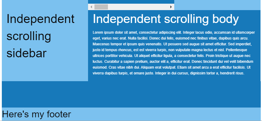
There are two primary use cases. First is the entire page layout where I want the header and the footer to shrink while the content area in between behaves like auto except that it will grow past the available height if the content takes up more space than is available. Second use case would be teasers within a grid that uses |
|
@kball I've been having a look at the docs and trying to update the order the mixins are listed. Into the docs partial, but its still listing cell mixins first, so I'm assuming its doing it alphabetically. |
|
Hi @marvinhuebner - for a padding grid, you can actually combine the container with the grid... so something like but for margin it needs to be separate, which was one of the primary reasons for separating that out into its' own class. For full width cells, not sure exactly what the recommendation would be there... @brettsmason any thoughts? |
|
This is enough i guess for me <div class="grid-x grid-container grid-padding-x">
<div class="cell">
</div>
</div> |
save some markup if you jave just a single cell by compining .grid-container, .grid-x and .grid-padding-x

see: foundation#10141 (comment)
|
@kball sorry for the late reply. Personally I never understood the need for combining a row and column - they are 2 separate elements and should stay like that in my opinion. However what @IamManchanda pointed out will of course work. The grid should be modular enough to be able to combine classes for the desired behavior :) Alternatively if using Sass you could change the grid container padding max width and have it output padding on all sizes, and use that (then no need for cell). However this isn't really a grid, it's just a contained element with padding. Maybe we need a gutter utility class that can be used to add responsive padding to any element? |
I used to have that in my projects but in the end it caused more harm because i was using it as a prototyping utility and when the project changed we easily ignored making it into a real grid and gutters would be applied twice. Nowadays I always wrap it as a proper grid if it could potentially become a grid in the future. For components where I need gutters to space out content from the container (usually containers with a background color or an image), I use named placeholders to add spacing. https://github.com/generoi/sage/blob/genero/resources/assets/styles/utils/_spacings.scss |
|
There's an issue with The issue can be demonstrated if you delete some paragraphs from the official docs grid frame example. I'm attaching the photo for you to visualize what I mean:
Imho most users will require those columns to take up 100%, especially when background is applied. |
|
@brgrz Thanks for reporting this. Is there any way you could open that as a new issue? I think this thread should be closed now as the grid is live and its a little hard to keep track of 😄 |
|
sure #10457 |
|
Serious question. But why has the XY Grid been included by default considering it literally breaks everything? |
|
XY Grid + the equalizer doesn't seem to work around anymore. Is there a built in feature of XY Grid that can solve the issue of multiple items to have equal heights? |
|
A simple question but I seem to struggle on this, why is there no mixin to just change the xy-cell size ? li {
@include xy-cell(6, $gutter-type: padding, $gutter-output: false);
margin-bottom: rem-calc(5);
text-align: left;
}And I just want to change the xy-cell($size), to 4, instead of 6 for large breakpoint so I'm using this : @include breakpoint(large) {
@include xy-cell(4);
}But this override the parameters I have passed above, why is there no specific mixin to just target the cell-size ? There is a function but I can't find any specific usability ^^ Thanks! |
|
I'm having some problems making a grid "semantically" using mixins. I've posted this in Foundation forums and found a workoaround already. http://foundation.zurb.com/forum/posts/54127-i-cant-reproduce-simple-xy-grid-with-mixins Could someone please explain if this could be made using only "official" mixins? Am I doing something wrong? Thanks! |
|
@sveggiani are you able to link to a live link of your code? Not entirely sure from looking at the forum thread what you are trying to achieve. Everything will be possible with mixins, I just need a better idea of what you need to do in order to help. |
|
@brettsmason Hi, thanks for your response. What I'm trying to achieve is to create a simple grid like this: <!-- XY Grid clases (Works!) -->
<div class="grid-x grid-margin-x">
<div class="cell small-6">A</div>
<div class="cell small-6">B</div>
</div>I would like reproduce that exact grid layout without using Foundation classes in markup but mixins: <div class="item-row">
<div class="item-row__cell">A</div>
<div class="item-row__cell">B</div>
</div>.item-row {
@include xy-grid;
}
.item-row__cell {
@include xy-cell(6);
}But I'm not being able to express with mixins what the .item-row {
@include xy-grid;
@extend .grid-margin-x; // <---- this!
}I'm sorry I can't point you to a live example because I'm not being able to include Foundation SASS mixins in Codepen or similar tools. Thank you very much. |
|
@sveggiani sorry for the delay. Therefore for now, you would need to do this: @kball looks like an issue here: https://github.com/zurb/foundation-sites/blob/develop/scss/xy-grid/_cell.scss#L123 however |
|
@brettsmason I am using this code to achieve grid-margin-x : .item-row {
@include xy-grid;
@include xy-gutters($negative: true);
}
.item-row__cell {
@include xy-cell(6);
}What about my issue above with the lack of xy-cell-size mixin ? |
|
@brettsmason I've made some tests and the solution from @heyflo is the right for my case. Using |
|
@sveggiani no problem 👍 |
|
@heyflo Sorry for missing your question - I'm taking a small break from contributing to Foundation at the moment so am not very active. So to answer your question - I started off with having a Question - are you using just padding gutters? If so maybe an option to change the default for the mixin, or a mixin to wrap code to set some defaults so you dont have to keep setting them might be a good idea. With your example, you woud currently need to write: To be honest the mixins do need a lot of work and probably a rework. They are fairly biased towards using margin gutters at the moment because at the time its what people seemed to be vocal about. @kball Do you have any thoughts on how to make this scenario easier? I think we really need to completely redo the mixins at some point... |
|
@brettsmason Thanks for answering. That is what I am already using, I figured out there was no other solution. To point out what I wanted to do intially so it does make sense, I wanted to have some cells to have the full width (and not the calc(% - gutters)), so in order to do that I had to set the $gutter-type to padding and turn the output to false. With some tests, I figured out that only having $gutter-output: false, doesn't remove the calc(% - gutters) for the width size, something I don't really understand. If you don't want gutters then I think the width should be a clear % and not a calc(% - gutters). |
|
@brettsmason @heyflo @sveggiani I tried to accomplish the same: A grid-margin-x grid and thought the xy-grid-layout mixin should be exactly what is needed for that. So I used the following code: It wasn´t clear to me how to remove the padding gutter to achieve the margin gutter. Instead of using |
|
@jmartsch I think you are right, using a parameter on the Maybe they thought about more usages of that mixin ( |
|
I don't have anything to contribute at the moment but have run into the same issue. Very much appreciate the solutions provided but a bit surprised this doesn't work better out of the box in regards to building semantically. |
|
Hi there, a question (and perhaps a feature request?) — many of the designs I work with don't have square gutters. What do I mean by this? For example, gutters might be 20px wide and 18px tall. I'm not sure if the grid supports this currently? My suggestion would be to support the following, for example: $grid-margin-gutters: (
small: 1.125rem 1rem,
large: 1.25rem 1.125rem
);Where I'm setting these in rem instead of pixels. Is this possible / planned? I couldn't find an issue or much about this online. Next step for me is to see if I can override some of the foundation mixins in my build and get something like this working. Will report back. |
|
Thanks everyobne for the helpful feedback. We are closing this very long issue as separate issues and questions should be reported as new single issues. |
Now that the new XY Grid has been merged and is included in the RC lets keep all discussion surrounding this in one place, and gather as much feedback to improve it as much as possible before the full release.
You’ll find a Codepen to the new grid here:
https://codepen.io/ZURBFoundation/pen/owvqYp?editors=1000
And the docs:
http://foundation.zurb.com/sites/6.4.0-rc1/docs/xy-grid.html
For previous discussion history see:
The text was updated successfully, but these errors were encountered: