UI/UX design overhaul #35081
Comments
|
@SamWoolerton The designs were all amazing. I think that the night mode could use a few changes. Also in the curriculum page for the topics, maybe we could use the same kind of progress bar you used to show the number of projects, challenges done. |
|
Related issue thread: #16445 |
|
@SamWoolerton I love the designs that you've made,As @Nirajn2311 , the night mode could use some work, the colour of grey isn't particularly 'night' if you get what I mean and maybe just leave this white: |

|
I, for one, think the design looks absolutely beautiful/functional |
|
Our brand guidelines: https://design-style-guide.freecodecamp.org/ |
|
Thanks all for the feedback! @Nirajn2311 Totally agree, curriculum with progress bars was actually one of the first things I tried there. I prefer the version without as it's a bit cleaner visually, but this is a good option too, and it's really nice to see progress at a glance. @thecodingaviator yeah night mode colours are hard. Currently using background #333, cards #555, brand colour #7DB17D, text #aaa to #ddd depending on how prominent it needs to be. Let me know what your preferred colour palette would be (or better yet, clone Figma and give it a crack yourself, then share the link here) @raisedadead cheers for the heads up, didn't realise that existed! I kept the brand font throughout, but chose to use a different brand colour - that's my personal preference to have a less dominant colour throughout the UI. I'd be happy to see the style guide updated, or to update the colours used in the design - unfazed which option we end up with. |

|
Thanks a lot for investing your time and efforts in the UI/UX. First of all these look great! 👏 I guess @QuincyLarson can attest this better but, we do have a brand tone that we adhere to. Some pointers off the top of my head that we care about:
I am pretty sure we can use your concepts and marry them to certain rules that we have established to achieve a really functional design. |
|
@raisedadead Sweet as, fully get the a11y side of things. I'll aim to make some time over the weekend and play around with the colour scheme - will look to swap in the brand dark green and will test the orange. I do think that the light gray page background with white background for content (kind of a card look) is another form of whitespace and helps to separate out content sections. Without this, the page's different sections tend to blend into each other a bit. |
|
I given things a knock here . @raisedadead / @QuincyLarson I really think we should add the color |
|
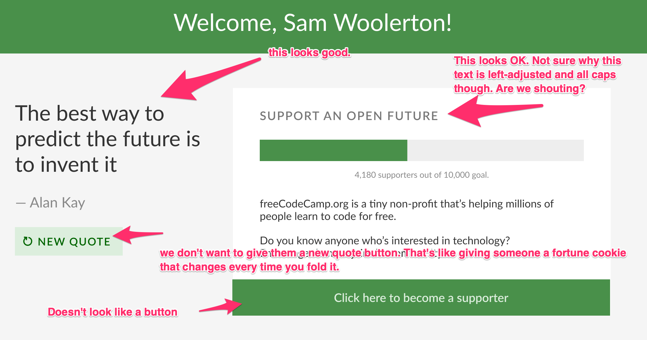
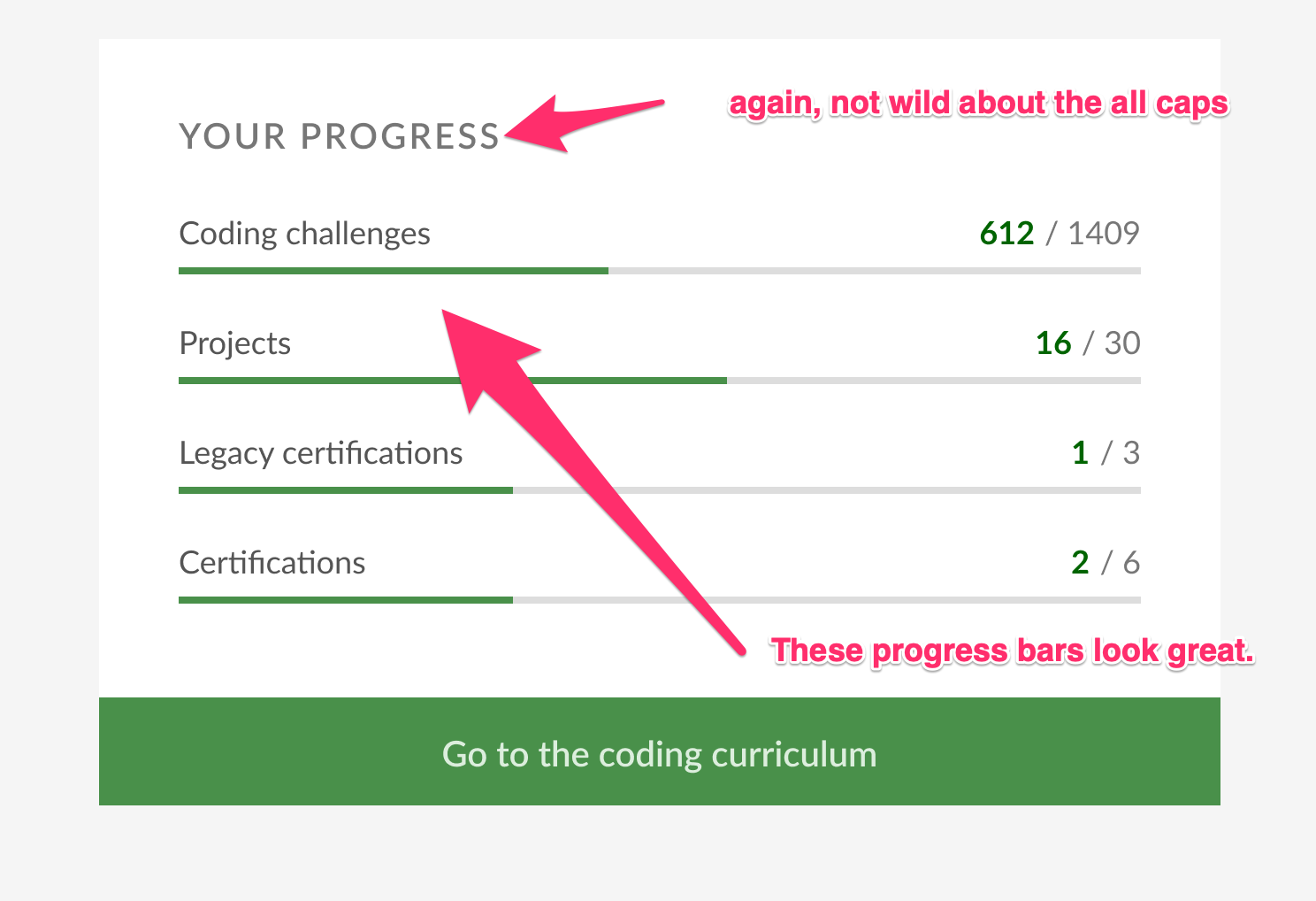
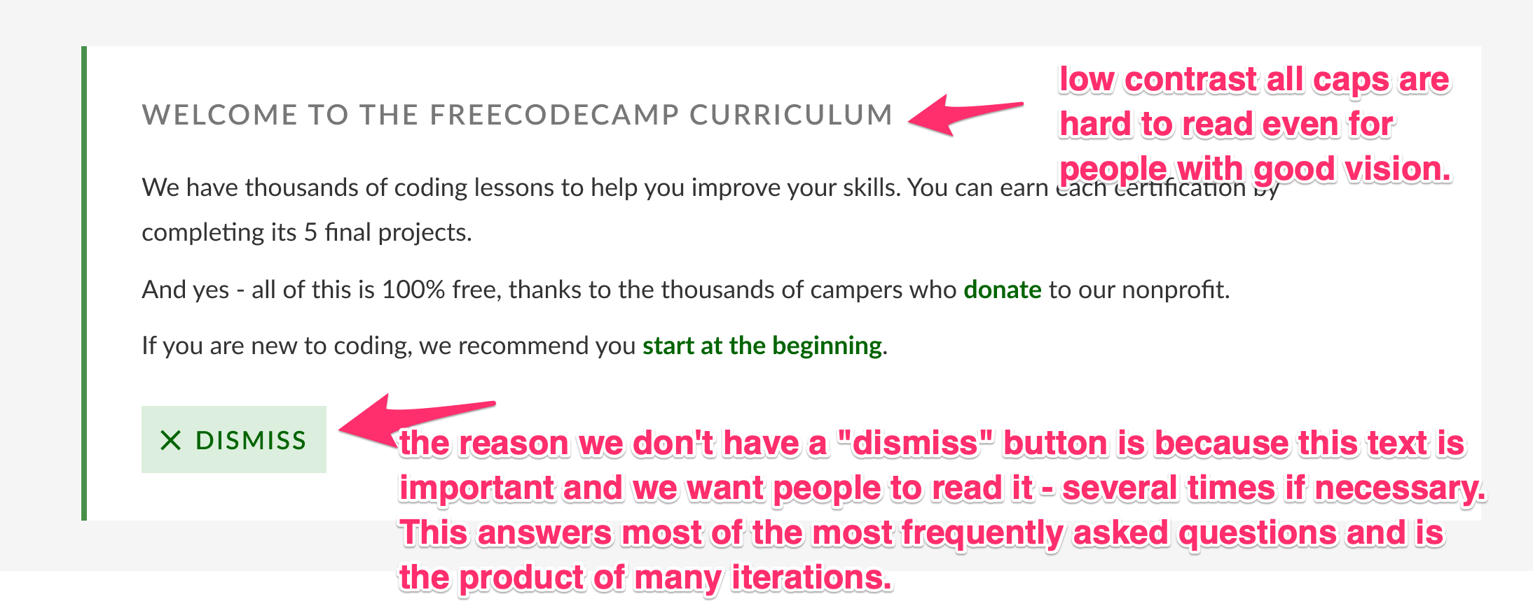
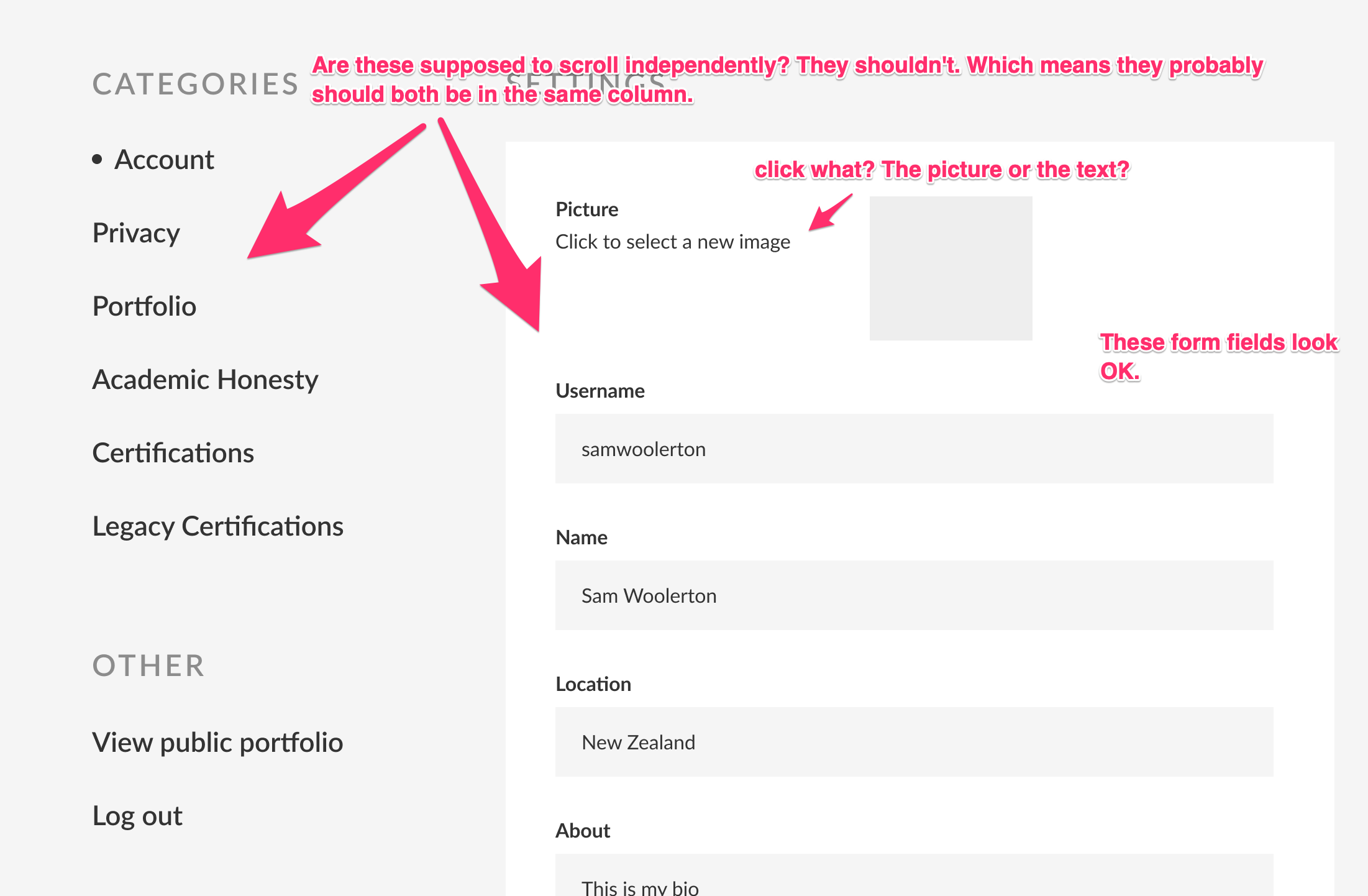
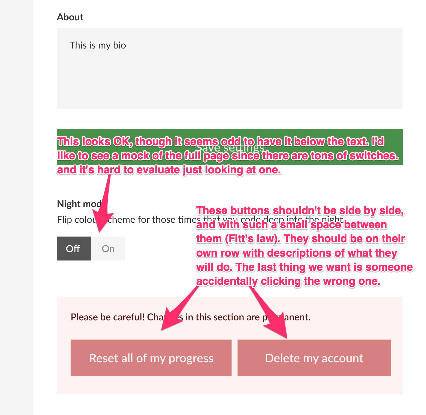
@SamWoolerton First of all, thanks for taking the time to create these mock-ups and share them with us. We get these kinds of redesign concepts often. The main thing that informs our design is accessibility and unambiguity. Some people say Craigslist is an ugly website. Why haven't they changed it after all these years? The fact is, it's fast, accessible, and it works. This said, I think there is some room for incremental improvements in freeCodeCamp's UI, and there may be some ideas here we can incorporate. What follows are my notes in screenshots for the sake of time and clarity (my apologies to anyone reading this with a screen reader).
Link about scrolling (a strong argument for not worrying about saving vertical space and just keeping everything single-column): https://uxmyths.com/post/654047943/myth-people-dont-scroll
Rather than focusing on how things look, I encourage you to focus on how things use. Are there ways we can use space and hierarchy to better convey what the user should be doing and how to do it? Could you get freeCodeCamp running locally and implement some of these ideas with our existing CSS? |


|
@QuincyLarson Thanks for the detailed feedback, much appreciated! There were probably 3 key UX prompts that started me on the redesign
I still think these are worth addressing, and should be doable within the existing FCC brand guidelines and current visual design. I'd be happy to look at implementing this at some point in the next month or so if you guys would accept a PR on them. As for my proposed UI changes, happy to write those off. Once I'd made the above UX improvements I redesigned the rest in my preferred design style, thought it would be nice to have a facelift on a few things - I fully understand FCC having a focus on accessibility, and the current design clearly isn't holding you back. Unfazed either way. |
Sure - we could definitely implement these to the right of the carets. Would you be interested in doing this?
I don't think it's so long that it necessitates a tabbed approach. If anything we could have a "Jump to certifications" button at the top. My philosophy has been - instead of adding more complicated interfaces, simplify the amount of elements you have to begin with. We may be able to pair back or simplify some of the content here.
Agreed. Would you be interested in implementing these?
We're open to this. We just want to make sure every change has sound reasoning behind it. We are not interested in chasing ephemeral design trends, but if they're changes that don't hurt usability, we can definitely consider them. |
Hey all,
I've thought for some time that while I love FCC's content, the design (both UX and UI( could be better. For context, I used FCC about 18 months ago to learn frontend and have recommended the site to many people interested in learning programming. I recently revisited the site and noticed the potential for improvement.
I've rebuilt the site's main pages (landing page, home, curriculum, settings) in Figma (an awesome free online design tool), and you can check out the original and new designs here.
I've left content mostly the same (copywriting isn't my specialty), but have overhauled the UI and UX, particularly focusing on consistency and visual hierarchy in the UI, and for UX I've focused on improving navigation patterns within pages and helping users to get to relevant actions and information faster.
I'm happy to revise per feedback - I'm pretty new at this myself, so I know I still have a ton to learn. Very open to finding ways to do better!
Figma has a 'clone' feature where you can test whatever changes you want (much like forking a repo) - feel free to then add comments with suggestions on the original.
Look forward to hearing your thoughts!
The text was updated successfully, but these errors were encountered: