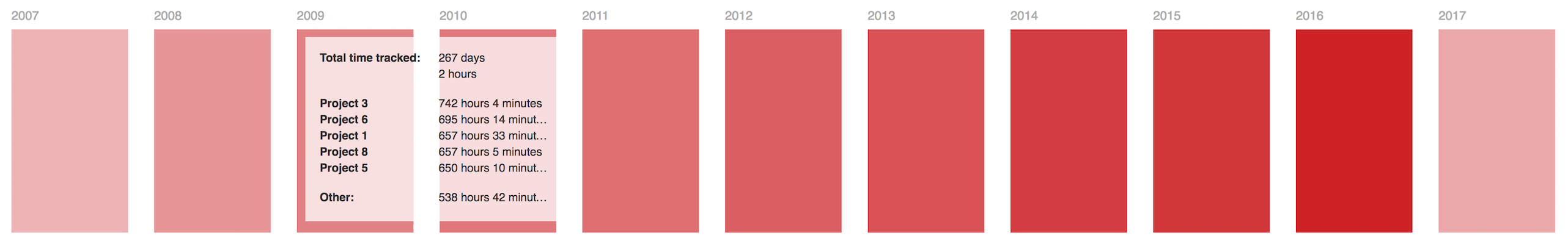
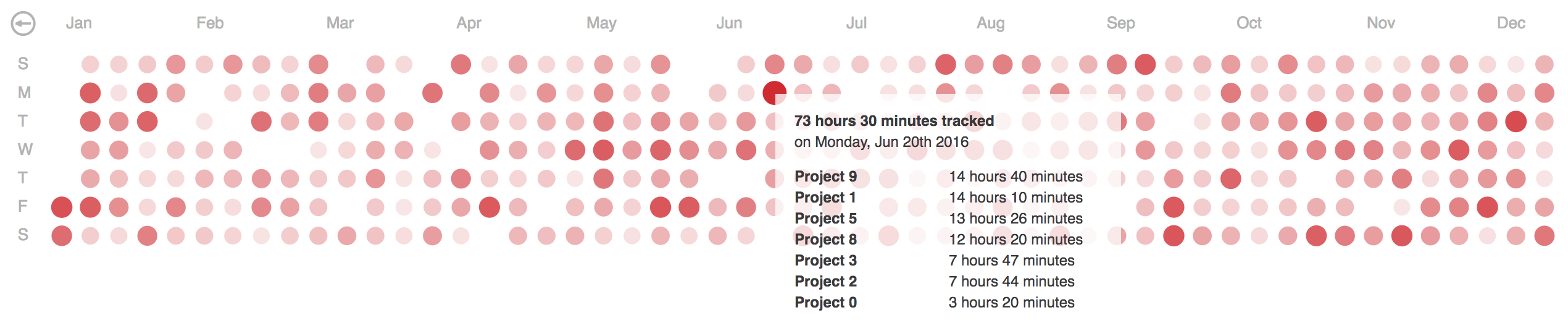
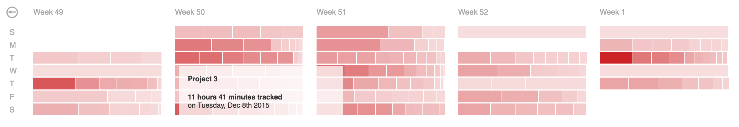
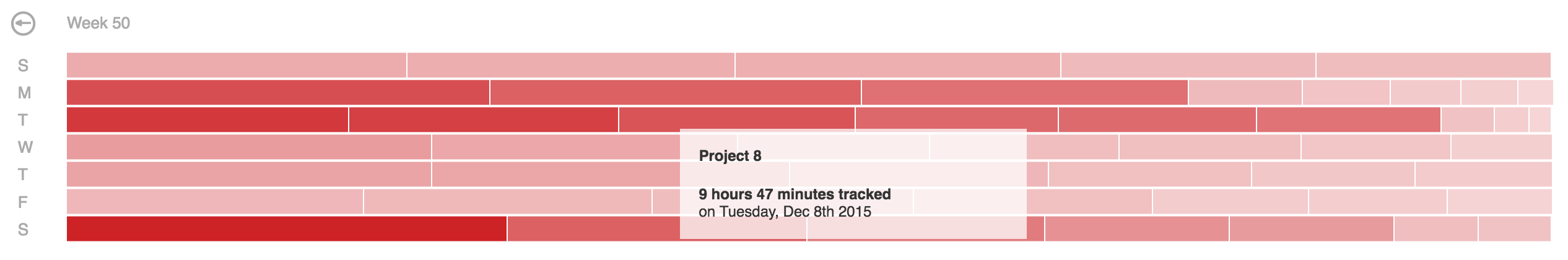
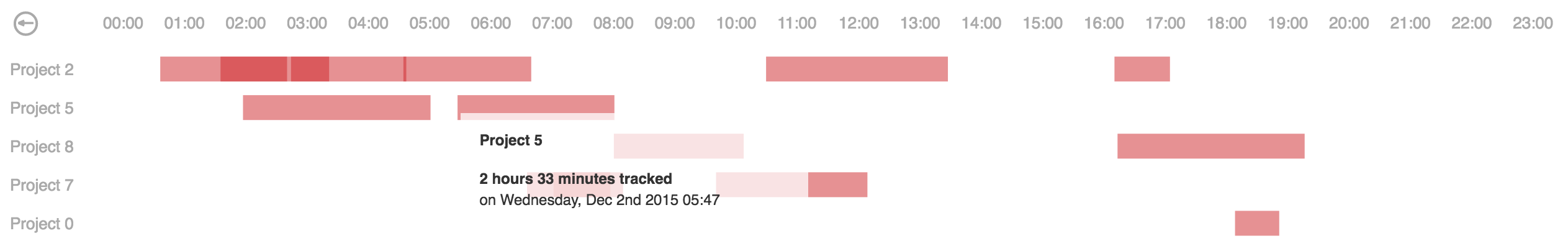
This d3.js heatmap representing time series data is used to visualize tracked time over the past year, showing details for each of the days on demand.
Includes a global overview of multiple years and visualizations of year, month, week and day overview with zoom for details-on-demand.
Inspired by Github's contribution graph
Based on Calendar View by Mike Bostock
Aaand D3.js Calendar Heatmap by Darragh Kirwan
Click here for a live demo.
- Install 'calendar-heatmap-graph' with bower
bower install calendar-heatmap-graph
- Install 'calendar-heatmap-graph' with npm
npm install calendar-heatmap-graph
- Or include files directly in your html:
<link rel="stylesheet" type="text/css" href="dist/calendar-heatmap.min.css">
<script type="text/javascript" src="dist/calendar-heatmap.min.js"></script>
| Property | Usage | Default | Required |
|---|---|---|---|
| data | Time series data from max a year back | none | yes |
| container | Div to place the calendar in | placed where function called | no |
| color | Theme hex color | #45ff00 | no |
| overview | Initial overview type (choices are: year, month, day) | year | no |
| handler | Handler function is fired on click of a time entry in daily overview | none | no |
Time series data where each day has a total time tracked (in seconds).
Details, if provided, are shown in a tooltip on mouseover in different overviews.
var data = [{
  "date": "2016-01-01",
  "total": 17164,
  "details": [{
    "name": "Project 1",
    "date": "2016-01-01 12:30:45",
    "value": 9192
  }, {
    "name": "Project 2",
    "date": "2016-01-01 13:37:00",
    "value": 6753
  },
  .....
  {
    "name": "Project N",
    "date": "2016-01-01 17:52:41",
    "value": 1219
  }]
}]
Additionally you may specify a color to be used as the primary color for that data point in daily overview, for example:
var data = [{
  "date": "2017-01-01",
  "total": 18456,
  "color": "red",
  .....
}]
In some cases details array could be large and in order to fit the data into the tooltip a short summary is generated with distinct projects and their total tracked time for that date. In terms of optimization, summary data can be computed server-side and passed in using the ``summary'' attribute. And in addition to the data structure described above this would result in a summary dictionary with distinct project names and total values of tracked time in seconds, e.g.:
var data = [{
  "date": "2016-01-01",
  "total": 17164,
  "details": [.....],
  "summary": [{
    "name": "Project 1",
    "value": 9192
  }, {
    "name": "Project 2",
    "value": 6753
  },
  .....
  {
    "name": "Project N",
    "value": 1219
  }]
}]
See index.html for an example implementation with random data or click here for a live demo.
If you want to use this heatmap as an Angular directive (version 1.x), see angular-calendar-heatmap
Or as an Angular component (version 2.x), see angular2-calendar-heatmap
If you want to use this heatmap as a React component, see reactjs-calendar-heatmap