rn-sliding-button-panel is a highly customizable side panel that provides a button view by default.
However, a custom view can be provided using customPanelView property. It is recommended to set width and height of the custom view to 100% to have the best experience
Using npm:
npm install --save rn-sliding-button-panelUsing yarn:
yarn add rn-sliding-button-panel| Default View | Custom Panel Style | Custom Panel View |
|---|---|---|
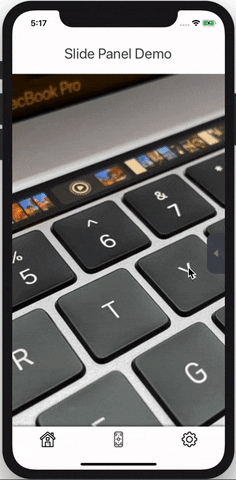 |
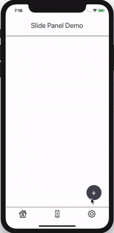 |
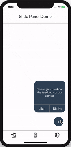 |
"Icon made by FreePik from www.flaticon.com"
import SlideButtonPanel from 'rn-sliding-button-panel';
<SlidingButtonPanel
  panelBackgroundColor={'rgba(40,60,90,0.8)'}
  openBtnBackgroundColor={'rgba(40,60,90,0.8)'}
  btnSeparatorColor={'black'}
  buttons={[
    {
      uri: 'ic_right',
      onPress: onRightPress,
    },
    {
      uri: 'ic_wrong',
      onPress: onWrongPress
    },
  ]}
/><SlidingButtonPanel
hideOpenButton // to hide default open button
panelStyle={{borderRadius:20}}
ref={(ref)=>{this.slidingPanelRef = ref}} // openPanel function on ref
buttons={[
{
uri: 'ic_right',
onPress: onRightPress,
},
{
uri: 'ic_wrong',
onPress: onWrongPress
},
]}
/>Define your open button and use ref to show/hide the panel like this
<TouchableHighlight onPress={()=>{this.slidingPanelRef.openPanel()}}>
  <View>
    <Text>Toggle Panel</Text>
  </View>
</TouchableHighlight>| Name | Default | Description |
|---|---|---|
| ref | openPanel function on ref can be used to show/hide the panel programatically |
|
| width | 70 | to adjust the width of the panel |
| height | 300 | to adjust the height of the panel, must be greater than 100 if provided |
| top | 150 | to adjust the top margin of the panel |
| alignment | 'right' | position of the panel on the screen, 'left' and 'right' are supported |
| slidingWidth | 0 | extra sliding width to slide panel on to the screen |
| onShow | ()=> {} | do something on panel show |
| onHide | ()=> {} | do something on panel hide |
| panelBackgroundColor | 'rgba(0,0,0,0.8)' | change the background color of the panel |
| panelStyle | {} | adjust the panel styling |
| customPanelView | null | provide your own custom view for the panel |
| buttons | [{}] | provide the array of data for buttons, see below for button item props |
| showBtnSeparator | true | hide button separators |
| btnIconsAnimation | true | on/off button icons animation |
| flipIconsInRTL | false | reverse icons in RTL layout |
| btnSeparatorColor | 'gray' | change the color of the button separators |
| hideOpenButton | false | to hide default open button of the panel |
| openBtnBackgroundColor | 'rgba(0,0,0,0.8)' | change the background color of the open button |
| openButtonStyle | {} | adjust styling of the open button |
| Name | Default | Description |
|---|---|---|
| onPress | () => {} | onPress of each button |
| iconWidth | 36 | width of the icon |
| iconHeight | 36 | height of the icon |
| uri | image uri for the icon e.g uri: 'ic_save' | |
| requireUri | require the. icon file and provide it as a requireUri value e.g. requireUri: require('./assets/save.png'). Overrides uri property | |
| buttonView | null custom view for the button, overrides icon properties, use your own styling on the button view |