Crisp text #263
Comments
|
What do you mean by 'fuzzy'? Perhaps a screenshot would help diagnose the issue or find a solution. |
|
Try flooring the pixel values to be integers or integers + 0.5. So if |
|
You can also make sure the Rusttype will do a little bit of anti-aliasing for you and I don't think it can be turned off from how ggez currently uses it. This is generally actually what you want; curves and such look awful otherwise. Usually you want to make sure to render the font at the actual size that it's going to be displayed at on the screen, and not rescale it after that. If you absolutely need pixel-perfect control over font and can't make rusttype do what you want, that's generally what bitmap fonts are for. Still, I would hope you can get good results out of a .ttf font. Screenshots might help us figure something out. |
|
Thanks for the ideas!
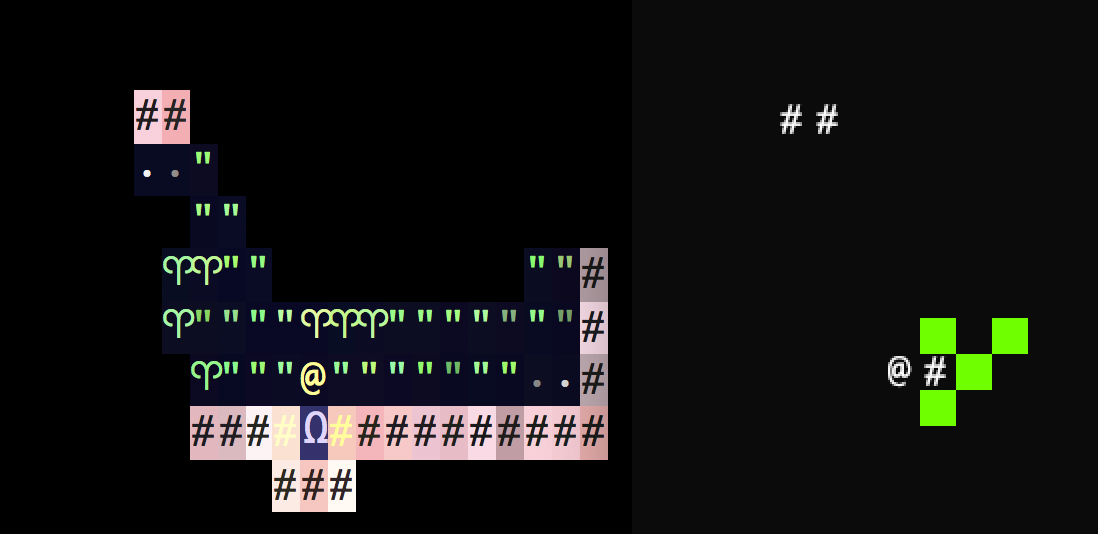
Yes, sorry for the vagueness. Here's a picture of Brogue and a little bit of my roguelike side-by-side, both are using the Monaco font.
For the Text's position? Everything is u32's. I've tried setting the position.x/y to + 0.5 and it didn't have any effect.
So far, I haven't been able to get this to make a difference. Could it be to do with being on a retina screen? |


|
What point size are you rendering the font at? |
|
13 (my cells are 18x18px but the text comes out too large so I reduce it to fit - 13pt seems to fit well in 18x18px cells). It gets loaded like this: pub fn load_font<P>(&mut self, context: &mut Context, path: P)
where
P: AsRef<path::Path> + fmt::Debug,
{
// reduce the font size relative to the cell_size so it fits
if let Ok(font) = graphics::Font::new(context, path, self.cell_size - self.font_fudge) {
self.font = Some(font);
}
}and then rendered like this (I know I shouldn't really create a text object every frame): fn draw_glyph(
&self,
context: &mut Context,
glyph: char,
pos: graphics::Point2,
color: graphics::Color,
) {
if let Some(ref f) = self.font {
if let Ok(mut text) = graphics::Text::new(context, &glyph.to_string(), &f) {
text.set_filter(graphics::FilterMode::Nearest);
graphics::set_color(context, color).expect("couldn't set color while drawing text");
graphics::draw(context, &text, position, 0.0).expect("couldn't draw text");
}
}
} |
|
And if you render it larger and resize it down when drawing, how does it look? |
|
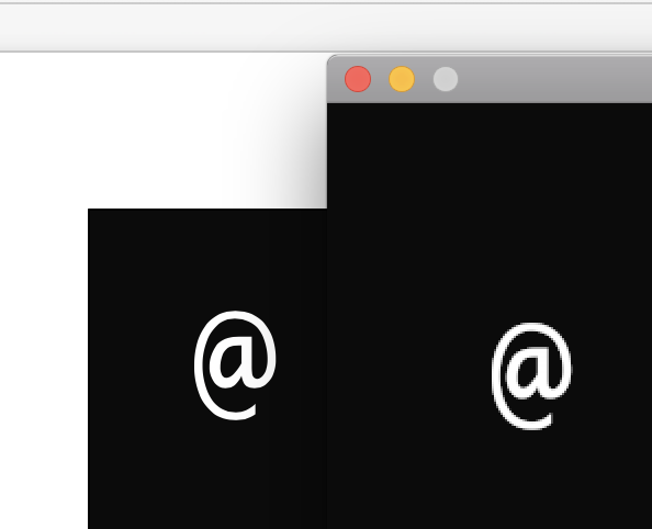
The text is clearer. This is the text rendered at 42pt – |


|
I think part of what you're seeing here is brogue taking advantage of the retina screen on your macbook while ggez is not. I don't really know what the solution is for that (I think there was somone who had, in theory, added support for retina/hidpi displays in the past but I dont know if that has since broken or even exaclty what it did). What happens if you render the font at 42px like you have now and then scale it down appropriately to size when you draw it? |
|
Ah, that makes sense. Text looks significantly crisper if I render and then resize - good plan! Thanks for all your help. |
|
If you want smoother text, you are going to need to tell ggez to render the text with more pixels. You do this by setting the ggez will attempt to get what DPI your screen is at and scale the font accordingly to show up at the Right Size, see here: https://github.com/ggez/ggez/blob/master/src/graphics/text.rs#L52-L75 However, this depends on actually having correct information for what your monitor's DPI is, which some systems (Retina for example) may lie about. There's an I'd love to actually get this to work properly but I don't have a Retina screen to test on. Long story short: Create a bigger font until it looks as smooth as it should, then scale it down. |
|
Alrighty – with A quick bit of googling says that Retina screens have twice the pixel density so this all makes sense now. I wonder if this means all assets need to be 2x? |
|
Resolved. 😢 See #587 for basically the reason why. |
|
This says "Resolved" but I still see it in 0.5.1 on Linux. The fix to render twice the size font you want and scale it by half when you draw also still works. For future readers, to scale by half when you draw your text object: |
I'm building a roguelike using ggez. So far it's going well but I can't get the text to not be fuzzy. Is it something I'm doing wrong, a current limitation of ggez/rusttype or something else? I'm using a .ttf font – should I use a bitmap one?
Thanks!
The text was updated successfully, but these errors were encountered: