UI for using in your react native projects (Android and IOS).
npm i react-native-master-uior
yarn add react-native-master-uiThen
npm i react-native-vector-icons
react-native link
or
yarn add react-native-vector-icons
react-native linkimport React, {Component} from 'react';
import {View,} from 'react-native';
import {CardView, ListItem, Accordion, StarsRate, Button} from 'react-native-master-ui'
export default class App extends Component {
render() {
return (
<View style={{flex: 1, justifyContent: 'center', alignItems: 'center'}}>
<Button title={'Sample Button'}/>
</View>
)
}
}
| Prop | Type | Default | Description |
|---|---|---|---|
| title | string | null | Title of the accordion. |
| titleStyle | object | {} | Add your custom style for the title. |
| headerStyle | object | {} | Add your custom style for the header. |
| containerStyle | object | {} | You can change style accordion. |
| isRtl | boolean | false | For the languges are right to left (like: farsi,arabic). |
| isCard | boolean | false | You have two style of accordion (flat,card) . |
| iconColor | string | "gray" | Color of arrow icon. |
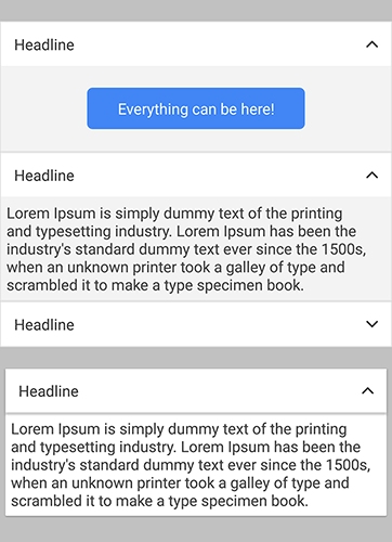
import React, {Component} from 'react';
import {View,} from 'react-native';
import {Accordion} from 'react-native-master-ui'

export default class App extends Component {

    render() {
        return (
            <View style={{flex: 1, justifyContent: 'center', alignItems: 'center'}}>
                <Accordion
                    title={"Headline"}
                    titleStyle={{
                        color: 'red'
                    }}
                    headerStyle={{
                        backgroundColor: 'blue'
                    }}
                    containerStyle={{
                        marginTop: 20
                    }}
                    iconColor={"red"}
                    isCard={true}
                    isRtl={false}
                >
                    <View>
                        .... whatever can be here
                    </View>
                </Accordion>
            </View>
        )
    }
}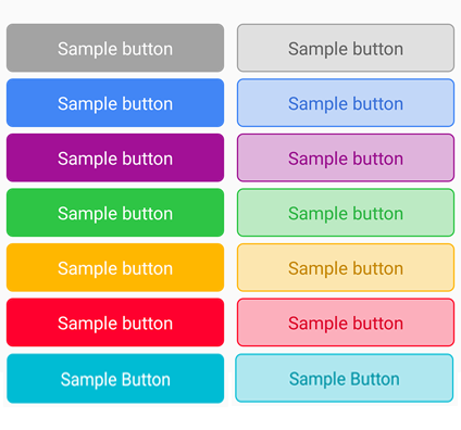
| Prop | Type | Default | Description |
|---|---|---|---|
| onPress | function() | undefine | The job you want to happen after click. |
| title | string | null | Title on the Button. |
| textStyle | object | {} | Add your custom style for title. |
| status | string | null | Can be one of: "info","info2","success","warning","danger","aqua" |
| style | object | {} | Add your custom style for button. |
| isLinear | isLinear | false | Show button with border and opacity background color. |
| disable | boolean | false | Button not working when click if disable is true. |
| isLoading | boolean | false | It shows an indicator instead of title until it's true. |
| indicatorColor | string | "white" | Color of indicator. |
import React, {Component} from 'react';
import {View,} from 'react-native';
import {Button} from 'react-native-master-ui'

export default class App extends Component {

    render() {
        return (
            <View style={{flex: 1, justifyContent: 'center', alignItems: 'center'}}>
                <Button
                    onPress={() => alert("Clicked!")}
                    title={'Sample Button'}
                    textStyle={{fontSize: 16}}
                    status={"info"} /// "info","info2","success","warning","danger"
                    style={{
                        marginTop: 5
                    }}
                    isLinear={true}
                    disable={false}
                    isLoading={false}
                    indicatorColor={"black"}
                />
            </View>
        )
    }
}
| Prop | Type | Default | Description |
|---|---|---|---|
| onPress | function() | undefine | The job you want to happen after click on card. (Do'nt use this props if you're card is not clickable!) |
| avatarImage | string | null | The image top of card. (Does not show if not used) |
| avatarImageStyle | object | {} | Add your custom style for avatar image. |
| avatarTitle | string | null | Like names or user name ... . (Does not show if not used) |
| avatarTitleStyle | object | {} | Add your custom style for avatar title. |
| image | string | null | The image you want to show. (Does not show if not used) |
| imageStyle | object | {} | Add your custom style for image. |
| resizeMode | string | null | Change the resize mode of image for custom purpose. |
| title | string | null | Title of what ever you want to show. (Does not show if not used) |
| titleStyle | object | {} | Add your custom style for title. |
| content | string | null | Description of what ever you want to show. (Does not show if not used) |
| contentStyle | object | {} | Add your custom style for Description. |
| numberOfLines | number | null | Number of "content" line you want to show. |
| isFlat | boolean | false | There is two style "Card" if it's false and "Flat" if it's true. |
| style | object | {} | Add your custom style for CardView. |
| isRtlText | boolean | false | For the languges are right to left (like: farsi,arabic). |
| isRtlAvatar | boolean | false | For the languges are right to left (like: farsi,arabic). |
import React, {Component} from 'react';
import {View,} from 'react-native';
import {CardView} from 'react-native-master-ui'

export default class App extends Component {

    render() {
        return (
            <View style={{flex: 1, justifyContent: 'center', alignItems: 'center'}}>
                <CardView
                    onPress={() => alert('clicked!')}
                    avatarImage={{uri:'image link address'}}
                    avatarImageStyle={{width:20,height:20}}
                    avatarTitle={'UserName'}
                    avatarTitleStyle={{fontSize:10}}
                    image={{uri:'image link address'}}
                    imageStyle={{borderRadius: 5}}
                    resizeMode={'cover'}
                    title={"Title text"}
                    titleStyle={{fontFamily: 'my custom font'}}
                    content={'here is the description'}
                    contentStyle={{fontFamily: 'my custom font'}}
                    numberOfLines={2}
                    isFlat={false}
                    style={{backgroundColor: 'red'}}
                    isRtlText={false}
                    isRtlAvatar={false}
                >
                    <View>whatever can be here(like: buttons, links, texts...)</View>
                </CardView>
            </View>
        )
    }
}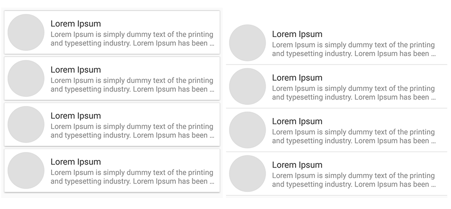
| Prop | Type | Default | Description |
|---|---|---|---|
| onPress | function() | undefine | The job you want to happen after click on card.(Do'nt use this props if you're card is not clickable!) |
| image | string | null | The image you want to show. |
| imageStyle | object | {} | Add your custom style for image. |
| title | string | null | Title of what ever you want to show. |
| titleStyle | object | {} | Add your custom style for title. |
| content | string | null | Description of what ever you want to show. |
| contentStyle | object | {} | Add your custom style for Description. |
| numberOfLines | number | null | Number of "content" line you want to show. |
| isCard | boolean | false | There is two style "Card" if it's true and "Flat" if it's false. |
| style | object | {} | Add your custom style for ListItem. |
| isRtl | boolean | false | For the languges are right to left (like: farsi,arabic). |
import React, {Component} from 'react';
import {View,} from 'react-native';
import {ListItem} from 'react-native-master-ui'

export default class App extends Component {

    render() {
        return (
            <View style={{flex: 1, justifyContent: 'center', alignItems: 'center'}}>
                <ListItem
                    onPress={() => alert('clicked!')}
                    image={{uri:''}}
                    imageStyle={{
                        borderRadius:5
                    }}
                    title={"Title text"}
                    titleStyle={{
                        fontFamily:'my custom font'
                    }}
                    content={'here is the description'}
                    contentStyle={{
                        fontFamily:'my custom font'
                    }}
                    numberOfLines={2}
                    isCard={false}
                    style={{
                        backgroundColor:'red'
                    }}
                    isRtl={false}
                />
            </View>
        )
    }
}
| Prop | Type | Default | Description |
|---|---|---|---|
| onPress | function() | undefine | It will update the star count. if you don't want user able to change count of stars just remove this porps. |
| starSelected | number | 0 | Count of selected stars. |
| starStyle | object | {} | Add your custom style for each star. |
| starColor | string | "gold" | Color of stars or hearts. |
| starSize | number | 14 | Size of stars or hearts. |
| isHeart | boolean | false | False will show "Stars" and true will show "Hearts" |
import React, {Component} from 'react';
import {View,} from 'react-native';
import {StarsRate} from 'react-native-master-ui'

export default class App extends Component {

    constructor(props) {
        super(props)
        this.state = {
            starCount: 3
        }
    }

    render() {
        return (
            <View style={{flex: 1, justifyContent: 'center', alignItems: 'center'}}>
                <StarsRate
                    onPress={(starCount) => this.setState({starCount})}
                    starSelected={this.state.starCount}
                    starStyle={{
                        margin: 10,
                        backgroundColor: 'white'
                    }}
                    starColor={'red'}
                    starSize={20}
                    isHeart={false}
                />
            </View>
        )
    }
}
MIT Licensed