Unit Size
The unit is one of the Jetpack Compose modules of this library, which can support relative
screen sizes in sdp, ssp and custom create with @Dimen. Also, we can
use rememberWindowSize() to know in which device we are (Compact, Medium, Expanded) or
use postureState to build adaptive and responsive UIs in Foldables.
plugins {
    ...
    id("com.google.devtools.ksp") version "1.7.10-1.0.6"
}

android {
    ...
    kotlin {
        sourceSets.debug {
            kotlin.srcDir("build/generated/ksp/debug/kotlin")
        }
        sourceSets.release {
            kotlin.srcDir("build/generated/ksp/release/kotlin")
        }
    }
}

dependencies {
    implementation 'com.github.ghasemdev.affogato:affogato-unit:AFFOGATO_VERSION'
    ksp 'com.github.ghasemdev.affogato:affogato-unit-processor:AFFOGATO_VERSION'
}
To use the default relative units, just use the extension values .sdp or .ssp.
Column(
    modifier = Modifier
        .fillMaxSize()
        .padding(16.sdp),
    horizontalAlignment = Alignment.CenterHorizontally,
    verticalArrangement = Arrangement.Center
) {
    Image(
        painter = painterResource(id = R.drawable.affogato),
        modifier = Modifier.size(80.sdp),
        contentDescription = null
    )
    Spacer(modifier = Modifier.height(32.sdp))

    Text(
        text = stringResource(id = R.string.lorem),
        textAlign = TextAlign.Justify,
        fontSize = 16.ssp
    )
    Spacer(modifier = Modifier.height(32.sdp))

    Button(
        modifier = Modifier
            .fillMaxWidth()
            .height(48.sdp),
        onClick = { }
    ) {
          Text(text = stringResource(id = R.string.app_name).uppercase(), fontSize = 16.ssp)
      }
}
You can create custom dimension with @Dimen tag. As a first step, you must first create a variable using the following format:
@Dimen(type = "dp|sp", values = ["screen_width(Int):value(Int)", ...])
val variable_name = defualt_value.(dp|sp)
Then build the project so that the codes are generated. The next step is, you need to add the ProvideDimens function to the Theme.kt, now you only need to use the dimen variable.
...
ProvideDimens {
    MaterialTheme(
        colors = colors,
        typography = Typography,
        shapes = Shapes,
        content = content
    )
}
@Dimen(type = "dp", values = ["320:70", "480:80", "600:180", "720:180"])
val icon = 80.dp
@Dimen(type = "dp", values = ["320:14", "480:16", "600:18", "720:20"])
val padding = 16.dp
@Dimen(type = "dp", values = ["320:26", "480:32", "600:34", "720:36"])
val space = 32.dp
@Dimen(type = "dp", values = ["320:50", "480:50", "600:70", "720:80"])
val heightButton = 48.dp
@Dimen(type = "sp", values = ["320:14", "480:20", "600:30", "720:32"])
val fontSize = 16.sp
Column(
modifier = Modifier
.fillMaxSize()
.padding(dimen.padding),
horizontalAlignment = Alignment.CenterHorizontally,
verticalArrangement = Arrangement.Center
) {
Image(
painter = painterResource(id = R.drawable.affogato),
modifier = Modifier.size(dimen.icon),
contentDescription = null
)
Spacer(modifier = Modifier.height(dimen.space))
Text(
text = stringResource(id = R.string.lorem),
textAlign = TextAlign.Justify,
fontSize = dimen.fontSize
)
Spacer(modifier = Modifier.height(dimen.space))
Button(
modifier = Modifier
.fillMaxWidth()
.height(dimen.heightButton),
onClick = { }
) {
Text(text = stringResource(id = R.string.app_name).uppercase(), fontSize = dimen.fontSize)
}
}
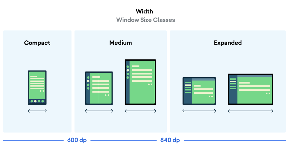
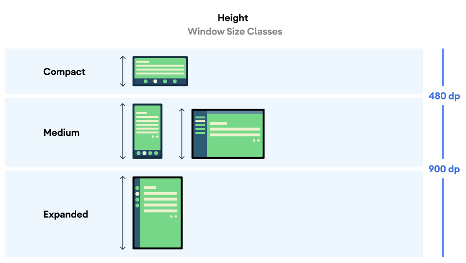
Use rememberWindowSize() to know in which device we are (Compact, Medium, Expanded).
// optional config
GlobalWindowSize.compactWidth = 480
// or
GlobalWindowSize.Factory.fromWidth { screenWidth ->
  screenWidth < 0 -> throw IllegalArgumentException("value cannot be negative")
  screenWidth < 500 -> WindowType.Compact(width)
  screenWidth < 700 -> WindowType.Medium(width)
  else -> WindowType.Expanded(width)
}

val window = rememberWindowSize()
val text by remember(window) {
    mutableStateOf(
        when (window.width) {
            WindowType.Compact -> "Compact"
            WindowType.Medium -> "Medium"
            WindowType.Expanded -> "Expanded"
        }
    )
}

@Dimen(type = "dp", values = ["$COMPACT_WIDTH:70", "$MEDIUM_WIDTH:80", "$EXPANDED_WIDTH:100"])
val icon = 80.dp
Another extension variable is Configuration.isLandscape to use for orientation configuration.
Fold state:
FLATandHALF-OPENEDfrom Google.
Posture class represents device postures in the flexible display or a hinge between two physical display panels.
- Posture.TableTop - Device posture is in tabletop mode (half open with the hinge horizontal).
- Posture.Book - Device posture is in book mode (half open with the hinge vertical).
- Posture.Normal - Device posture is in normal mode.
You can get a State of Posture to build adaptive and responsive UIs with the postureState extension on your Activity as following below:
val postureState: State<Posture> = postureState
when (postureState.value) {
    Posture.Normal -> // posture is Normal
    is Posture.TableTop -> // posture is TableTop
    is Posture.Book -> // posture is Book
}Note: Make sure your project includes Coroutines and
androidx.lifecycle:lifecycle-runtime-ktx:2.4.0dependencies.
WindowLayoutInfo contains the list of DisplayFeature-s
located within the window. You can get the State of the WindowLayoutInfo as following below:
val windowLayoutInfoState: State<WindowLayoutInfo> = windowLayoutInfoState
val windowLayoutInfo = windowLayoutInfoState.value

val foldingFeature = windowLayoutInfo.displayFeatures.findFoldingFeature()
val posture = foldingFeature?.toPosture()
val isTableTopPosture = foldingFeature?.isTableTopPosture
val isBookPosture = foldingFeature?.isBookPosture
val isHalfOpened = foldingFeature?.isHalfOpened
val isFlat = foldingFeature?.isFlat
val isVertical = foldingFeature?.isVertical
val isHorizontal = foldingFeature?.isHorizontal


val isSeparating: Boolean = windowLayoutInfo.isSeparating
val occlusionType: FoldingFeature.OcclusionType = windowLayoutInfo.occlusionType
val orientation: FoldingFeature.Orientation = windowLayoutInfo.orientation
val state: FoldingFeature.State = windowLayoutInfo.stateIf your foldable device is separated by a hinge, you can get a hinge size with the extensions below:
val hingeDp: Dp = foldingFeature.hingeDp
val hingeDpSize: DpSize = foldingFeature.hingeDpSize
val hingeWidthDp: Dp = foldingFeature.hingeWidthDp
val hingeHeightDp: Dp = foldingFeature.hingeHeightDp
...
👈 back to Core-ktx