Commit Form: Display current branch name #4189
Conversation
|
Could you please explain the benefits. |
|
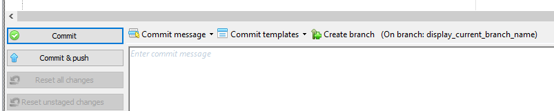
I was aware of all of that but feel it was not enough. In fact, the branch name in the title, even if being useful, is hard to read and even much more harder to discover. I think very few user know it's there (written in small with other dense data and not where you look) and use it. Even if I know it's here, I much often close the form just to see it in the browse form. And also, the data is displayed just next to the place where you are just before committing and there is a lot more chance that you see that you are not in the good branch when writing the commit message (you have quite no effort to do to see it while you have to deliberately to look at it when just displayed in the title bar). It fills the principle that the data must be displayed the nearer the place it should be used. And it make much more sense to put the information here since we added the "create a branch" button here |
bb5117f
to
bacf470
Compare
|
Sorry Philippe, I am still unconvinced this change enhances the usability of the form. To me it adds visual clutter to the already busy dialog... What does everyone else think? @jbialobr @KindDragon @gerhardol @vbjay @mdonatas @Drake103 @gpongelli . . . I can offer you an alternative task, if you wish to make the dialog more usable - add a toolstrip menu to it, which will host all available features to the user - no more hidden context menus in various controls or various drop downs in different parts. |
|
I think that it is not a good place to show the current branch. Perhaps to be more consistent it could be placed in the status bar at the bottom of the window next to the Commiter info. |
|
I've never encountered problems with this as I tend to check the active branch before commit. Also like RussKie said it's visible in the title and I agree that this would not add much benefit but definitely would add clutter. |
It is useful when you commit submodules changes by opening the commit dialog from the commit dialog of the superproject. |
@mdonatas I like this comment. It seems to prove exactly what I try to fix here ;) I see it like you were obliged to adopt an habit because there was a lack when you use GitExtensions the first times. And this argument is not at all relevant since the button "create branch" has been added to the commit form... If we verify on which branch we are, their is no need to have the button because we already have created the branch before opening the commit form. And how do we know (easily/ergonomically) on which branch we are?
Can you tell me, honestly, which users (except you and me that are power users of GitExtensions) are looking for information in the title bar of an application? Do you find it discoverable and ergonomic? Could you rembember when you discovered that the branch name was displayed here? I ask to my team of 20 and (quite) none was aware of that. The title bar is a summary and usefull data must be displayed also elsewhere in the form.
&
It seems that everybody agree on the fact that it's not displayed in the right place. I hesitate between this place, next to the "create branch" button, and the status bar. But I'm OK to change that to display it in the status bar. |
|
To make this conversation even more complicated: I would like to have the commit in the Browse form. Some discussions in #4031, will probably open a new issue regarding this (or continue on the really old one). I have played around with it but not submitted anything as there will be a lot of duplicated code. This addition does not change much in this matter. However, a non-modal commit dialogue will introduce a different way of working where you commit to where you stand, not change where you stand while committing. So you do not have to improve the information where you stand right now (in the dialogue). I do not have a strong opinion about this specific change: I maybe prefer the way it is displayed but also feel like this is adding code we do not really need. |
|
I like the idea of showing the branch name. I just don't like where it's located. I think it should be at the top of the form inside and info panel. Things like last commit summary and what branch is being committed to could be in a group at the top. That way, we don't have to fool with limited horizontal space and we could make the info panel scrollable to limit the vertical space. The panel could be collapsed and remember that state. |
|
Personally I prefer having branch name in title bar, because the summary of the windows is “doing commit somewhere”.
Otherwise an info panel could be used (I can’t imagine where to place and how it’s structured).
I don’t like this position because I don’t know also what happens with very long branch name (three dots at the end or bigger windows?)
Ps
To add even more complication on this discussion, “Commit” button zone should be adapted to create signed commit, similar to tag dialog.
… Il giorno 14 dic 2017, alle ore 13:52, Jay Asbury ***@***.***> ha scritto:
I like the idea of showing the branch name. I just don't like where it's located. I think it should be at the top of the form inside and info panel. Things like last commit summary and what branch is being committed to could be in a group at the top. That way, we don't have to fool with limited horizontal space and we could make the info packet el scrollable to limit the vertical space.
—
You are receiving this because you were mentioned.
Reply to this email directly, view it on GitHub, or mute the thread.
|
|
It looks like we have some sort of general agreement. @pmiossec could please add the current branch information to the status bar, to the right of the committer info. Something like: @gpongelli please raise a new feature request for GPG related changes. thank you all |

Actually I've no idea on which changes submit with PR. |
bacf470
to
577d418
Compare
|
I have put the branch name in the status bar. The look of the new version: |

|
I like the look of it
…On 17/12/2017 7:26 AM, "Philippe Miossec" ***@***.***> wrote:
I have put the branch name in the status bar.
The look of the new version:
[image: image]
<https://user-images.githubusercontent.com/460196/34073907-db55de16-e2a4-11e7-9cb7-c5ed1dc9ae99.png>
—
You are receiving this because you commented.
Reply to this email directly, view it on GitHub
<#4189 (comment)>,
or mute the thread
<https://github.com/notifications/unsubscribe-auth/AEMyXu6VRKu0OpMznn2Gme424DZGAW1Oks5tBCd7gaJpZM4Qz9Ha>
.
|
|
@pmiossec the only questions remains - the license attached to the added image. |
I search for it but didn't find it (and it seems strange to me that it doesn't exist). Happy you found it. I will replace the icon... |
577d418
to
8b43bd3
Compare
|
@RussKie done. Thanks for spotting the icon! |
|
Good work, thank you |
|
Wouldn't it be better to group the branch name with the commiter on the left side? On the right side there is commit form specific data. On the left side there could be global data area. |
next to the branch creation button
Screenshots after:
Has been tested on (remove any that don't apply):