Add Sankey diagram #308
Add Sankey diagram #308
Conversation
|
PTAL. Let me know your thoughts about whether this fits here. |
|
I think this is worthwhile having, but a couple of questions. Why is Flow retained as a pointer and with an inUse field? It seems to me that it's not mutated except for the Group field when there is a defaulting behaviour. Would it not be better to just use a concrete Flow, not mutate it and either understand that "" is default, or pass "Default" (I don't like this) when f.Group is "". Would you accept a bezier curve instead of a cubic spline. I have a bezier package that I can donate - I prefer to not increase imports given the trouble we have had here with moving infrastructure. |
|
|
| if s[i].order != s[j].order { | ||
| return s[i].order < s[j].order | ||
| } | ||
| panic(fmt.Errorf("can't sort stocks:\n%+v\n%+v", s[i], s[j])) |
There was a problem hiding this comment.
prepend error message with "plotter:"
|
I just removed the requirement for the group to not be an empty string. There is currently no requirement that the stock labels not be an empty string, so I figured it would be best for the behavior to be consistent. |
| // SourceStockLabel and ReceptorStockLabel are the labels | ||
| // of the stocks that originate and receive the flow, | ||
| // respectively. | ||
| SourceStockLabel, ReceptorStockLabel string |
There was a problem hiding this comment.
SourceLabel, DestinationLabel? These diagrams are used in many places where the entities are not financial. Same for the categories below.
There was a problem hiding this comment.
I was thinking stocks and flows in the sense used here. It is true that the terms are most commonly used in an economic context, but as the wikipedia page linked above mentions, the amount of CO2 in the atmosphere can also be thought of as a stock. If these terms are deemed not sufficiently general, though, we can use something else.
There was a problem hiding this comment.
Fair enough, the issue for me is more that it makes the field names java-esque. If Source and Destination are meaningful and short. SourceCategory and DestinationCategory are unfortunately longer, but an additional type to allay this doesn't seem warranted.
|
Could you remove the changes from other branches (possibly rebase onto master if you want, but the other commits confound the PR). |
cea0048
to
cb8727c
Compare
|
PTAL. I'm still not sure about the proper usage of ClipLinesX. @eaburns ? |
| flows []Flow | ||
|
|
||
| // FlowStyle is a function that specifies the | ||
| // background colar and border line style of the |
|
Where are we up to on this? |
|
Sorry for the delay. I have responded to the remaining comments and made some additional changes. PTAL. |
| @@ -276,7 +276,6 @@ func (s *Sankey) Plot(c draw.Canvas, plt *plot.Plot) { | |||
| {catMin, valMin}, | |||
| {catMax, valMin}, | |||
| } | |||
| // outline := c.ClipLinesX(pts) // This causes half of the lines to disappear. | |||
| c.StrokeLines(lineStyle, pts) //outline...) | |||
|
done. @eaburns PTAL |
|
Very pretty plots, though I don't really understand them. My one issue is that I don't like the outline-box drawn around the plot within the axes. In my opinion it violates the idea of maximizing the data:ink ratio. The box adds too much ink and no additional information. It's on purpose that Plotinum didn't have a box around the entire plot like many other plotting systems do. Anyway, if you all prefer that, then I don't want to block anything. I skimmed the code. It looks very nice. LGTM after a squash. |
|
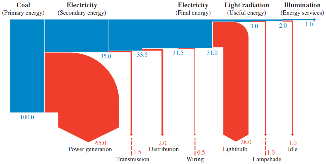
The idea behind sankey diagrams is to visualize stocks and flows, where stocks are some quantity and each flow some transfer function that relates two stocks. Perhaps the most famous sankey diagram is this one where the stocks are numbers of soldiers and the flows are loss rates between events. A more common use of the diagrams, is to visualize energy utilization, where the stocks are different types of energy (either waste or useful) and the flows are conversions between the different types. Both of the examples linked above used solid colors with no outlines to delimit the different stocks and flows, but the implementation here uses outlines with no fill color by default. So the outline box around the whole plotter does represent data: the y-height of the box gives the total value of the stock in the system at a given point on the x axis (just like in a stacked bar plot). So in this example, the outlines show that the trees produce 18 apples total but we only know the fate of 17 of them. If you look closely, you can see that this is due to a difference between the number of apples Sofia recieves and the number of apples she does something with. These types of accounting mismatches are common in the types of data used in these plots, and different implementations handle them differently. |
|
I see. So is it sufficient to only have the line on the top? Just curious. |
|
We could, but I think that would be the equivalent of not outlining the bottom of the bar in a bar chart, but bar charts currently do currently have lines at bottom. |
|
Yeah the bar charts are kind of noisy. Oh well. To late to fix them. |
No description provided.