Design Issues #1
Comments
|
MoonDance is complete. Some glyphs still have overlaps. |
|
Hi @RobLeuschke, Moon Dance has some spacing & kerning issues:
Weight Issues.
Please take the latest file at the root of the 'sources' folder in DropBox to inspect the entire font and solve all the cases. Remember you could use the sidebearing arithmetics in glyphs to make it easier and consistent whenever possible.
|


|
I will need to have a meeting about the kerning issues.
…On Mon, Oct 11, 2021 at 10:55 AM Viviana Monsalve ***@***.***> wrote:
Hi @RobLeuschke <https://github.com/RobLeuschke>, Moon Dance has some
spacing & kerning issues:
- Some common kerning pairs are missing
- There is a positive kerning between space and many uppercase
letters. Please review if either the space is too short or the left
sidebearing of the letters needs a higher value.
- As the uppercase set for MoonDance is more romanized, they could be
used in "All caps". Therefore the spacing among them should be improved.
*Weight Issues.*
- Also, the l and o letters seem to be too light and darker
respectively. In the o it could be the loop to form the eye.
Please take the latest file at the root of the 'sources' folder in DropBox
to inspect the entire font and solve all the cases. Remember you could use
the sidebearing arithmetics in glyphs
<https://glyphsapp.com/learn/spacing> to make it easier and consistent
whenever possible.
[image: Screen Shot 2021-10-11 at 10 20 23]
<https://user-images.githubusercontent.com/48698976/136818778-d1b9e38d-8554-44e7-ae8c-ed7fc51db1b4.png>
[image: Screen Shot 2021-10-11 at 10 20 28]
<https://user-images.githubusercontent.com/48698976/136818790-28175f7d-7d2a-4d04-bdfe-0bda7a5eb3c3.png>
[image: Screen Shot 2021-10-11 at 10 22 12]
<https://user-images.githubusercontent.com/48698976/136819364-60268699-08f1-4cb7-81b4-3a7461417e6f.png>
[image: Screen Shot 2021-10-11 at 10 22 30]
<https://user-images.githubusercontent.com/48698976/136819374-fe62efe4-3eb4-4c42-b238-419817f36c7d.png>
[image: Screen Shot 2021-10-11 at 10 41 07]
<https://user-images.githubusercontent.com/48698976/136819394-f8b8f2a9-b305-4e95-a139-8292f68ca19c.png>
[image: Screen Shot 2021-10-11 at 10 35 35]
<https://user-images.githubusercontent.com/48698976/136819385-28f7c77b-afd5-486e-a647-e16d1269234e.png>
[image: Screen Shot 2021-10-11 at 10 21 16]
<https://user-images.githubusercontent.com/48698976/136819551-87e3485c-1867-4c1f-9c1a-9030cee2bf5f.png>
[image: Screen Shot 2021-10-11 at 10 21 36]
<https://user-images.githubusercontent.com/48698976/136819554-dee9df35-a131-45e0-9b91-25562460ecaf.png>
—
You are receiving this because you were mentioned.
Reply to this email directly, view it on GitHub
<#1 (comment)>,
or unsubscribe
<https://github.com/notifications/unsubscribe-auth/ANXDGHMLIVN3CONU4TXPDS3UGMCHZANCNFSM5DFIW77A>
.
Triage notifications on the go with GitHub Mobile for iOS
<https://apps.apple.com/app/apple-store/id1477376905?ct=notification-email&mt=8&pt=524675>
or Android
<https://play.google.com/store/apps/details?id=com.github.android&referrer=utm_campaign%3Dnotification-email%26utm_medium%3Demail%26utm_source%3Dgithub>.
|
|
Please let me know your questions |
|
I have corrected the kerning pairs and made adjustments to some of the letter weights. |
|
Thanks. I'll download the file from DB and let you know if anything else is needed. |
|
Hi @RobLeuschke, the latest source file still have some issues with the spacing and kerning, like unnecessary kerning pairs for things that would be covered systematically by adjusting the spacing before. You would like to follow the Glyphs tutorial to better grasp how this could be solved, especially making use of the sidebearing arithmetic option.
|

|
okie dokie
(are you familiar with that American phrase?)
R0b
…On Tue, Oct 19, 2021 at 6:24 PM Viviana Monsalve ***@***.***> wrote:
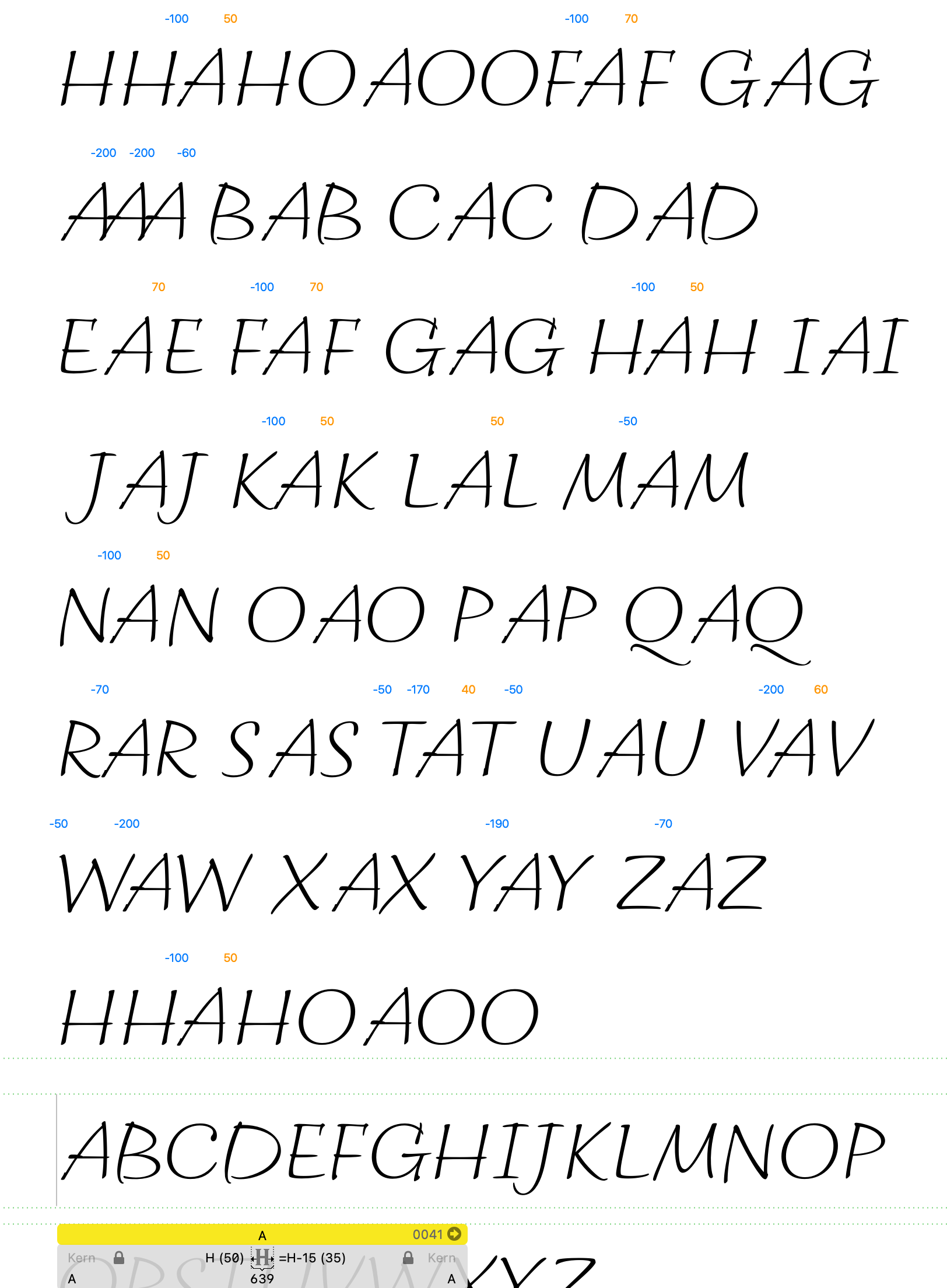
Hi @RobLeuschke <https://github.com/RobLeuschke>, the latest source file
still have some issues with the spacing and kerning, like unnecessary
kerning pairs for things that would be covered systematically by adjusting
the spacing before.
E.g. the space between AH should be the same or similar to AF and AK but
the latter are tighter.
This is happening due to the AH is being solved through a kerning pair
(+40) instead of adjusting the right sidebearing of the A.
You would like to read the Glyphs tutorial
<https://glyphsapp.com/learn/spacing> to better grasp how this could be
solved, especially making use of the sidebearing arithmetic option.
[image: Screen Shot 2021-10-19 at 18 09 27]
<https://user-images.githubusercontent.com/48698976/138003046-62abcee0-03b2-42fe-b8e9-1cc57e3552b3.png>
—
You are receiving this because you were mentioned.
Reply to this email directly, view it on GitHub
<#1 (comment)>,
or unsubscribe
<https://github.com/notifications/unsubscribe-auth/ANXDGHISTSR5GHABJJRNUG3UHX42ZANCNFSM5DFIW77A>
.
Triage notifications on the go with GitHub Mobile for iOS
<https://apps.apple.com/app/apple-store/id1477376905?ct=notification-email&mt=8&pt=524675>
or Android
<https://play.google.com/store/apps/details?id=com.github.android&referrer=utm_campaign%3Dnotification-email%26utm_medium%3Demail%26utm_source%3Dgithub>.
|
Yes, we used to use it a lot here in Colombia. I don't know if it has a particular story though, is there one?. |
|
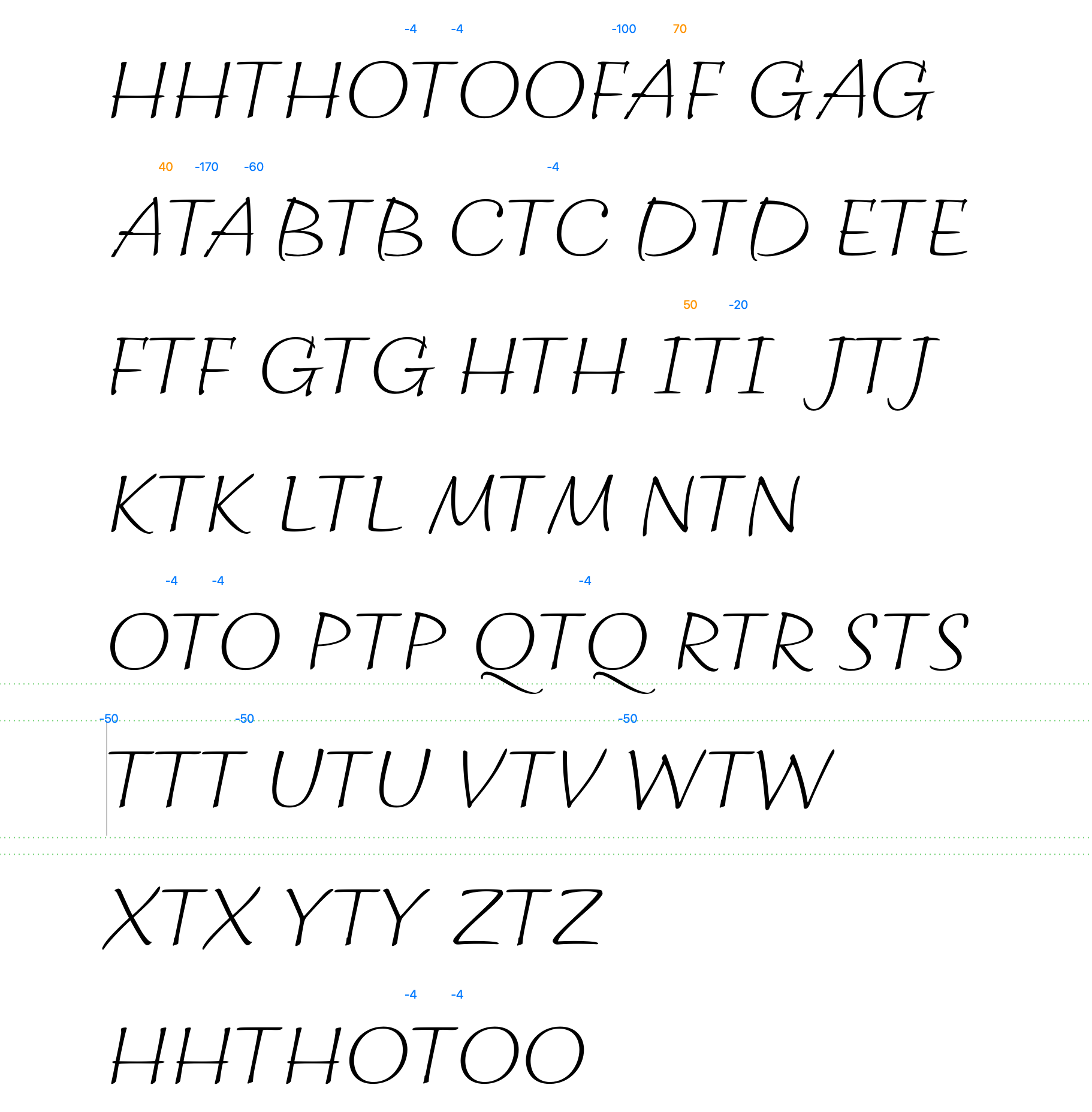
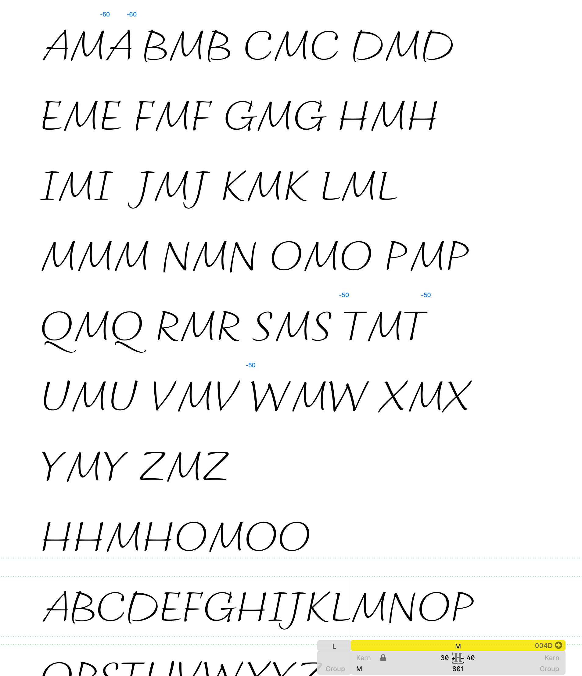
Hi @RobLeuschke after pulling the latest source file in DropBox (date 24/10/21) the spacing is starting to look better.
- In other cases it is backwards, it is the left one the one that is loose (e.g. `M`)
- And, given the `A` is a triangular shape, therefore with a bigger withe area around, it can't have the same value as `H`, it is leading to some crashes and gaps with different letters. Please keep in mind that for all the cases the combination with HH and OO as key characters is crucial. The sequence with HH must be solved first and without kerning. Typically, no kerning is expected between any letter and H. Then it goes the sequence with OO which in some particular cases (like AO) could need a small amount of kerning.
|


Google Fonts Latin Plus coverage
adblgrave) marked in dark grey as pending to be created using the componentsDiacritics
combmarks Legacy marks, delete the legacy marks and add them back so they are made using thecombmarks as components.caronandcircumflexĽSlovak On page 30 of this document you can find detailed info around the vertical Caron.Glyphs
ampersandandEngneed to be consistent (in size and style) with the font. See RUSerius as referenceordfeminineandordmasculineas well as superior numbers are well proportioned and with a balanced stem thickness. Issue of referenceThe text was updated successfully, but these errors were encountered: