Examples
The DVF module is extremely flexible with the different ways data can be visualised. This page covers a number of different examples utilising the out-of-the-box visualisations that come packaged with DVF. Of course, you can always develop your own visualisation style and present the data whatever way you like.
For all the below examples we will use this CSV as our datasource, let's call it fruits-harvested.csv
Fruits,Region,2001,2002,2003,2004,2005,2006,2007,2008,2009,2010
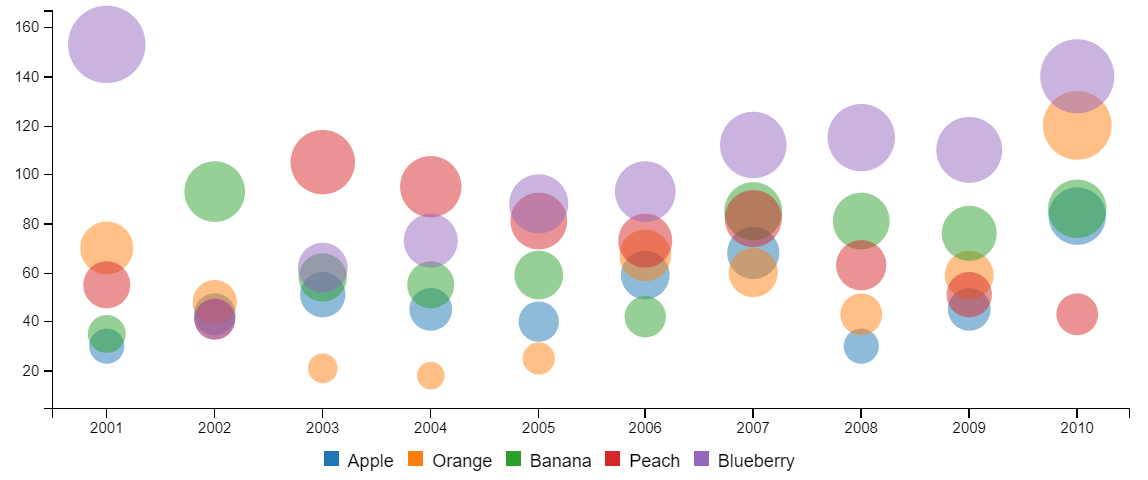
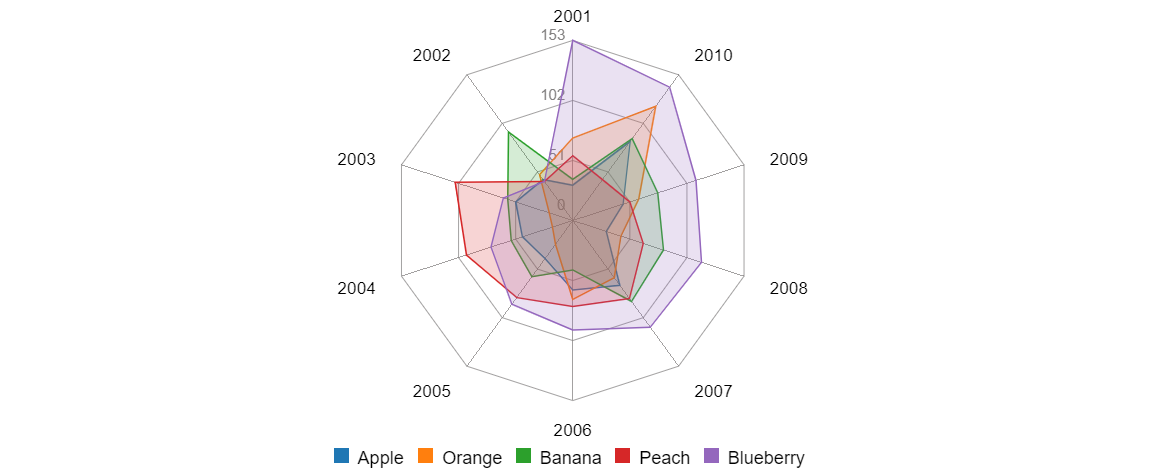
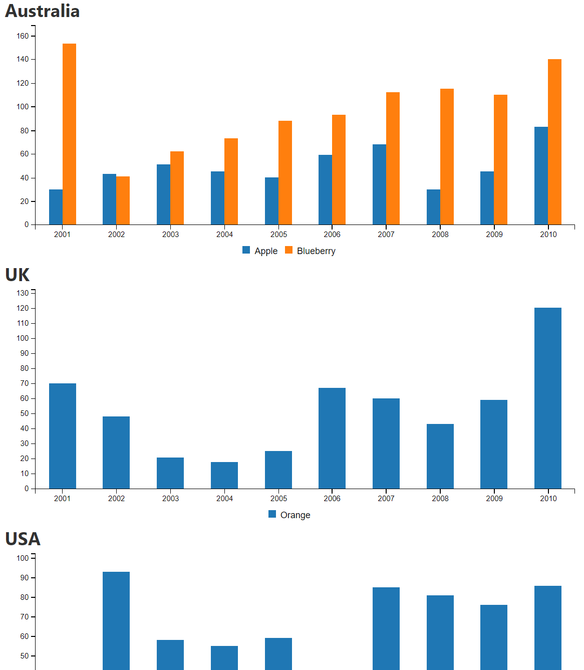
Apple,Australia,30,43,51,45,40,59,68,30,45,83
Orange,UK,70,48,21,18,25,67,60,43,59,120
Banana,USA,35,93,58,55,59,42,85,81,76,86
Peach,Africa,55,41,105,95,81,73,82,63,51,43
Blueberry,Australia,153,41,62,73,88,93,112,115,110,140
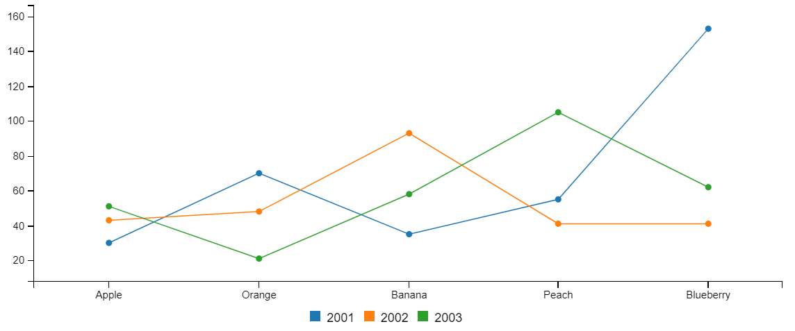
Datatables utilise the Datatables.js library and is the most basic method of displaying the data.
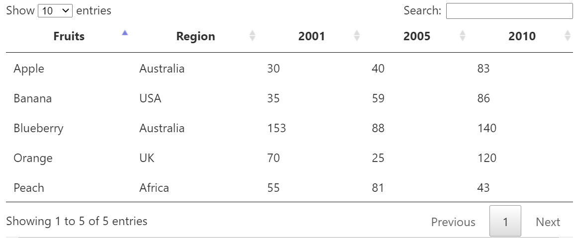
- The only fields selected are
Fruits,Region,2001,2005and2010
- Visualisation style
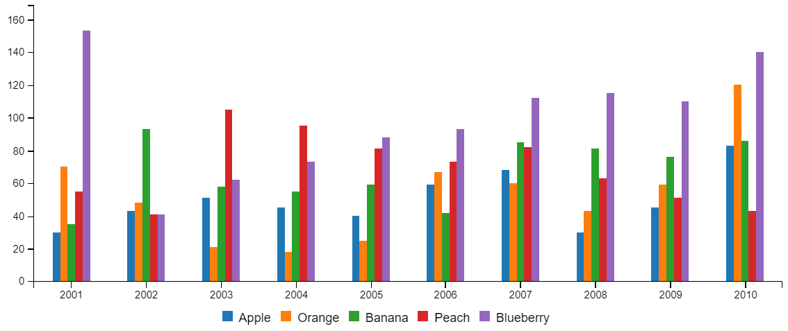
Bar chart - Only fields selected are the years
- Axis settings > X axis settings
- Tick values field =
Fruits(Uses fruit names in the legend) - X axis groupting =
Group by label values(Displays the years along bottom axis)
- Tick values field =
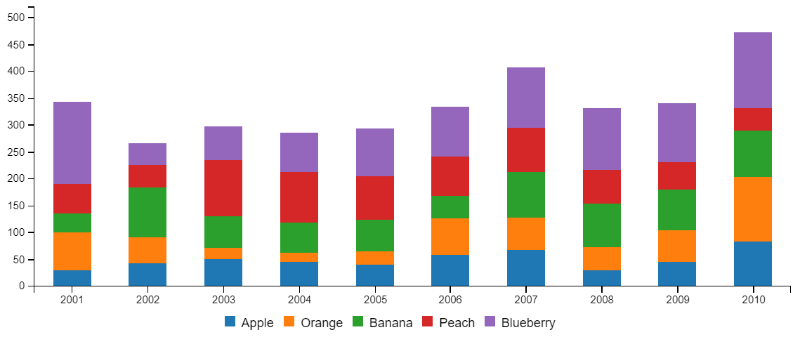
- Bar chart settings
- Stacked =
checked - Stacked data order =
decending
- Stacked =
These charts utilise the "Column overrides" to mix together multiple chart types
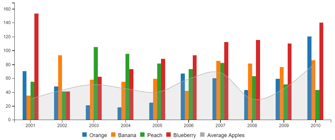
- Bar chart settings
- Stacked =
unchecked
- Stacked =
- Column/Group override
- Under the
Applefield, the following has been addedtype|area-spline weight|20 color|#aaaaaa label|Average Apples - Using these overrides we have are able to change how a specific dataset is displayed. Eg changing the type, order (weight), colour and label.
- Under the
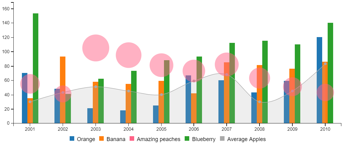
- Column/Group override
- Under the
Peachfield, the following has been addedtype|bubble color|#FF6387 label|Amazing peaches
- Under the
- Visualisation style changed to
Spline chart - Column/Group override
- Under the
Applefield, the following has been changedtype|bar color|#b00b69
- Under the
- Axis settings > Axis styles
- Check
Rotate orientation
- Check
- Grid settings
- Check
Show X axis grid - Check
Show Y axis grid
- Check
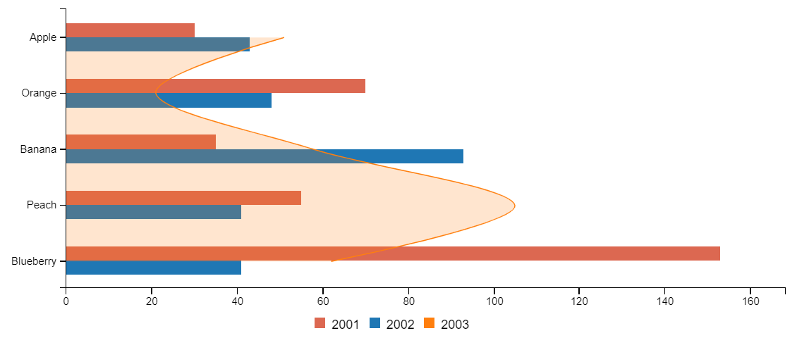
- Visualisation style changed to
Line chart
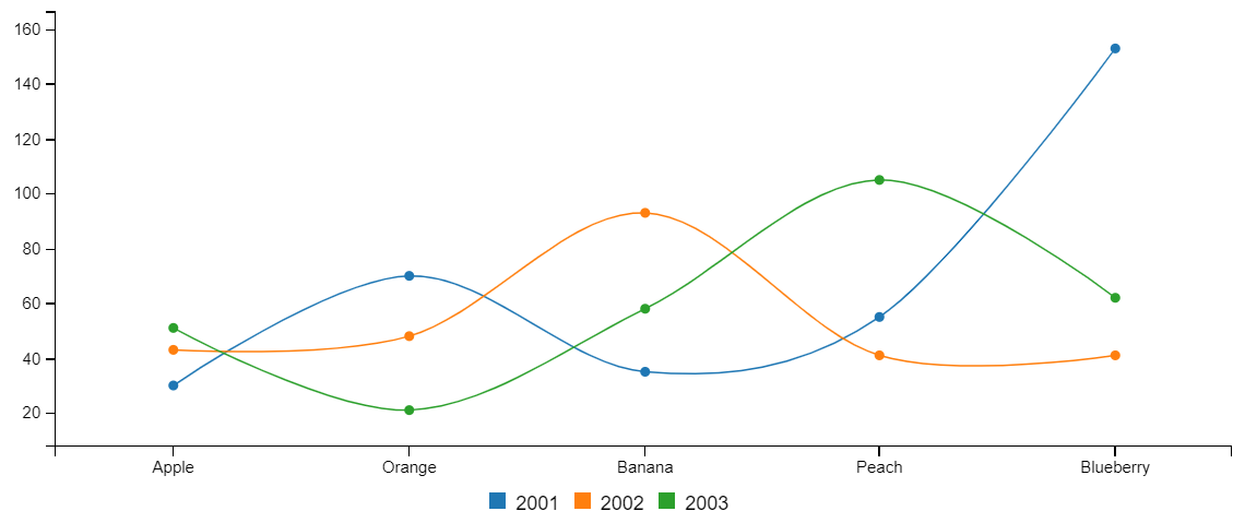
- Visualisation style changed to
Spline chart
- Visualisation style changed to
Spline chart - Spline chart settings
- Uncheck
Show data points - Check
Enable area
- Uncheck
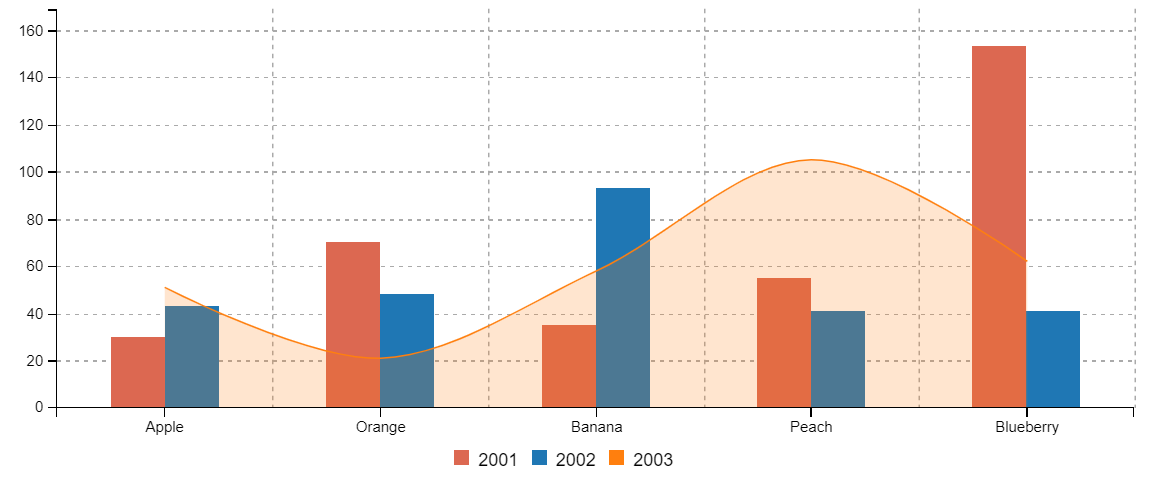
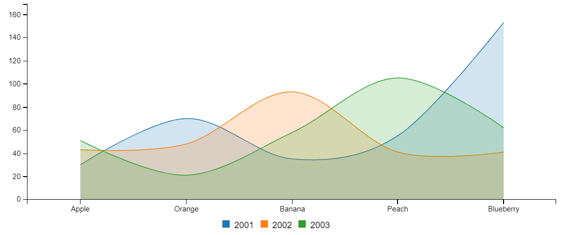
- Visualisation style changed to
Scatter plot
- Visualisation style changed to
Bubble chart
- Visualisation style changed to
Radar chart
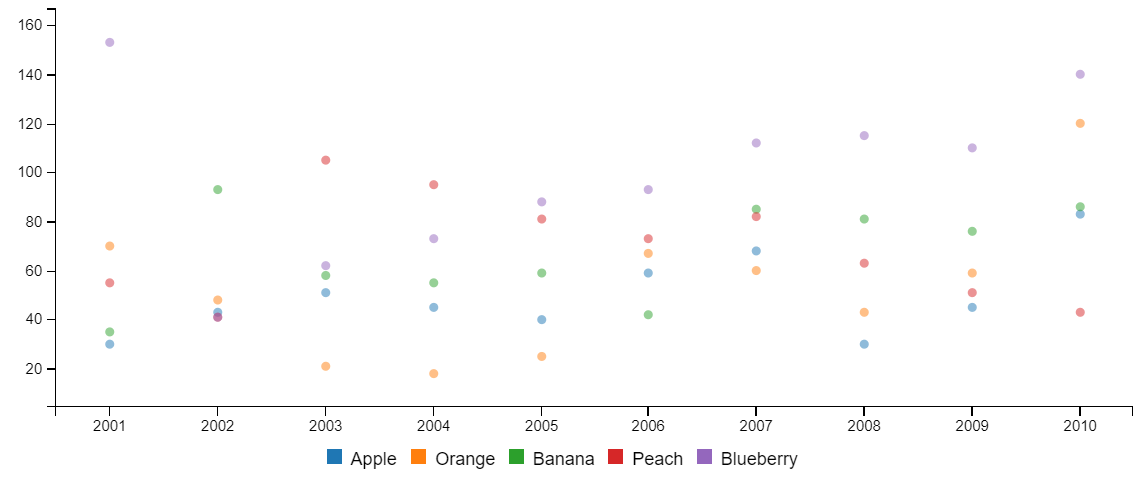
You can turn one dataset into many charts using the Split field. This will datasets together based on the value of
a field in the dataset. In this example we are splitting on the Region field, which if you look back to the sample
dataset we are using has 2 fruits with the region set to Australia, with all the rest having unique regions.
-
Split fieldset toRegion