A responsive website for a cafe, built from scratch and including an order form that does simple calculations and creates a temporary record of the data.
Demo: https://idyll-cafe.netlify.app/
Tech used: HTML, CSS, JavaScript.
A responsive static website built from scratch that leans heavily on CSS for enhancements. While it is functionally static for now, it is structured so that elements can be dynamically created (from menu order form to featured 'new' items, but also could be applied towards 'new/featured' section and reviews).
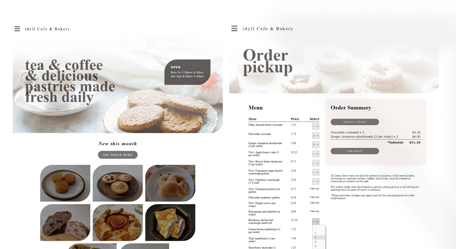
Menu would be integrated into the order platform in practice. The existing order form is supported by JavaScript, which enables the following:
- Dynamically generates the order menu based on product information (stored as an array of objects).
- Calculates and presents an estimate of the total cost to the customer, which can be edited. The checkout option is enabled only after a nonzero selection is made.
- Captures the customer selection in an array of objects that can then be passed for payment processing.
In order of earliest to most recent updates:
- Dropdown and slide-out menu design (with thanks to some online tutorials for the initial burger menu code without the slide-out effect).
- Fully responsive, with unique behaviors for desktop vs. mobile around hover effects and the gallery page.
- Centered lightbox for the detailed view of new featured products; appears/disappears on click.
- Reviews carousel: Currently a simple clip-by-container approach. Assumes desktop visitors will understand to click/drag with mouse or swipe with touchpad, but may add controllers back in at some point.
- Explore further possibilities with CSS and reorganize some of the styles and classes (deciding betweeen a few methodologies)
- Smooth out or update of the current effects, such as offset of the main page when the menu is present, and the intro section behavior on mobile for the gallery page.
- Modularize the CSS styles and classes.
- Get some customer feedback!
- Predictive/semi-personalized promotions (especially in the confirmation screen post-payment processing) is probably overkill for this business but could be useful elsewhere for different products and services that would want to promote email newsletter signups, integrations for RSS feed, and events.
- Set up reviews carousel to dynamically create review elements. Consider review elements articles?
As always, refactoring to bring the code more in line with OOP principles and to reduce pageload time.
- Shift-out menu effect was a success - and nearly 100% CSS driven. My goal is to continue to limit use of JavaScript for purely styling purposes.
- Continue cleaning up the carousel needs re: breakpoints and on-swipe behavior options.
- Pageload speed: Large visual files obviously impact this.
- JavaScript query selectors: Especially for the dynamically generated menu, I started with a brute force (and very not DRY) approach first to get it working and have now refactored so that the code takes advantage of the naming schema. Would like to use data- attributes next time for this instead (all things I would want to apply to the earlier Memory Challenge project, below).
Some question remains around why condensing the JavaScript files (e.g., moving what's in orders.js into main.js) can cause errors.
Memory Challenge: https://github.com/h-yung/memory-challenge