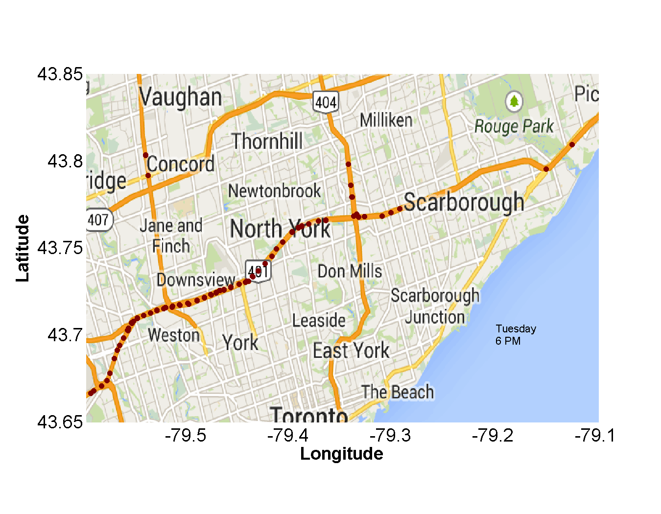
zavarzino is some code we developed for a transportation analytics case study in one of our papers. For illustrating one of the common analytics that is usual in transportation systems, we tried to visualize weekly pattern of traffic data. Depending on the day of the week, the transportation demand will vary from location to location and time period to time period. We visualize the speed for each day of the week for the entire data set. Instead of analyzing measurements of a particular location in the GTA, we analyze all loop detector sensor readings to treat GTA as one unit. This represents an average travel behavior over the complete highway network [1]. Scope of the visualization: We only have highway traffic data for GTA for three months, namely May, June and July 2013. Therefore, the scope of the reports is limited to three months and to GTA. This approximates to 365million (365,215,882) samples in the highway table.
Assumptions in the visualization: • An hour is a suitable granularity of time to aggregate data. • Aggregated highway data is similar to individual lane data. • All 1,001 sensors in the data set are operational during the entire three months. • We consider sensor to be a particular “point” on the highway.
the original data in tabular form has the following format (day,hour,latitude, longitude, volume, occupancy, speed) every row represents a sample from a sensor generated over a 10 minute interval
Using a compound MySQL query we obtained a more coarse-grained data set where each row represents an aggregate speed over the time of day and a day of the week. Each row is result of averaging over three months of data for the same day of the week and time of the day. For example the following record: (Monday, 2 PM, sensor99, 90km/h) is obtained by averaging the original data set over 12 weeks and the six 10 minute intervals in each hour. The logic of SQL query is as follows: in the inner part, we tried to aggregate the number of vehicles hourly for each sensor during the week and in outer query, we aggregated the average number of vehicles for all sensors during the weekdays. The call this metric the aggregate speed. It has taken us multiple iterations to refine the query to obtain the data we want. The iterations took from hours, initially, to tens of minutes in the later cycle. The query stated above takes about 5 minutes to execute with warm data caches. Note that our intention to generate aggregated data was to make the data set is small enough so that it can fit into the memory and we could analyze it with typical data analysis software (here Matlab). We export the data into a CSV file which is readable by Matlab and then perform a set of post-processing using a set of in memory operations.
Before doing any visualization , I first cleaned the data and then converted it to the multidimensional format. In multidimensional format, you deal with multidimensional arrays or cubes instead of tables. Each cube has a bunch of dimensions and each element of the cube is indexed by the dimensions. Each element can contain multiple values. Possible operations on the dimensions are projection, summarization, slice and dice, drill down, roll up, and pivot. For example moving from 10 minute sample granularity to one hour can be considered a rollup in the time dimension. This resulted into a smaller data set that can be explored using in-memory programs (here Matlab). We could have, of course, exported the whole data into a multidimensional database where all possible cubes are materialized and so the queries are very fast, but we kind of did this using in-house tools.
I mainly performed four types of visualizations. I will describe each separately. I first assumed that there may similarities between a transportation network and a queuing network.
In a queuing network the main measures of interest are the utilization of each queuing center(Uk), the delay it center introduces for the customers (Rk), and the number of customers waiting or getting a service in each queue (Nk).
Let’s assume the volume in our data set is throughput, the occupancy is the utilization U, and the speed is a measure of how high th delay is i.e. R.
As a result the relationship between the volume and the occupancy has to be proportional:
Inline-style:
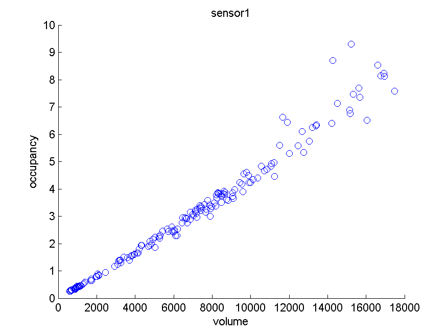
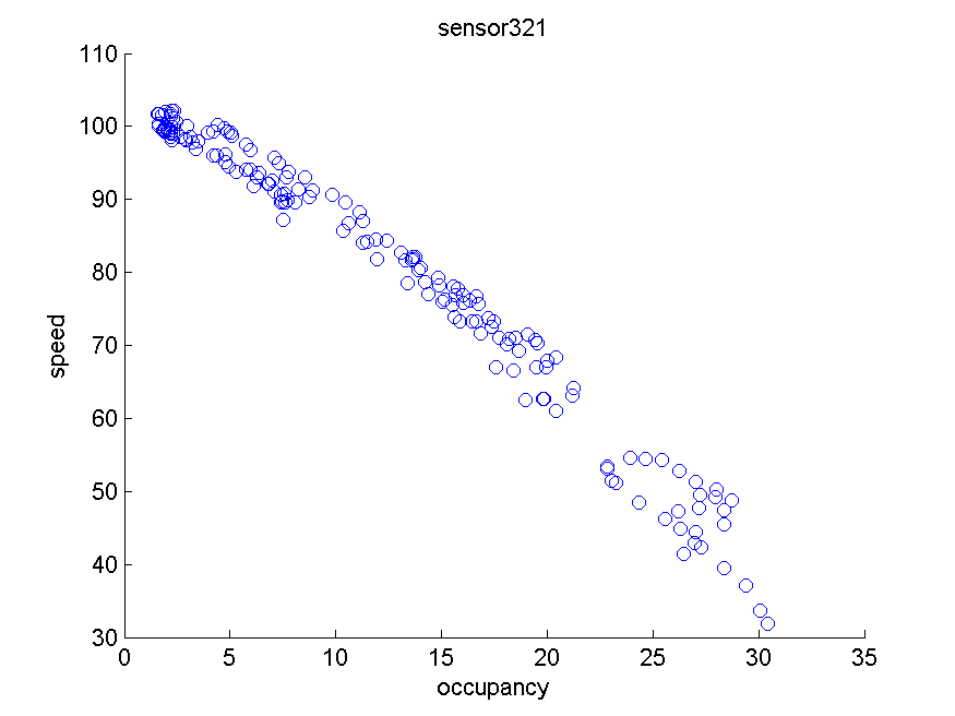
Below graphs shows the speed drops as soon as the occupancy starts to increase:
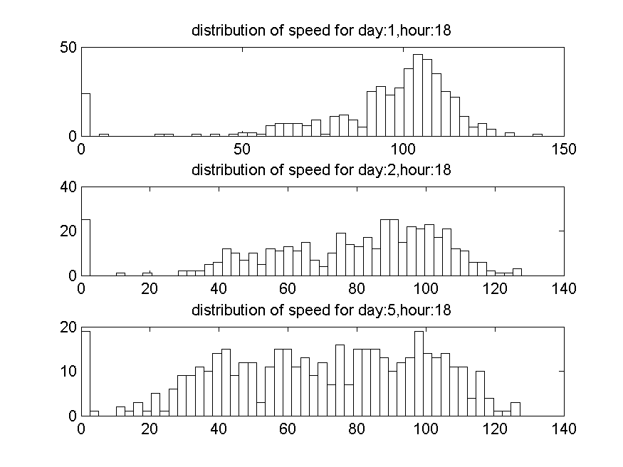
the graph is self descriptive. It shows that on day five we have much less a speed overall. the distributions are over all the sensors.
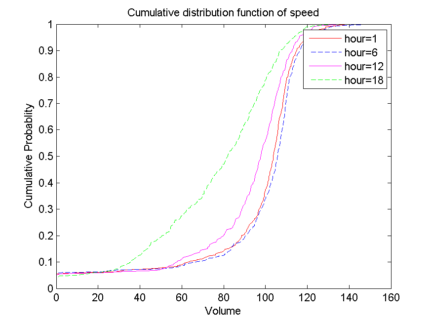
multiple cumulative distribution functions of different hours of the day can be shown in the same diagram. Below, in the first diagram we see that (sorry the x axis labels are wrong) at 6 o’clock half of sensors cdf= .5, experience an speed of under 80 km. Almost 70% of sensors at this hour experience speed of lower than hundred kilometers. In other hours, almost 90% of sensors experience an speed of more than 90 km.
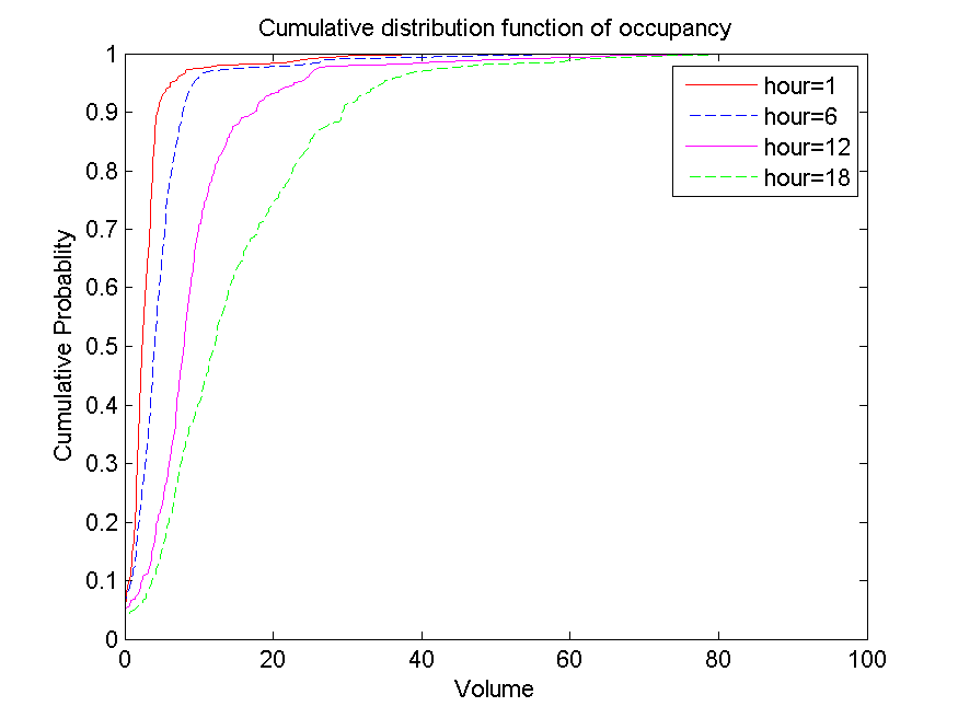
Below graph shows that the occupancy experienced by most of the sensors is increased by about 15 to 20 at 6 o’clock.
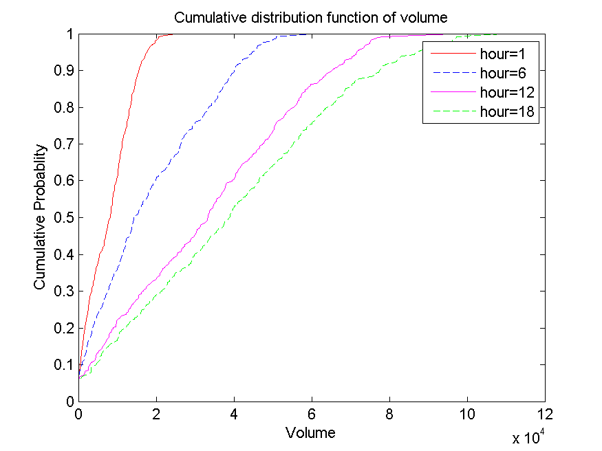
graph shows that the volume experienced by sensors at 6 o’clock is pretty much the same volume that is experienced at noon. This might be again because the network is saturated and cannot take more volume. This increase in the occupancy while the volume hits a max again suggests that may be the volume represents some metric such as utilization and the occupancy represents the number of cars in the region.
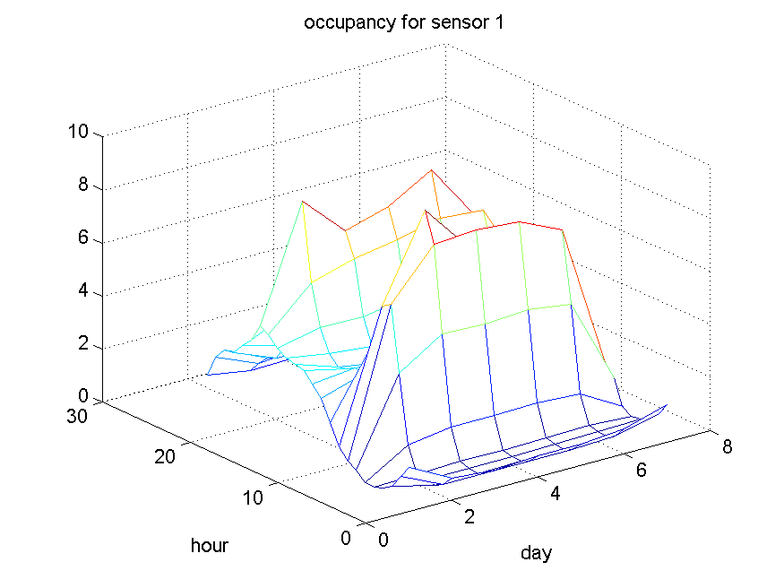
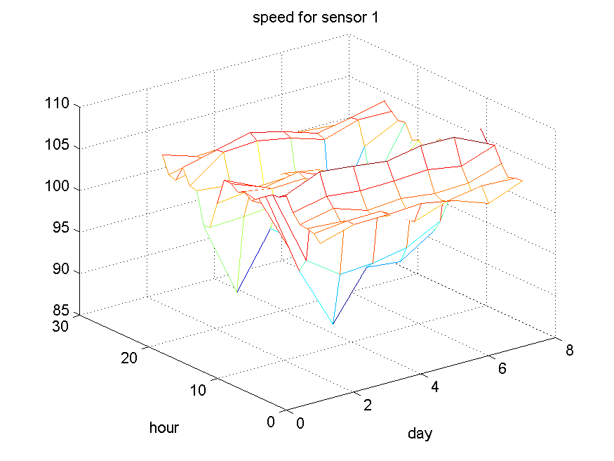
this graphs focus on individual sensors. Basically they show that there are two points during the day of the volume is increase and speed is dropped.
This experiment is the answer to “what are the congestion points for each day of the week and time of the day over GTA?”. We intend to visualize the congestion points as small red circles over the map. For each time of the day and day of the week there will be a separate picture generated. Pictures on it then put together as to make an animated movie of how the congestion points very over time of the day and day of the weeks. The post processing steps are as follows. We first converted the data into an in-memory multidimensional format using Matlab . We then normalized the aggregate speed of each sensor between zero and one by comparing it to maximum aggregate speed overall days of the week and all times of the day. To pick the sensors whose aggregate speed dropped by 30% at a specified time, we first used a slice operation to obtain the aggregate speed associated with a specific day of the week and time of the day for all sensors. We then performed a dice operation were we selected the sensors whose aggregate speed drops to 70% of their own maximum aggregate speed. Our intuition was that this would give us the congested spots over the highway network. We then visualize the location of these filter set of sensors using a scatterplot overlapped on the actual map. In the scatterplot, each circle represents a sensor. the location of the circle is obtained by the sensor’s latitude and longitude. We then put together these pictures as frames of one animation over the whole week. Each frame represented congested points at a specific time of day and day of the week.
