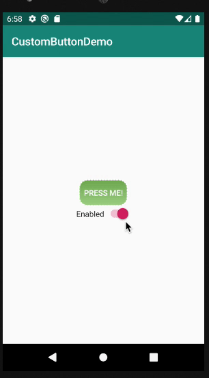
- Create a
drawablefile - Add
<shape>tag inside of it
<shape xmlns:android="http://schemas.android.com/apk/res/android"
    android:shape="rectangle">

    ...

</shape>
- Create a parent drawable that holds all the buttons, i.e
custom_button.xmlin this case
<selector xmlns:android="http://schemas.android.com/apk/res/android">

    <item
        android:state_pressed="true"
        android:drawable="@drawable/button_pressed" />
    <item
        android:state_enabled="false"
        android:drawable="@drawable/button_disabled" />
    <item
        android:drawable="@drawable/button_default" />

</selector>
- Add the button to
styles.xmlfile
<style name="CustomButton" parent="Widget.AppCompat.Button">
    <item name="android:background">@drawable/custom_button</item>
    <item name="android:textColor">#FFF</item>
    <item name="android:stateListAnimator">@null</item>
</style>
- Add the style into the
AppTheme
<style name="AppTheme" parent="Theme.AppCompat.Light.DarkActionBar">
    <!-- Customize your theme here. -->
    <item name="colorPrimary">@color/colorPrimary</item>
    <item name="colorPrimaryDark">@color/colorPrimaryDark</item>
    <item name="colorAccent">@color/colorAccent</item>
    <item name="buttonStyle">@style/CustomButton</item>
</style>