Skip to content
This repository has been archived by the owner on Apr 20, 2019. It is now read-only.

New logo? #68

Closed
hueniverse opened this issue Jan 15, 2016 · 85 comments
Closed

New logo? #68

hueniverse opened this issue Jan 15, 2016 · 85 comments

Comments

@hueniverse
Copy link
Contributor

I think it's time. We are no longer using the Ren & Stimpy theme so maybe refresh the logo with something cleaner and more up to date?

@nlf
Copy link
Contributor

nlf commented Jan 15, 2016

interesting. let me talk to someone i know :)

@AdriVanHoudt
Copy link
Contributor

Just make sure I can get stickers ;)

@devinivy
Copy link
Contributor

@adityabakle
Copy link

same here :) sticker for me too

@geek
Copy link
Contributor

geek commented Jan 16, 2016

We owe it to everyone to keep the logo fun loving.

Should we keep the same orange color we have on the site (#f6941e)? Do we fit the design into a hex?

@kepano
Copy link

kepano commented Jan 16, 2016

We've enjoyed using hapi for lumi.com – let me know if we can contribute some stickers :)

@davepoon
Copy link

A minimalist logo could be a great option, which is easier to get people to remember.
A great use of minimalist logo could convey the message of simplicity and reliability from the hapi framework.
hapi could even define a new visual language, a brand redesign, not only the logo.
Meteor.js is an great example to see the success of the redesign, which increase publicity around the framework.
Please let me know if you need any of my design contribution ;)

@jhrobles
Copy link

hapi

How is this? I wasn't sure if you wanted to pull completely away from the helmet/Ren & Stimpy.

@hueniverse
Copy link
Contributor Author

@jhrobles thanks! That's a great option. I'm sure people will have comments. I need to stare at it for a bit :-)

@AdriVanHoudt
Copy link
Contributor

@jhrobles great job, personally I did like the detail of the current one, also it has more colors and the weird angle :P

@nlf
Copy link
Contributor

nlf commented Jan 20, 2016

I definitely like this simpler approach better than the old logo. I asked @jhrobles to come up with a few other non-helmet ideas too :)

@AdriVanHoudt
Copy link
Contributor

I do like the helmet, and not against flat logos, I like the one from eslint a lot

@paulovieira
Copy link

Good work! I like it, but it's a bit too "clean", maybe... One thing I like in the current logo is the childish aspect.

Also, it immediately reminded me of the reddit logo. Anyone else too?

@dylan-cromwell-sociomantic

@hueniverse from reading the thread I understood a logo has not yet been chosen. Thus, I let one of our Designers at Sociomantic know about this issue. They are very excited and whipping up a proposal logo for you now. I can't say precisely how long they need, maybe a couple of weeks?

@vctrfrnndz
Copy link

@hueniverse We use HapiJS in our projects at Auth0 and one of our team members told me you were looking for a logo. I tought I might have a go at it, this is my proposal:
hapijs
Kept the helmet to some extent, and humanized it a bit. Let me know what you guys think.

@hueniverse
Copy link
Contributor Author

@vctrfrnndz nice! These are very cool. I am not sure keeping the helmet concept but going in another direction makes sense though. The existing helmet was from Ren and Stimpy Happy Happy Joy Joy song.

@dylan-cromwell-sociomantic would be cool to get more options, thanks!

@dylan-cromwell-sociomantic

@vctrfrnndz yes those are very cool! Dig the calm, humble style and flat illustrative quality. Nice color schemes too!

@hueniverse yup will post the work from our Designer ASAP once it's ready. Thanks for the opportunity here!

Also, if you have anything specific you'd want me to pass along to the Designers, please let me know. They are very receptive to direction.

@zoe-1
Copy link

zoe-1 commented Feb 26, 2016

hapilogodev2

Got inspired and came up with this today.
It goes in a different direction than the helmet etc.

@zoe-1
Copy link

zoe-1 commented Feb 26, 2016

hapilogopluginname2
Has space to brand hapijs plugins too.

@zoe-1
Copy link

zoe-1 commented Feb 26, 2016

hapilogostandardpop

Changed the size proportions between the H and the api.

@nlf
Copy link
Contributor

nlf commented Feb 26, 2016

hmm.. i like the style of it, the only issue i take with any of these @zoe-1 is that we've already established that hapi is always all lowercase, so it seems weird to see the H capitalized

@zoe-1
Copy link

zoe-1 commented Feb 27, 2016

hmmm.... that is an issue.
@nlf Will put more thought into it.
The capital H is more proportional so easier to design with.

@zoe-1
Copy link

zoe-1 commented Feb 27, 2016

lower case concepts below:
hapilowercaseeyesboxes

@zoe-1
Copy link

zoe-1 commented Feb 27, 2016

hapilowercaseeyesangle

eyes on angle

@zoe-1
Copy link

zoe-1 commented Feb 27, 2016

hapilowercaseeyesstraight
eyes straight ahead.

@zoe-1
Copy link

zoe-1 commented Feb 27, 2016

hapilowercaseeyesboxesnosmile

@zoe-1
Copy link

zoe-1 commented Feb 27, 2016

I think lowercase looks better :-)

  • Could try moving the eyes/smiley face to different locations.
  • the js is still vertically positioned in the middle of the hapi word. This worked better when it was capital H. Need to test relocating the js.

@nlf what do you think?

@arb
Copy link
Contributor

arb commented Feb 27, 2016

I think #68 (comment) is my favorite of your recent posts; FWIW.

@devinivy
Copy link
Contributor

@vctrfrnndz #68 (comment) looks very nice!

I don't mind the helmet staying around, especially if it has a very different character (as in the logo referenced above). What do we think of the all-caps in that logo? The all-caps don't offend me, but we do typically stylize "hapi" to be entirely lowercase.

@designsaves
Copy link

hapi-logo-comps-01

@designsaves
Copy link

hapi-logo-comps-03

@hueniverse
Copy link
Contributor Author

@meetthelegend these are very cool but I am worried about trademark and brand issue (just take a look at https://www.google.com/search?q=happy+logo&tbm=isch).

@dylan-cromwell-sociomantic awesome! I need to think about feedback.

@sockdrawermoney
Copy link

@hueniverse I don't think there's any defensibility of the smile shape in a trademark. See trademark dilution — if you don't and can't defend a trademark as uniquely yours, you can't win any claim someone is infringing on your rights. Your example actually makes that point quite well in this case. :)

And hey, for example, here's this story:

"In its claims for trademark infringement against an online parodist, Wal-Mart claimed that it had trademark rights in the ubiquitous yellow smiley face. Not only did Wal-Mart lose its case, the judge held it had no rights in the smiley face mark."

@hueniverse
Copy link
Contributor Author

@adambrault ok :-)

@sockdrawermoney
Copy link

@hueniverse Also: Hi, Eran. <3 <3 <3

@designsaves
Copy link

Thanks @hueniverse and @adambrault. I understand your concern (isn't branding fun?!) I'll throw any other ideas that come to mind into this issue, and maybe mock up how a new brand could look in the hapi website.

@dilkROM
Copy link

dilkROM commented Mar 14, 2016

On vacation now but had to jump in to say big kudos @meetthelegend I love your design. This thread is a such a cool thing to see in the dev community when people come together and so much talent is shown off. Need more logo threads. 👍

@dilkROM
Copy link

dilkROM commented Mar 14, 2016

And @hueniverse sure thing, our designer is on stand-by if you have any requests or further instructions etc. Cheers!

@zoe-1
Copy link

zoe-1 commented Mar 16, 2016

In general, I like the work @meetthelegend and @dylan-cromwell-sociomantic are doing.
#68 (comment) is my favorite of the above FWIW. Second would be #68 (comment).
If a nodejs logo theme is preferred, then @meetthelegend 's designs would work. However, I prefer something different from the nodejs theme.

If I had all the votes and could just fiat the decision, I would create some sort of an abstract image or concept that represents hapi. For example, previously the helmet with it's connection to Ren and Stimpy t.v. show was that (happy happy joy joy). Additionally, I think of Walmarts logo and it's light bulb / shining light as an abstract image representing Walmart. Github has the octocat etc. etc. Even though there are famous brands that do not follow this concept (ex Google), I would prefer hapi to have an image concept that represents hapi and not just have it's name in pretty text or something like that. The name hapi leds itself to having a really fun logo as described above IMHO. The hapi face I submitted is my attempt at achieving this. I am sure we can come up with better.

Perhaps, we could turn the hapi face into a hapi robot named hapibot. And, hapibot could be the hapi mascot or something. Anyhow, I am just brain storming with the community.
Appreciate your thoughts.

O yeah, if we are going to keep the helmet concept, then #68 (comment) does the job IMHO.

It has been fun designing with the community :-) This thread has provided some nice breaks from coding. With all that said, below is another round of concepts...


hapibubblegumplayorange


hapibubblegumplayyellow


hapibubblegumplayred


hapibubblegumtempateplayred2

@nlf
Copy link
Contributor

nlf commented Mar 16, 2016

i feel like @meetthelegend and this set from @dylan-cromwell-sociomantic are the only ones that really nail the "clean and professional" look. the majority of the others feel too overdone.

@dylan-cromwell-sociomantic

@hueniverse here is another look from our designer. She said she has had some time to "explore the concepts a bit further" by playing with colors and product design.

01_combined

02_combined

@zoe-1 thanks for the insight, ideas, and especially praise of our designer's work. I've passed all that on. Perhaps she will take a stab at a text-less version (more about iconography).

@nlf I believe the set you like is represented here in the second mock-up.

@dylan-cromwell-sociomantic

@hueniverse and @meetthelegend I just realized my earlier comments were with my non-work account @dilkROM ... sorry if that caused any confusion! 😨

@dylan-cromwell-sociomantic

@hueniverse further concepts from our Designer, just for variety:

hapijslogo-withjs

hapijslogo-withoutjs

@dylan-cromwell-sociomantic

Gentle nudge at @hueniverse (and others): any further feedback and / or updates here? Anything else you'd like to see from our designer (or the other designers present, for that matter)?

@hueniverse
Copy link
Contributor Author

Is there an easy tool to setup a test vote? I'd like to see what are the top 3 logos people like and then maybe do a revision on those. The initial vote should be on gray scale versions, no colors.

@dylan-cromwell-sociomantic

@hueniverse TypeForm ( https://www.typeform.com/ ) is free to use and pretty good / easy. I would recommend that if you wanted to create a quick survey for people to fill out. I think it does allow you to add images as well. Once you create a survey you can share a link to it here and people could go vote and then you can easily view the resulting data afterward.

Hope it helps!

@hueniverse
Copy link
Contributor Author

Voting to thin out the selection: https://www.surveymonkey.com/r/DR6YQ8T

@hueniverse
Copy link
Contributor Author

Comments from survey takers:

1 They are all bad! 4/11/2016 6:40 PM
2 This mobile interface to too annoying to vote with for the only one I actually like. The others are meh. 4/11/2016 2:57 PM
3 4 makes me think of lisp 4/11/2016 7:03 AM
4 Terrible survey UI 4/10/2016 1:43 PM
5 in fact, no one is good... 4/10/2016 12:46 PM
6 Image 8 has a lot of meaning. The helmet is shaped as a cloud and the antennas are the connections/interfaces to
that cloud (I see it as the interfaces in UML). Could Web Services be described better? Also, it is for me the most
appealing logo. The other logos are a bit meaningless and ugly to me.
4/10/2016 3:20 AM
7 If 7 had a hint of color it could be killer. 4/9/2016 7:11 PM
8 4,7 - everything else is... yukkkk 4/9/2016 4:26 PM
9 Rest of them...meh 4/9/2016 3:14 PM
10 No 2 is good but reminds me an insurance company. 8 is too Reddit, This voting system in super confusing, I requires
to scroll back and forth a lot. It would be much easier to put a number corresponding to a logo next to a rank. #ux
@ykovzel
4/9/2016 2:47 PM
11 they are all horrible 4/9/2016 1:47 PM
12 7 and 8 looks good, the rest sucks. 4/9/2016 11:30 AM
13 please choose the best logo 4/9/2016 11:12 AM
14 Why change? The current one is much better than all of these. 4/9/2016 10:39 AM
15 9 would have ranked higher without the hanging smile or whatever it is on the h. 4/9/2016 10:23 AM
16 Seven would also potentially be a good favicon, is self contained and well proportioned. It has to be seven! 4/9/2016 10:03 AM
17 Keep the space helmet! 4/9/2016 9:20 AM
18 Yeah, but I'm really love current logo. 4/9/2016 8:51 AM
19 This ranking is exponential 4/9/2016 8:35 AM
20 Honestly, it's hard to rank beyond #7 and #2. Not a big fan of the direction any of the other logos are going.
Considering #7 was just a concept and it came out looking pretty good after a couple iterations, I'd love to see hapi
work with that designer if they're interested in remaining involved.
4/9/2016 8:25 AM
21 #8 by far! Still prefer the current logo. 4/9/2016 7:36 AM
22 3 & 6 are too loud and confusing. :( 8 seems like a spiritual successor. I also really like 2 because it's clean, simple
and it's a smile for happy (hapi)!
4/9/2016 6:49 AM
23 Don't see a need for a rebrand, love the existing as is... 4/9/2016 6:16 AM
24 Just keep the existing one! 4/9/2016 5:36 AM
25 Current! 4/9/2016 5:13 AM
26 Great feel to 7. 4/9/2016 5:04 AM
27 8 by a landslide 4/9/2016 5:03 AM
28 Keep the helmet. 4/9/2016 4:43 AM
29 image 8 - most professional and positive 4/9/2016 3:56 AM
30 They are all pretty awful bar 7 and 8. 7 is by far the best. The current one would be next and then 8 would be after that 4/9/2016 3:03 AM
31 The first one will fit in print better. I didn't even want to award the others points. 4/9/2016 3:00 AM
1 / 2
hapi.js Logo Survey (Phase I) SurveyMonkey
32 I like the current logo. 4/9/2016 2:20 AM
33 I think we're still lacking more "professional" choice in the selection, only 2 designers gave it a real shot. 4/9/2016 2:10 AM
34 Please, do NOT pick 3, 6 or 9. They are not even proper logos, won't work across different mediums (e.g. will fail in
print, if you ever decide to do a merch like t-shirt).
4/9/2016 2:04 AM
35 I don't like the rest :) 4/9/2016 1:44 AM
36 Number 8 is really awesome and still has a clue from last logo, which is good. 4/9/2016 1:38 AM
37 The current one is fine 4/9/2016 1:35 AM
38 Only 7 and 8 are worth mentioning and could be an alternative for the current one, I feel that the rest would be a step
backwards
4/9/2016 1:31 AM
39 current logo 4/9/2016 12:47 AM
40 You can't tell this from my answer but I like 7 about a million times more than any of the rest! 4/9/2016 12:27 AM
41 Image 7 just has that fantastic retro-futuristic feel to it, that aligns so well with the futuristic vision of hapi 4/9/2016 12:10 AM
42 Everything except image 7 and 8 is really horrible and difficult to order. I’d rather not choose any of them. 4/9/2016 12:03 AM
43 Thanks a ton for your passion to work on hapi! 4/8/2016 11:52 PM
44 It's got to be 7. Looks most professional whilst interesting. Also has most customisable potential and as its an
astronaut he's looking towards the future. The others are either too fiddly or look dated already.
4/8/2016 11:49 PM
45 I think these were all a bit on the boring side and not reflecting the fun of Hapi 4/8/2016 11:47 PM
46 I like the old logo, it's colorful cartoon style and non-formal font. Because formalism and strictness are not associated
with being happy for me.
4/8/2016 11:24 PM
47 The first logo is ?? 4/8/2016 11:23 PM
48 They are all not great, the current logo is fine. Why the need to rebrand? 4/8/2016 11:20 PM
49 this is a terrible poll... 4/8/2016 11:01 PM
50 3, 4, 6, 9 are equally unappealing to me 4/8/2016 10:54 PM

@hueniverse
Copy link
Contributor Author

Full results:

image

@nlf
Copy link
Contributor

nlf commented Apr 14, 2016

so 7 and 8 it sounds like are on top? which were those?

@hueniverse
Copy link
Contributor Author

logos

@jamesdixon
Copy link

Seems like your next project should be to develop a new hapi-based survey tool :)

@hueniverse did anyone ask you to fill out a creative brief or anything? Not sure that from this thread that it's clear what hapi means to you and where you see its future heading. Might be helpful in crafting a new logo/refining the existing entries.

@hueniverse
Copy link
Contributor Author

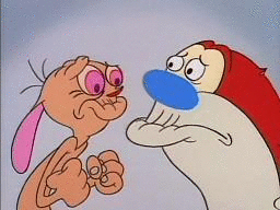
@jamesdixon This is not my decision. I just think it's time for a cleaner logo that is moving away from Ren and Stimpy since we no longer follow that concept.

@hueniverse
Copy link
Contributor Author

From twitter replies:

7 - 32 votes
8 - 16 votes
5 - 5 votes
2 - 3 votes
6 - 1 vote

@hueniverse
Copy link
Contributor Author

Conclusion - people like the helmet.

I'll start a new thread for helmet logos so this thread doesn't get crazy long.

@digitalforus
Copy link

Hello! I would like to redesign the logo and give it a perfect and minimal look with simple animation

Sign up for free to subscribe to this conversation on GitHub. Already have an account? Sign in.
Projects
None yet
Development

No branches or pull requests