A Flutter library that provides a customizable Material Design date and range picker widgets.
- Beautiful UI.
- Support Material 3 out of the box.
- Highly Customizable UI.
- Supports multi-language.
To use the Date Picker library, add the following dependency to your pubspec.yaml file:
dependencies:
  date_picker_plus: ^3.0.2
Import the library in your Dart file:
import 'package:date_picker_plus/date_picker_plus.dart';Call the showDatePickerDialog function to show a date picker dialog:
final date = await showDatePickerDialog(
  context: context,
  minDate: DateTime(2021, 1, 1),
  maxDate: DateTime(2023, 12, 31),
);Call the showRangePickerDialog function to show a range picker dialog:
final date = await showRangePickerDialog(
  context: context,
  minDate: DateTime(2021, 1, 1),
  maxDate: DateTime(2023, 12, 31),
);
Customize the appearance of the picker by providing optional parameters to the showDatePickerDialog or
showRangePickerDialog function.
final date = await showDatePickerDialog(
context: context,
initialDate: DateTime(2022, 10, 10),
minDate: DateTime(2020, 10, 10),
maxDate: DateTime(2024, 10, 30),
currentDate: DateTime(2022, 10, 15),
selectedDate: DateTime(2022, 10, 16),
currentDateDecoration: const BoxDecoration(),
currentDateTextStyle: const TextStyle(),
daysOfTheWeekTextStyle: const TextStyle(),
disbaledCellsDecoration: const BoxDecoration(),
disabledCellsTextStyle: const TextStyle(),
enabledCellsDecoration: const BoxDecoration(),
enabledCellsTextStyle: const TextStyle(),
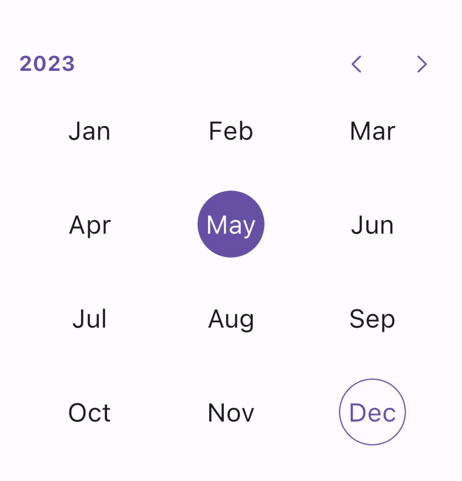
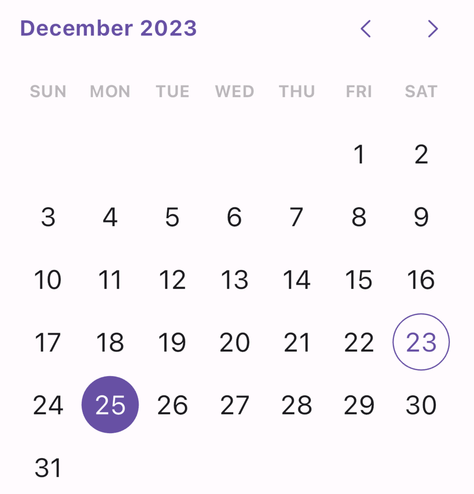
initialPickerType: PickerType.days,
selectedCellDecoration: const BoxDecoration(),
selectedCellTextStyle: const TextStyle(),
leadingDateTextStyle: const TextStyle(),
slidersColor: Colors.lightBlue,
highlightColor: Colors.redAccent,
slidersSize: 20,
splashColor: Colors.lightBlueAccent,
splashRadius: 40,
centerLeadingDate: true,
);final range = await showRangePickerDialog(
context: context,
initialDate: DateTime(2022, 10, 10),
minDate: DateTime(2020, 10, 10),
maxDate: DateTime(2024, 10, 30),
currentDate: DateTime(2022, 10, 15),
selectedRange: DateTimeRange(start: DateTime(2022), end: Dat(2023)),
selectedCellsDecoration: const BoxDecoration(),
selectedCellsTextStyle: const TextStyle(),
singelSelectedCellDecoration: const BoxDecoration(),
singelSelectedCellTextStyle: const TextStyle(),
currentDateDecoration: const BoxDecoration(),
currentDateTextStyle: const TextStyle(),
daysOfTheWeekTextStyle: const TextStyle(),
disbaledCellsDecoration: const BoxDecoration(),
disabledCellsTextStyle: const TextStyle(),
enabledCellsDecoration: const BoxDecoration(),
enabledCellsTextStyle: const TextStyle(),
initialPickerType: PickerType.days,
leadingDateTextStyle: const TextStyle(),
slidersColor: Colors.lightBlue,
highlightColor: Colors.redAccent,
slidersSize: 20,
splashColor: Colors.lightBlueAccent,
splashRadius: 40,
centerLeadingDate: true,
);Alternatively, you can use other widget directly:
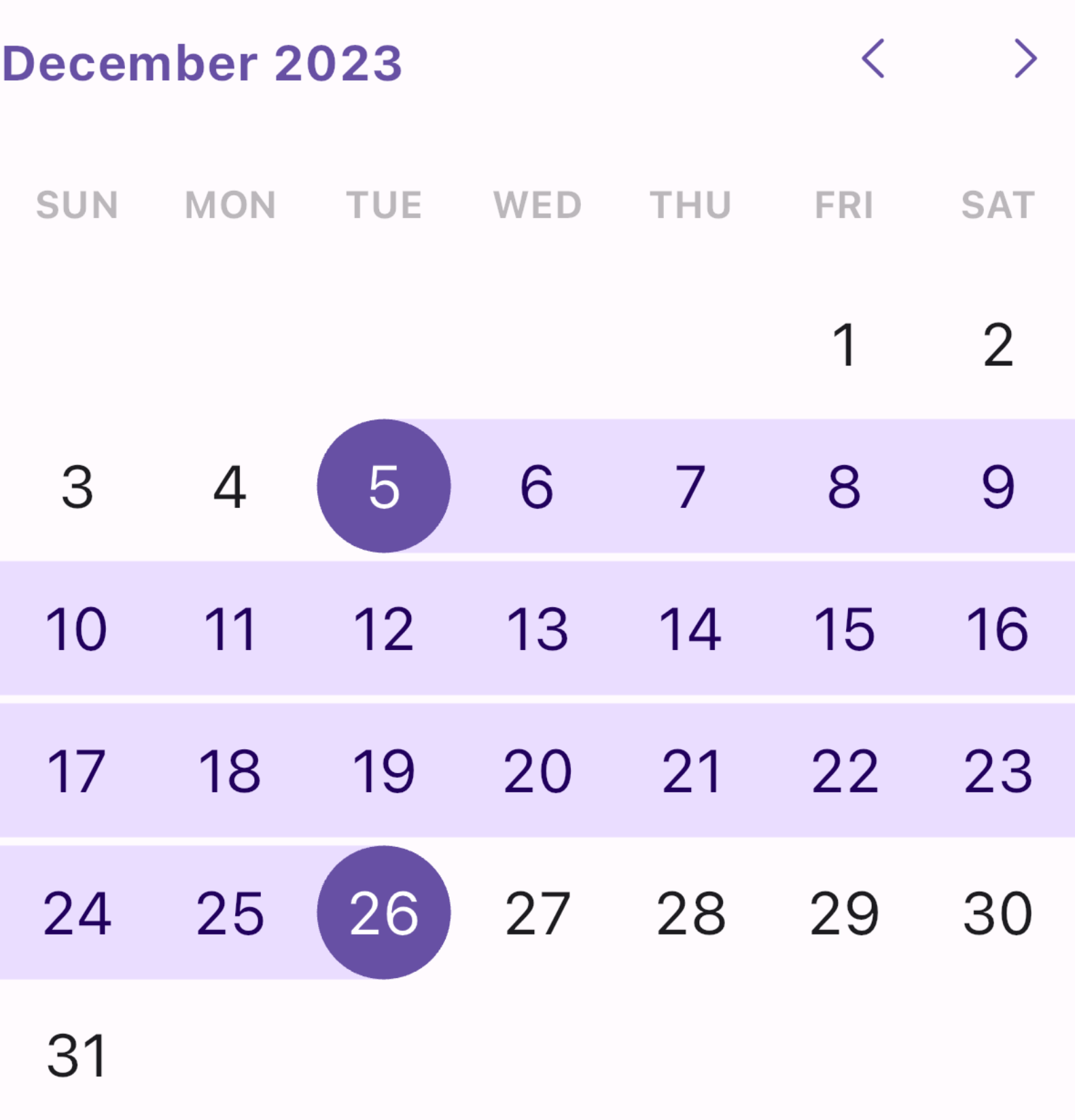
Creates a full date picker.
DatePicker(
  minDate: DateTime(2021, 1, 1),
  maxDate: DateTime(2023, 12, 31),
  onDateSelected: (value) {
    // Handle selected date
  },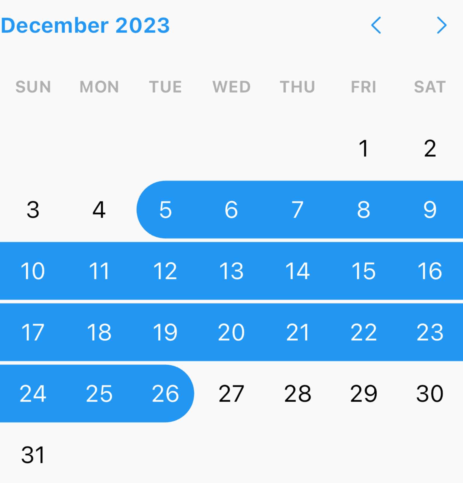
);Creates a full range picker.
RangeDatePicker(
  minDate: DateTime(2021, 1, 1),
  maxDate: DateTime(2023, 12, 31),
  onRangeSelected: (value) {
    // Handle selected range
  },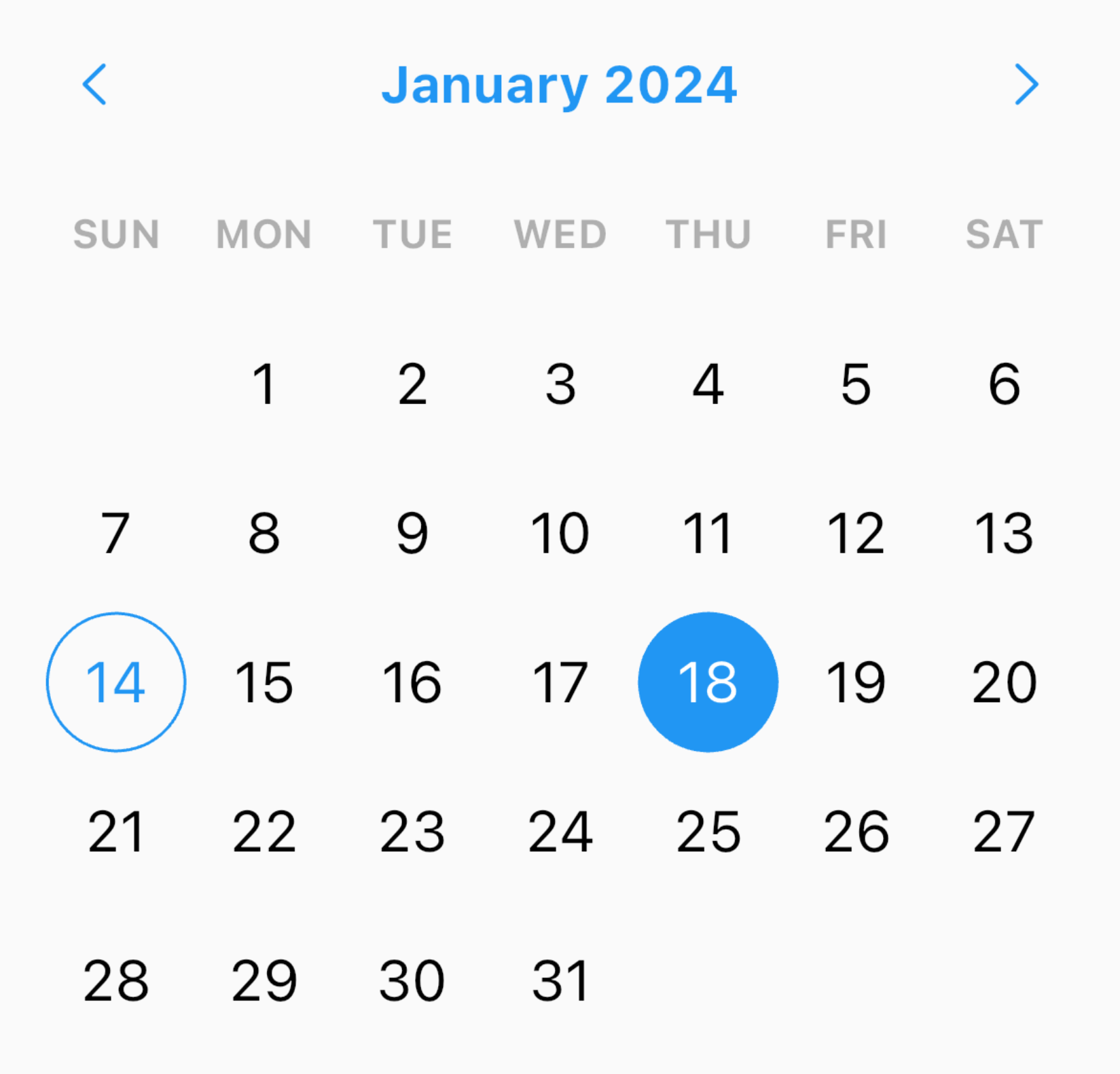
);Creates a day picker only.
DaysPicker(
  minDate: DateTime(2021, 1, 1),
  maxDate: DateTime(2023, 12, 31),
  onDateSelected: (value) {
    // Handle selected date
  },
);Creates a month picker only. The day of selected month will always be 1.
MonthPicker(
  minDate: DateTime(2021, 1),
  maxDate: DateTime(2023, 12),
  onDateSelected: (value) {
    // Handle selected date
  },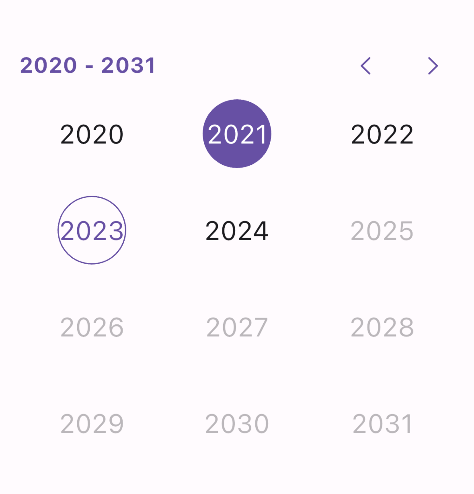
);Creates a year picker only. The month of selected year will always be 1.
YearsPicker(
  minDate: DateTime(2021),
  maxDate: DateTime(2023),
  onDateSelected: (value) {
    // Handle selected date
  },
);This package has multi-language supports. To enable it, add your Locale into the wrapping MaterialApp:
MaterialApp(
  localizationsDelegates: GlobalMaterialLocalizations.delegates,
  locale: const Locale('en', 'US'),
  supportedLocales: const [
    Locale('en', 'US'),
    Locale('en', 'GB'),
    Locale('ar'),
    Locale('zh'),
    Locale('ru'),
    Locale('es'),
    Locale('hi'),
  ],
  ...
);
For more details, see the example file.
Contributions to the Date Picker library are welcome! If you find any issues or have suggestions for improvement, please create a new issue or submit a pull request on the GitHub repository.
Before creating a PR:
- Please make sure to cover any new feature with proper tests.
- Please make sure that all tests passed.
- Please always create an issue/feature before raising a PR.
- Please always create a minimum reproducible example for an issue.
- Please use the official Dart Extension as your formatter or use
flutter format .if you are not using VS Code. - Please keep your changes to its minimum needed scope (avoid introducing unrelated changes).
The Date Picker library is licensed under the MIT License. See the LICENSE file for more details.