SimpleRatingBar is a lightweight rating bar for Android. It displays ratings using unicode characters as icons.
It's very easy to set different sizes, colors, and icons without having to create multiple drawable resources!
The default style uses a 5-star rating, as shown below.

To use it, just include SimpleRatingBar in your layout, and call setRating(int) or setRating(double)
It's that easy!
<!-- layout file -->
<com.tigerpenguin.widget.simpleratingbar.SimpleRatingBar
        android:id="@+id/myRatingBar"
        android:layout_width="wrap_content"
        android:layout_height="wrap_content"/>
// java file
SimpleRatingBar myRatingBar = (SimpleRatingBar) findViewById(R.id.myRatingBar);
myRatingBar.setRating(5);Many aspects of the SimpleRatingBar can be easily customized via XML attributes, which are shown below.
SRB_hideRatingNumber
boolean. When set to true, hides the rating number value. Default is false.
SRB_size
dimension. Size of rating number text and icons.
SRB_maxRating
int. Maximum possible rating. Default is 5.
SRB_filledIcon
String. Single character to use for filled icon. Default is filled star. Refer to rating_icons.xml
SRB_unfilledIcon
String. Single character to use for unfilled icon. Default is same as filledIcon.
SRB_textColor
color. Color of rating number text. Default is orange.
SRB_filledIconColor
color. Color of filled rating icon. Default is orange.
SRB_unfilledIconColor
color. Color of unfilled rating icon. Default is gray.
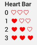
<!-- layout xml -->
<com.tigerpenguin.widget.simpleratingbar.SimpleRatingBar
        android:id="@+id/heartBar"
        style="@style/RatingBar.Heart"/>
<!-- styles xml -->
<style name="RatingBar">
<item name="android:layout_width">wrap_content</item>
<item name="android:layout_height">wrap_content</item>
</style>
<style name="RatingBar.Heart">
<item name="SRB_maxRating">3</item>
<item name="SRB_textColor">@color/black</item>
<item name="SRB_filledIconColor">@color/red</item>
<item name="SRB_unfilledIconColor">@color/red</item>
<item name="SRB_filledIcon">@string/ratingIconHeartFilled</item>
<item name="SRB_unfilledIcon">@string/ratingIconHeartOutline</item>
</style>To use SimpleRatingBar in your project,
- Copy the SimpleRatingBar folder to your project directory.
- Update your project's settings.gradle file to
include ':SimpleRatingBar' - Update your app's build.gradle dependencies to have
compile project(':SimpleRatingBar')
Refer to the SimpleRatingBarDemo for project setup reference.
Some unicode code characters may not show on some devices. This is purely device dependent.
Run ./gradlew tasks to see a list of available tasks.
Run ./gradlew installDebug to compile and install the demo apk.
Run ./gradlew connectedAndroidTest to run the unit tests.
Go to File -> Import Project and import the 'settings.gradle' file.
If you want to say hi, you can find me on twitter! =)
https://twitter.com/hiBrianLee
Copyright (c) 2014 Brian Lee

Licensed under the Apache License, Version 2.0 (the "License");
you may not use this file except in compliance with the License.
You may obtain a copy of the License at

   http://www.apache.org/licenses/LICENSE-2.0

Unless required by applicable law or agreed to in writing, software
distributed under the License is distributed on an "AS IS" BASIS,
WITHOUT WARRANTIES OR CONDITIONS OF ANY KIND, either express or implied.
See the License for the specific language governing permissions and
limitations under the License.