


React Native Customized Box is very simple and easy to use.
- Node (version 12 or greater).
- Yarn (version 1.5 or greater).
- React, React-Native should be installed
- A fork of the repo (for any contributions).
Using NPM
npm i --save react-native-customized-boxUsing Yarn
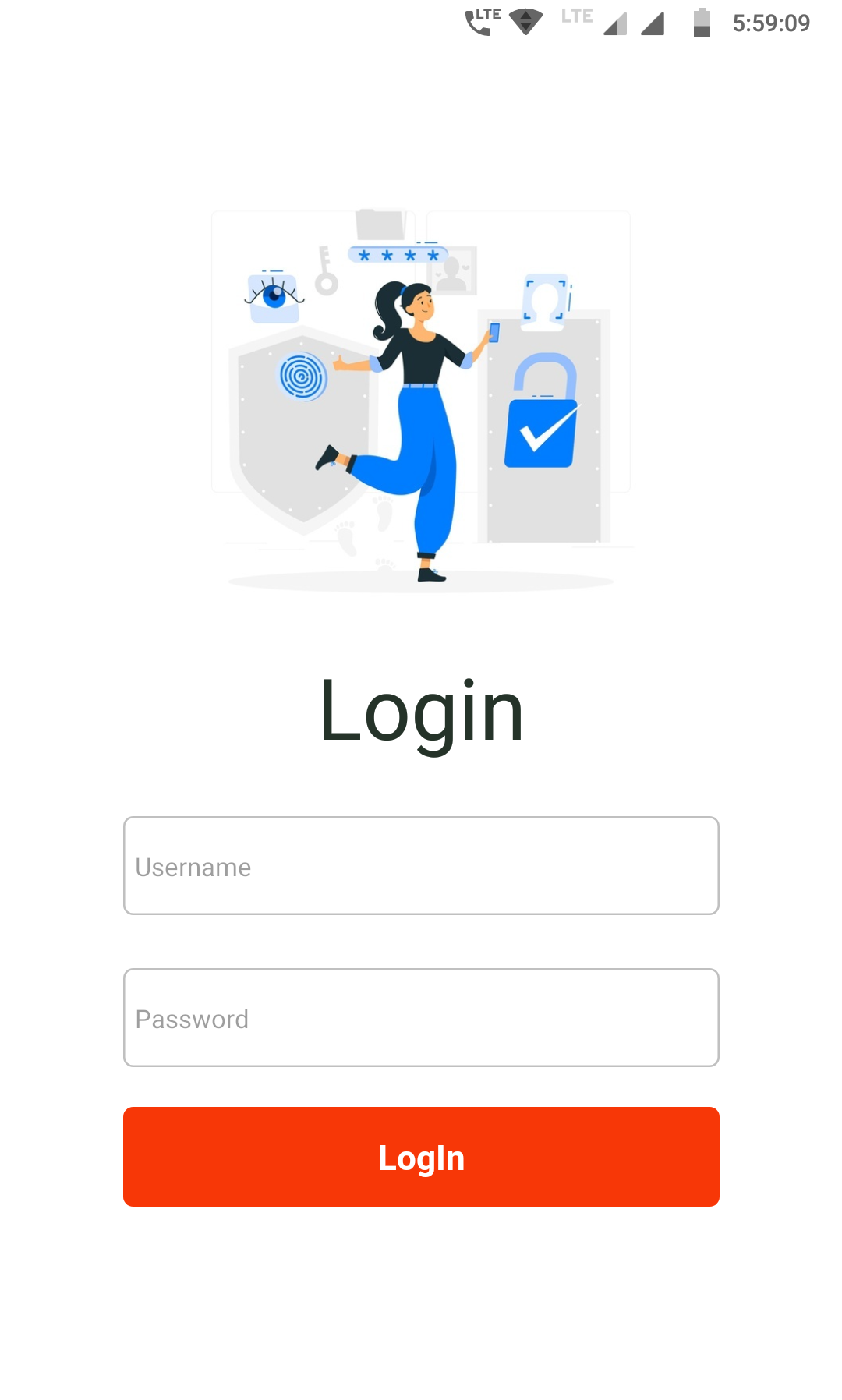
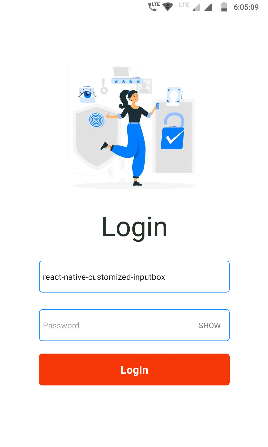
yarn add react-native-customized-boximport CustomBox from "react-native-customized-box";→ Box fully customizable
 |
 |
Code Snippet ↓
<CustomBox
placeholder={"Username"}
boxColor={"dodgerblue"}
focusColor={"#33ff00"}
boxStyle={{ borderRadius: 40, borderWidth: 2 }}
/>
<CustomBox
placeholder={"Password"}
toggle={true}
boxColor={"dodgerblue"}
focusColor={"#33ff00"}
boxStyle={{ borderRadius: 40, borderWidth: 2, borderStyle: "dotted" }}
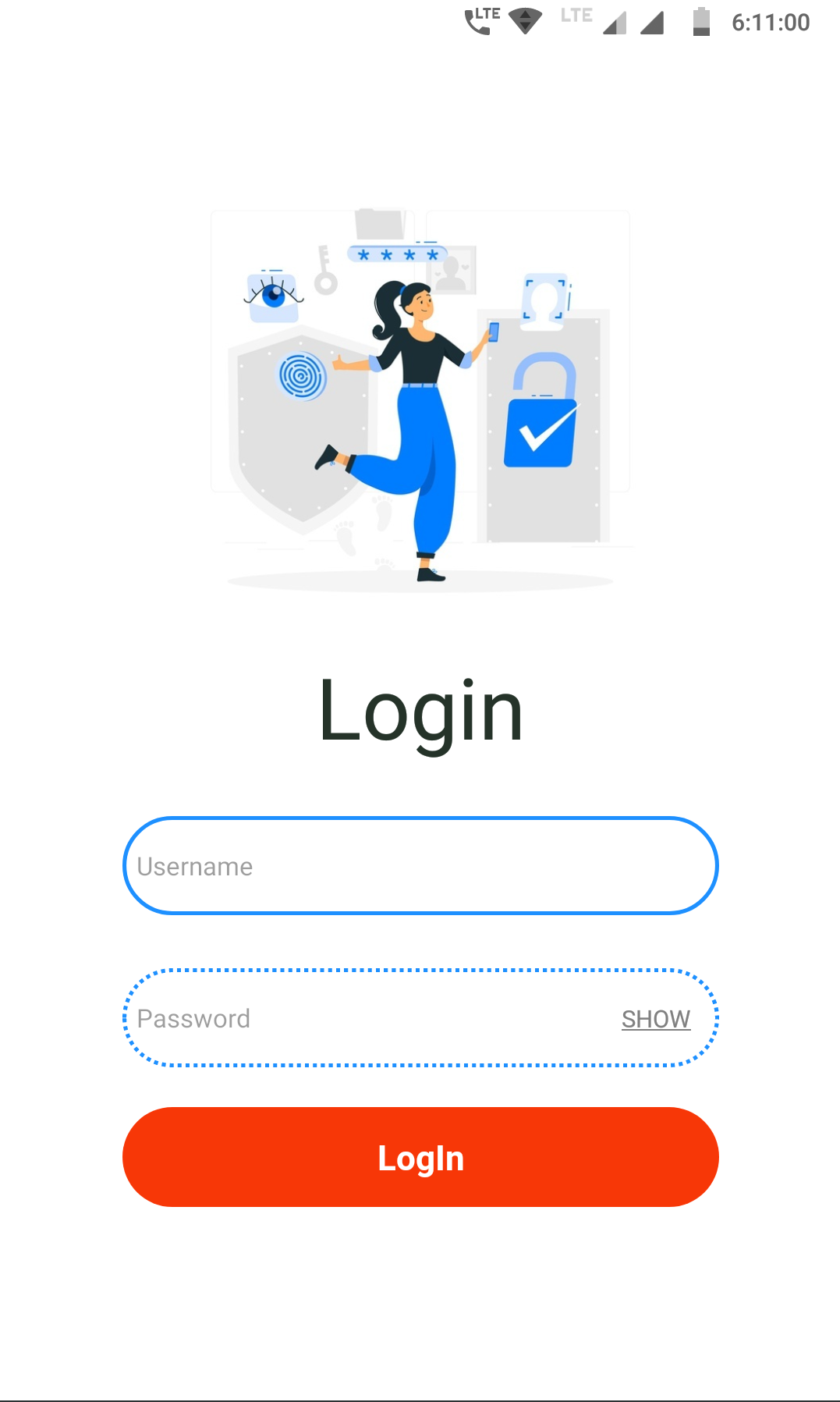
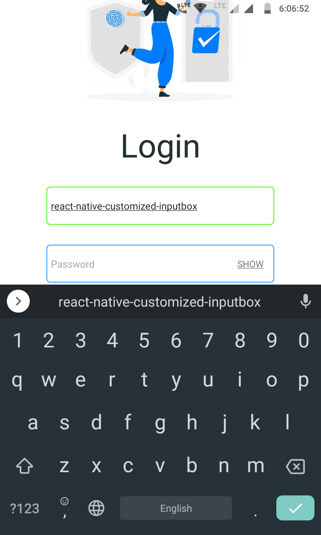
/>→ Toggle feature enabled
 |
 |
Code Snippet ↓
<CustomBox placeholder={"Username"} />
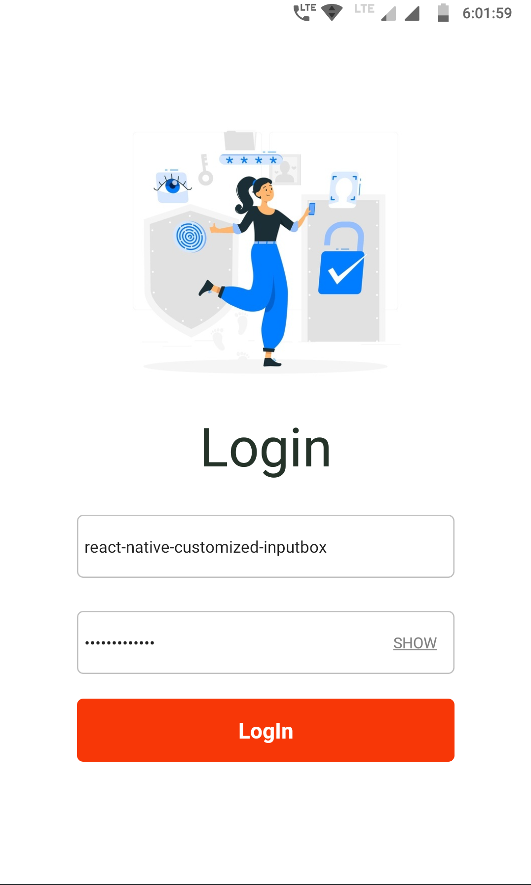
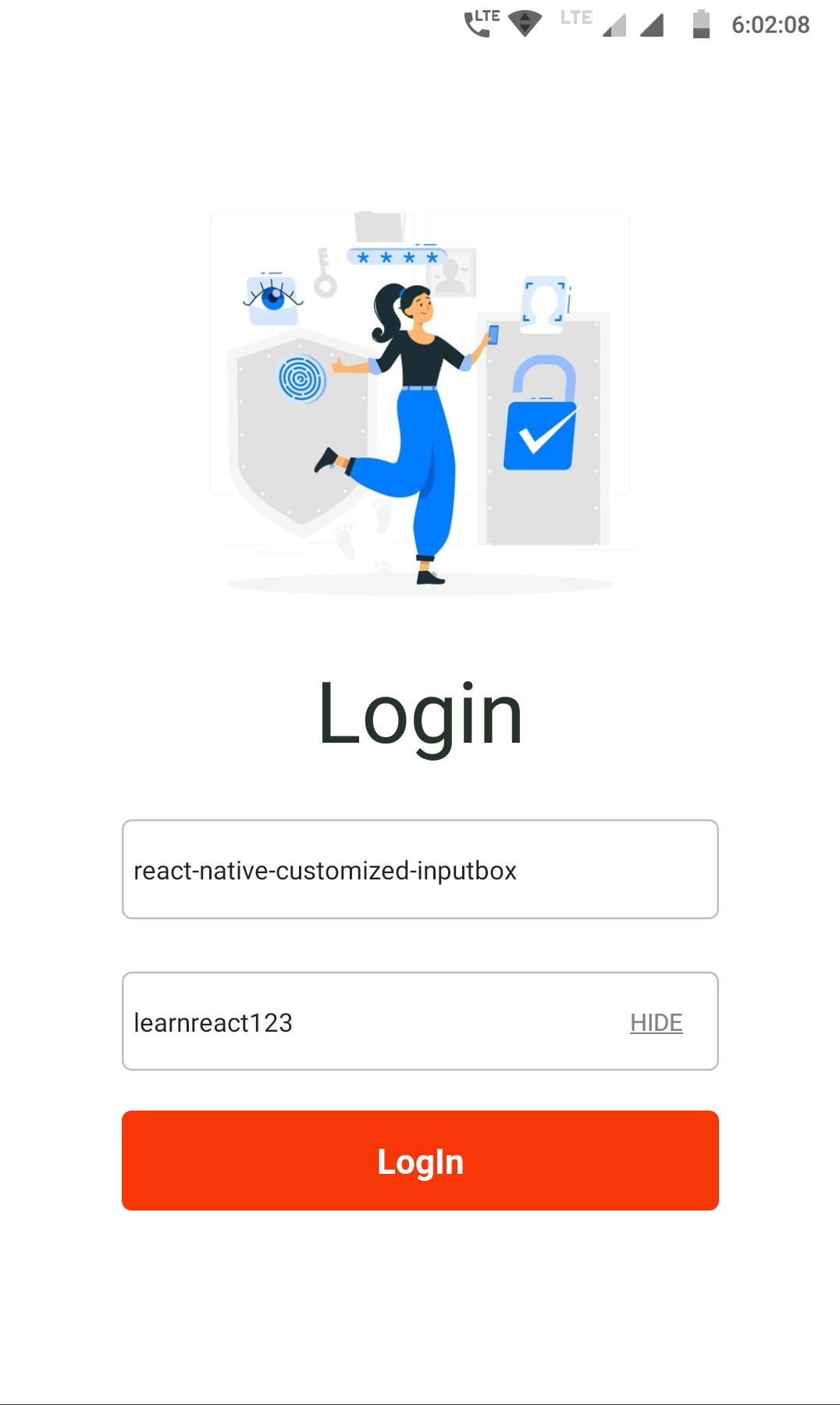
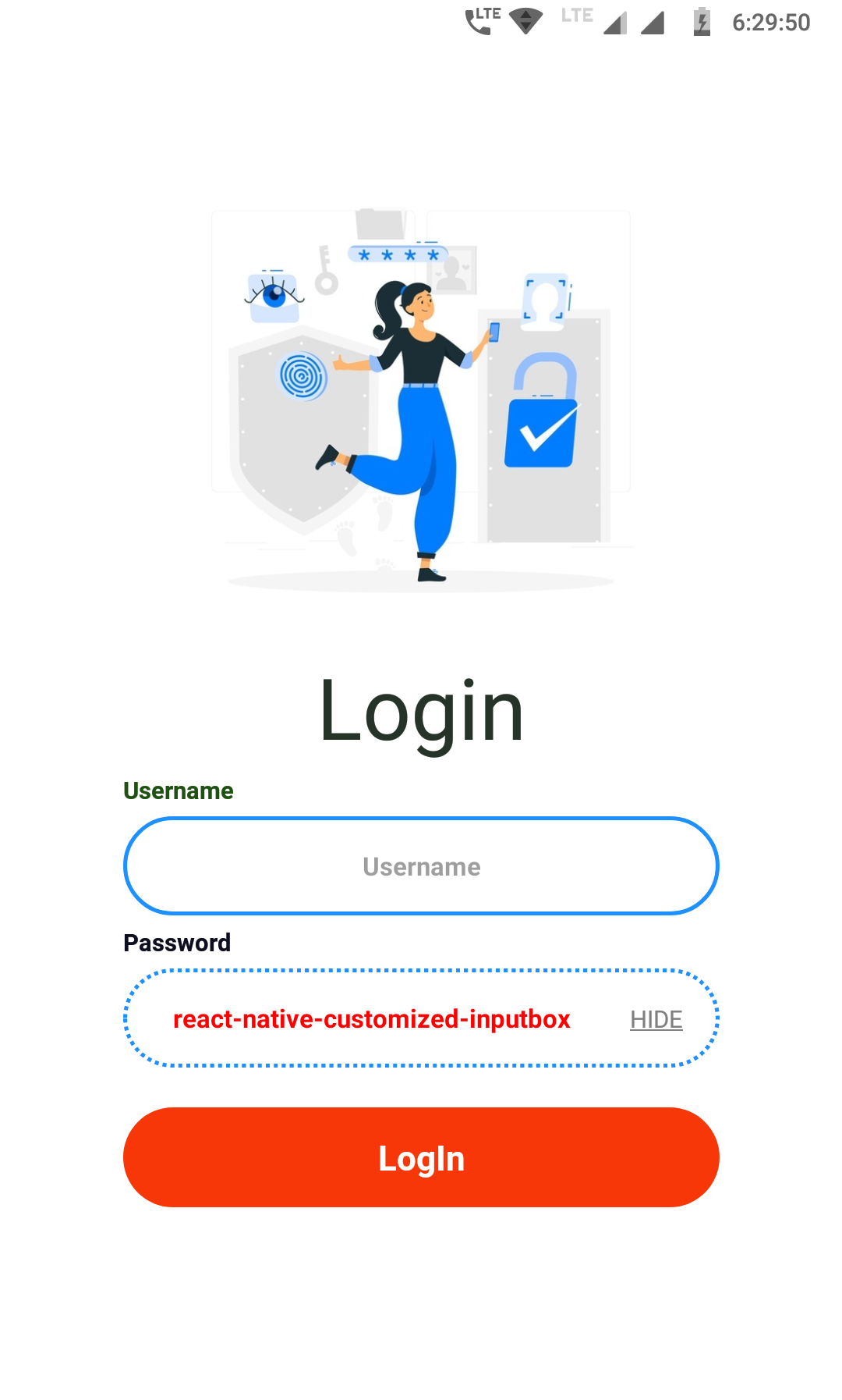
<CustomBox placeholder={"Password"} toggle={true} />→ Box color change while focusing
 |
 |
Code Snippet ↓
      <CustomBox
        placeholder={"Username"}
        boxColor={"dodgerblue"}
        focusColor={"#33ff00"}
      />
      <CustomBox
        placeholder={"Password"}
        toggle={true}
        boxColor={"dodgerblue"}
        focusColor={"#33ff00"}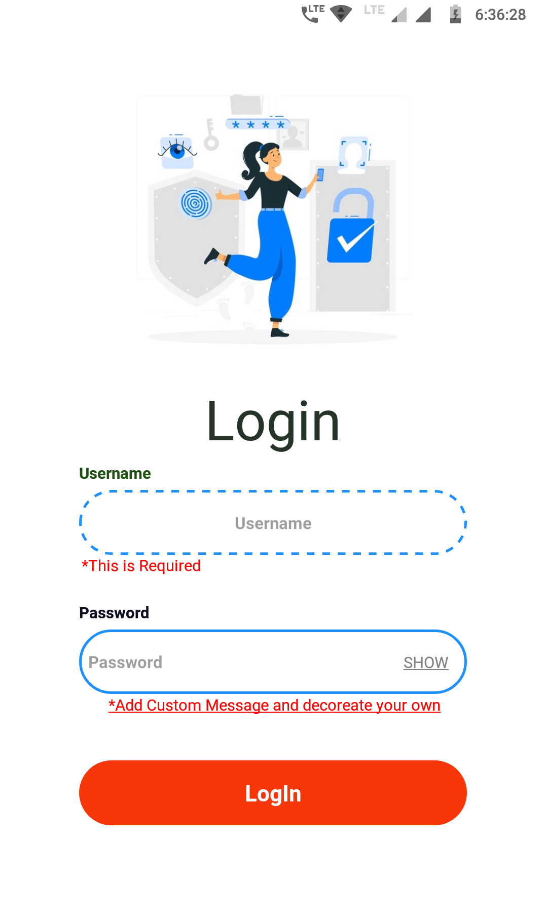
/>→ Label and Required option enable to give error on condition
 |
 |
Code Snippet ↓
      <CustomBox
        placeholder={"Username"}
        boxColor={"dodgerblue"}
        focusColor={"#33ff00"}
        boxStyle={{ borderRadius: 40, borderWidth: 2, borderStyle: "dashed" }}
        inputStyle={{ textAlign: "center", fontWeight: "bold", color: "red" }}
        labelConfig={{
          text: "Username",
          style: {
            color: "#1f5212",
            fontWeight: "bold",
          },
        }}
        requiredConfig={{
          text: "*This is Required",
        }}
      />
      <CustomBox
        placeholder={"Password"}
        toggle={true}
        boxColor={"dodgerblue"}
        focusColor={"#33ff00"}
        boxStyle={{ borderRadius: 40, borderWidth: 2 }}
        inputStyle={{ fontWeight: "bold", color: "red" }}
        labelConfig={{
          text: "Password",
          style: {
            color: "#0e0e21",
            fontWeight: "bold",
          },
        }}
        requiredConfig={{
          text: <Text>*Add Custom Message and decoreate your own</Text>,
          style: { textAlign: "center", textDecorationLine: "underline" },
        }}
/>🔧 Below are the method which you can use to customized the Box in your style
| Method | Type | Description |
|---|---|---|
width |
Number | This is not *Mandatory By default set to 300 but you can change and add your own |
height |
Number | This is not *Mandatory By default set to 50 but you can change and add your own |
placeholder |
String | Provide text for the Placeholder |
toggle |
Boolean | Provide True to display SHOW/HIDE by default set to False |
boxColor |
String | Provide Color for the InputBox by default color set to silver |
focusColor |
String | Provide Color for change the box color while focusing the InputBox |
boxStyle |
Object | Provide custom style/decoration for the InputBox |
inputStyle |
Object | Provide custom style/decoration for the Text inside the InputBox |
labelConfig |
Object | text: Provide text for the Label (String) style: Provide custom style for the Label (Object) |
requiredConfig |
Object | text: Provide custom mandatory message to display like(*This is Required) you can add your own (String) style: Provide custom style for the required text (Object) |
values |
String | You can use this to set predefine values or get the current InputBox value |
onChangeText |
Function | Function like onChangeText |
Made with 🖤 by
Author : Rishu Chowdhary
Email : hi.10rishu@gmail.com
This project is licensed under the MIT License - see the LICENSE.md file for details