📊 7 unit oriented bar chart library suitable for TODO and more.
Thank you for your interest and use!
Any issues will be fixed as soon as they are delivered or confirmed.

setting.gradle
allprojects {
    repositories {
        ...
        maven { url 'https://jitpack.io' }
    }
}
build.gradle(Module)
dependencies {
    ...
    implementation 'com.github.hyunjine:WTBarChart:1.0.1'
}Please note that ExampleActivity is registered in the app path.
Add two layouts to the view you want to use.
Each layout has an area for charts and an area for chart items.
The reason for dividing the two is to allow different background properties to be specified for each.
The default background is white.
<com.hyunjine.wtbarchart.WTBarChart
    android:id="@+id/wt_chart"
    android:layout_width="0dp"
    android:background="@drawable/bg_chart_area"
    android:layout_height="152dp"
    app:layout_constraintBottom_toBottomOf="parent"
    app:layout_constraintEnd_toEndOf="parent"
    app:layout_constraintStart_toStartOf="parent"
    app:layout_constraintTop_toTopOf="parent"
    app:layout_constraintWidth_percent="0.8" />

<com.hyunjine.wtbarchart.WTChartItem
    android:id="@+id/wt_item"
    android:layout_width="0dp"
    android:layout_height="wrap_content"
    android:background="@drawable/bg_item_area"
    android:paddingTop="5dp"
    android:paddingBottom="5dp"
    app:layout_constraintEnd_toEndOf="@id/wt_chart"
    app:layout_constraintStart_toStartOf="@id/wt_chart"
app:layout_constraintTop_toBottomOf="@id/wt_chart" />primary point
WTUnit.getAll()This method is a containing method that returns all elements of WTUnit as Array type.
It is used when you want to change all items. Like this
for (i in WTUnit.getAll()) {
    wtItem.getItem(i).textSize = 12f
}
Two methods that are likely to be used frequently have been implemented in advance.
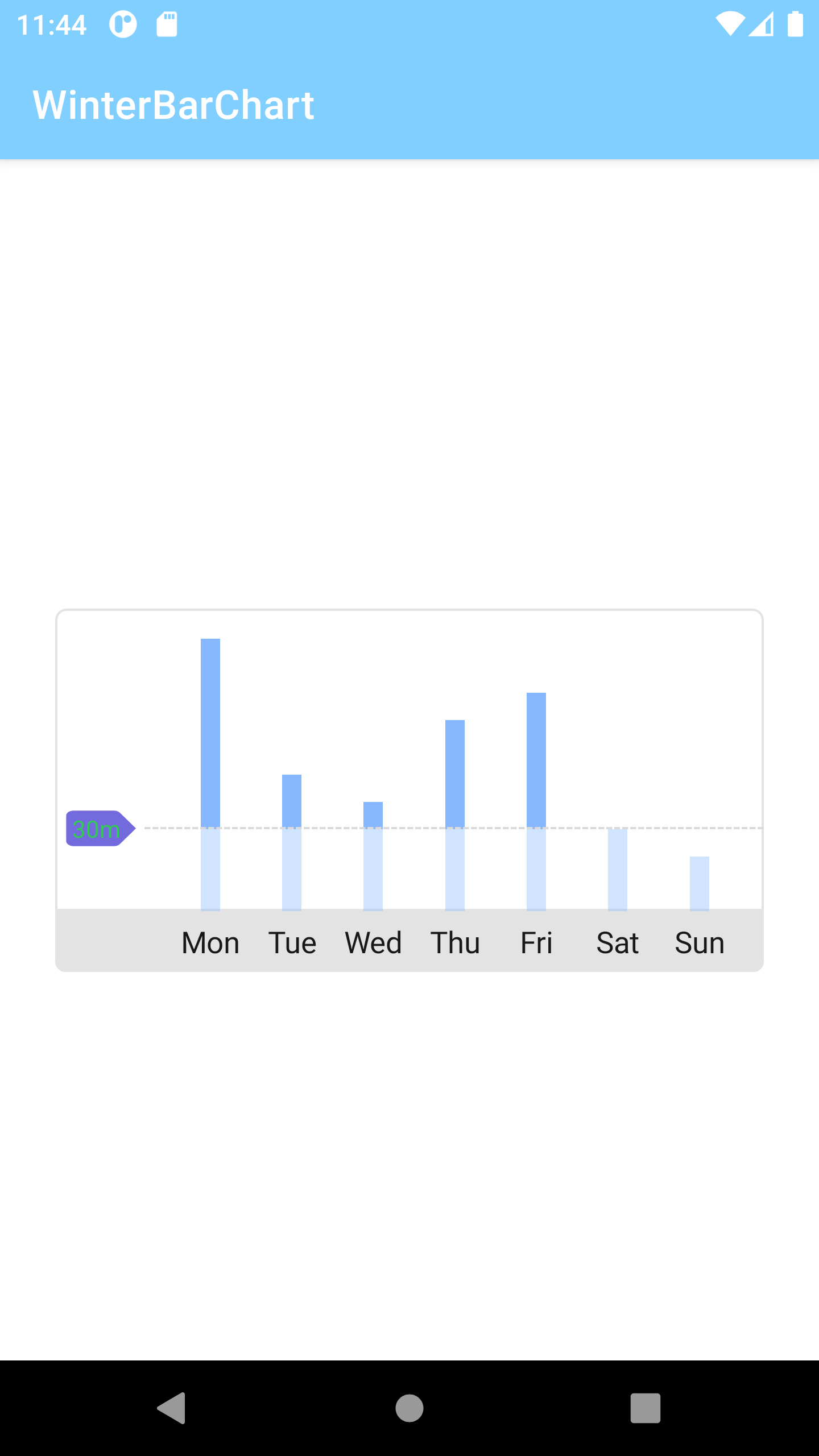
binding.run {
    wtItem.setAllItemText(arrayOf("Mon", "Tue", "Wed", "Thu", "Fri", "Sat", "Sun"))
    wtChart.setAllChartValue(arrayOf(100f, 50f, 40f, 70f, 80f, 30f, 20f)
}
WTUnit.COMPONENT1
WTUnit.COMPONENT2
WTUnit.COMPONENT3
...
WTUnit.COMPONENT7This applies equally to charts and chart items, and the order is COMPONENT1 from the left.
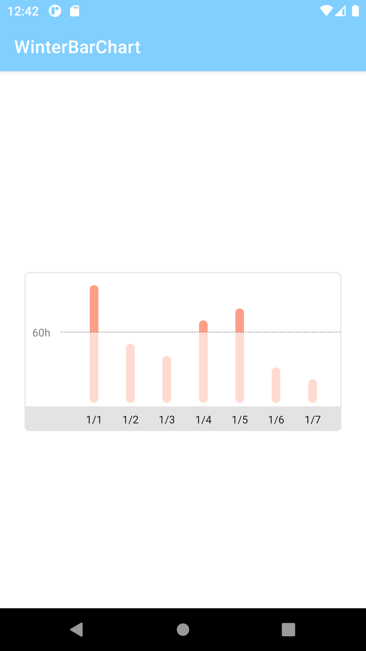
In order to use this library, basically, you need to enter three values.
You must specify the values of each chart, the names of chart items, and the recommended values.
The order in which they appear in the view is from left to right.
When less than 7 values are entered, only the corresponding values are displayed in the view, but if they are exceeded, an exception is raised.
In addition, a max value can be specified.
If the difference in values between charts exceeds the normal range, charts with small values are rarely seen.
To prepare, the setMaxValue() method exists to specify a maximum value, and if this maximum value is exceeded, the value is displayed equal to the maximum value..
binding.run {
    wtItem.setAllItemText(arrayOf("Mon", "Tue", "Wed", "Thu", "Fri", "Sat", "Sun"))
    wtChart.apply {
        setAllChartValue(arrayOf(100f, 50f, 40f, 70f, 80f, 30f, 20f))
        setRecommendValue(60f)
        setMaxValue(100f)
    }
}
binding means viewbinding. Of course you can use findViewById as well.
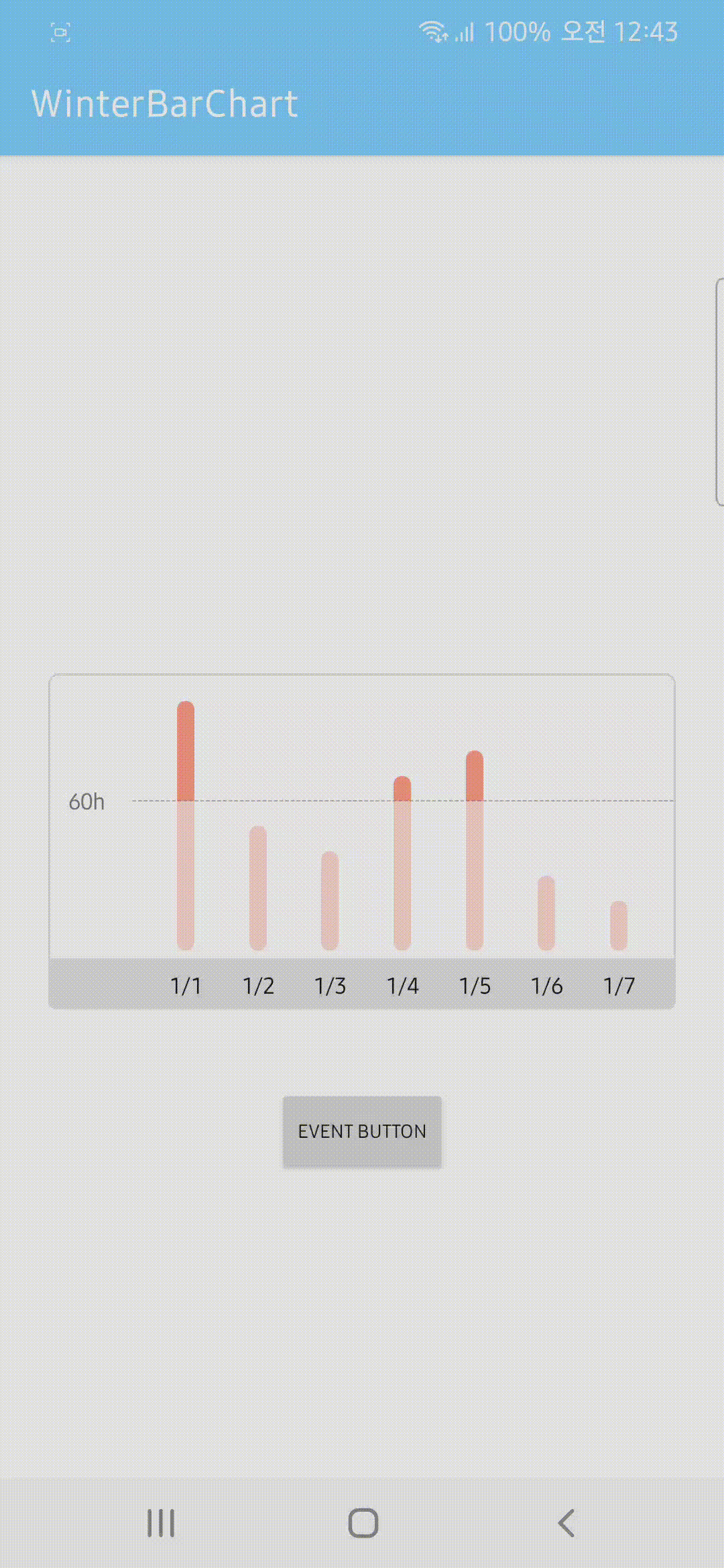
If you want to handle the event through chart click, you can use the following function.
binding.run {
    ...
    wtChart.setOnChartClickListener { wtUnit ->
        // What you want
    }

    // or
    ...
    wtChart.setOnChartClickListener(object : OnChartClickListener {
        override fun onChartClick(unit: WTUnit) {
            // What you want
        }
    })
}
The parameter "unit" means the enum value of the clicked chart, and "value" means the current value of the clicked chart.
All elements composing this library inherit View, so the process of changing it to the desired shape is the same as usual.
- Chart - View
- Recommend Line - View
- Recommend Box - TextView
- Chart Item - TextView
  public fun setMaxValue(value: Float)

  public fun setRecommendValue(value: Float)

  public fun setAllChartValue(list: Array<Float>)
Same as above
  public fun setChartValue(unit: WTUnit, value: Float)

  // Example
  binding.wtChart.setChartValue(WTUnit.COMPONENT1, 10f)
unit is an enum class as a WTUnit type, and there are COMPONENT1 to COMPONENT7.
For value, put the desired value as a float type.
  public fun setChartWidth(width: Float)

  // Example
  binding.wtChart.setChartWidth(10f)
width is the width of all charts, and you can enter the desired width value. The default is 8f.
  public fun getDownChart(unit: WTUnit): View
  public fun getUpChart(unit: WTUnit): View

  // Example
  binding.wtChart.getDownChart(WTUnit.COMPONENT7)
  binding.wtChart.getUpChart(WTUnit.COMPONENT7)

They return the view of the corresponding chart with the enum value entered in the parameter.
getDownChart returns the bottom view and getUpChart returns the top view.
In particular, these methods are mainly used to change the chart appearance.
This method is required to implement the round shape chart in preview.
If the value in the chart is less than or equal to the recommend value, you need to change the shape of donwChart.
    for (i in WTUnit.getAll()) {
        getUpChart(i).setBackgroundResource(R.drawable.bg_up_chart)
        if (getRecommendValue() < getChartValue(i)) {
            getDownChart(i).setBackgroundResource(R.drawable.bg_down_chart)
        } else {
            getDownChart(i).setBackgroundResource(R.drawable.bg_down_chart_all_rounding)
        }
} public fun getChartValue(unit: WTUnit): Float
// Example
val chartValue: Float = binding.wtChart.getChartValue(WTUnit.COMPONENT_5)This is the method to get the current value of that chart.
  public fun getRecommendBox(): TextView

  // Example
  binding.wtChart.getRecommendBox().run {
      text = ...
      setBackgroundResource(...)
  }
This returns a TextView that displays the recommended values. You can set the desired shape or text with the returned TextView.
You can use Typeface Class to change the font.
  public fun getRecommendLine(): View

  // Example
  binding.wtChart.getRecommendLine().setBackgroundResource(R.drawable.bg_recommend_line)
This returns the View responsible for displaying the recommended values.
By using this method, you can change the dotted line of the recommended line differently, remove it, or represent it as a solid line.
Below are the defaults. Refer to this shape.xml if you change it
<shape xmlns:android="http://schemas.android.com/apk/res/android" android:shape="line">
    <solid android:color="@android:color/transparent" />
    <stroke
        android:width="1dp"
        android:color="@color/wtbar_recommend_line"
        android:dashGap="1dp"
        android:dashWidth="3dp" />
</shape> public fun getItem(unit: WTUnit): TextView
// Example
binding.wtChart.getItem(WTUnit.COMPONENT1).text = ...It returns the TextView composing the chart items. Customize this too the way you like it.