This package provides a new inspector editor displaying it's options as buttons.
Buttons operates like check- or radioboxes.
Run composer require i13e/buttoneditor.
Use the new editor in your properties
I13e.Package:Content.Text:
properties:
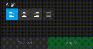
align:
# ButtonEditor supports "string" and "array"
type: string
defaultValue: left
ui:
label: 'Align'
inspector:
editor: I13e.ButtonEditor/ButtonEditor
editorOptions:
# Allow all buttons to be deselected
# boolean, default: false
allowEmpty: false
# Allow multiple buttons to be active
# If set to true also use `type` array
# boolean, default: false
multiple: false
# Disable all buttons
# boolean, default: false
disabled: false
values:
left:
label: i18n
icon: align-left
center:
label: i18n
icon: align-center
right:
label: i18n
icon: align-right
justify:
label: i18n
icon: align-justify
# An alternative icon for the active state
iconActive: align-justify
# Disable a single option
disabled: true
# ---
# Optionally use a data source:
#
# If `dataSourceIdentifier` or `dataSourceUri` is defined, the `values` from above will be ignored
dataSourceIdentifier: 'i13e-some-datasource'
dataSourceUri: 'some/custom-route'
dataSourceAdditionalData:
group: 'align'
dataSourceDisableCaching: falseAs you may have realized, the configuration is nearly completely compatible with the default SelectBoxEditor.
editorOptions:
  allowEmpty: true
  multiple: true
  values:
    # define your own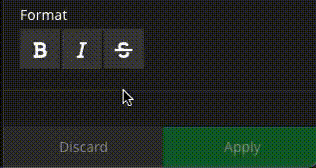
editorOptions:
  allowEmpty: true
  values:
    toggle:
      label: i18n
      icon: toggle-off
      iconActive: toggle-on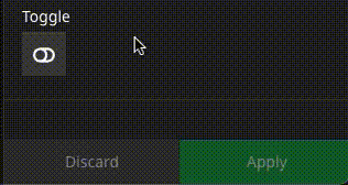
- Although the ButtonEditor works with Neos 5.3 it does not support automatic label i18n handling. With Neos 5.3 please use full translation paths.
If you'd like to contribute simply create a pull-request.
Proudly developed in the Hanover Region