fix(form): Be more specific with .notice-dismiss class #3337
Comments
|
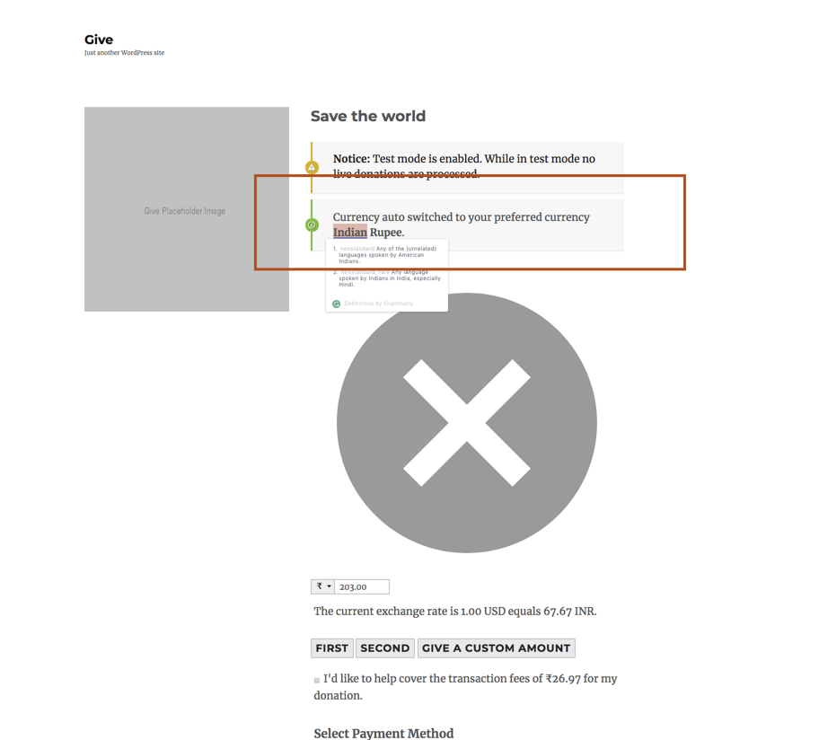
@Sidsector9 Update this CSS rule to match the example below. Ideally the class would be prefixed, but we are using it throughout the add-ons so just update the selector and add Please also ensure that the alert in currency switcher has a green bar with green icon. It is currently showing a red border with green icon, which is confusing and looks alarming. This may require an issue in currency switcher add-on since it is outputting inline styles which are unnecessary because they are already in the front-end stylesheet. If necessary, create an issue for the add-on and address it. Thanks. Current
Proposed
|


fix(form): Be more specific with .notice-dismiss class #3337
|
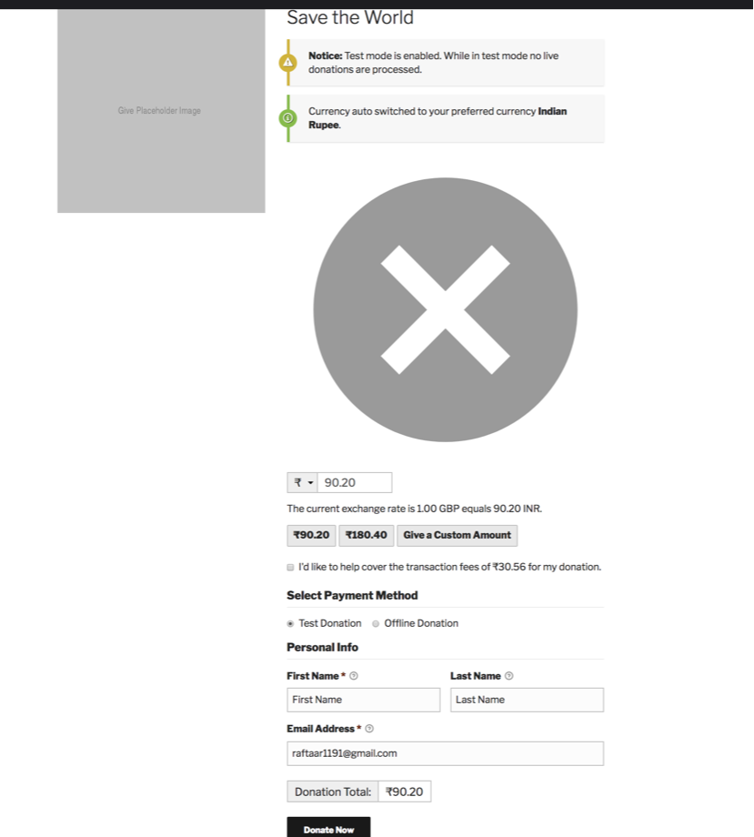
Slack Call Summary Participants: @Sidsector9 , @raftaar1191 FindingAfter making a donation to any other current expect the default one and then again try to make a donation is see the following issue This issues may be related to: #3337 Video Link: https://screencast-o-matic.com/watch/cF12XjFivB
|
fix(form): Be more specific with .notice-dismiss class #3337
TestingWhen testing the Give Core 2.1.5 I find it out that with currency switcher is on we are still getting this issues
|
|
Slack Call Summary Participants: @Sidsector9 , @raftaar1191 |
User Story
As a Give user, I expect that the Give styles will be strong enough to avoid problems like this:
Current Behavior
Currently, this style is very generic, it's just
.notice-dismissso it can easily get over-written by other themes or plugins like in the example above.Expected Behavior
I expect that Give can avoid this by being more specific in the notices style.
Possible Solution
Here's a couple options:
Any of those would help prevent the problem shown above.
Related
The text was updated successfully, but these errors were encountered: