See storybookjs/storybook#19684. Should be available for Storybook v7.0.0 or later
Add JSDoc comments to your storybook examples that show up on your DocsPage.
See Github issue that inspired this package: storybookjs/storybook#8527 (comment)
Code
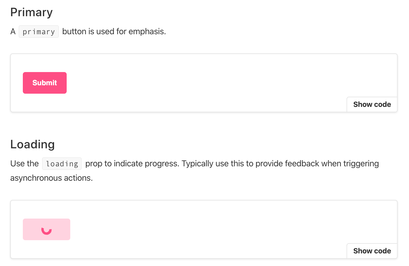
// A `primary` button is used for emphasis.
export const Primary = () => <Button primary>Submit</Button>

/**
 * Use the `loading` prop to indicate progress. Typically use
 * this to provide feedback when triggering asynchronous actions.
 */
export const Loading = () => <Button loading>Loading</Button>
Rendered docs
1. Installing package
You'll need to have Storybook and the Docs Addon installed. Then run:
npm install --save-dev story-description-loader
2. Adding to Webpack
If using JSX
module: {
  rules: [
    {
      test: /\.stories\.jsx/,
      use: [{ loader: "story-description-loader", options: { isJSX: true } }],
    }
  ]
}
If using TSX
module: {
  rules: [
    {
      test: /\.stories\.tsx/,
      use: [{ loader: "story-description-loader", options: { isTSX: true } }],
    }
  ]
}
Or plain old JS
module: {
  rules: [
    {
      test: /\.stories\.js/,
      use: [{ loader: "story-description-loader" }],
    }
  ]
}