Widgets Easier is a Flutter component library of open-source widgets, featuring multiple pre-built UI components. It aims to make development faster, simpler, and more efficient, turning development into an enjoyable task.
WidgetsEasier offers a wide range of features to streamline your Flutter development process:
- Pre-built UI Components: Save time and effort with our collection of ready-to-use UI widgets, including buttons, cards, lists, and more.
- Customization Options: Easily customize each component to match your app's unique design and branding requirements.
- Responsive Design: Ensure your app looks great on any screen size with built-in responsiveness features.
- Cross-platform Compatibility: Build once and deploy across multiple platforms, including iOS, Android, and web, with ease.
- Open Source and Community-driven: Benefit from an active community of developers contributing to the library's growth and improvement.
- Easy Integration: Seamlessly integrate WidgetsEasier into your existing Flutter projects with simple installation steps.
- Regular Updates: Stay up-to-date with the latest Flutter trends and best practices, as we continuously update and enhance WidgetsEasier.
In your Flutter project, run the following commands:
flutter pub add widgets_easier
flutter pub add flutter_easy_animations
This will install the latest version of the Widgets Easier library. The animation part is encapsulated into the flutter_easy_animations library. When dealing with animation-related functionalities, you need to install it separately.
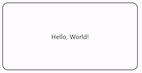
A Solid Border is the most common and basic type of border. Its main characteristics include:
-
Uniform edges: The defining feature of a Solid Border is its even, continuous line that separates it from the surrounding content. Unlike Ribbed Borders or Grooved Borders, there are no raised or sunken effects along the edges of a Solid Border; instead, it uniformly surrounds the target area.
-
Clear demarcation: The edges of the border are typically sharp, providing a distinct visual separation that allows users to clearly identify the boundaries of the target area.
-
Simple appearance: Solid Borders present a clean, straightforward appearance without additional decoration or depth effects. This simplicity is sometimes more suitable for interface designs that prioritize the content itself over decorative elements.
Solid Borders are commonly used in layouts that require a clean, clear design, such as table borders, buttons, input fields, and other elements where borders are necessary, or to highlight specific content boundaries. In design, the choice between using a Solid Border or other border styles depends on the designer's requirements for the overall style of the interface and user experience.
Container(
  width: 100,
  height: 50,
  decoration: ShapeDecoration(
    shape: SolidBorder(
      borderRadius: BorderRadius.circular(12),
    ),
  ),
  child: const Center(child: Text("Hello, World!")),
)
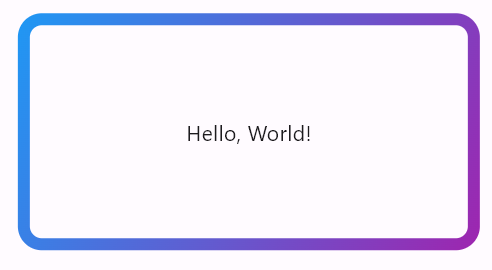
Container(
  width: 100,
  height: 50,
  decoration: ShapeDecoration(
    shape: SolidBorder(
      width: 8,
      borderRadius: BorderRadius.circular(12),
      // 或使用渐变色
      gradient: const LinearGradient(
        colors: [Colors.blue, Colors.purple],
        begin: Alignment.topLeft,
        end: Alignment.bottomRight,
      ),
    ),
  ),
  child: const Center(child: Text("Hello, World!")),
)
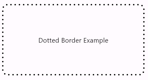
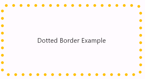
A Dotted Border is another type of border commonly used in interface design.
-
Dot pattern: The defining characteristic of a Dotted Border is that its edges are composed of a series of spaced dots rather than a continuous solid line. This combination of dots creates a blurred boundary visually, making the edges of the target area softer.
-
Delicate appearance: Dotted Borders present a lightweight, delicate appearance compared to Solid Borders. This light appearance makes Dotted Borders particularly suitable for scenarios where you want to highlight the target area without emphasizing the edges too much.
-
Visual separation: While Dotted Borders may not have the sharp delineation of Solid Borders, they still provide a visual separation effect, allowing users to discern the boundaries of the target area clearly. Dotted Borders are also commonly used to highlight specific content or as decorative borders.
Dotted Borders are typically used in layouts that require a soft, delicate design, such as borders for cards, panels, image frames, and other elements, or to emphasize specific content boundaries. In design, the choice between using a Dotted Border or other border styles depends on the designer's requirements for the overall style of the interface and user experience.
An example is provided below:
Container(
  height: 150,
  width: 300,
  decoration: ShapeDecoration(
    shape: DottedBorder(
      borderRadius: BorderRadius.circular(10),
    ),
  ),
  child: const Center(
    child: Text('Dotted Border Example'),
  ),
)
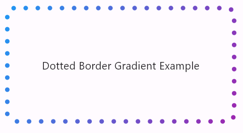
Container(
  height: 150,
  width: 300,
  decoration: ShapeDecoration(
    shape: DottedBorder(
      dotSize: 6,
      dotSpacing: 10,
      borderRadius: BorderRadius.circular(10),
      color: Colors.amber,
    ),
  ),
  child: const Center(
    child: Text('Dotted Border Example'),
  ),
)
Container(
  height: 50,
  width: 300,
  decoration: ShapeDecoration(
    shape: DottedBorder(
      dotSize: 6,
      dotSpacing: 10,
      borderRadius: BorderRadius.circular(10),
      gradient: const LinearGradient(
        colors: [
          Colors.blue,
          Colors.purple,
        ],
        begin: Alignment.topLeft,
        end: Alignment.bottomRight,
      ),
    ),
  ),
  child: const Center(
    child: Text('Dotted Border Gradient Example'),
  ),
)
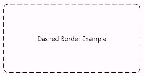
A Dashed Border is a common border style in interface design, slightly different in appearance and characteristics from Solid Borders and Dotted Borders. Its main features include:
-
Dash pattern: The defining feature of a Dashed Border is that its edges are composed of a series of spaced short dashes arranged at intervals, creating a dashed edge effect. This dashed appearance gives a lively and playful feeling visually.
-
Dynamic appearance: Compared to Solid Borders and Dotted Borders, Dashed Borders present a more dynamic and lively appearance. This characteristic makes Dashed Borders often used in scenarios where you want to highlight the target area and draw the user's attention.
-
Visual separation: Although the edges of Dashed Borders are not as continuous and distinct as Solid Borders, they still provide a certain degree of visual separation, helping users identify the boundaries of the target area.
Dashed Borders are typically used in layouts that require a lively and playful design, such as borders for cards, panels, buttons, and other elements, or to highlight specific content boundaries. In design, the choice between using a Dashed Border or other border styles depends on the designer's requirements for the overall style of the interface and user experience.
An example is provided below:
Container(
  height: 150,
  width: 300,
  decoration: ShapeDecoration(
    shape: DashedBorder(
      borderRadius: BorderRadius.circular(10),
    ),
  ),
  child: const Center(
    child: Text(
      'Dashed Border Example',
    ),
  ),
)
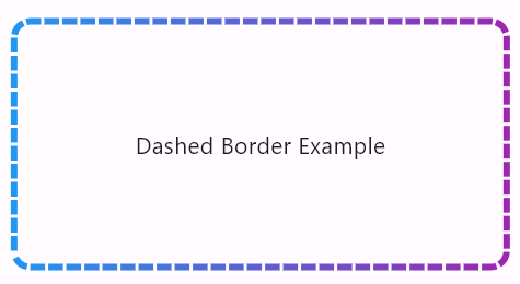
Container(
  height: 150,
  width: 300,
  decoration: ShapeDecoration(
    shape: DashedBorder(
      width: 4,
      dashSize: 9,
      dashSpacing: 2,
      gradient: const LinearGradient(colors: [
        Colors.blue,
        Colors.purple,
      ]),
      borderRadius: BorderRadius.circular(10),
    ),
  ),
  child: const Center(
    child: Text(
      'Dashed Border Example',
    ),
  ),
)
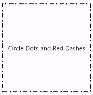
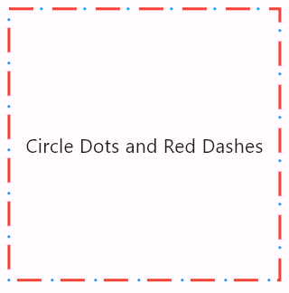
A Dotted Dash Border is another type of border commonly used in interface design, with slight differences in appearance and characteristics compared to Solid Borders, Dotted Borders, and Dashed Borders. Its main features include:
-
Dot-dash pattern: The defining feature of a Dotted Dash Border is that its edges are composed of a series of alternately arranged dots and short dashes. This combination of dots and short dashes creates an alternating edge effect, giving the border both the continuity of dots and the spacing of short dashes.
-
Spaced separation: There is typically a certain spacing between the dots and short dashes of a Dotted Dash Border, making the border appear lighter and softer. This spaced separation characteristic makes Dotted Dash Borders often used in scenarios where you want to highlight the target area without emphasizing the edges too much.
-
Visual separation: Although the edges of a Dotted Dash Border are not as continuous and distinct as Solid Borders, they still provide a certain degree of visual separation, helping users identify the boundaries of the target area.
Dotted Dash Borders are typically used in layouts that require a light, soft design, such as borders for cards, panels, image frames, and other elements, or to highlight specific content boundaries. In design, the choice between using a Dotted Dash Border or other border styles depends on the designer's requirements for the overall style of the interface and user experience.
Container(
  width: 200,
  height: 200,
  decoration: const ShapeDecoration(
    shape: DottedDashBorder(),
  ),
  child: const Center(child: Text("Circle Dots and Red Dashes")),
)
Container(
  width: 200,
  height: 200,
  decoration: const ShapeDecoration(
    shape: DottedDashBorder(
      dotSize: 2.0,
      dashSize: 18.0,
      spacing: 6.0,
      dotShape: BorderDotShape.circle,
      dotColor: Colors.blue,
      dashColor: Colors.red,
    ),
  ),
  child: const Center(child: Text("Circle Dots and Red Dashes")),
)
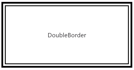
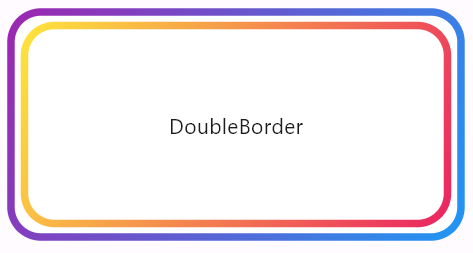
A Double Border is a common border style used in interface design to highlight or separate different areas. Compared to a single-line border, a Double Border has a more prominent and three-dimensional appearance. Its main features include:
-
Double-line structure: The defining feature of a Double Border is that its edges are composed of two parallel lines, typically with a certain spacing between them, creating a double boundary effect. This double-line structure enhances the border's sense of depth and thickness visually.
-
Prominent appearance: With two parallel lines, the edges of a Double Border have a more prominent and three-dimensional appearance compared to a single-line border, making it more eye-catching. This prominent appearance makes Double Borders particularly suitable for scenarios where you need to emphasize the target area or provide visual separation.
-
Clear demarcation: The two lines of a Double Border are typically clear and continuous, providing a distinct visual separation line that allows users to clearly identify the boundaries of the target area.
Double Borders are commonly used in interface layouts that require highlighting the target area or adding depth to elements, such as borders for cards, panels, buttons, and other elements, or to highlight specific content boundaries. In design, the choice between using a Double Border or other border styles depends on the designer's requirements for the overall style of the interface and user experience.
Container(
  height: 150,
  width: 300,
  decoration: const ShapeDecoration(
    shape: DoubleBorder(
      outerWidth: 4,
      innerWidth: 2,
      spacing: 3,
    ),
    color: Colors.white,
  ),
  child: const Center(child: Text("DoubleBorder")),
)
Container(
  height: 150,
  width: 300,
  decoration: ShapeDecoration(
    shape: DoubleBorder(
      outerWidth: 5,
      borderRadius: BorderRadius.circular(20),
      innerWidth: 5,
      spacing: 4,
      outerGradient: const LinearGradient(
        colors: [Colors.purple, Colors.blue],
        begin: Alignment.topLeft,
        end: Alignment.bottomRight,
      ),
      innerGradient: const LinearGradient(
        colors: [Colors.yellow, Colors.pink],
        begin: Alignment.topLeft,
        end: Alignment.bottomRight,
      ),
    ),
    color: Colors.white,
  ),
  child: const Center(child: Text("DoubleBorder")),
)
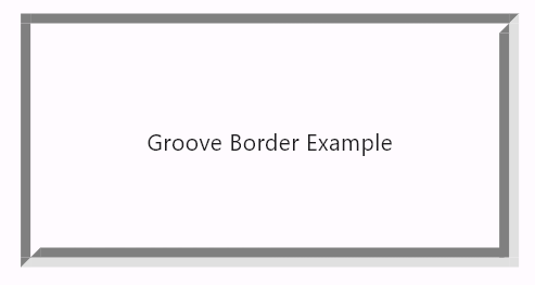
A Groove Border is a 3D effect border used to highlight or separate different areas. In contrast to other borders, a Groove Border presents opposite visual characteristics. Its main features include:
-
Concave appearance: The defining feature of a Groove Border is its edges presenting a concave appearance, forming a distinct separation from the surrounding content. Compared to Ridge Borders, the edges of Groove Borders are inwardly concave, providing a sense of depth and compression.
-
Prominent edges: Despite being inwardly concave, the edges of the border are usually quite prominent, attracting the user's attention while also providing visual separation. This makes the boundaries between interface elements clearer.
-
Visual hierarchy: Groove Borders also create a sense of visual hierarchy, making the relationships between interface elements clearer. Through variations in depth, users can more easily understand the relationships between different parts of the interface.
Groove Borders are typically used in scenarios corresponding to Ridge Borders, such as highlighting dialog boxes, table cells, or emphasizing important content. In design, the choice between using a Groove Border or a Ridge Border depends on the designer's overall style and layout requirements for interface elements.
You can try the CSS version on the MDN website, which achieves the same effect as described here: MDN - border-style.
Container(
  height: 150,
  width: 300,
  decoration: const ShapeDecoration(
    shape: GrooveBorder(width: 6),
  ),
  child: const Center(
    child: Text('Groove Border Example'),
  ),
),
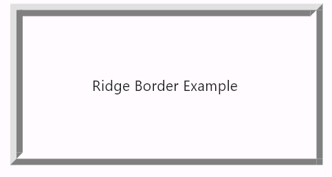
A Ridge Border is typically used to highlight or separate different areas. Its characteristics include:
-
Raised appearance: The defining feature of a Ridge Border is its edges presenting a raised appearance, forming a distinct separation from the surrounding content.
-
Prominent edges: The edges of the border are usually quite prominent, attracting the user's attention while also providing visual separation.
-
Visual hierarchy: Ridge Borders create a sense of visual hierarchy, making the relationships between interface elements clearer.
This type of border is common in user interface design, such as highlighting dialog boxes, table cells, or emphasizing important content.
You can try the CSS version on the MDN website, which achieves the same effect as described here: MDN - border-style.
In reality, Ridge Borders and Groove Borders are completely opposite, essentially creating a mirror effect. They also have two colors: a light color representing the highlight and a dark color representing the solid line.
Container(
  height: 150,
  width: 300,
  decoration: const ShapeDecoration(
    shape: RidgeBorder(width: 6),
  ),
  child: const Center(child: Text("Ridge Border Example")),
),
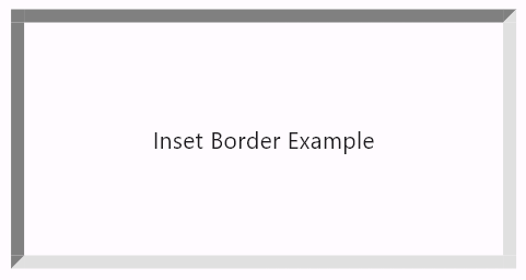
An Inset Border is another type of 3D effect border, similar to a Groove border, but without the inner shadow effect.
-
Concave appearance: The defining feature of an Inset Border is its edges presenting a concave appearance, creating an inwardly sunken border compared to the surrounding content. This appearance gives users the perception that the target area is enveloped by the border, creating a sense of depth.
-
Clear demarcation: The edges of the border are typically clear, providing a distinct visual separation line that allows users to easily identify the boundaries of the target area.
-
Visual depth perception: Inset Borders introduce a sense of visual depth, making the target area more prominent. This effect can sometimes enhance the hierarchy between interface elements, improving user understanding of the interface layout.
-
Inset Borders are commonly used to highlight or separate different areas. In contrast to Outset Borders, the defining feature of Inset Borders is their edges presenting a concave appearance.
Inset Borders are commonly seen in user interface design, such as borders for cards, panels, buttons, and other elements, or to highlight specific content boundaries. In design, the choice between using an Inset Border or other border styles depends on the designer's requirements for the overall style and user experience of the interface.
Container(
  height: 150,
  width: 300,
  decoration: const ShapeDecoration(
    shape: InsetBorder(width: 8),
  ),
  child: const Center(child: Text("Inset Border Example")),
),
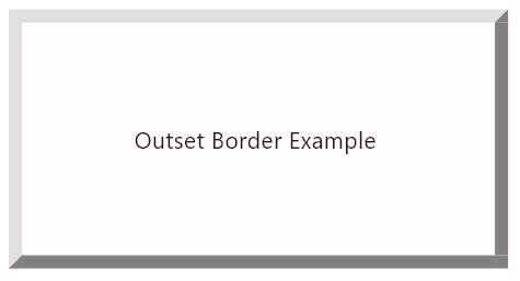
An Outset Border is another type of 3D effect border, similar to a Ridge border, but without the inner shadow effect. In contrast to an Inset Border, its defining feature is edges that appear to protrude outward.
-
Protruding appearance: The defining feature of an Outset Border is its edges presenting a protruding appearance, creating an outwardly bulging border compared to the surrounding content. This appearance gives users the perception that the edges of the target area are emphasized, creating a sense of depth.
-
Clear demarcation: The edges of the border are typically clear, providing a distinct visual separation line that allows users to easily identify the boundaries of the target area.
-
Visual emphasis: Outset Borders bring a visual emphasis, making the target area stand out more. This effect can sometimes enhance the hierarchy between interface elements, improving user understanding of the interface layout.
Outset Borders are also commonly seen in user interface design, such as borders for cards, panels, buttons, and other elements, or to highlight specific content boundaries. In design, the choice between using an Outset Border or other border styles depends on the designer's requirements for the overall style and user experience of the interface.
Container(
  height: 150,
  width: 300,
  decoration: const ShapeDecoration(
    shape: OutsetBorder(width: 8),
  ),
  child: const Center(
    child: Text('Outset Border Example'),
  ),
),
The BorderWrapper component allows you to apply borders to other components, with content outside the border being clipped according to the border's outline. For example:
BorderWrapper(
  shape: const SolidStarBorder(
    borderWidth: 19,
    borderGradient: LinearGradient(
      colors: [Colors.blue, Colors.purple],
      begin: Alignment.topLeft,
      end: Alignment.bottomRight,
    ),
  ),
  child: Card(
    child: SizedBox(
      width: 200,
      height: 200,
      child: Write.image(
        source: 'assets/example-img.png',
        fit: BoxFit.cover,
      ),
    ),
  ),
)
In this example, the SolidStarBorder used is based on Flutter's native StarBorder implementation, with the Solid Border effect added onto it. This allows you to specify line width, color, and gradients on the SolidStarBorder. The BorderWrapper can be used to achieve clipping with borders, enabling the addition of specified line effects while changing the shape of the original widget. Therefore, to implement more border shapes, you can create shape clippers similar to SolidStarBorder that draw lines. However, rest assured that this library will continue to implement new border shapes in the future.
Inspired by the Element-Plus component library in Widgets Easier, specific shadow effects are provided. These shadow effects can be added to other components in a component-like manner.
Similar to Element-Plus, in the Widgets Easier library, typical shadow effects are encapsulated into the following four components: BasicShadow, LightShadow, LighterShadow, DarkShadow. Each component uses DecoratedBox to implement a specific shadow effect.
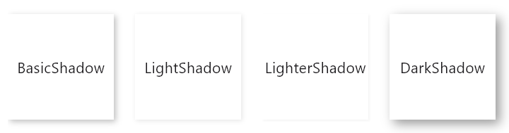
BasicShadow is a component that provides basic shadow effects. It utilizes DecoratedBox to achieve the shadow effect, suitable for elements that require subtle highlighting. This shadow effect is not too strong but is sufficient to add some depth and dimension to the element.
BasicShadow(
  child: Container(
    height: 100,
    width: 100,
    color: Colors.white,
    child: const Center(
      child: Text('BasicShadow'),
    ),
  ),
)LightShadow provides a lighter shadow effect compared to BasicShadow. It also utilizes DecoratedBox, with a subtler shadow that is suitable for interface elements that do not require much prominence but still want subtle differentiation.
LightShadow(
  child: Container(
    height: 100,
    width: 100,
    color: Colors.white,
    child: const Center(
      child: Text('LightShadow'),
    ),
  ),
)LighterShadow is the lightest among the four shadows. It is almost invisible, providing only the slightest shadow effect when necessary. It is suitable for extremely delicate user interface designs where each detail requires meticulous handling.
LighterShadow(
  child: Container(
    height: 100,
    width: 100,
    color: Colors.white,
    child: const Center(
      child: Text('LighterShadow'),
    ),
  ),
)DarkShadow provides the most intense shadow effect, implemented using DecoratedBox. This type of shadow is suitable for elements that require clear distinction, significantly enhancing the visual hierarchy of elements and drawing the user's attention effectively.
DarkShadow(
  child: Container(
    height: 100,
    width: 100,
    color: Colors.white,
    child: const Center(
      child: Text('DarkShadow'),
    ),
  ),
)SemanticButton is a highly customizable button component that supports various visual and interactive effects. It allows developers to set the button's text, icon, color, border style, shadow, and visual feedback during interactions. Additionally, buttons can be configured with prefix and suffix icons to enhance their expressiveness and functionality.
Applying the semantic enumerations of SemanticButton to buttons allows for different buttons with color theme differentiations.
For example:
SemanticButton(
  text: 'primary',
  type: SemanticEnum.primary,
  onTap: () {},
),
const Gap(10),
SemanticButton(
  text: 'secondary',
  type: SemanticEnum.secondary,
  onTap: () {},
),
const Gap(10),
SemanticButton(
  text: 'info',
  type: SemanticEnum.info,
  onTap: () {},
),
const Gap(10),
SemanticButton(
  text: 'success',
  type: SemanticEnum.success,
  onTap: () {},
),
const Gap(10),
SemanticButton(
  text: 'warning',
  type: SemanticEnum.warning,
  onTap: () {},
),
const Gap(10),
SemanticButton(
  text: 'danger',
  type: SemanticEnum.danger,
  onTap: () {},
),
const Gap(10),
SemanticButton(
  text: 'fatal',
  type: SemanticEnum.fatal,
  onTap: () {},
By default, SemanticButton is a regular button (non-outline button). By setting the isOutlined property parameter of the SemanticButton class to true, the button will be displayed in outline form, for example:
SemanticButton(
  text: 'primary',
  type: SemanticEnum.primary,
  isOutlined: true,
  onTap: () {},
),
const Gap(10),
SemanticButton(
  text: 'secondary',
  type: SemanticEnum.secondary,
  isOutlined: true,
  onTap: () {},
),
const Gap(10),
SemanticButton(
  text: 'info',
  type: SemanticEnum.info,
  isOutlined: true,
  onTap: () {},
),
const Gap(10),
SemanticButton(
  text: 'success',
  type: SemanticEnum.success,
  isOutlined: true,
  onTap: () {},
),
const Gap(10),
SemanticButton(
  text: 'warning',
  type: SemanticEnum.warning,
  isOutlined: true,
  onTap: () {},
),
const Gap(10),
SemanticButton(
  text: 'danger',
  type: SemanticEnum.danger,
  isOutlined: true,
  onTap: () {},
),
const Gap(10),
SemanticButton(
  text: 'fatal',
  type: SemanticEnum.fatal,
  isOutlined: true,
  onTap: () {},
),
In addition to the default solid outline, you can manually specify the outlineStyle parameter value to set different types of outlines or remove the outline. The solid outline (OutlineStyle.solide) is the default, so examples are not repeated here.
A dotted outline consists of a series of equally spaced dots connected together to form the edge of an object. By specifying outlineStyle: OutlineStyle.dotted, you can set a dotted outline. For example:
SemanticButton(
  text: 'primary',
  type: SemanticEnum.primary,
  isOutlined: true,
  outlineStyle: OutlineStyle.dotted,
  onTap: () {},
),
const Gap(10),
SemanticButton(
  text: 'secondary',
  type: SemanticEnum.secondary,
  isOutlined: true,
  outlineStyle: OutlineStyle.dotted,
  onTap: () {},
),
const Gap(10),
SemanticButton(
  text: 'info',
  type: SemanticEnum.info,
  isOutlined: true,
  outlineStyle: OutlineStyle.dotted,
  onTap: () {},
),
const Gap(10),
SemanticButton(
  text: 'success',
  type: SemanticEnum.success,
  isOutlined: true,
  outlineStyle: OutlineStyle.dotted,
  onTap: () {},
),
const Gap(10),
SemanticButton(
  text: 'warning',
  type: SemanticEnum.warning,
  isOutlined: true,
  outlineStyle: OutlineStyle.dotted,
  onTap: () {},
),
const Gap(10),
SemanticButton(
  text: 'danger',
  type: SemanticEnum.danger,
  isOutlined: true,
  outlineStyle: OutlineStyle.dotted,
  onTap: () {},
),
const Gap(10),
SemanticButton(
  text: 'fatal',
  type: SemanticEnum.fatal,
  isOutlined: true,
  outlineStyle: OutlineStyle.dotted,
  onTap: () {},
),
A dashed outline consists of a series of spaced dash lines connected together to form the edge of an object. By specifying outlineStyle: OutlineStyle.dashed, you can set a dashed outline. For example:
SemanticButton(
  text: 'primary',
  type: SemanticEnum.primary,
  isOutlined: true,
  outlineStyle: OutlineStyle.dashed,
  onTap: () {},
),
const Gap(10),
SemanticButton(
  text: 'secondary',
  type: SemanticEnum.secondary,
  isOutlined: true,
  outlineStyle: OutlineStyle.dashed,
  onTap: () {},
),
const Gap(10),
SemanticButton(
  text: 'info',
  type: SemanticEnum.info,
  isOutlined: true,
  outlineStyle: OutlineStyle.dashed,
  onTap: () {},
),
const Gap(10),
SemanticButton(
  text: 'success',
  type: SemanticEnum.success,
  isOutlined: true,
  outlineStyle: OutlineStyle.dashed,
  onTap: () {},
),
const Gap(10),
SemanticButton(
  text: 'warning',
  type: SemanticEnum.warning,
  isOutlined: true,
  outlineStyle: OutlineStyle.dashed,
  onTap: () {},
),
const Gap(10),
SemanticButton(
  text: 'danger',
  type: SemanticEnum.danger,
  isOutlined: true,
  outlineStyle: OutlineStyle.dashed,
  onTap: () {},
),
const Gap(10),
SemanticButton(
  text: 'fatal',
  type: SemanticEnum.fatal,
  isOutlined: true,
  outlineStyle: OutlineStyle.dashed,
  onTap: () {},
),
By specifying outlineStyle: OutlineStyle.none, you can disable the outline. For example:
SemanticButton(
  text: 'primary',
  type: SemanticEnum.primary,
  isOutlined: true,
  outlineStyle: OutlineStyle.none,
  onTap: () {},
),
const Gap(10),
SemanticButton(
  text: 'secondary',
  type: SemanticEnum.secondary,
  isOutlined: true,
  outlineStyle: OutlineStyle.none,
  onTap: () {},
),
const Gap(10),
SemanticButton(
  text: 'info',
  type: SemanticEnum.info,
  isOutlined: true,
  outlineStyle: OutlineStyle.none,
  onTap: () {},
),
const Gap(10),
SemanticButton(
  text: 'success',
  type: SemanticEnum.success,
  isOutlined: true,
  outlineStyle: OutlineStyle.none,
  onTap: () {},
),
const Gap(10),
SemanticButton(
  text: 'warning',
  type: SemanticEnum.warning,
  isOutlined: true,
  outlineStyle: OutlineStyle.none,
  onTap: () {},
),
const Gap(10),
SemanticButton(
  text: 'danger',
  type: SemanticEnum.danger,
  isOutlined: true,
  outlineStyle: OutlineStyle.none,
  onTap: () {},
),
const Gap(10),
SemanticButton(
  text: 'fatal',
  type: SemanticEnum.fatal,
  isOutlined: true,
  outlineStyle: OutlineStyle.none,
  onTap: () {},
),
By setting the onTap property of the button, you can specify a function as the callback function for the button click event. If no callback function is specified, or if the value of the onTap property is null, the button becomes disabled. For example:

For desktop or web platforms, a disabled button not only cannot be clicked, but also does not have elevation changes on hover like a normal button. Additionally, icons on the button switch from active to disabled icons.
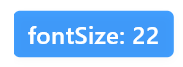
By setting the fontSize property, you can specify the size of the text. For example:
SemanticButton(
  text: 'fontSize: 22',
  fontSize: 22,
  onTap: () {},
  shrink: true,
),
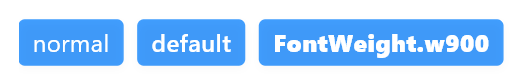
By using the fontWeight property, you can specify the thickness of the font, for example:
SemanticButton(
  text: 'normal',
  fontWeight: FontWeight.normal,
  onTap: () {},
),
const Gap(10),
SemanticButton(
  text: 'default',
  onTap: () {},
),
const Gap(10),
SemanticButton(
  text: 'FontWeight.w900',
  onTap: () {},
  fontWeight: FontWeight.w900,
),
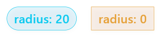
The radius parameter of SemanticButton is used to uniformly specify the radius of all four corners of the button. It is a double type parameter. By default, the radius parameter value is 4. In some scenarios, depending on your needs, you can manually adjust the corner radius of the button. For example:
SemanticButton(
  text: 'radius: 20',
  shrink: true,
  type: SemanticEnum.info,
  isOutlined: true,
  onTap: () {},
  radius: 20,
),
const Gap(20),
SemanticButton(
  text: 'radius: 0',
  shrink: true,
  type: SemanticEnum.warning,
  isOutlined: true,
  onTap: () {},
  radius: 0,
),
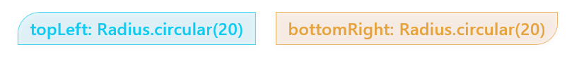
The borderRadius of SemanticButton is more flexible and can also be used to specify the radius of circular borders. For example, the following example demonstrates two buttons, each specifying rounded corners for their top-left and bottom-right corners:
SemanticButton(
  text: 'topLeft: Radius.circular(20)',
  borderRadius:
      const BorderRadius.only(topLeft: Radius.circular(20)),
  type: SemanticEnum.info,
  isOutlined: true,
  onTap: () {},
  radius: 20,
),
const Gap(20),
SemanticButton(
  text: 'bottomRight: Radius.circular(20)',
  borderRadius:
      const BorderRadius.only(bottomRight: Radius.circular(20)),
  type: SemanticEnum.warning,
  isOutlined: true,
  onTap: () {},
  radius: 20,
),
By using size enumerations, you can utilize preset sizes. For example:
SemanticButton(
  text: 'small',
  size: SizeEnum.small,
  type: SemanticEnum.info,
  onTap: () {},
),
const Gap(20),
SemanticButton(
  text: 'defaultSize',
  type: SemanticEnum.info,
  size: SizeEnum.defaultSize,
  onTap: () {},
),
const Gap(20),
SemanticButton(
  text: 'large',
  size: SizeEnum.large,
  type: SemanticEnum.info,
  onTap: () {},
),In addition to size enumerations, you can also specify the size of the button using specific numerical values. Once a numerical value is specified, the enumerated sizes automatically become inactive. An example of specifying size using numerical values is:
SemanticButton(
  text: 'Size By Button Height: 60',
  type: SemanticEnum.info,
  height: 60,
  shrink: true,
  onTap: () {},
),In the SemanticButton component, the shrink parameter controls the button's shrink behavior. When shrink is set to true, the button will adapt its width based on its content rather than occupying all available space. This is useful in certain cases, such as when you want to place multiple buttons side by side and want each button's width to match its content. Let's look at the effect of the shrink parameter through an example.
- When shrink is set to false (the default value), the button will occupy all available width provided by its parent container.
- In this case, the button's width is determined by the constraints of its parent container rather than its content.
- The button's content (text and icon) will be centered within the available space of the button.
Suppose the following button is in a Column, and there are no other widgets in this row:
SemanticButton(
  text: 'shrink = false',
  type: SemanticEnum.primary,
  onTap: () {},
),- When shrink is set to true, the button will adapt its width based on its content.
- The width of the button will be determined by the actual width of its content (text and icon) rather than occupying all available space.
- This means the button will shrink to fit the width required by its content.
Here's an example with shrink = true. Suppose the following button is in a Column, and there are no other widgets in this row:
SemanticButton(
  text: 'shrink = true',
  shrink: true,
  type: SemanticEnum.primary,
  onTap: () {},
),
Here's a comparison between the two:
- When shrink is set to true, the button will adapt its width based on its content.
- The width of the button will be determined by the actual width of its content (text and icon) rather than occupying all available space.
- This means the button will shrink to fit the width required by its content.
In SemanticButton, you can add a prefix icon using the prefixIcon property. This icon is displayed to the left of the button text and is typically used to enhance the button's semantics or provide visual cues. For example, a phone icon can be used on a "Call" button to visually indicate the button's function.
SemanticButton(
  text: "Call",
  onTap: () {},
  shrink: true,
  prefixIcon: Icon(Icons.phone),
  type: SemanticEnum.primary,
)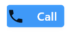
In the above code, Icon(Icons.phone) is passed as the prefixIcon to the SemanticButton, allowing users to visually identify this as a button for making phone calls.
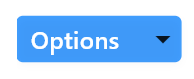
Similar to prefix icons, SemanticButton also supports suffix icons, set through the suffixIcon property. Suffix icons are displayed to the right of the button text and are suitable for indicating secondary actions or additional functionalities, such as an expand arrow or information icon.
SemanticButton(
  text: "Options",
  onTap: () {},
  shrink: true,
  suffixIcon: Icon(Icons.arrow_drop_down),
  type: SemanticEnum.primary,
)
In this example, Icon(Icons.arrow_drop_down) is set as the suffixIcon, indicating that this button may expand to show more options or a menu.
Whether it's a prefix icon or a suffix icon, the type is Widget?, which means you can flexibly use widgets as icons. In this way, the prefixIcon and suffixIcon properties of SemanticButton provide Flutter developers with a flexible way to design more expressive and functional user interfaces.
You can customize the color through the button's color parameter. The color parameter has higher priority. If a custom color is specified, the color effect brought by the type parameter will disappear. The following example demonstrates how to implement the color parameter.
SemanticButton(
  text: 'Colors.amber',
  shrink: true,
  color: Colors.amber,
  onTap: () {},
),
const Gap(40),
SemanticButton(
  text: 'Colors.amber',
  shrink: true,
  color: Colors.amber,
  isOutlined: true,
  onTap: () {},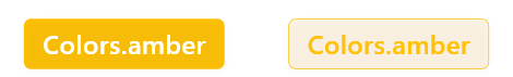
For a more visually appealing appearance, you can also specify button gradient colors through the gradient parameter. For example, the following example demonstrates two gradient color buttons:
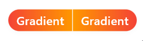
SemanticButton(
  text: 'Gradient',
  shrink: true,
  borderRadius: const BorderRadius.only(
    topLeft: Radius.circular(20),
    bottomLeft: Radius.circular(20),
  ),
  gradient: const LinearGradient(
    colors: [
      Colors.red,
      Colors.orange,
    ],
  ),
  onTap: () => print('Gradient1'),
),
const Gap(1),
SemanticButton(
  text: 'Gradient',
  shrink: true,
  borderRadius: const BorderRadius.only(
    topRight: Radius.circular(20),
    bottomRight: Radius.circular(20),
  ),
  gradient: const LinearGradient(
    colors: [
      Colors.orange,
      Colors.red,
    ],
  ),
  onTap: () => print('Gradient2'),
),
Button groups in the Widgets Easier component library are collections of multiple SemanticButtons. They have unified semantics and are arranged closely together.
ButtonGroup(
  buttons: [
    SemanticButton(
        text: 'Button 1', onTap: () => print('Button 1 pressed')),
    SemanticButton(
        text: 'Button 2', onTap: () => print('Button 2 pressed')),
    SemanticButton(
        text: 'Button 3', onTap: () => print('Button 3 pressed')),
    SemanticButton(
        text: 'Button 4', onTap: () => print('Button 4 pressed')),
  ],
  type: SemanticEnum.primary,
  size: SizeEnum.defaultSize,
)
In ButtonGroup, the event callback function for each button is directly specified on the onTap property of SemanticButton. Similarly, the text for each individual button is directly specified through the text parameter of each SemanticButton.
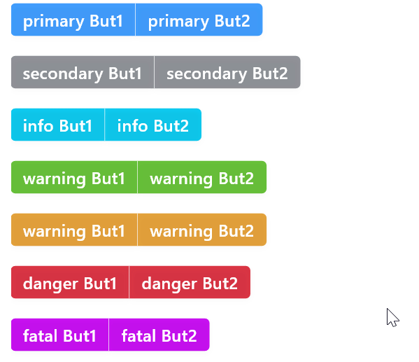
Similar to SemanticButton, you can also specify different type properties for ButtonGroup to obtain button groups with different symbolic colors representing different meanings. For example:
ButtonGroup(
  buttons: [
    SemanticButton(
        text: 'primary But1',
        onTap: () => print('primary But1 pressed')),
    SemanticButton(
        text: 'primary But2',
        onTap: () => print('primary But2 pressed')),
  ],
  type: SemanticEnum.primary,
),
const Gap(20),
ButtonGroup(
  buttons: [
    SemanticButton(
        text: 'secondary But1',
        onTap: () => print('secondary But1 pressed')),
    SemanticButton(
        text: 'secondary But2',
        onTap: () => print('secondary But2 pressed')),
  ],
  type: SemanticEnum.secondary,
),
const Gap(20),
ButtonGroup(
  buttons: [
    SemanticButton(
        text: 'info But1', onTap: () => print('info But1 pressed')),
    SemanticButton(
        text: 'info But2', onTap: () => print('info But2 pressed')),
  ],
  type: SemanticEnum.info,
),
const Gap(20),
ButtonGroup(
  buttons: [
    SemanticButton(
        text: 'warning But1',
        onTap: () => print('warning But1 pressed')),
    SemanticButton(
        text: 'warning But2',
        onTap: () => print('warning But2 pressed')),
  ],
  type: SemanticEnum.success,
),
const Gap(20),
ButtonGroup(
  buttons: [
    SemanticButton(
        text: 'warning But1',
        onTap: () => print('warning But1 pressed')),
    SemanticButton(
        text: 'warning But2',
        onTap: () => print('warning But2 pressed')),
  ],
  type: SemanticEnum.warning,
),
const Gap(20),
ButtonGroup(
  buttons: [
    SemanticButton(
        text: 'danger But1', onTap: () => print('danger But1 pressed')),
    SemanticButton(
        text: 'danger But2', onTap: () => print('danger But2 pressed')),
  ],
  type: SemanticEnum.danger,
),
const Gap(20),
ButtonGroup(
  buttons: [
    SemanticButton(
        text: 'fatal But1', onTap: () => print('fatal But1 pressed')),
    SemanticButton(
        text: 'fatal But2', onTap: () => print('fatal But2 pressed')),
  ],
  type: SemanticEnum.fatal,
),
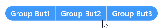
You can manually modify the corner radius of the button group by specifying the radius property for the button group. If not specified, the default corner radius is 4. An example of manually specifying the button group corner radius is as follows:
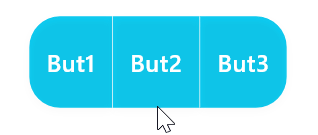
ButtonGroup(
  radius: 20,
  buttons: [
    SemanticButton(text: 'Group But1', onTap: () {}),
    SemanticButton(text: 'Group But2', onTap: () => {}),
    SemanticButton(text: 'Group But3', onTap: () => {}),
  ],
)
Similar to SemanticButton, ButtonGroup can also specify sizes using enumeration sizes and numerical sizes.
Enumeration size values can be used to specify the size of the button group. For example: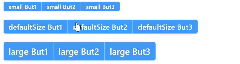
Numeric sizes provide a more flexible way to specify sizes. Once a numeric size is used, the specified enumeration size will automatically become inactive. You can specify numeric sizes using the height property, for example:
ButtonGroup(
  radius: 20,
  type: SemanticEnum.info,
  height: 60,
  buttons: [
    SemanticButton(text: 'But1', onTap: () {}),
    SemanticButton(text: 'But2', onTap: () => {}),
    SemanticButton(text: 'But3', onTap: () => {}),
  ],
)
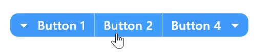
While ButtonGroup can contain multiple SemanticButtons, only the first button in ButtonGroup can have a prefix icon and the last button can have a suffix icon. This is straightforward to implement, simply by specifying the prefixIcon parameter or suffixIcon parameter for the ButtonGroup. For example:
ButtonGroup(
  radius: 10,
  prefixIcon: const Icon(
    Icons.arrow_drop_down,
    color: Colors.white,
  ),
  suffixIcon: const Icon(
    Icons.arrow_drop_down,
    color: Colors.white,
  ),
  buttons: [
    SemanticButton(
      text: 'Button 1',
      onTap: () {},
    ),
    SemanticButton(
      text: 'Button 2',
      onTap: () {},
    ),
    SemanticButton(
      text: 'Button 4',
      onTap: () {},
    ),
  ],
  type: SemanticEnum.primary,
  size: SizeEnum.defaultSize,
)
Similar to SemanticButton, you can specify the shrink behavior for ButtonGroup. This is particularly useful in situations where you need a single button group to occupy the full container width. For example, specifying the shrink parameter value as false to make the button group occupy the entire row:
ButtonGroup(
  shrink: false,
  radius: 10,
  prefixIcon: const Icon(
    Icons.arrow_drop_down,
    color: Colors.white,
  ),
  suffixIcon: const Icon(
    Icons.arrow_drop_down,
    color: Colors.white,
  ),
  buttons: [
    SemanticButton(
      text: 'Button 1',
      onTap: () {},
    ),
    SemanticButton(
      text: 'Button 2',
      onTap: () {},
    ),
    SemanticButton(
      text: 'Button 4',
      onTap: () {},
    ),
  ],
  type: SemanticEnum.primary,
  size: SizeEnum.defaultSize,
),
The running result is as follows:

ButtonGroup is a whole composed of multiple SemanticButtons organized in a certain way. You can specify more parameters for SemanticButtons in ButtonGroup—there are no syntax errors here. However, not every parameter of SemanticButton will take effect in ButtonGroup because the buttons in the group need to be managed in their own way. The main parameters that can be specified are the text and callback events for each button because these parameters do not belong to the whole but are specific to each unit.
The type parameter of the Tag component allows for the utilization of semantic colors. For example:
const Row(
  mainAxisAlignment: MainAxisAlignment.spaceAround,
  children: [
    Tag('tag', type: SemanticEnum.primary),
    Tag('tag', type: SemanticEnum.secondary),
    Tag('tag', type: SemanticEnum.info),
    Tag('tag', type: SemanticEnum.success),
    Tag('tag', type: SemanticEnum.warning),
    Tag('tag', type: SemanticEnum.danger),
    Tag('tag', type: SemanticEnum.fatal),
  ],
),
The running result is as follows:

Inspired by Element-plus, Tag has three style themes: plain, light, and dark. By default, it is set to plain, as demonstrated in the previous section. Below are examples of the light and dark themes:
const Row(
  mainAxisAlignment: MainAxisAlignment.spaceAround,
  children: [
    Tag('tag', theme: TagThemeEnum.light, type: SemanticEnum.primary),
    Tag('tag', theme: TagThemeEnum.light, type: SemanticEnum.secondary),
    Tag('tag', theme: TagThemeEnum.light, type: SemanticEnum.info),
    Tag('tag', theme: TagThemeEnum.light, type: SemanticEnum.success),
    Tag('tag', theme: TagThemeEnum.light, type: SemanticEnum.warning),
    Tag('tag', theme: TagThemeEnum.light, type: SemanticEnum.danger),
    Tag('tag', theme: TagThemeEnum.light, type: SemanticEnum.fatal),
  ],
),
The running result is as follows:

const Row(
  mainAxisAlignment: MainAxisAlignment.spaceAround,
  children: [
    Tag('tag', theme: TagThemeEnum.dark, type: SemanticEnum.primary),
    Tag('tag', theme: TagThemeEnum.dark, type: SemanticEnum.secondary),
    Tag('tag', theme: TagThemeEnum.dark, type: SemanticEnum.info),
    Tag('tag', theme: TagThemeEnum.dark, type: SemanticEnum.success),
    Tag('tag', theme: TagThemeEnum.dark, type: SemanticEnum.warning),
    Tag('tag', theme: TagThemeEnum.dark, type: SemanticEnum.danger),
    Tag('tag', theme: TagThemeEnum.dark, type: SemanticEnum.fatal),
  ],
),
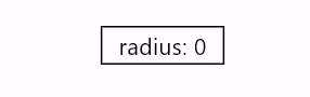
By default, there is a radius of 4 for corners. To manually modify this, you can specify the radius parameter. The radius parameter accepts a double value. For example, setting radius to 0 will remove the rounded corners:
Tag('radius: 0', radius: 0),The running result is as follows:
For example:
Tag('SizeEnum.small', size: SizeEnum.small),
Tag('SizeEnum.defaultSize', size: SizeEnum.defaultSize),
Tag('SizeEnum.large', size: SizeEnum.large),
The running result is as follows:

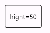
You can specify a numeric value as the size using the height parameter. Once the height is specified, the size parameter becomes ineffective. For example, specifying a height of 50:
Tag('hignt=50', height: 50),The running result is as follows:
By setting the shrink property to false, you can make a tag occupy as much space as possible on a single line. For example:
Tag('shrink: false', shrink: false)The running result is as follows:

By specifying closable: true, a close icon will be displayed. For example:
const Row(
  mainAxisAlignment: MainAxisAlignment.spaceAround,
  children: [
    Tag('tag', closable: true, type: SemanticEnum.primary),
    Tag('tag', closable: true, type: SemanticEnum.secondary),
    Tag('tag', closable: true, type: SemanticEnum.info),
    Tag('tag', closable: true, type: SemanticEnum.success),
    Tag('tag', closable: true, type: SemanticEnum.warning),
    Tag('tag', closable: true, type: SemanticEnum.danger),
    Tag('tag', closable: true, type: SemanticEnum.fatal),
  ],
),
The running result is as follows:

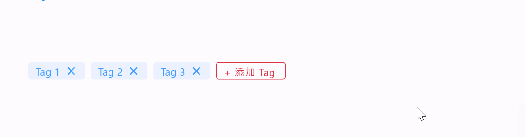
Dynamic editing of tags can be achieved by triggering the onClose event after clicking the close button on the tag. For example:
import 'package:flutter/material.dart';
import 'package:widgets_easier/widgets_easier.dart';

class DynamicTagsExample extends StatefulWidget {
  const DynamicTagsExample({super.key});

  @override
  State<DynamicTagsExample> createState() => _DynamicTagsExampleState();
}

class _DynamicTagsExampleState extends State<DynamicTagsExample> {
  final List<String> _tags = ['Tag 1', 'Tag 2', 'Tag 3'];
  final String _newTagButtonText = '+ 添加 Tag';

  void _handleClose(int index) {
    setState(() {
      _tags.removeAt(index);
    });
  }

  void _handleSubmitted(String value) {
    if (value.isNotEmpty) {
      setState(() {
        _tags.add(value);
      });
    }
  }

  @override
  Widget build(BuildContext context) {
    return Wrap(
      spacing: 8,
      runSpacing: 8,
      children: [
        Text('$_tags'),
        for (int index = 0; index < _tags.length; index++)
          Tag(
            key: UniqueKey(), // 重要
            _tags[index],
            type: SemanticEnum.primary,
            theme: TagThemeEnum.light,
            closable: true,
            onClose: (_) {
              _handleClose(index);
            },
          ),
        Tag(
          _newTagButtonText,
          type: SemanticEnum.danger,
          editable: true,
          restoreAfterSubmitted: true,
          onSubmitted: _handleSubmitted,
        ),
      ],
    );
  }
}
The running result is as follows:
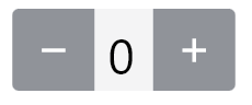
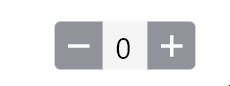
CounterInput is a Flutter widget for numerical input and adjustment. It provides an intuitive interface that allows users to change the current value by clicking plus and minus buttons or directly inputting numbers. This component includes the following features:
- Supports increasing or decreasing the current value by clicking plus and minus buttons.
- Supports directly inputting numbers in the text field.
- Customizable minimum value, maximum value, and step size.
- Customizable styles, including size, color, and border style.
- Provides multiple callback events for monitoring value changes and boundary conditions.
- Supports continuous value change by long-pressing plus and minus buttons.
- Supports disabling and enabling component interaction.
Like other components, you can specify semantic enumeration values through the type property to obtain different semantic colors. For example:
CounterInput(type: SemanticEnum.primary)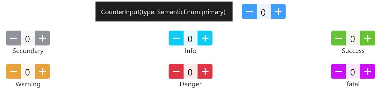
If you want to specify the colors of each part more flexibly, that's also possible. Specifically, there are the following color parameters:
- iconColor: Color of the plus and minus icons
- backgroundColor: Background color of the input field
- buttonColor: Color of the buttons
- textColor: Text color of the input field
Here's an example:
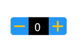
const CounterInput(
  size: SizeEnum.small,
  iconColor: Colors.amber,
  backgroundColor: Colors.black,
  buttonColor: Colors.blue,
  textColor: Colors.white,
)
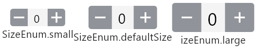
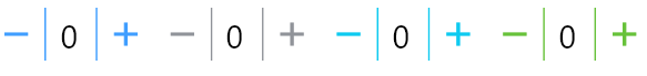
You can specify enumeration sizes through the size parameter, including SizeEnum.small, SizeEnum.defaultSize, and SizeEnum.large. If not specified, the default is SizeEnum.defaultSize. For example:
Row(
  children: [
    Column(
      children: [
        CounterInput(
          size: SizeEnum.small,
          controller: CounterInputController(),
        ),
        const Text('SizeEnum.small'),
      ],
    ),
    Column(
      children: [
        CounterInput(
          size: SizeEnum.defaultSize,
          controller: CounterInputController(),
        ),
        const Text('SizeEnum.defaultSize'),
      ],
    ),
    Column(
      children: [
        CounterInput(
          size: SizeEnum.large,
          controller: CounterInputController(),
        ),
        const Text('izeEnum.large'),
      ],
    ),
  ],
),
If enumeration sizes cannot meet your requirements, you can also specify numerical values:
CounterInput(
  height: 50,
  controller: CounterInputController(),
),
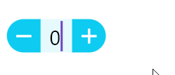
By setting the value of isOutlined to true, you can set the counter as an outline style. For example:
Row(
  children: [
    CounterInput(
      type: SemanticEnum.primary,
      controller: CounterInputController(),
      isOutlined: true,
    ),
    CounterInput(
      type: SemanticEnum.secondary,
      controller: CounterInputController(),
      isOutlined: true,
    ),
    CounterInput(
      type: SemanticEnum.info,
      controller: CounterInputController(),
      isOutlined: true,
    ),
    CounterInput(
      type: SemanticEnum.success,
      controller: CounterInputController(),
      isOutlined: true,
    ),
  ],
),
You can easily set the counter with rounded corners using the radius property, for example:
const CounterInput(
  type: SemanticEnum.info,
  radius: 20,
  step: 3,
)
By default, the width is automatic, and the width of the counter's text input area increases as the number of digits increases. However, you can also specify a fixed width for the text input area. For example:
CounterInput(
  textFieldWidth: 60,
  controller: CounterInputController(),
),The increment callback is used to listen for value increase events, triggered when the value increases; similarly, the decrement callback is used to listen for decrease events, triggered when the value decreases.
- The
onIncrementcallback is used to monitor value increase events. - The
onDecrementcallback is used to monitor value decrease events.
In the following example, with an initial value of 7 and a step of 2, when incrementing or decrementing, the new and old values are printed on the console:
CounterInput(
  controller: CounterInputController(initialValue: 7),
  step: 2,
  onIncrement: (oldValue, value) {
    debugPrint("+增加前为$oldValue;增加后为:$value");
  },
  onDecrement: (oldValue, value) {
    debugPrint("-减少前为$oldValue;减少后为:$value");
  },
),
Note: Specifying an initial value requires using the CounterInputController controller, as shown in this example.
The counter has a maximum value and a minimum value, with the default minimum value being 0 and the maximum value being 100. When it reaches the minimum value, the minimum value callback is triggered. The following example demonstrates executing the relevant callbacks when reaching the maximum/minimum values. Here, the maximum value is set to 10, the minimum value to 1, the initial value to 6, and the step to 2. A popup message appears whenever the minimum or maximum value is reached.
CounterInput(
  type: SemanticEnum.primary,
  minValue: 1,
  maxValue: 10,
  controller: CounterInputController(),
  step: 1,
  onIncrement: (oldValue, value) {
    debugPrint("+Increasing from $oldValue to $value");
  },
  onDecrement: (oldValue, value) {
    debugPrint("-Decreasing from $oldValue to $value");
  },
  onMax: () => InfoDialogs.show(
    context,
    message: 'Reached maximum value',
    type: SemanticEnum.primary,
    onTapDismiss: () => Navigator.of(context).pop(),
  ),
  onMin: () => InfoDialogs.show(
    context,
    message: 'Reached minimum value',
    type: SemanticEnum.fatal,
    onTapDismiss: () => Navigator.of(context).pop(),
  ),
)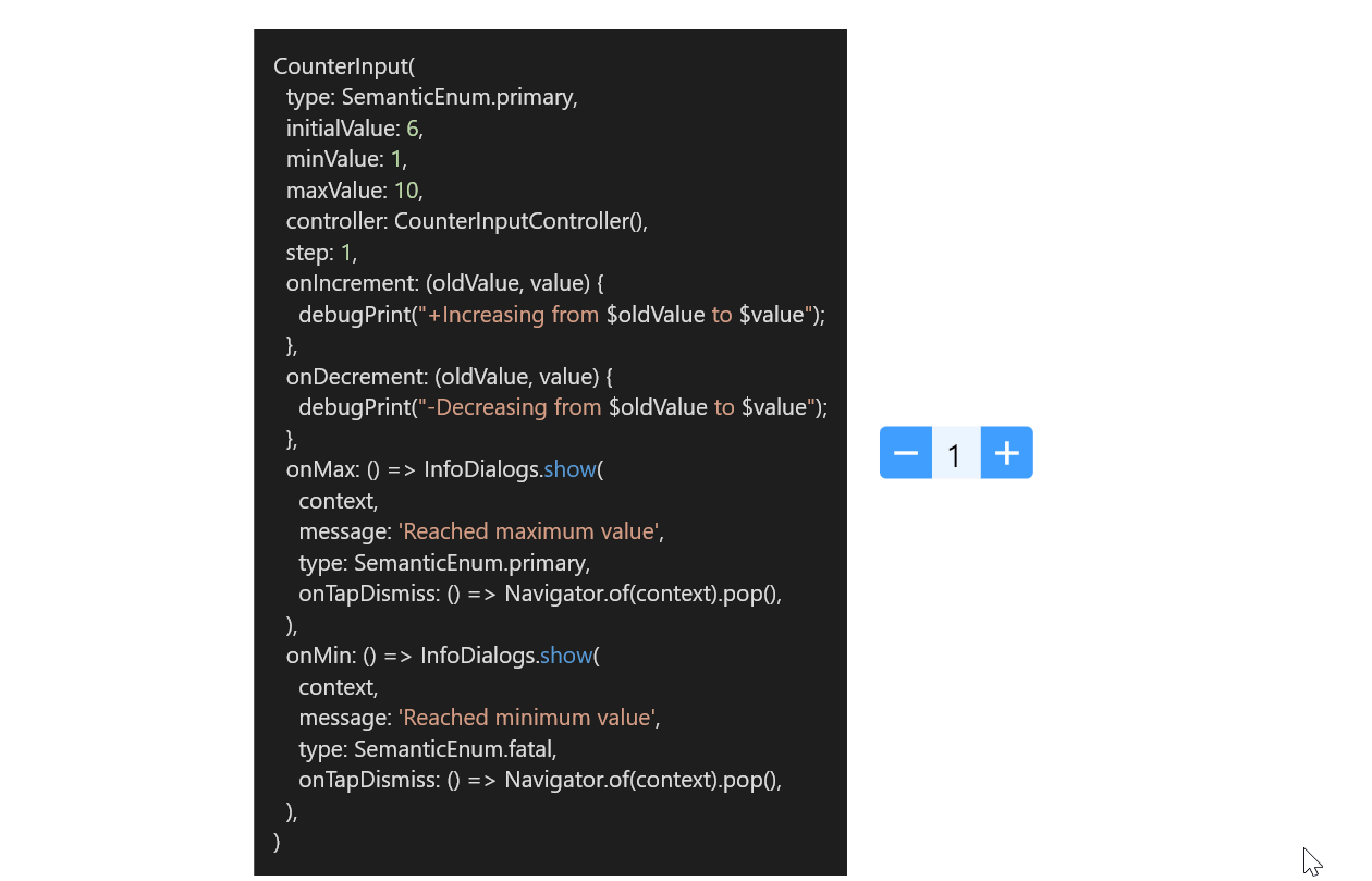
Through this example, it can be observed that onMax and onMin are only called when reaching the maximum or minimum values, but they are not called if attempting to continue clicking the buttons beyond those limits. Using the GIF image above as an example, when incrementing to 10, the onMax method will be called, but attempting to increment further beyond 10 will not be handled.
The overflow callback is used to respond to scenarios where operations continue beyond the maximum value when incrementing or beyond the minimum value when decrementing. For example:
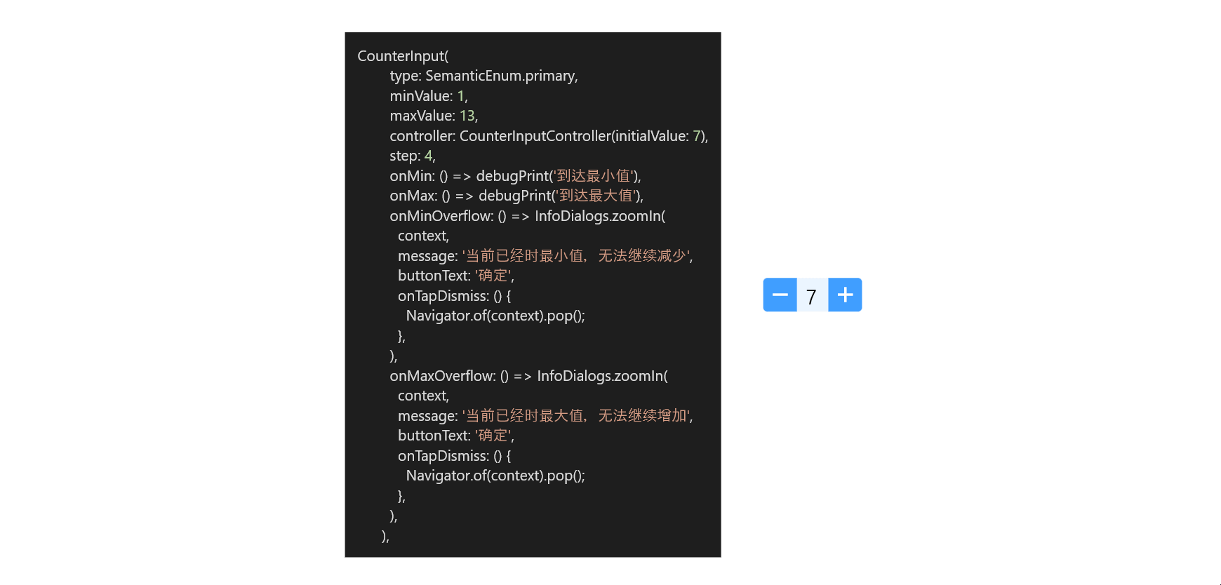
CounterInput(
  type: SemanticEnum.primary,
  minValue: 1,
  maxValue: 13,
  controller: CounterInputController(initialValue: 7),
  step: 4,
  onMinOverflow: () => InfoDialogs.zoomIn(
    context,
    message: '当前已经时最小值,无法继续减少',
    buttonText: '确定',
    onTapDismiss: () {
      Navigator.of(context).pop();
    },
  ),
  onMaxOverflow: () => InfoDialogs.zoomIn(
    context,
    message: '当前已经时最大值,无法继续增加',
    buttonText: '确定',
    onTapDismiss: () {
      Navigator.of(context).pop();
    },
  ),
)
CounterInput(
  onValueChanged: (oldValue, newValue) {
    print('oldValue is $oldValue, newValue is $newValue');
  },
)
The corresponding clicks in the image result in the following console output:
flutter: oldValue is 0.0, newValue is 1.0
flutter: oldValue is 1.0, newValue is 2.0
flutter: oldValue is 2.0, newValue is 3.0
flutter: oldValue is 3.0, newValue is 4.0
flutter: oldValue is 4.0, newValue is 5.0
flutter: oldValue is 5.0, newValue is 6.0
flutter: oldValue is 6.0, newValue is 7.0
flutter: oldValue is 7.0, newValue is 6.0
flutter: oldValue is 6.0, newValue is 5.0
flutter: oldValue is 5.0, newValue is 4.0
flutter: oldValue is 4.0, newValue is 3.0
flutter: oldValue is 3.0, newValue is 2.0
flutter: oldValue is 2.0, newValue is 1.0
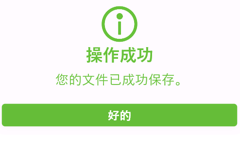
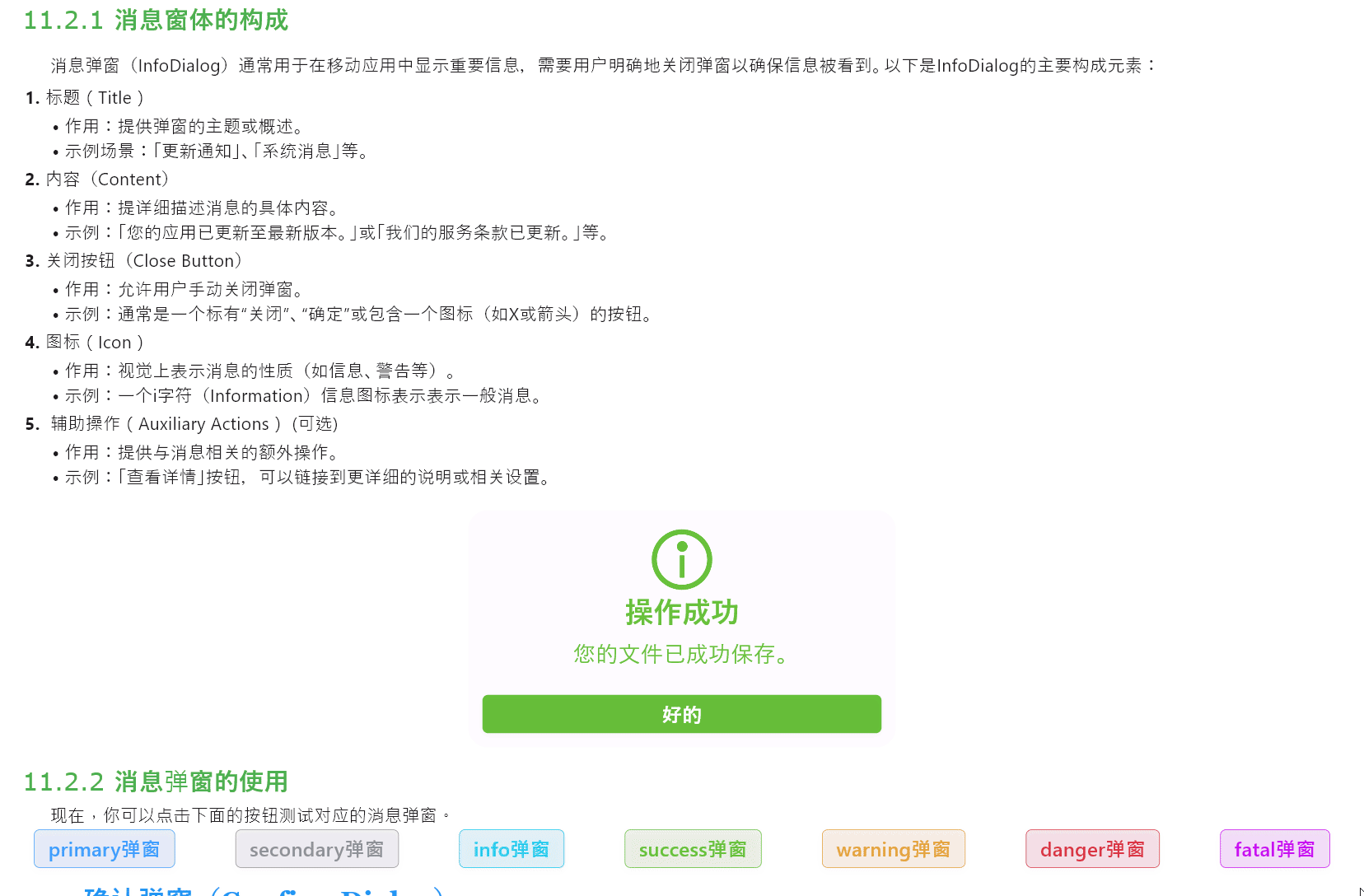
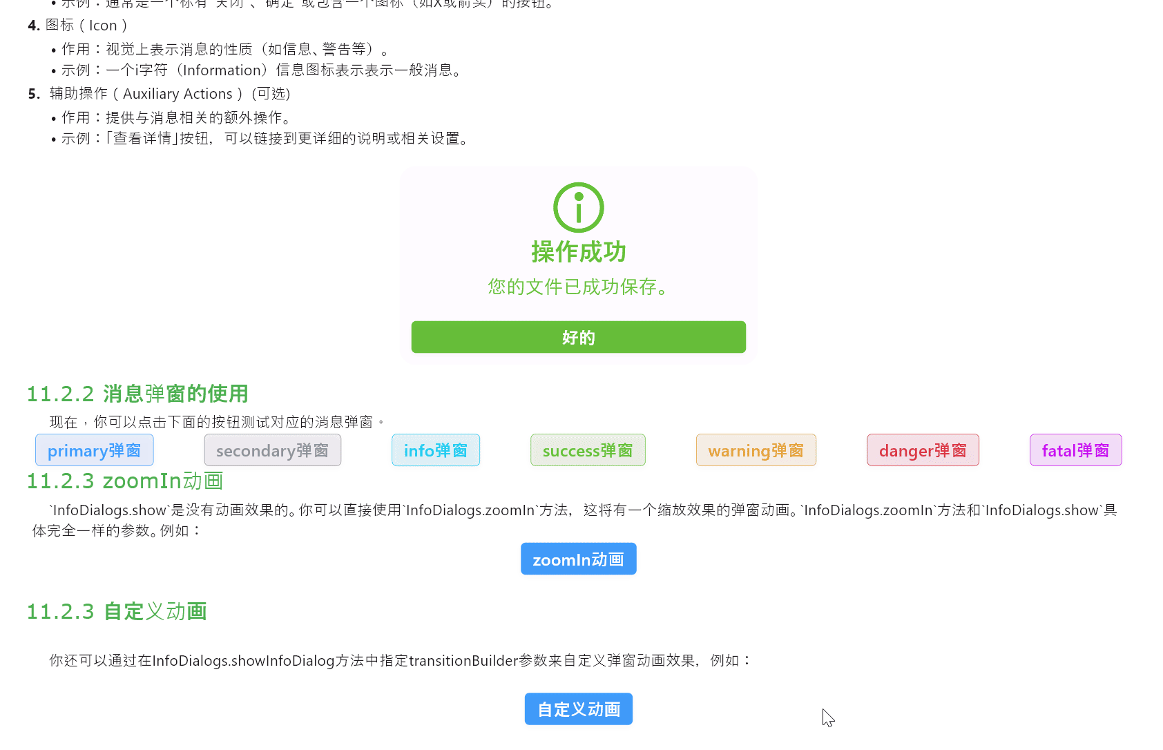
flutter: oldValue is 1.0, newValue is 0.0Message pop-up windows (InfoDialogs) are typically used in mobile applications to display important information that requires users to explicitly close the window to ensure the information is seen. The main components of an InfoDialog are as follows:
- Icon (optional)
- Title
- Content
- Close Button
InfoDialogs are a type of message-style pop-up window that typically contains only one button. You can specify a type attribute for InfoDialogs, which gives it semantic color. The appearance of the pop-up window is as follows:
例如:
Row(
  mainAxisAlignment: MainAxisAlignment.spaceAround,
  children: [
    SemanticButton(
      text: 'primary弹窗',
      type: SemanticEnum.primary,
      isOutlined: true,
      onTap: () => InfoDialogs.show(
        context,
        title: "你好啊!",
        message: "这是一个primary消息弹窗",
        buttonText: "我知道了",
        onTapDismiss: () {
          Navigator.of(context).pop();
        },
        type: SemanticEnum.primary,
      ),
    ),
    const Gap(10),
    SemanticButton(
      text: 'secondary弹窗',
      type: SemanticEnum.secondary,
      isOutlined: true,
      onTap: () => InfoDialogs.show(
        context,
        title: "你好啊!",
        message: "这是一个secondary消息弹窗",
        buttonText: "我知道了",
        onTapDismiss: () {
          Navigator.of(context).pop();
        },
        type: SemanticEnum.secondary,
      ),
    ),
    const Gap(10),
    SemanticButton(
      text: 'info弹窗',
      type: SemanticEnum.info,
      isOutlined: true,
      onTap: () => InfoDialogs.show(
        context,
        title: "你好啊!",
        message: "这是一个info消息弹窗",
        buttonText: "我知道了",
        onTapDismiss: () {
          Navigator.of(context).pop();
        },
        type: SemanticEnum.info,
      ),
    ),
    const Gap(10),
    SemanticButton(
      text: 'success弹窗',
      type: SemanticEnum.success,
      isOutlined: true,
      onTap: () => InfoDialogs.show(
        context,
        title: "你好啊!",
        message: "这是一个success消息弹窗",
        buttonText: "我知道了",
        onTapDismiss: () {
          Navigator.of(context).pop();
        },
        type: SemanticEnum.success,
      ),
    ),
    const Gap(10),
    SemanticButton(
      text: 'warning弹窗',
      type: SemanticEnum.warning,
      isOutlined: true,
      onTap: () => InfoDialogs.show(
        context,
        title: "你好啊!",
        message: "这是一个warning消息弹窗",
        buttonText: "我知道了",
        onTapDismiss: () {
          Navigator.of(context).pop();
        },
        type: SemanticEnum.warning,
      ),
    ),
    const Gap(10),
    SemanticButton(
      text: 'danger弹窗',
      type: SemanticEnum.danger,
      isOutlined: true,
      onTap: () => InfoDialogs.show(
        context,
        title: "你好啊!",
        message: "这是一个danger消息弹窗",
        buttonText: "我知道了",
        onTapDismiss: () {
          Navigator.of(context).pop();
        },
        type: SemanticEnum.danger,
      ),
    ),
    const Gap(10),
    SemanticButton(
      text: 'fatal弹窗',
      type: SemanticEnum.fatal,
      isOutlined: true,
      onTap: () => InfoDialogs.show(
        context,
        title: "你好啊!",
        message: "这是一个fatal消息弹窗",
        buttonText: "我知道了",
        onTapDismiss: () {
          Navigator.of(context).pop();
        },
        type: SemanticEnum.fatal,
      ),
    ),
  ],
)
The InfoDialogs.show method does not have an animation effect. You can directly use the InfoDialogs.zoomIn method, which provides a pop-up animation with scaling effect. The InfoDialogs.zoomIn method takes exactly the same parameters as InfoDialogs.show. For example:
SemanticButton(
  text: 'zoomIn动画',
  shrink: true,
  onTap: () => InfoDialogs.zoomIn(
    context,
    title: "你好啊!",
    message: "这是一个fatal消息弹窗",
    buttonText: "我知道了",
    onTapDismiss: () {
      Navigator.of(context).pop();
    },
  ),
)
The running result is as follows:
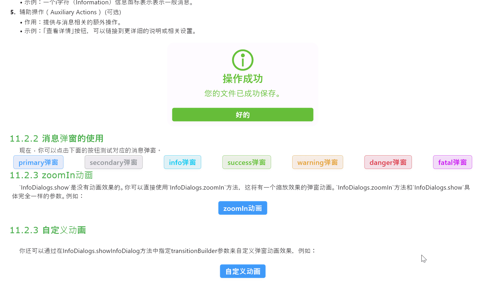
You can also customize the pop-up animation effect by specifying the transitionBuilder parameter in the InfoDialogs.showInfoDialog method, for example:
SemanticButton(
  text: '自定义动画',
  shrink: true,
  onTap: () => InfoDialogs.showInfoDialog(
    context,
    title: "你好啊!",
    message: "这是一个消息弹窗",
    buttonText: "我知道了",
    transitionBuilder:
        (context, animation, secondaryAnimation, child) {
      return AnimateStyles.backInDown(animation, child);
    },
    onTapDismiss: () {
      Navigator.of(context).pop();
    },
  ),
)
Note: The
AnimateStyles.backInDownanimation used here needs to be installed separately.flutter pub add flutter_easy_animations
The running result is as follows:
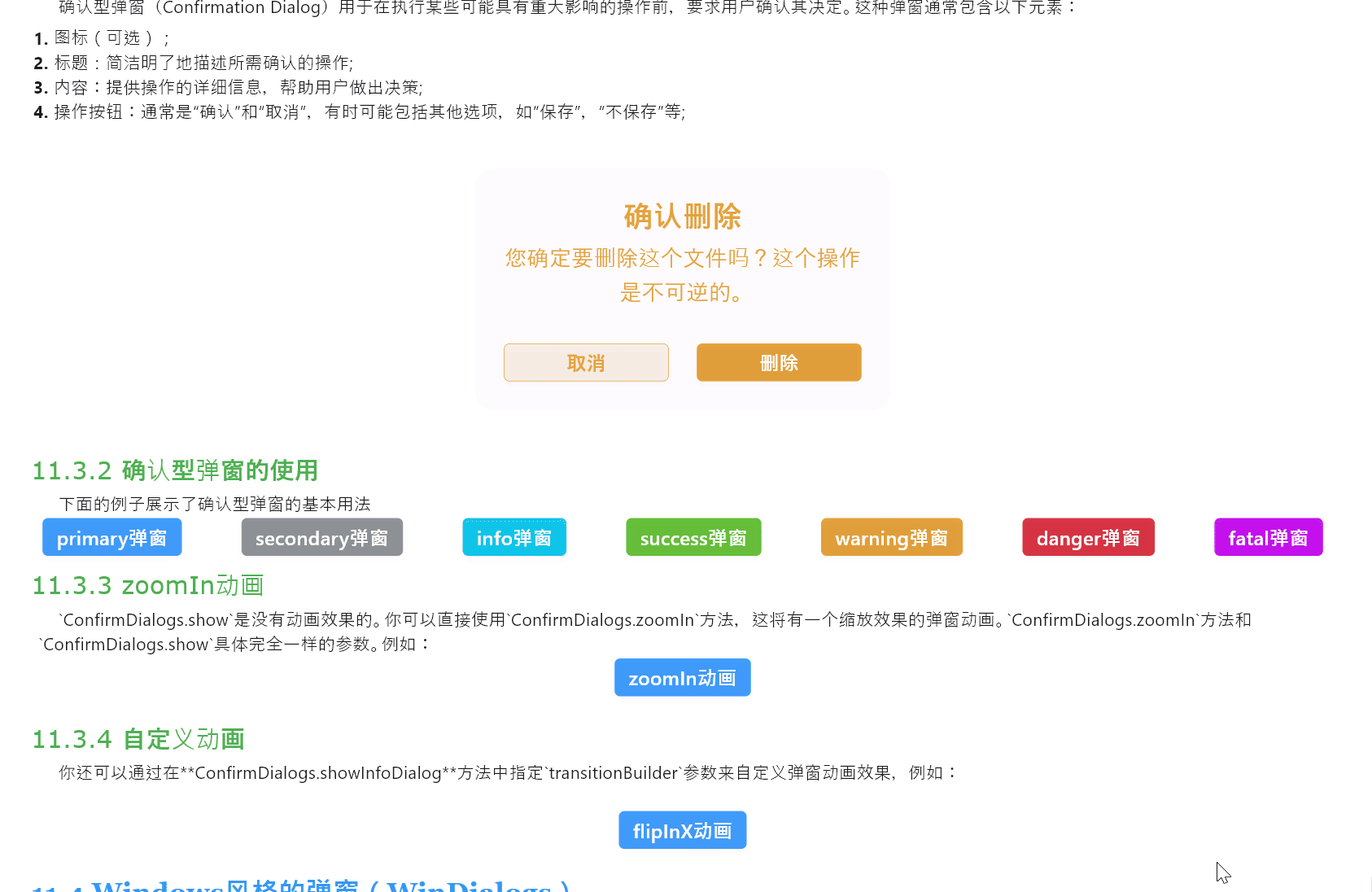
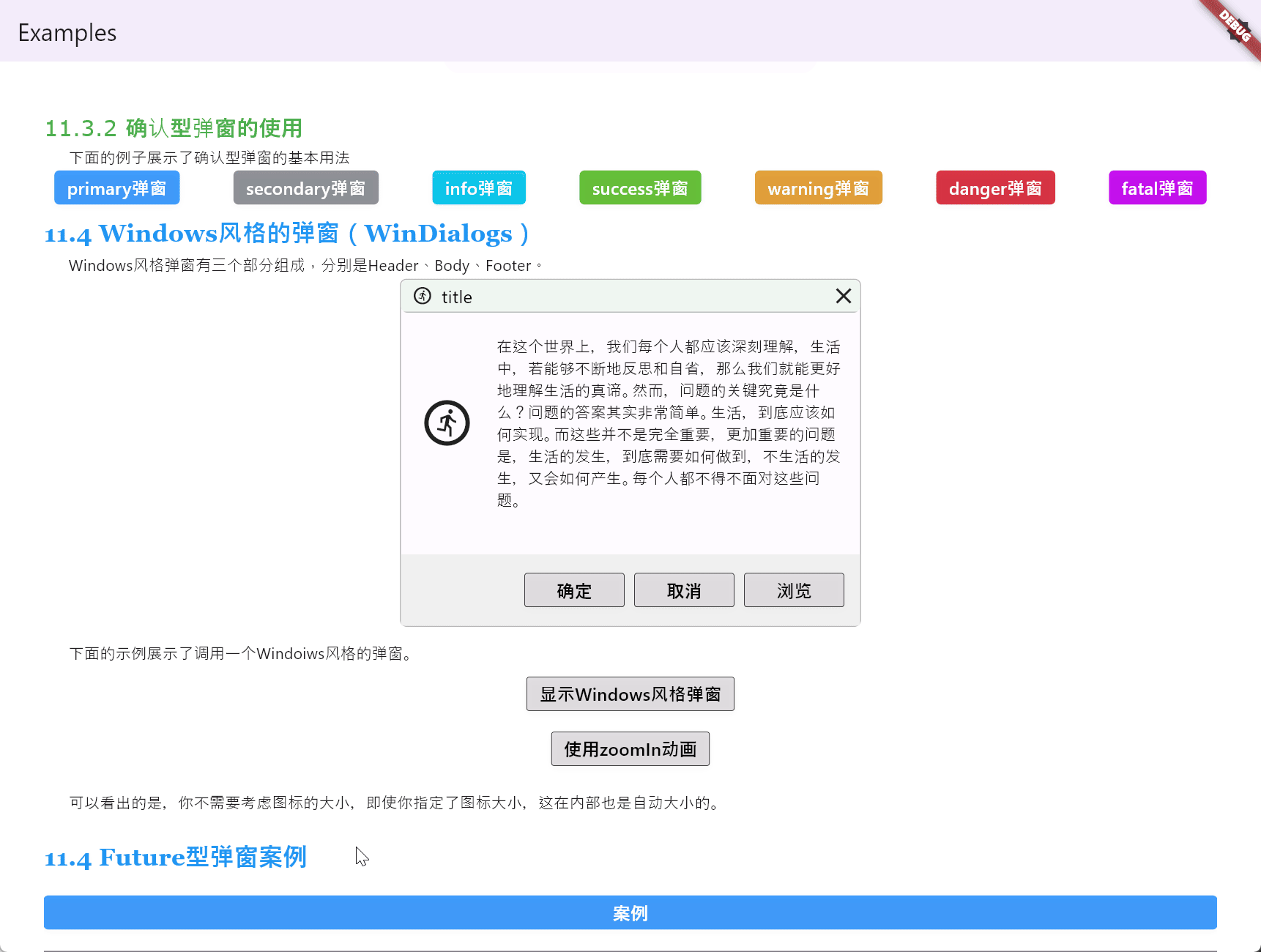
Confirmation Dialogs are used to request user confirmation before performing actions that may have significant consequences. These pop-up windows typically contain the following elements:
- Icon (optional)
- Title: Clearly describes the action requiring confirmation.
- Content: Provides detailed information about the action to help the user make a decision.
- Action Buttons: Typically include "Confirm" and "Cancel", sometimes may include other options such as "Save", "Don't Save", etc.
The appearance of the pop-up window is as follows:
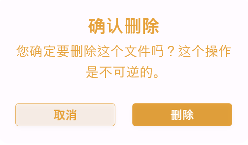
You can specify a type attribute for ConfirmDialogs, which gives it semantic color. The appearance of the pop-up window is as follows:
For example:
Row(
  mainAxisAlignment: MainAxisAlignment.spaceAround,
  children: [
    SemanticButton(
      text: 'primary弹窗',
      type: SemanticEnum.primary,
      onTap: () => ConfirmDialogs.show(
        context,
        title: "你确定吗",
        message: "这个是primary确认弹窗",
        confirmButtonText: "确定",
        cancelButtonText: "真的确定",
        onTapCancel: () {
          Navigator.of(context).pop();
        },
        onTapConfirm: () {
          Navigator.of(context).pop();
        },
        type: SemanticEnum.primary,
      ),
    ),
    const Gap(10),
    SemanticButton(
      text: 'secondary弹窗',
      type: SemanticEnum.secondary,
      onTap: () => ConfirmDialogs.show(
        context,
        title: "你确定吗",
        message: "这个是secondary确认弹窗",
        confirmButtonText: "确定",
        cancelButtonText: "真的确定",
        onTapCancel: () {
          Navigator.of(context).pop();
        },
        onTapConfirm: () {
          Navigator.of(context).pop();
        },
        type: SemanticEnum.secondary,
      ),
    ),
    const Gap(10),
    SemanticButton(
      text: 'info弹窗',
      type: SemanticEnum.info,
      onTap: () => ConfirmDialogs.show(
        context,
        title: "你确定吗",
        message: "这个是info确认弹窗",
        confirmButtonText: "确定",
        cancelButtonText: "真的确定",
        onTapCancel: () {
          Navigator.of(context).pop();
        },
        onTapConfirm: () {
          Navigator.of(context).pop();
        },
        type: SemanticEnum.info,
      ),
    ),
    const Gap(10),
    SemanticButton(
      text: 'success弹窗',
      type: SemanticEnum.success,
      onTap: () => ConfirmDialogs.show(
        context,
        title: "你确定吗",
        message: "这个是success确认弹窗",
        confirmButtonText: "确定",
        cancelButtonText: "真的确定",
        onTapCancel: () {
          Navigator.of(context).pop();
        },
        onTapConfirm: () {
          Navigator.of(context).pop();
        },
        type: SemanticEnum.success,
      ),
    ),
    const Gap(10),
    SemanticButton(
      text: 'warning弹窗',
      type: SemanticEnum.warning,
      onTap: () => ConfirmDialogs.show(
        context,
        title: "你确定吗",
        message: "这个是warning确认弹窗",
        confirmButtonText: "确定",
        cancelButtonText: "真的确定",
        onTapCancel: () {
          Navigator.of(context).pop();
        },
        onTapConfirm: () {
          Navigator.of(context).pop();
        },
        type: SemanticEnum.warning,
      ),
    ),
    const Gap(10),
    SemanticButton(
      text: 'danger弹窗',
      type: SemanticEnum.danger,
      onTap: () => ConfirmDialogs.show(
        context,
        title: "你确定吗",
        message: "这个是danger确认弹窗",
        confirmButtonText: "确定",
        cancelButtonText: "真的确定",
        onTapCancel: () {
          Navigator.of(context).pop();
        },
        onTapConfirm: () {
          Navigator.of(context).pop();
        },
        type: SemanticEnum.danger,
      ),
    ),
    const Gap(10),
    SemanticButton(
      text: 'fatal弹窗',
      type: SemanticEnum.fatal,
      onTap: () => ConfirmDialogs.show(
        context,
        title: "你确定吗",
        message: "这个是fatal确认弹窗",
        confirmButtonText: "确定",
        cancelButtonText: "真的确定",
        onTapCancel: () {
          Navigator.of(context).pop();
        },
        onTapConfirm: () {
          Navigator.of(context).pop();
        },
        type: SemanticEnum.fatal,
      ),
    ),
  ],
)The ConfirmDialogs.show method does not have an animation effect. You can directly use the ConfirmDialogs.zoomIn method, which provides a pop-up animation with a scaling effect. The ConfirmDialogs.zoomIn method takes exactly the same parameters as ConfirmDialogs.show. For example:
SemanticButton(
  text: 'zoomIn动画',
  shrink: true,
  onTap: () => ConfirmDialogs.zoomIn(
    context,
    title: "你确定吗",
    message: "这个是确认弹窗",
    confirmButtonText: "确定",
    cancelButtonText: "真的确定",
    onTapCancel: () {
      Navigator.of(context).pop();
    },
    onTapConfirm: () {
      Navigator.of(context).pop();
    },
  ),
)
The running result is as follows:
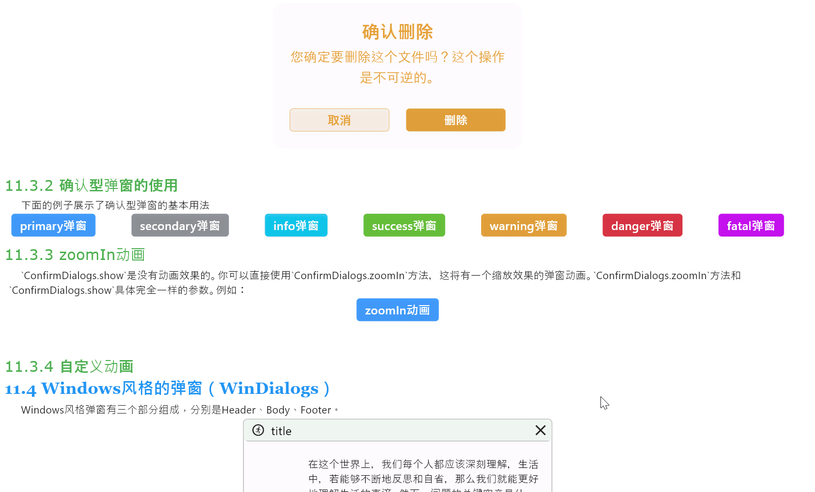
You can also customize the pop-up animation effect by specifying the transitionBuilder parameter in the ConfirmDialogs.showInfoDialog method, for example:
SemanticButton(
  text: 'flipInX动画',
  shrink: true,
  onTap: () => ConfirmDialogs.showConfirmDialog(
    context,
    transitionBuilder:
        (context, animation, secondaryAnimation, child) {
      return AnimateStyles.flipInX(animation, child);
    },
    title: "你确定吗",
    message: "这个是确认弹窗",
    confirmButtonText: "确定",
    cancelButtonText: "真的确定",
    onTapCancel: () {
      Navigator.of(context).pop();
    },
    onTapConfirm: () {
      Navigator.of(context).pop();
    },
  ),
)
Note: The
AnimateStyles.flipInXanimation used here needs to be installed separately.flutter pub add flutter_easy_animations
The running result is as follows:
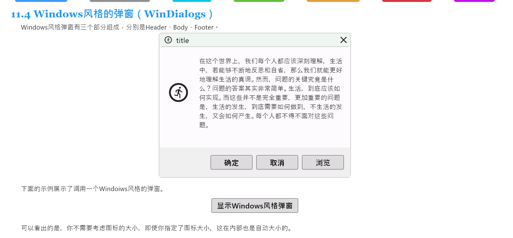
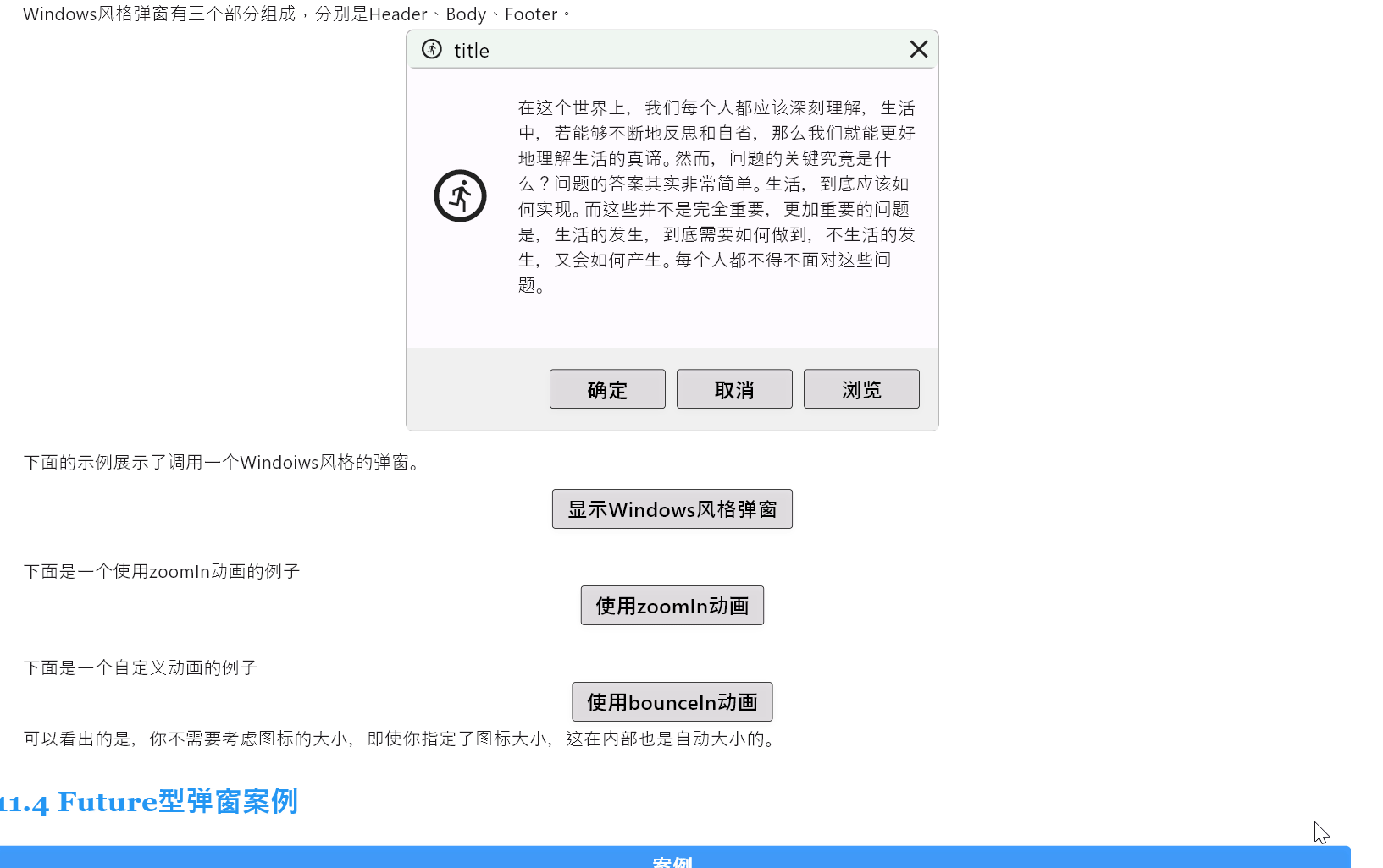
WinDialogs is a type of dialog that mimics the Windows style. The following example demonstrates calling a Windows-style dialog:
SemanticButton(
  text: '显示Windows风格弹窗',
  isOutlined: true,
  shrink: true,
  radius: 2,
  color: Colors.black,
  onTap: () => WinDialogs.show(
    context,
    title: 'title',
    icon: const Icon(Icons.run_circle_outlined),
    text: '在这个世界上,我们每个人都应该深刻理解,生活中,若能够不断地反思和自省,那么我们就能更好地理解生活的真谛。',
    contents: Row(
      children: [
        const Text('打开(O):'),
        const Gap(10),
        Expanded(
          child: Container(
            height: 25,
            decoration: BoxDecoration(
              border: Border.all(
                color: Colors.grey,
                width: 1,
              ),
              borderRadius: BorderRadius.circular(2),
            ),
          ),
        ),
      ],
    ),
    actions: [
      SemanticButton(
        text: '确定',
        width: 90,
        isOutlined: true,
        radius: 2,
        color: Colors.black,
        onTap: () {},
      ),
      const Gap(10),
      SemanticButton(
        text: '取消',
        width: 90,
        isOutlined: true,
        radius: 2,
        color: Colors.black,
        onTap: () {},
      ),
      const Gap(10),
      SemanticButton(
        text: '浏览',
        width: 90,
        isOutlined: true,
        radius: 2,
        color: Colors.black,
        onTap: () {},
      ),
    ],
  ),
),
The running result is as shown in the image:
Just like with the previous dialogs, you can use the zoomIn method to set a pop-up animation effect that scales from small to large. This method takes the same parameters as the show method:
If you intend to customize the pop-up animation, it's similar to the previous dialogs. You can use showWinDialog and specify an animation through the transitionBuilder parameter. For example:
SemanticButton(
  text: 'Use bounceIn animation',
  isOutlined: true,
  shrink: true,
  radius: 2,
  color: Colors.black,
  onTap: () => WinDialogs.showWinDialog(
    context,
    transitionBuilder: (context, animation, secondaryAnimation, child) {
      return AnimateStyles.bounceIn(animation, child);
    },
    title: 'Title',
    icon: const Icon(Icons.run_circle_outlined),
    text: 'In this world, each of us should deeply understand that if we can continually reflect and introspect, we can better understand the true essence of life.',
    contents: Row(
      children: [
        const Text('Open (O):'),
        const Gap(10),
        Expanded(
          child: Container(
            height: 25,
            decoration: BoxDecoration(
              border: Border.all(
                color: Colors.grey,
                width: 1,
              ),
              borderRadius: BorderRadius.circular(2),
            ),
          ),
        ),
      ],
    ),
    actions: [
      SemanticButton(
        text: 'Confirm',
        width: 90,
        isOutlined: true,
        radius: 2,
        color: Colors.black,
        onTap: () {},
      ),
      const Gap(10),
      SemanticButton(
        text: 'Cancel',
        width: 90,
        isOutlined: true,
        radius: 2,
        color: Colors.black,
        onTap: () {},
      ),
      const Gap(10),
      SemanticButton(
        text: 'Browse',
        width: 90,
        isOutlined: true,
        radius: 2,
        color: Colors.black,
        onTap: () {},
      ),
    ],
  ),
)
The running result is as follows:
Note: The
AnimateStyles.bounceInanimation used here needs to be installed separately.flutter pub add flutter_easy_animations
FutureDialogs are used to handle dialogs based on Future objects.
A Future object has two states during its lifecycle:
- Uncompleted:
When a Future is created, it's in the uncompleted state. This means the asynchronous operation has not yet completed, and the result is not available.
- Completed:
After the asynchronous operation is completed, the Future enters the completed state. There are two possible outcomes in this state:
- Fulfilled: The asynchronous operation completed successfully, and the Future obtains a value.
- Rejected: The asynchronous operation failed to complete successfully due to an error, and the Future obtains an error.
The static methods in FutureDialogs require corresponding construction of the content to be displayed when loading, success, or failure occurs.
Taking a login page as an example, a login request is made to the backend server with two possible outcomes: success or failure. We construct the content for the following two dialogs accordingly:
Content for successful authentication display:
import 'package:flutter/material.dart';

import 'package:gap/gap.dart';

class SuccessDialog extends StatelessWidget {
  final String data;
  const SuccessDialog(
    this.data, {
    super.key,
  });

  @override
  Widget build(BuildContext context) {
    return Align(
      alignment: Alignment.center,
      child: Material(
        color: Colors.transparent,
        child: Container(
          width: 200,
          height: 200,
          margin: const EdgeInsets.all(26),
          padding: const EdgeInsets.all(26),
          decoration: BoxDecoration(
            color: Colors.black.withOpacity(0.6),
            borderRadius: BorderRadius.circular(16),
          ),
          child: Column(
            mainAxisAlignment: MainAxisAlignment.center,
            children: [
              const Icon(
                Icons.check,
                color: Colors.green,
                size: 60,
              ),
              const Gap(20),
              Text(data, style: const TextStyle(color: Colors.white)),
            ],
          ),
        ),
      ),
    );
  }
}
Content displayed for authentication failure:
import 'package:flutter/material.dart';
import 'package:gap/gap.dart';

class FailureDialog extends StatelessWidget {
  final String data;
  const FailureDialog(
    this.data, {
    super.key,
  });

  @override
  Widget build(BuildContext context) {
    return Align(
      alignment: Alignment.center,
      child: Material(
        color: Colors.transparent,
        child: Container(
          width: 230,
          height: 200,
          margin: const EdgeInsets.all(16),
          padding: const EdgeInsets.all(16),
          decoration: BoxDecoration(
            color: Colors.black.withOpacity(0.6),
            borderRadius: BorderRadius.circular(16),
          ),
          child: Column(
            mainAxisAlignment: MainAxisAlignment.center,
            children: [
              const Icon(
                Icons.close,
                color: Colors.red,
                size: 60,
              ),
              const Gap(20),
              Text(data,
                  style: const TextStyle(
                    color: Colors.white,
                    fontSize: 18,
                    fontWeight: FontWeight.bold,
                  )),
            ],
          ),
        ),
      ),
    );
  }
}
Then we call the dialogs on the login page:
import 'package:example/login/dialogs/failure_dialog.dart';
import 'package:flutter/material.dart';
import 'package:widgets_easier/widgets_easier.dart';

import 'dialogs/success_dialog.dart';
import 'login_controller.dart';

class LoginPage extends StatefulWidget {
  const LoginPage({super.key});

  @override
  State<LoginPage> createState() => _LoginPageState();
}

class _LoginPageState extends State<LoginPage> {
  final TextEditingController usernameController = TextEditingController();
  final TextEditingController passwordController = TextEditingController();
  final LoginController loginManager = LoginController();

  void handleLogin(BuildContext context) {
    // Get the username and password from the text controller.
    final String username = usernameController.text;
    final String password = passwordController.text;

    // Display a dialog for an asynchronous operation that will close after the Future of the `simulateLogin` method is completed.
    FutureDialogs.show<String>(
      context: context,
      futureCallback: () => loginManager.simulateLogin(username, password),
      buildSuccessDialog: (data) {
        return SuccessDialog(data);
      },
      buildFailureDialog: (data) {
        return FailureDialog(data);
      },
    ).then((result) {
      // Check the result returned from simulateLogin.
      if (result != null && result['status'] == true) {
        // If login is successful, navigate to the home page.
        Navigator.pushReplacementNamed(context, '/login-success');
      }
    });
  }

  @override
  Widget build(BuildContext context) {
    return Scaffold(
      appBar: AppBar(title: const Text('FutureDialogs Demo')),
      body: Padding(
        padding: const EdgeInsets.all(20),
        child: Column(
          children: [
            TextField(
              controller: usernameController,
              decoration: const InputDecoration(
                labelText: '输入你的账号',
                border: OutlineInputBorder(),
                prefixIcon: Icon(Icons.account_circle),
              ),
            ),
            const SizedBox(height: 10),
            TextField(
              controller: passwordController,
              decoration: const InputDecoration(
                labelText: '输入你的密码',
                border: OutlineInputBorder(),
                prefixIcon: Icon(Icons.lock),
              ),
              obscureText: true,
            ),
            const SizedBox(height: 20),
            SemanticButton(
              text: '登录',
              type: SemanticEnum.primary,
              onTap: () => handleLogin(context),
              radius: 40,
              isOutlined: true,
            )
          ],
        ),
      ),
    );
  }
}
Where:
FutureDialogs.show<String>(
      context: context,
      futureCallback: () => loginManager.simulateLogin(username, password),
      buildSuccessDialog: (data) {
        return SuccessDialog(data);
      },
      buildFailureDialog: (data) {
        return FailureDialog(data);
      },
    ).then((result) {
      // 检查从 simulateLogin 返回的结果
      if (result != null && result['status'] == true) {
        // 如果登录成功,导航到主页
        Navigator.pushReplacementNamed(context, '/login-success');
      }
    });
After completion, we can also chain some operations. This design is very necessary. In this example, after a successful login, we navigate to the login success page. Here, the result parameter in the then function is also the value returned by the futureCallback. On the other hand, if needed, we can also continue with the next dialog here.
Where the asynchronous function is:
import 'dart:async';

class LoginController {
  Future<Map<String, dynamic>> simulateLogin(
    String username,
    String password,
  ) async {
    // Typically, for cases like empty passwords, client-side validation can be done to reduce API requests.
    if (username.isEmpty || password.isEmpty) {
      return {
        'status': false,
        'data': '账户名或密码不能为空',
      };
    }
    // Simulate the API request result, which could either succeed or fail.
    else if (username == 'jclee95' && password == '123456') {
      await Future.delayed(const Duration(seconds: 1));
      return {'status': true, 'data': '登录成功'};
    } else {
      await Future.delayed(const Duration(seconds: 1));
      return {'status': false, 'data': '账户名或密码错误'};
    }
  }
}
In this code snippet, simulateLogin is a function simulating an asynchronous login.
If the login is successful, it returns:
{'status': true, 'data': '登录成功'}If the login fails, it returns:
{'status': false, 'data': '账户名或密码错误'}Then construct a login success page:
import 'package:flutter/material.dart';

class LoginSuccessView extends StatelessWidget {
  const LoginSuccessView({super.key});

  @override
  Widget build(BuildContext context) {
    return Scaffold(
      appBar: AppBar(
        title: const Text('登录成功'),
      ),
      body: Center(
        child: Column(
          mainAxisAlignment: MainAxisAlignment.center,
          children: <Widget>[
            const Icon(
              Icons.check_circle_outline,
              size: 100,
              color: Colors.green,
            ),
            const Padding(
              padding: EdgeInsets.all(8.0),
              child: Text(
                '您已成功登录!',
                style: TextStyle(
                  fontSize: 24,
                  fontWeight: FontWeight.bold,
                  color: Colors.black,
                ),
              ),
            ),
            ElevatedButton(
              onPressed: () {
                Navigator.pushReplacementNamed(context, '/home');
              },
              child: const Text('回到主页'),
            ),
          ],
        ),
      ),
    );
  }
}
The appearance looks like this:
-
Username and password are empty:

-
Incorrect password input:
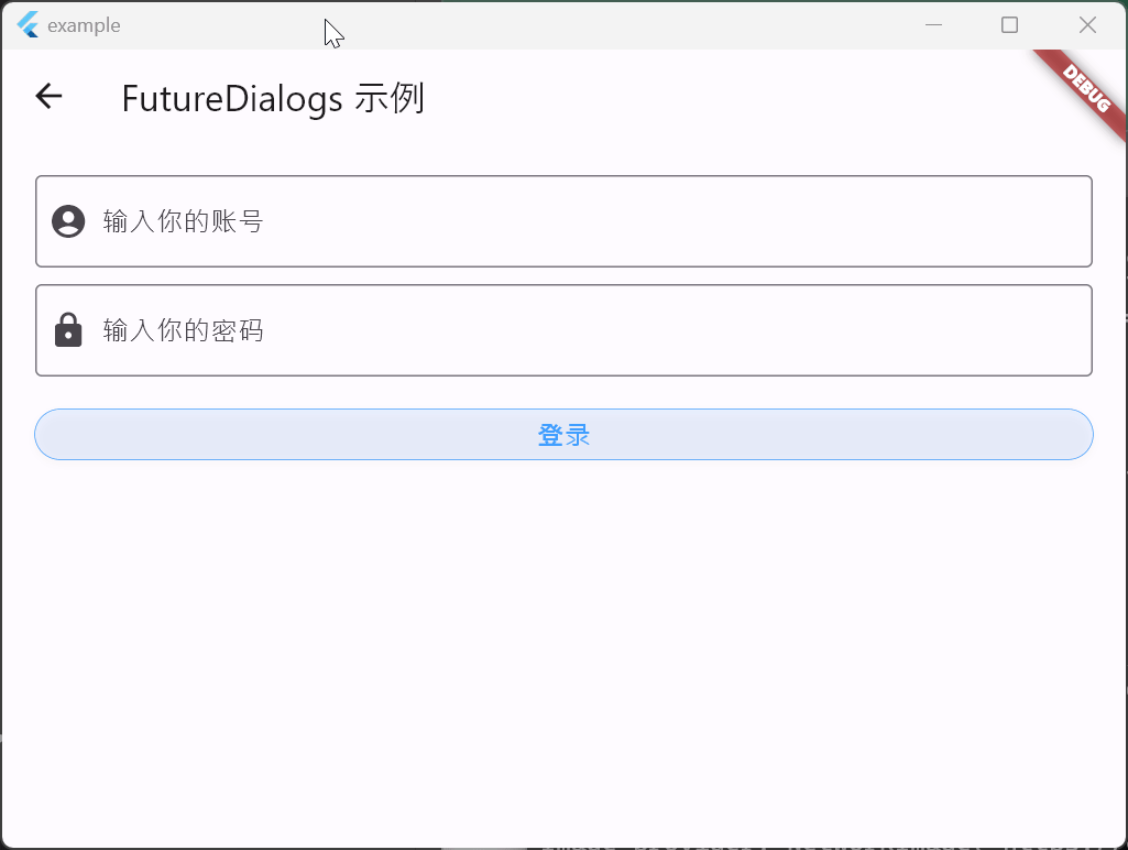 3. Password authentication successful
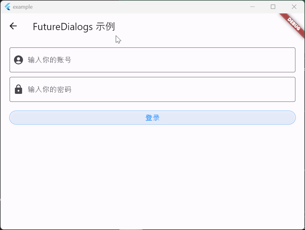
The toast message component is inspired by Element-Plus's Notification and encapsulated in a way that is suitable for use in Flutter. It provides a simple and flexible way to display message notifications in your application. By customizing styles, animation effects, and interactions, you can create message notifications that align with your app's design style.
The toast message-related components are displayed using static methods provided by the NotifyToasts class. The NotifyToasts class has four static methods corresponding to displaying message notifications in four different positions:
showTopLeft: Display message notification in the top-left corner of the screen.showTopRight: Display message notification in the top-right corner of the screen.showBottomLeft: Display message notification in the bottom-left corner of the screen.showBottomRight: Display message notification in the bottom-right corner of the screen.
For example:
Row(
  mainAxisAlignment: MainAxisAlignment.spaceAround,
  children: [
    SemanticButton(
      onTap: () => NotifyToasts.showTopRight(
        context,
        title: 'TopRight',
        message: 'Top Right Notification!',
      ),
      isOutlined: true,
      text: 'Top Right',
    ),
    SemanticButton(
      onTap: () => NotifyToasts.showTopLeft(
        context,
        title: 'TopLeft',
        message: 'Top Left Notification!',
      ),
      isOutlined: true,
      text: 'Top Left',
    ),
    SemanticButton(
      onTap: () => NotifyToasts.showBottomRight(
        context,
        title: 'BottomRight',
        message: 'Bottom Right Notification!',
      ),
      isOutlined: true,
      text: 'Bottom Right',
    ),
    SemanticButton(
      onTap: () => NotifyToasts.showBottomLeft(
        context,
        duration: const Duration(seconds: 1),
        title: 'BottomLeft',
        message: 'Bottom Left Notification!',
      ),
      isOutlined: true,
      text: 'Bottom Left',
    ),
  ],
),
The running effect of the code is as follows:
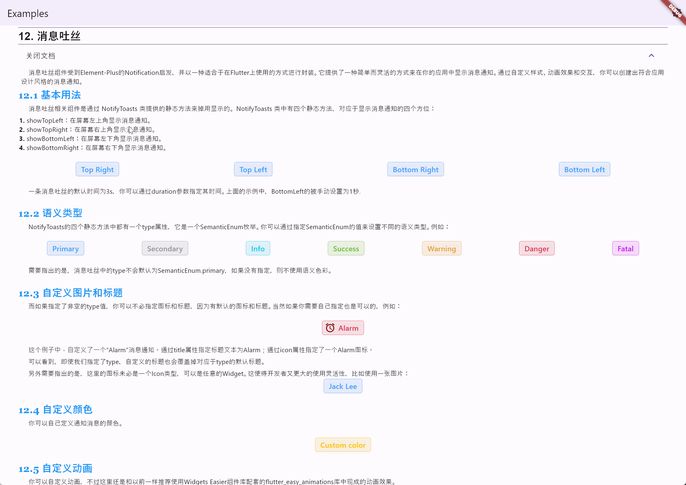
Translate the document: The default duration for a toast message is 3 seconds, and you can specify the time using the duration parameter. In the example above, the Bottom Left toast is manually set to 1 second.
Each of the four static methods in NotifyToasts has a type property, which is an enumeration of SemanticEnum. You can set different semantic types by specifying values from the SemanticEnum. For example:
Row(
  mainAxisAlignment: MainAxisAlignment.spaceAround,
  children: [
    SemanticButton(
      type: SemanticEnum.primary,
      onTap: () => NotifyToasts.showTopRight(
        context,
        type: SemanticEnum.primary,
        message: 'Here are some messages.',
      ),
      isOutlined: true,
      text: 'Primary',
    ),
    SemanticButton(
      type: SemanticEnum.secondary,
      onTap: () => NotifyToasts.showTopRight(
        context,
        type: SemanticEnum.secondary,
        message: 'Here are some messages.',
      ),
      isOutlined: true,
      text: 'Secondary',
    ),
    SemanticButton(
      type: SemanticEnum.info,
      onTap: () => NotifyToasts.showTopRight(
        context,
        type: SemanticEnum.info,
        message: 'Here are some messages.',
      ),
      isOutlined: true,
      text: 'Info',
    ),
    SemanticButton(
      type: SemanticEnum.success,
      onTap: () => NotifyToasts.showTopRight(
        context,
        type: SemanticEnum.success,
        message: 'Here are some messages.',
      ),
      isOutlined: true,
      text: 'Success',
    ),
    SemanticButton(
      type: SemanticEnum.warning,
      onTap: () => NotifyToasts.showTopRight(
        context,
        type: SemanticEnum.warning,
        message: 'Here are some messages.',
      ),
      isOutlined: true,
      text: 'Warning',
    ),
    SemanticButton(
      type: SemanticEnum.danger,
      onTap: () => NotifyToasts.showTopRight(
        context,
        type: SemanticEnum.danger,
        message: 'Here are some messages.',
      ),
      isOutlined: true,
      text: 'Danger',
    ),
    SemanticButton(
      type: SemanticEnum.fatal,
      onTap: () => NotifyToasts.showTopRight(
        context,
        type: SemanticEnum.fatal,
        message: 'Here are some messages.',
      ),
      isOutlined: true,
      text: 'Fatal',
    ),
  ],
)
The running effect of the code is as follows:
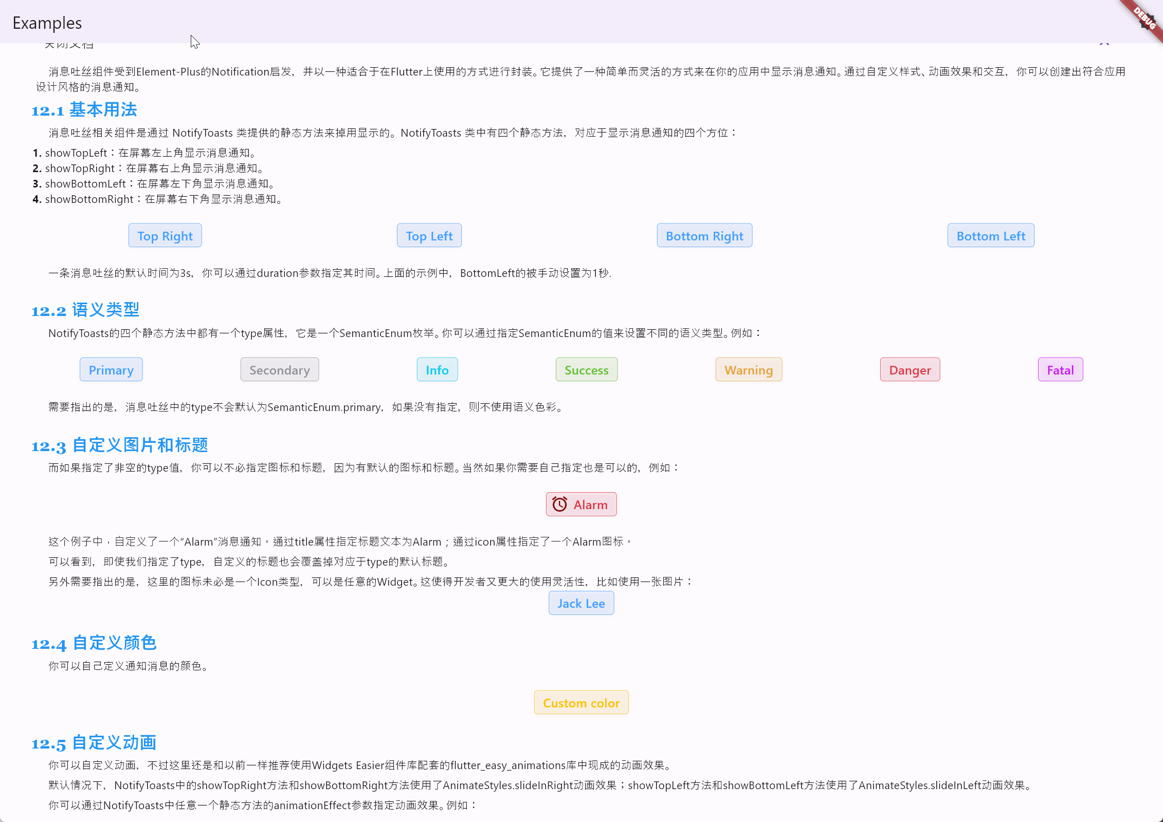
It should be noted that the type in toast messages will not default to SemanticEnum.primary; if not specified, semantic colors will not be used.
If a non-empty type value is specified, you do not need to specify icons and titles as there are default icons and titles. However, you can still customize them if needed, for example:
SemanticButton(
  shrink: true,
  prefixIcon: const Icon(
    Icons.access_alarms,
    color: Color.fromARGB(255, 125, 8, 0),
  ),
  type: SemanticEnum.danger,
  onTap: () => NotifyToasts.showTopRight(
    context,
    title: 'Alarm',
    icon: const Icon(
      Icons.access_alarms,
      color: Color.fromARGB(255, 125, 8, 0),
    ),
    type: SemanticEnum.danger,
    message: 'Here are some messages.',
  ),
  isOutlined: true,
  text: 'Alarm',
)
The running effect of the code is as follows:
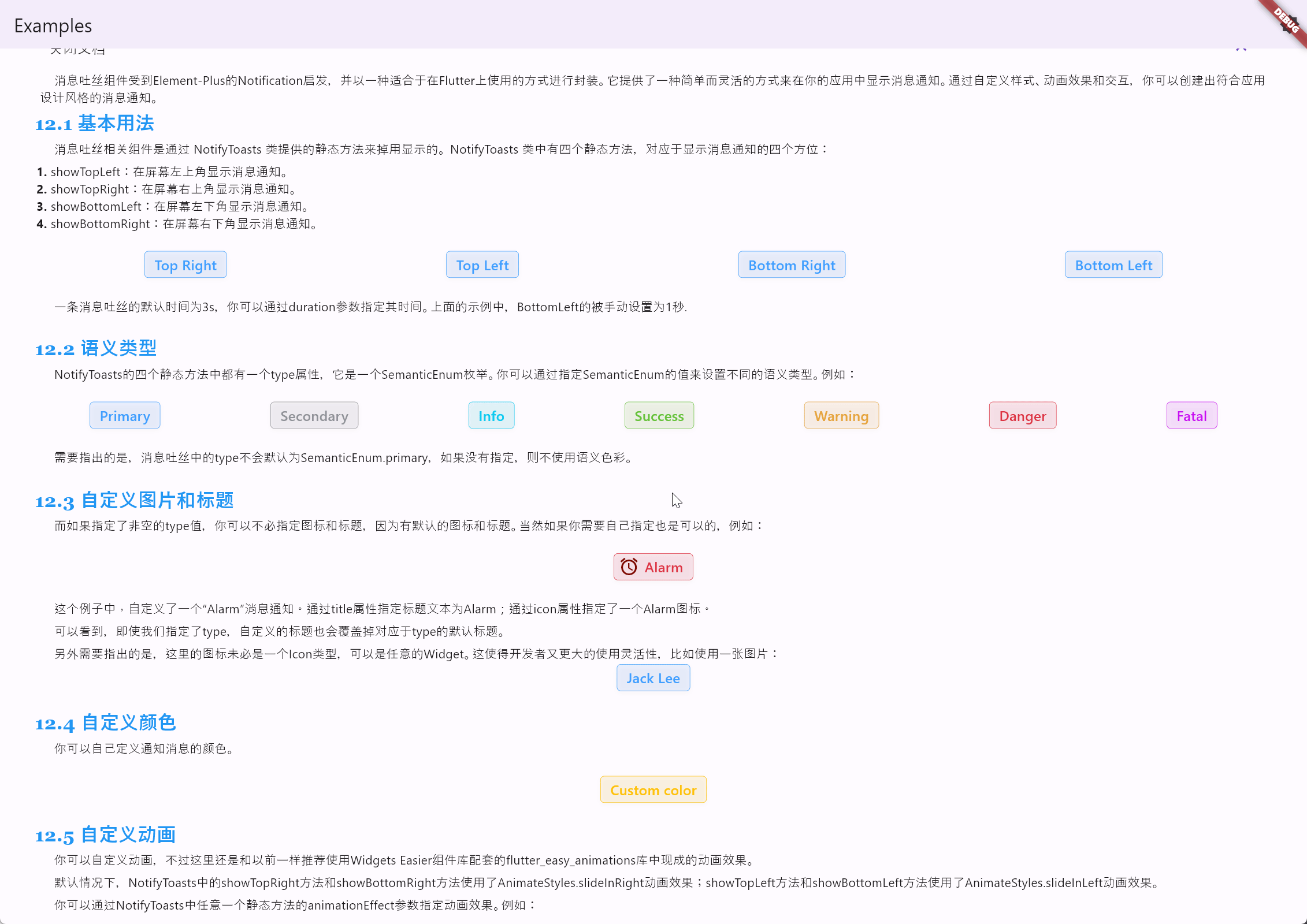
In this example, a custom "Alarm" message notification is defined. The title text is set to "Alarm" using the title property, and an Alarm icon is specified using the icon property. It can be observed that even if a type is specified, the custom title will override the default title associated with the type.
Additionally, it is worth noting that the icon here does not necessarily have to be of type Icon; it can be any widget. This provides developers with greater flexibility in usage, such as using an image:
SemanticButton(
  shrink: true,
  onTap: () => NotifyToasts.showTopRight(
    context,
    title: 'Jack Lee',
    icon: Picture(source: 'assets/jclee95.png'),
    message: 'JackLee, the author of this library, is a good boy.',
  ),
  isOutlined: true,
  text: 'Jack Lee',
)
The running effect of the code is as follows:
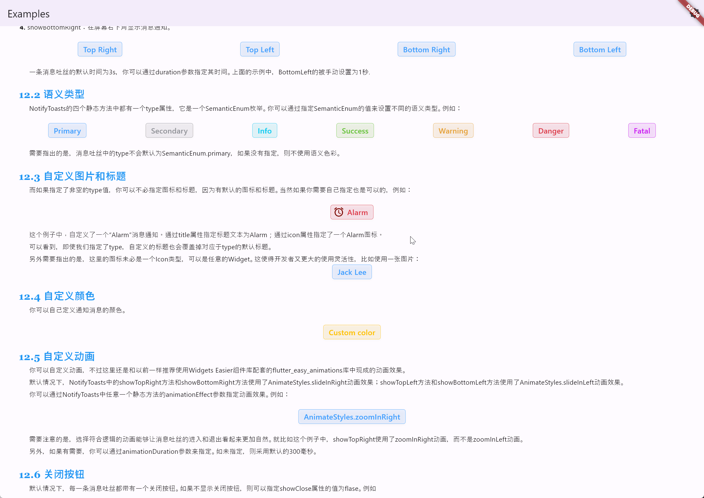
You can customize the colors of notification messages. For example:
SemanticButton(
  shrink: true,
  color: Colors.amber,
  onTap: () => NotifyToasts.showTopRight(
    context,
    color: Colors.amber,
    title: 'Custom color',
    message: 'The currently defined color is Colors.amber.',
  ),
  isOutlined: true,
  text: 'Custom color',
)
The running effect of the code is as follows:
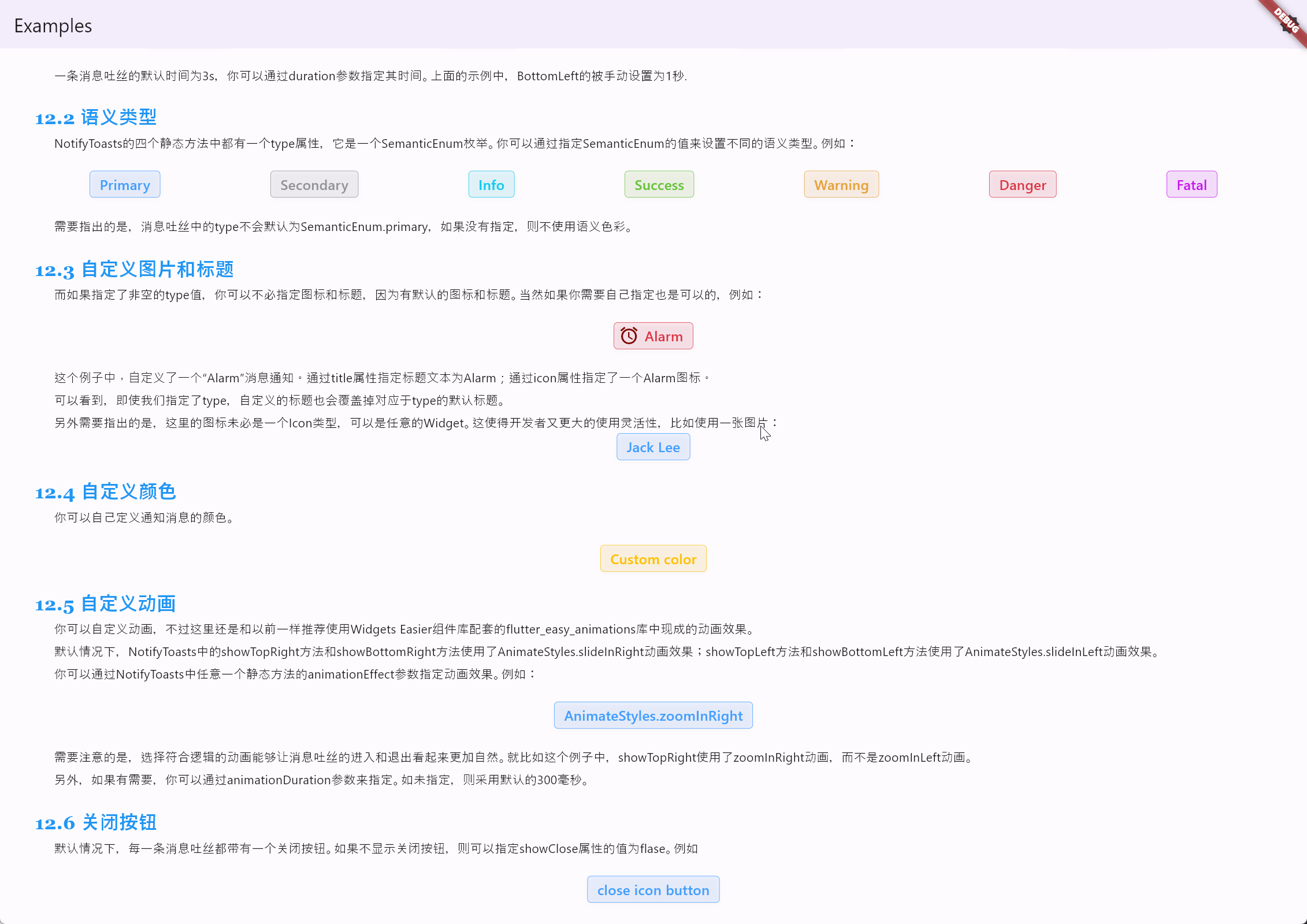
You can customize animations, but it is still recommended to use the pre-built animation effects from the flutter_easy_animations library that comes with the Widgets Easier component library. By default, the showTopRight and showBottomRight methods in NotifyToasts use the AnimateStyles.slideInRight animation effect, while the showTopLeft and showBottomLeft methods use the AnimateStyles.slideInLeft animation effect.
You can specify the animation effect by using the animationEffect parameter in any of the static methods in NotifyToasts. For example:
SemanticButton(
  shrink: true,
  onTap: () => NotifyToasts.showTopRight(
    context,
    animationEffect: AnimateStyles.zoomInRight,
    title: 'Custom Animation',
    message: 'Use AnimateStyles.zoomInRight animation effect.',
  ),
  isOutlined: true,
  text: 'AnimateStyles.zoomInRight',
)
The running effect of the code is as follows:
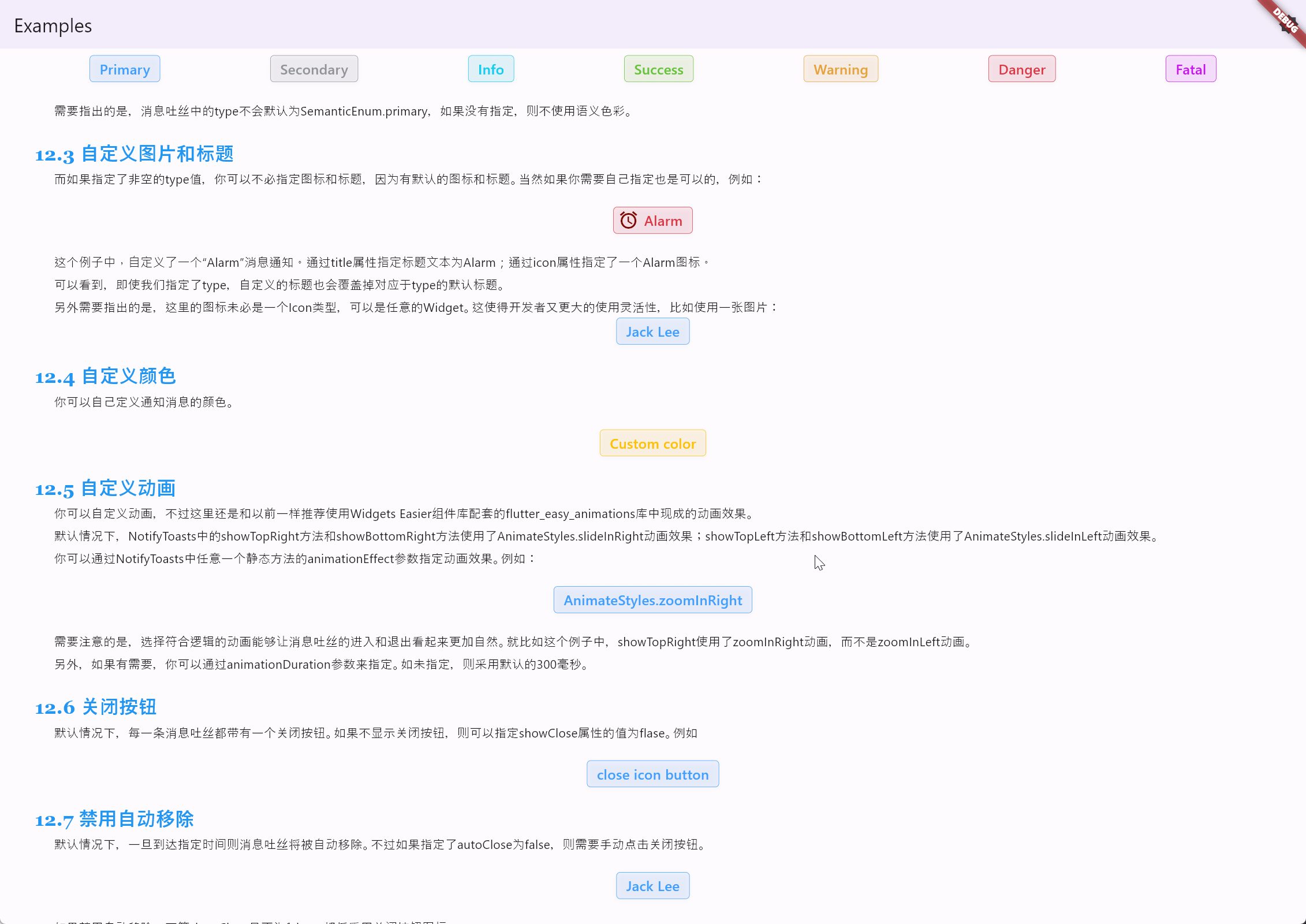
Please note that choosing appropriate animations can make the entry and exit of toast messages look more natural. For example, in this case, showTopRight uses the zoomInRight animation instead of the zoomInLeft animation.
Additionally, if needed, you can specify the animation duration using the animationDuration parameter. If not specified, the default duration of 300 milliseconds is used.
By default, each toast message includes a close button. If you do not want to display the close button, you can set the value of the showClose attribute to false. For example:
SemanticButton(
  shrink: true,
  onTap: () => NotifyToasts.showTopRight(
    context,
    title: 'close icon button',
    showClose: false,
    message:
        'You can disable the close icon button by specifying the value of the showClose property as flase.',
  ),
  isOutlined: true,
  text: 'close icon button',
)
The running effect of the code is as follows:
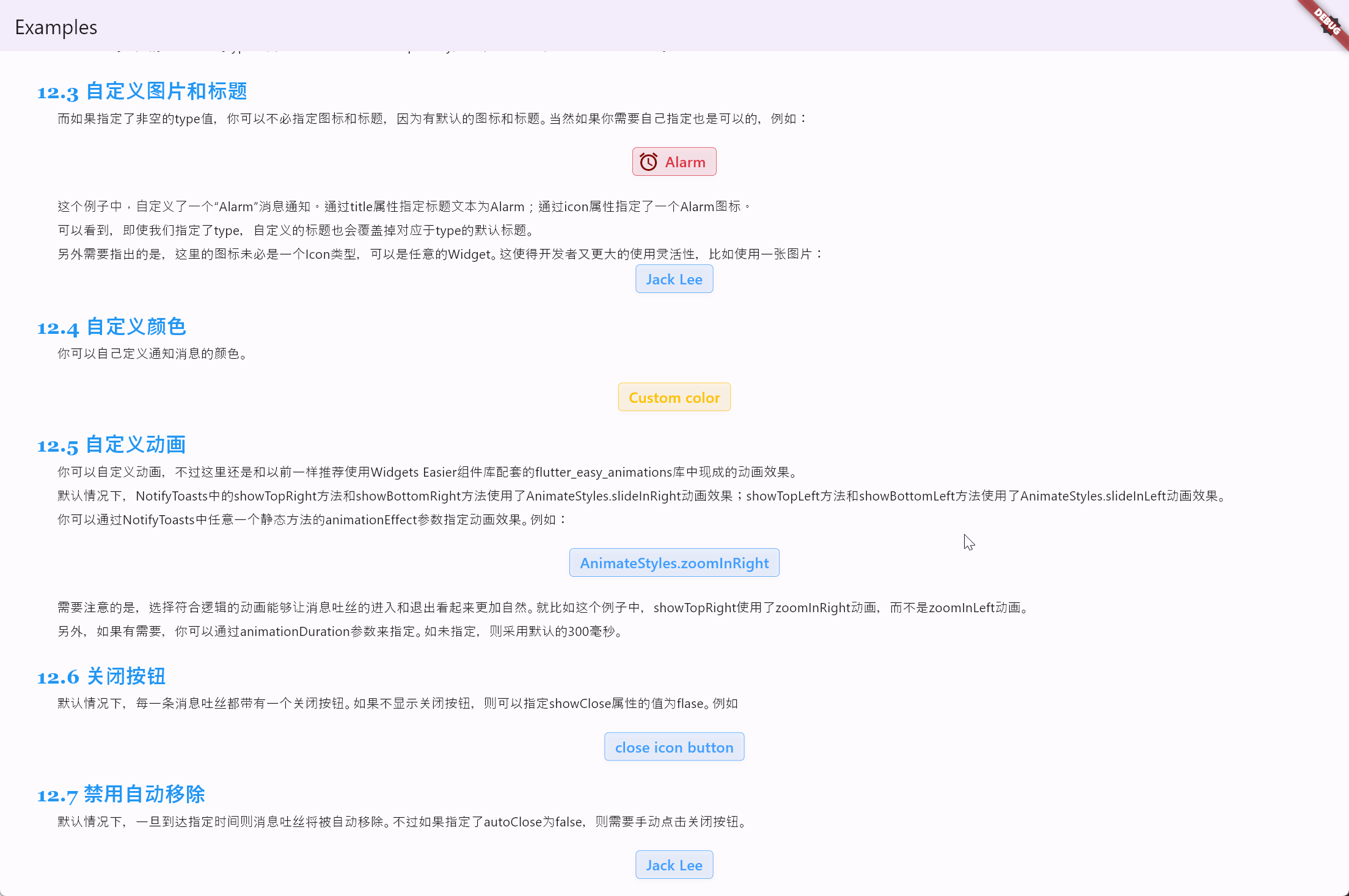
By default, toast messages are automatically removed once the specified time is reached. However, if you set autoClose to false, you will need to manually click the close button. For example:
SemanticButton(
  shrink: true,
  onTap: () => NotifyToasts.showTopRight(
    context,
    title: 'Jack Lee',
    autoClose: false,
    icon: Picture(source: 'assets/jclee95.png'),
    message: 'JackLee, the author of this library, is a good boy.',
  ),
  isOutlined: true,
  text: 'Jack Lee',
)
The running effect of the code is as follows:
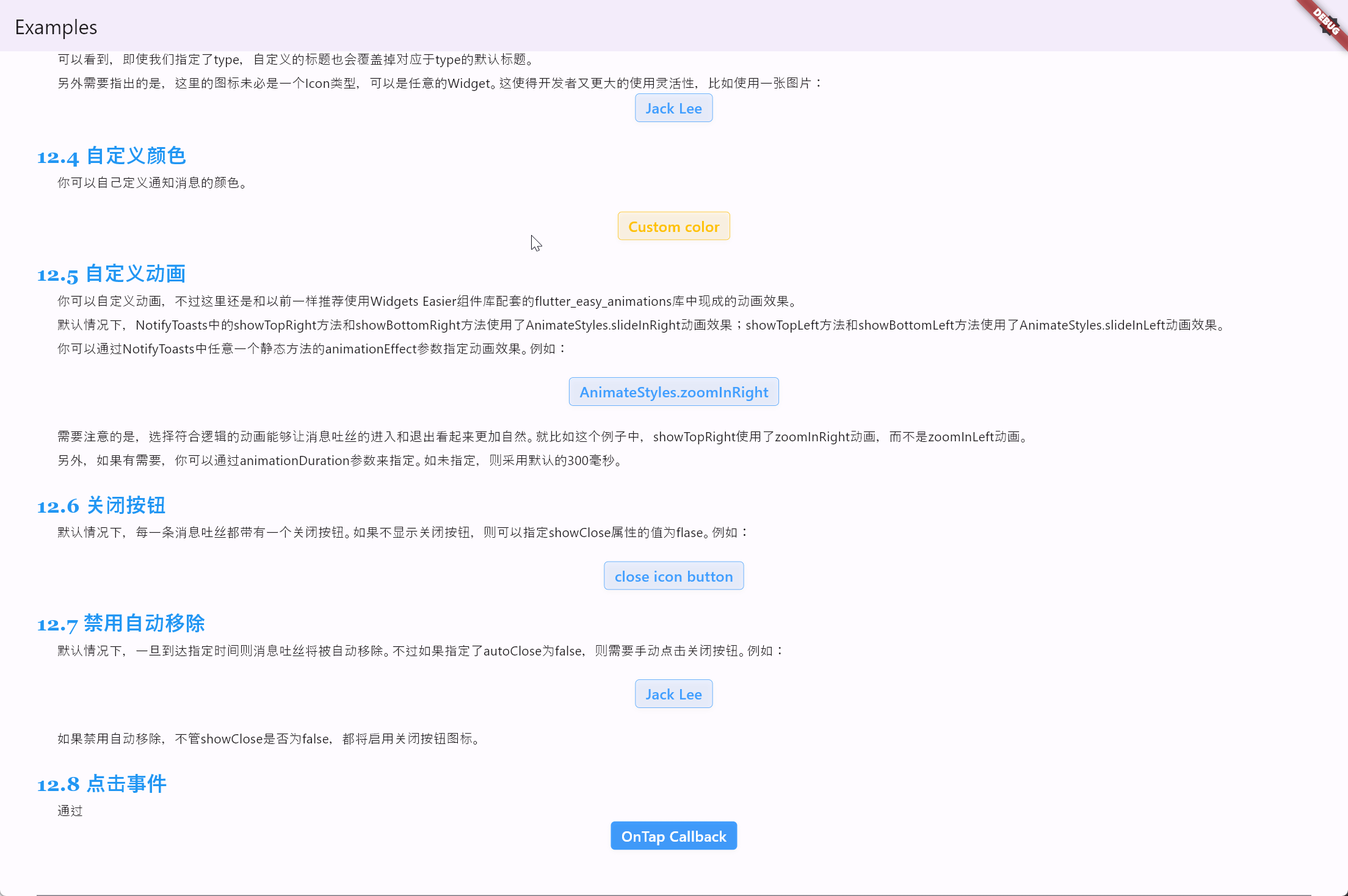
If auto removal is disabled, the close button icon will be enabled regardless of whether showClose is set to false.
SemanticButton(
  shrink: true,
  onTap: () => NotifyToasts.showTopRight(
    context,
    autoClose: false,
    title: 'Click Login',
    message: 'Click the message toast to jump to the login page.',
    onTap: () => Navigator.of(context).pushNamed('/login'),
  ),
  text: 'OnTap Callback',
)
The running effect of the code is as follows:
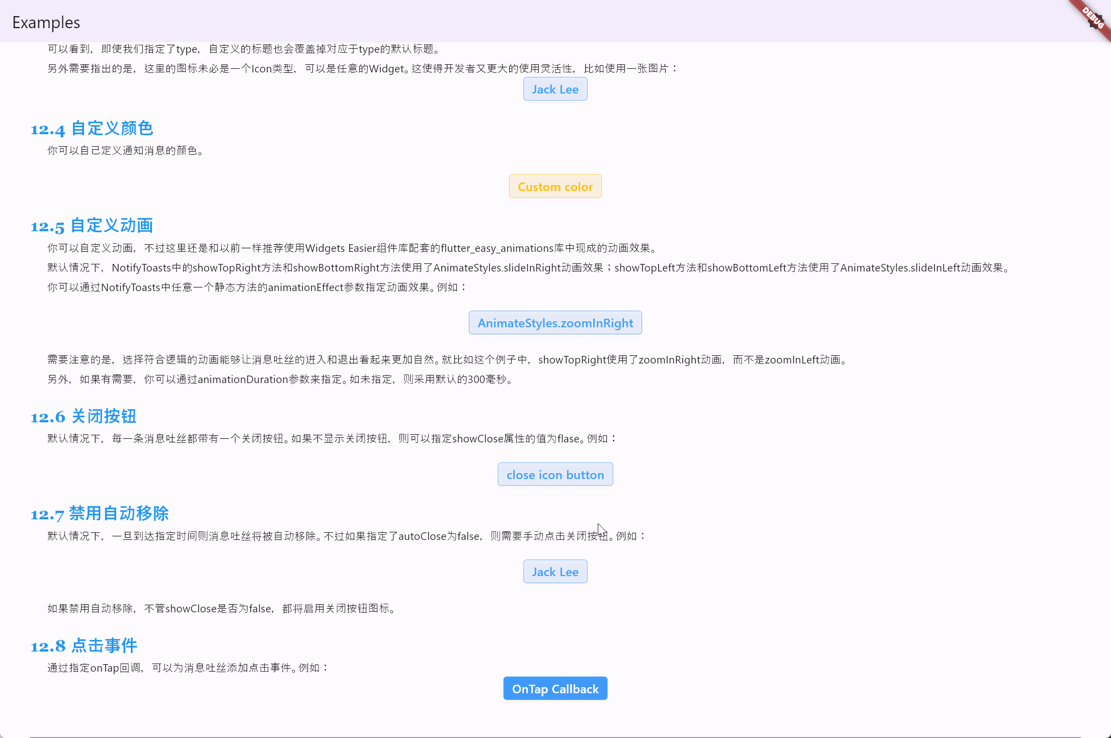
TipToasts is a utility class used to display toast messages in Flutter applications, serving as a simple form of toast. It offers a straightforward and flexible way to display brief messages at different positions on the screen, supporting custom animation effects and styles. TipToasts are suitable for various scenarios requiring simple informative prompts:
- Displaying messages indicating successful or failed operations.
- Providing notifications or warnings to users.
- Providing feedback to users after specific actions.
- Displaying temporary status information.
TipToasts provide several static methods for displaying toast messages, namely toCenter, toTop, and toBottom.
static void toCenter(
  BuildContext context,
  String message, {
  double opacity = 0.7,
  Color backgroundColor = Colors.black,
  TextStyle textStyle = const TextStyle(color: Colors.white, fontSize: 16),
  double maxWidth = double.infinity,
})
The toCenter method is a static method used to display toast messages at the center of the screen, with the following parameters:
context: The build context.message: The text message to display.opacity: The opacity of the background, default is 0.7.backgroundColor: The background color, default is black.textStyle: The text style, default is white text with a font size of 16.messageStyle: The style of the message text.maxWidth: The maximum width of the toast message, default is 200.
For example:
SemanticButton(
  shrink: true,
  text: 'toCenter',
  onTap: () => TipToasts.toCenter(context, 'toCenter'),
)
The running effect of the code is as follows:
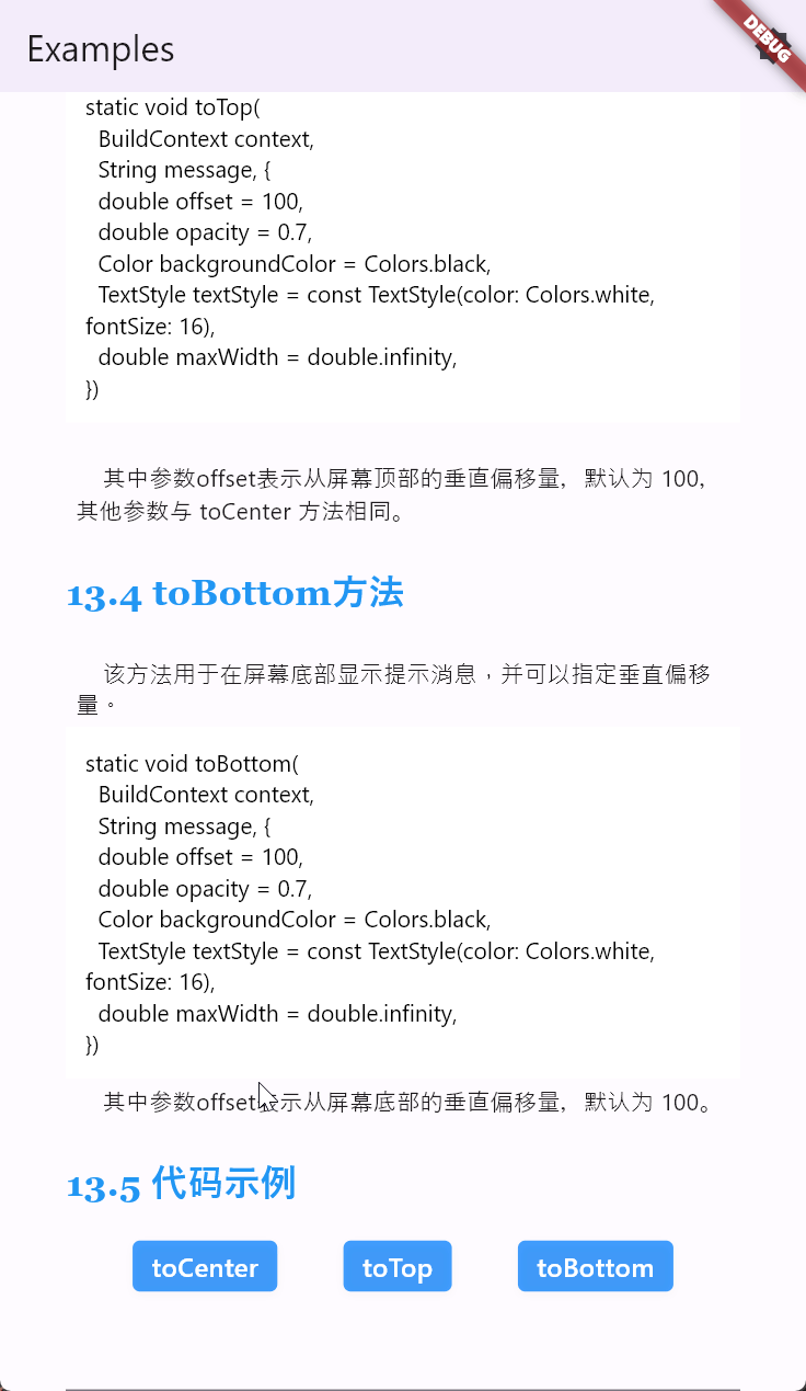
This method is used to display a prompt message at the top of the screen, with the option to specify a vertical offset.
static void toTop(
  BuildContext context,
  String message, {
  double offset = 100,
  double opacity = 0.7,
  Color backgroundColor = Colors.black,
  TextStyle textStyle = const TextStyle(color: Colors.white, fontSize: 16),
  double maxWidth = double.infinity,
})
Where the parameter offset represents the vertical offset from the top of the screen, defaulting to 100. Other parameters are the same as the toCenter method.
For example:
SemanticButton(
  shrink: true,
  text: 'toTop',
  onTap: () => TipToasts.toTop(context, 'toTop'),
)
The running effect of the code is as follows:

This method is used to display a prompt message at the bottom of the screen, with the option to specify a vertical offset.
static void toBottom(
  BuildContext context,
  String message, {
  double offset = 100,
  double opacity = 0.7,
  Color backgroundColor = Colors.black,
  TextStyle textStyle = const TextStyle(color: Colors.white, fontSize: 16),
  double maxWidth = double.infinity,
})
Where the parameter offset represents the vertical offset from the bottom of the screen, defaulting to 100.
For example:
SemanticButton(
  shrink: true,
  text: 'toBottom',
  onTap: () => TipToasts.toBottom(context, 'toBottom'),
)
The running effect of the code is as follows:
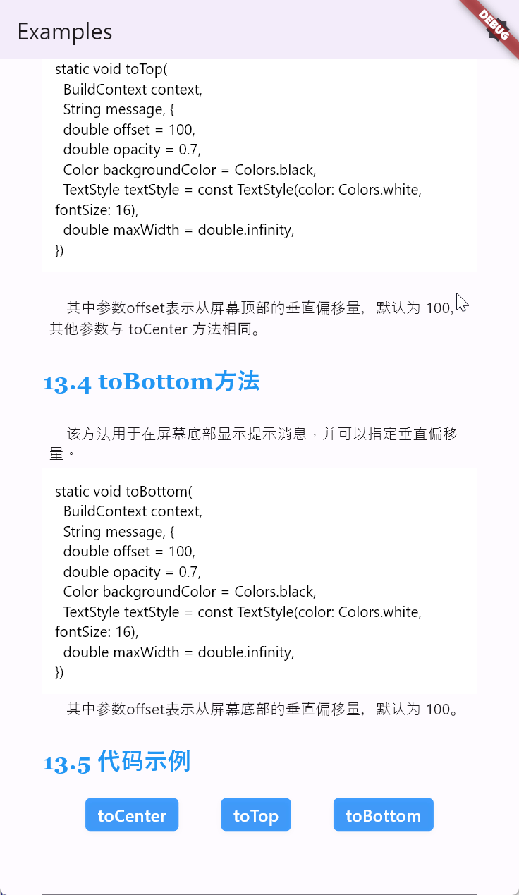
The bottom message pop-up is a bottom version of a message pop-up. You can use or disable images, specify relevant text, and define button callbacks, etc.
For example:
Row(
  mainAxisAlignment: MainAxisAlignment.spaceAround,
  children: [
    SemanticButton(
      text: 'Primary',
      type: SemanticEnum.primary,
      onTap: () => BottomSheets.showInfoSheet(
        context,
        title: "Primary Sheet",
        message: "This is a info bottom sheet.",
        buttonText: "Close",
        onTapDismiss: () => Navigator.pop(context),
        type: SemanticEnum.primary,
      ),
    ),
    SemanticButton(
      text: 'Secondary',
      type: SemanticEnum.secondary,
      onTap: () => BottomSheets.showInfoSheet(
        context,
        title: "Secondary Sheet",
        message: "This is a info bottom sheet.",
        buttonText: "Close",
        onTapDismiss: () => Navigator.pop(context),
        type: SemanticEnum.secondary,
      ),
    ),
    SemanticButton(
      text: 'Info',
      type: SemanticEnum.info,
      onTap: () => BottomSheets.showInfoSheet(
        context,
        title: "Info Sheet",
        message: "This is a info bottom sheet.",
        buttonText: "Close",
        onTapDismiss: () => Navigator.pop(context),
        type: SemanticEnum.info,
      ),
    ),
    SemanticButton(
      text: 'Success',
      type: SemanticEnum.success,
      onTap: () => BottomSheets.showInfoSheet(
        context,
        title: "Success Sheet",
        message: "This is a info bottom sheet.",
        buttonText: "Close",
        onTapDismiss: () => Navigator.pop(context),
        type: SemanticEnum.success,
      ),
    ),
    SemanticButton(
      text: 'Warning',
      type: SemanticEnum.warning,
      onTap: () => BottomSheets.showInfoSheet(
        context,
        title: "Warning Sheet",
        message: "This is a info bottom sheet.",
        buttonText: "Close",
        onTapDismiss: () => Navigator.pop(context),
        type: SemanticEnum.warning,
      ),
    ),
    SemanticButton(
      text: 'Danger',
      type: SemanticEnum.danger,
      onTap: () => BottomSheets.showInfoSheet(
        context,
        title: "Danger Sheet",
        message: "This is a info bottom sheet.",
        buttonText: "Close",
        onTapDismiss: () => Navigator.pop(context),
        type: SemanticEnum.danger,
      ),
    ),
    SemanticButton(
      text: 'Fatal',
      type: SemanticEnum.fatal,
      onTap: () => BottomSheets.showInfoSheet(
        context,
        title: "Fatal Sheet",
        message: "This is a info bottom sheet.",
        buttonText: "Close",
        onTapDismiss: () => Navigator.pop(context),
        type: SemanticEnum.fatal,
      ),
    ),
  ],
),
The running effect of the code is as follows:

The bottom confirmation pop-up is a bottom version of a confirmation pop-up. You can use or disable images, specify relevant text, and define button callbacks, etc.
For example:
Row(
  mainAxisAlignment: MainAxisAlignment.spaceAround,
  children: [
    SemanticButton(
      text: 'Primary',
      type: SemanticEnum.primary,
      isOutlined: true,
      onTap: () => BottomSheets.showConfirmSheet(
        context,
        title: "Primary Sheet",
        message: "This is a confirm bottom sheet.",
        confirmButtonText: '确定',
        cancelButtonText: '取消',
        onTapConfirm: () {
          // 处理确认操作
          Navigator.pop(context);
        },
        onTapCancel: () {
          // 处理取消操作
          Navigator.pop(context);
        },
        type: SemanticEnum.primary,
      ),
    ),
    SemanticButton(
      text: 'Secondary',
      type: SemanticEnum.secondary,
      isOutlined: true,
      onTap: () => BottomSheets.showConfirmSheet(
        context,
        title: "Secondary Sheet",
        message: "This is a confirm bottom sheet.",
        confirmButtonText: '确定',
        cancelButtonText: '取消',
        onTapConfirm: () {
          // 处理确认操作
          Navigator.pop(context);
        },
        onTapCancel: () {
          // 处理取消操作
          Navigator.pop(context);
        },
        type: SemanticEnum.secondary,
      ),
    ),
    SemanticButton(
      text: 'Info',
      type: SemanticEnum.info,
      isOutlined: true,
      onTap: () => BottomSheets.showConfirmSheet(
        context,
        title: "Info Sheet",
        message: "This is a confirm bottom sheet.",
        confirmButtonText: '确定',
        cancelButtonText: '取消',
        onTapConfirm: () {
          // 处理确认操作
          Navigator.pop(context);
        },
        onTapCancel: () {
          // 处理取消操作
          Navigator.pop(context);
        },
        type: SemanticEnum.info,
      ),
    ),
    SemanticButton(
      text: 'Success',
      type: SemanticEnum.success,
      isOutlined: true,
      onTap: () => BottomSheets.showConfirmSheet(
        context,
        title: "Success Sheet",
        message: "This is a confirm bottom sheet.",
        confirmButtonText: '确定',
        cancelButtonText: '取消',
        onTapConfirm: () {
          // 处理确认操作
          Navigator.pop(context);
        },
        onTapCancel: () {
          // 处理取消操作
          Navigator.pop(context);
        },
        type: SemanticEnum.success,
      ),
    ),
    SemanticButton(
      text: 'Warning',
      type: SemanticEnum.warning,
      isOutlined: true,
      onTap: () => BottomSheets.showConfirmSheet(
        context,
        title: "Warning Sheet",
        message: "This is a confirm bottom sheet.",
        confirmButtonText: '确定',
        cancelButtonText: '取消',
        onTapConfirm: () {
          // 处理确认操作
          Navigator.pop(context);
        },
        onTapCancel: () {
          // 处理取消操作
          Navigator.pop(context);
        },
        type: SemanticEnum.warning,
      ),
    ),
    SemanticButton(
      text: 'Danger',
      type: SemanticEnum.danger,
      isOutlined: true,
      onTap: () => BottomSheets.showConfirmSheet(
        context,
        title: "Danger Sheet",
        message: "This is a confirm bottom sheet.",
        confirmButtonText: '确定',
        cancelButtonText: '取消',
        onTapConfirm: () {
          // 处理确认操作
          Navigator.pop(context);
        },
        onTapCancel: () {
          // 处理取消操作
          Navigator.pop(context);
        },
        type: SemanticEnum.danger,
      ),
    ),
    SemanticButton(
      text: 'Fatal',
      type: SemanticEnum.fatal,
      isOutlined: true,
      onTap: () => BottomSheets.showConfirmSheet(
        context,
        title: "Fatal Sheet",
        message: "This is a confirm bottom sheet.",
        confirmButtonText: '确定',
        cancelButtonText: '取消',
        onTapConfirm: () {
          // 处理确认操作
          Navigator.pop(context);
        },
        onTapCancel: () {
          // 处理取消操作
          Navigator.pop(context);
        },
        type: SemanticEnum.fatal,
      ),
    ),
  ],
),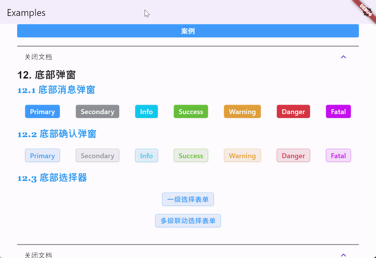
The bottom cascading picker is a commonly used UI component in mobile applications, mainly used for multi-level selection in a modal that pops up from the bottom. Users can scroll to select different options, which are typically hierarchical, such as selecting provinces, cities, and districts when choosing an address. The bottom cascading picker is suitable for scenarios requiring multi-level selection, commonly found in applications such as:
-
Address selection: Users can sequentially select provinces, cities, and districts.
-
Category selection: Choosing product categories on e-commerce platforms.
-
Setting options: For example, setting dates and times, selecting the year first, then the month, and finally the date.
The main features of the bottom cascading picker include:
-
Multi-level selection: Supports dynamic loading and display of multi-level data.
-
Customizable style: Button text, styles, etc., can be customized.
-
Flexible configuration: Supports configuration of whether the picker can be closed by clicking on the background, as well as other custom behaviors.
-
Responsive interaction: Selected items are instantly reflected in the UI, enhancing user experience.
SemanticButton(
  text: '一级选择表单',
  shrink: true,
  type: SemanticEnum.primary,
  isOutlined: true,
  onTap: () => BottomSheets.showCascadeSheet(
    context,
    items: [
      {'label': ''},
      {'label': '中国'},
      {'label': '俄罗斯'},
      {'label': '美国'},
      {'label': '法国'},
      {'label': '德国'},
      {'label': '意大利'},
    ],
  ).then((value) {
    debugPrint('value = $value');
  }),
)
The running effect of the code is as follows:
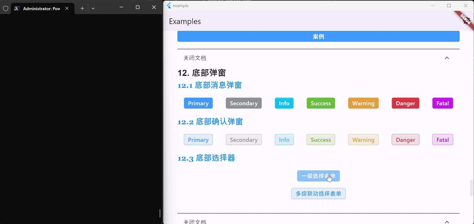
SemanticButton(
  text: '多级联动选择表单',
  shrink: true,
  type: SemanticEnum.primary,
  isOutlined: true,
  onTap: () => BottomSheets.showCascadeSheet(
    context,
    items: [
      {
        'label': '中国',
        'children': [
          {
            'label': '北京市',
            'children': [
              {
                'label': '东城区',
                'children': [
                  {'label': '安定门街道'},
                  {'label': '建国门街道'},
                  {'label': '朝阳门街道'},
                ],
              },
              {
                'label': '西城区',
                'children': [
                  {'label': '德胜门街道'},
                  {'label': '新街口街道'},
                  {'label': '月坛街道'},
                ],
              },
            ],
          },
          {
            'label': '上海市',
            'children': [
              {
                'label': '黄浦区',
                'children': [
                  {'label': '南京东路街道'},
                  {'label': '外滩街道'},
                  {'label': '半淞园路街道'},
                ],
              },
              {
                'label': '徐汇区',
                'children': [
                  {'label': '湖南路街道'},
                  {'label': '斜土路街道'},
                  {'label': '枫林路街道'},
                ],
              },
            ],
          },
        ],
      },
      {
        'label': '美国',
        'children': [
          {
            'label': '加利福尼亚州',
            'children': [
              {
                'label': '旧金山市',
                'children': [
                  {'label': '唐人街'},
                  {'label': '金融区'},
                  {'label': '渔人码头'},
                ],
              },
              {
                'label': '洛杉矶市',
                'children': [
                  {'label': '好莱坞'},
                  {'label': '比佛利山'},
                  {'label': '圣莫尼卡'},
                ],
              },
            ],
          },
          {
            'label': '纽约州',
            'children': [
              {
                'label': '纽约市',
                'children': [
                  {'label': '曼哈顿'},
                  {'label': '布鲁克林'},
                  {'label': '皇后区'},
                ],
              },
              {
                'label': '布法罗市',
                'children': [
                  {'label': '尼亚加拉广场'},
                  {'label': '艾伦敦'},
                  {'label': '拉萨尔公园'},
                ],
              },
            ],
          },
        ],
      },
    ],
  ).then((value) {
    debugPrint('value = $value');
  }),
)
The running effect of the code is as follows:
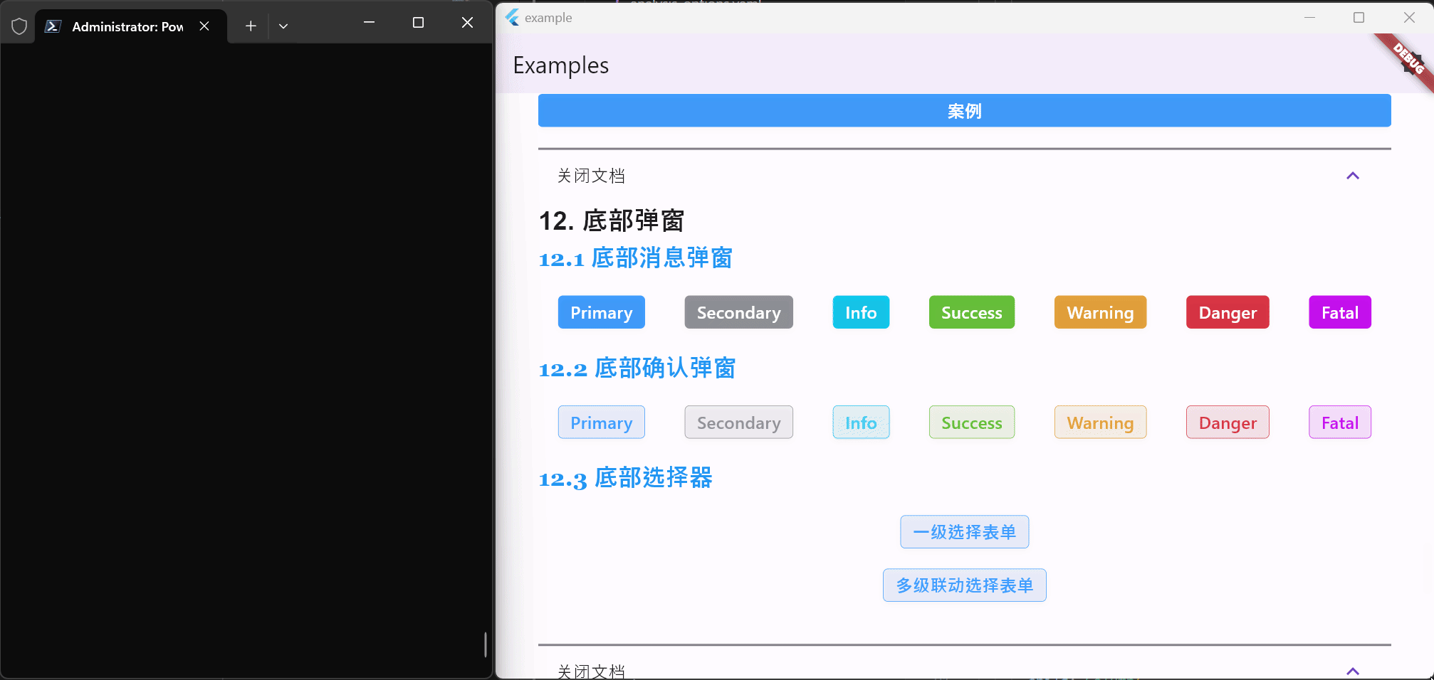
The PrivacyGuard component is used to protect certain page information from being screenshot or leaked. In some scenarios, we need to apply protection to pages. For instance, when a user enters a password, we need to prevent screenshots and screen recordings. Also, when the user leaves the page, it might be necessary to apply a blur effect to the page. This is a fairly common functionality, but there's no direct interface in Flutter to prohibit screen recording and similar actions, making it cumbersome to implement such a simple component each time through communication. Therefore, widgets Easier provides encapsulation for Android and iOS, offering it for use as a standalone widget. The signature of the PrivacyGuard widget is as follows:
const PrivacyGuard({
  super.key,
  required this.child, // The child component being protected
  this.blurRadius = 10.0, // Blur radius
  this.blurColor = const Color.fromARGB(136, 225, 225, 225), // Blur color
  this.onEnterPrivacyMode, // Callback when leaving the page
  this.onExitPrivacyMode, // Callback when returning to the page
  this.preventScreenshot = false, // Whether to prevent screenshots
});
The following code demonstrates a login page guarded by PrivacyGuard:
import 'package:flutter/material.dart';
import 'package:widgets_easier/widgets_easier.dart';

class GuardedPage extends StatelessWidget {
  const GuardedPage({super.key});

  @override
  Widget build(BuildContext context) {
    return PrivacyGuard(
      preventScreenshot: true,
      onEnterPrivacyMode: () => print('onEnterPrivacyMode'),
      onExitPrivacyMode: () => print('onExitPrivacyMode'),
      child: SafeArea(
        child: Scaffold(
          appBar: AppBar(
            title: const Text('Login Page'),
          ),
          body: Padding(
            padding: const EdgeInsets.all(16.0),
            child: Center(
              child: Column(
                mainAxisAlignment: MainAxisAlignment.center,
                children: [
                  const Text(
                    'Guarded Login Page',
                    style: TextStyle(
                      fontSize: 24.0,
                      fontWeight: FontWeight.bold,
                    ),
                  ),
                  const SizedBox(height: 32.0),
                  const TextField(
                    decoration: InputDecoration(
                      labelText: 'Username',
                      border: OutlineInputBorder(),
                    ),
                  ),
                  const SizedBox(height: 16.0),
                  const TextField(
                    decoration: InputDecoration(
                      labelText: 'Password',
                      border: OutlineInputBorder(),
                    ),
                    obscureText: true,
                  ),
                  const SizedBox(height: 16.0),
                  ElevatedButton(
                    onPressed: () {
                      // Login logic
                    },
                    child: const Text('Login'),
                  ),
                ],
              ),
            ),
          ),
        ),
      ),
    );
  }
}
页面的大致效果如下:
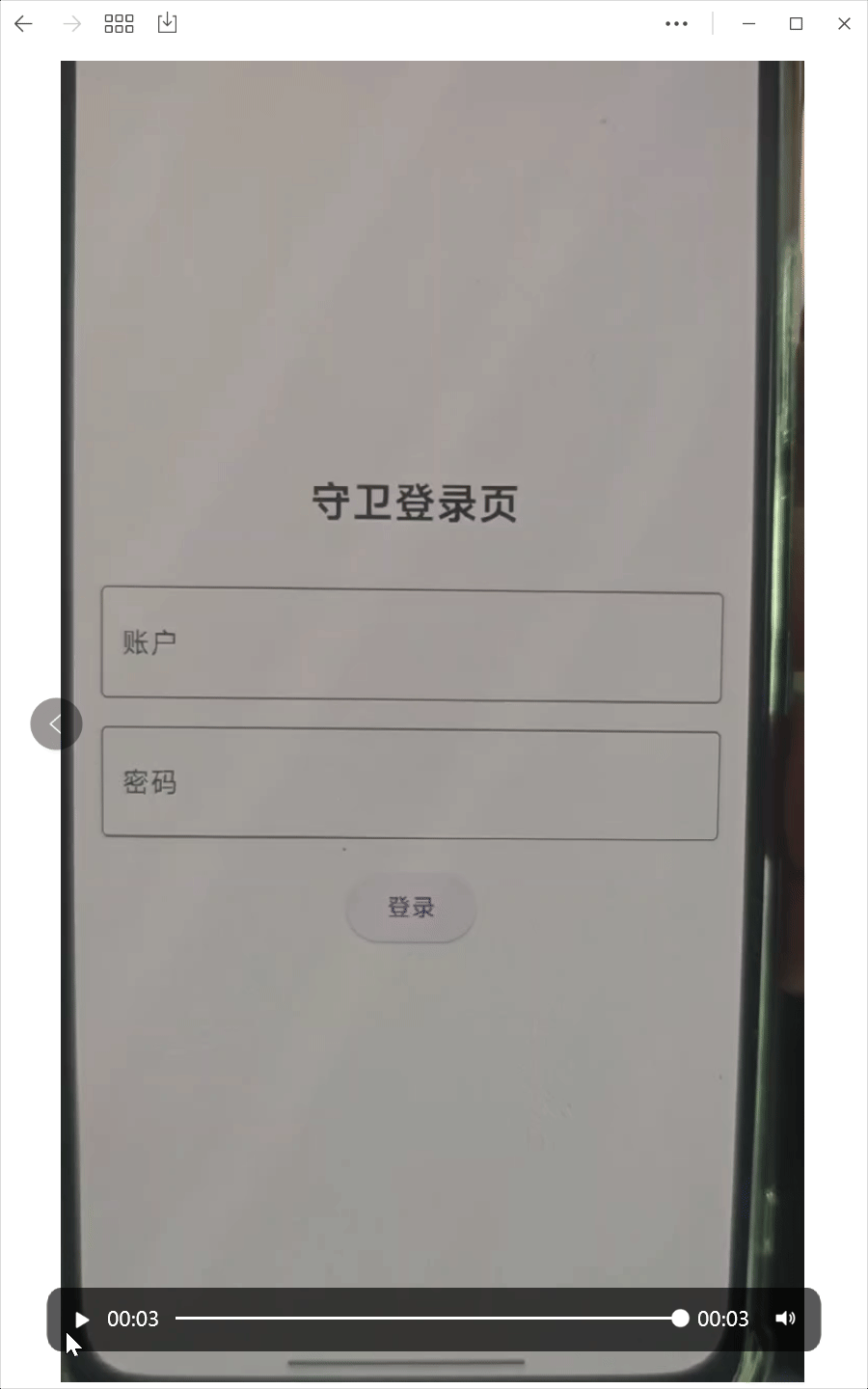
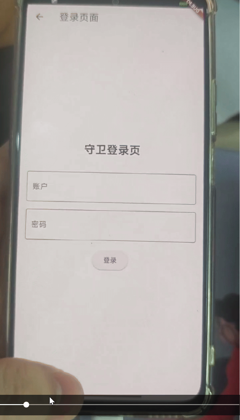
You can provide feedback or report issues on the project's GitHub page. If you think the library is missing a feature, please create a feature request. Before submitting, please check if there are already similar issues.
Please fork this repository to your account, make modifications, and then rebase before submitting a PR to the dev branch. It is recommended that the commit message format be:
type(scope): info about commit.