Business Insider Australia | September 2021
Most Australian airports were busier during the last financial year than pre-pandemic, an analysis of air traffic data has revealed, with FIFO workers in the west driving much of the demand.
That's despite lockdowns grounding flights, decimating profits across the aviation industry and turning the country's busiest airports, like Sydney and Melbourne, into virtual mausoleums.
While the overall number of planes in the air has been drastically reduced, at many of the country's smaller airports, runways have been busier in FY20-21, the first since the arrival of COVID, than in 2019, the year that preceded it.
The uptick in flights across regional Western Australia has mirrored the buoyancy in the price of resources and the state’s renewed appetite for mining exploration.
full article below
At the heart of this project is a very basic function that retrieves and saves the data for individual airports from a popular flight tracking service.
This can be accessed by running a query that references an airport four-letter International Civil Aviation Organization (ICAO) code.
For Melbourne, for example, that means it requires YMML, rather than MEL, the three-letter IATA code that passengers to the airport will be familiar with.
getTrafficByIcao('YMML')

After building this basic function, it meant the data collection process could then be automated, making it quick, efficient and repeatable.
To do that though, access to all the country's ICAO codes would be required.
Australia has more than 1700 airports spread across the continent, many of the remote and infrequently used.
A comprehensive list showing each of these airports and their relevant details was found in an HTML table at fallingrain.com, and downloaded with a similar function to the one above, though this time built to extract data from HTML tables.
dfCODES = getAusIcaoCodes()
dfCODES[0:10]

This produced a table containing 1589 ICAO codes. More than a hundred airports that are either too small to have a listed code or are listed as being closed were excluded from the list.
These codes code then be fed into the getTrafficByIcao function, one by one, with a CSV of each set of results saved separately.
The following was used to produce a matrix of results. This could then be analysed and the data and trends within it reported on.
def makeMatrix():

    dfMATRIX = dfCODES.copy()

    for index, row in dfMATRIX.iterrows():

        print(row['ICAO'], end=' ')

        dfx = getTrafficByIcao(row['ICAO'])

        if dfx.shape[0] != 0:

            for year in ['2019', '2020', '2021', '2022']:
                sums = dfx[dfx['YYYY'] == year][['arrivals', 'departures']].sum()
                dfMATRIX.loc[index, [f'arrivals_{year}', f'departures_{year}' ,f'total_{year}']] = sums['arrivals'], sums['departures'], sums['arrivals'] + sums['departures']

                if year in ['2020', '2021']:
                    sums = dfx[((dfx['YYYY'] == year) & (dfx['MM'].isin(['07', '08', '09', '10', '11', '12']))) | ((dfx['YYYY'] == str(int(year) + 1)) & (dfx['MM'].isin(['01', '02', '03', '04', '05', '06'])))][['arrivals', 'departures']].sum()
                    dfMATRIX.loc[index, [f'arrivals_FY{year}', f'departures_FY{year}' ,f'total_FY{year}']] = sums['arrivals'], sums['departures'], sums['arrivals'] + sums['departures']

    return dfMATRIX

dfMATRIX = makeMatrix()
dfMATRIX


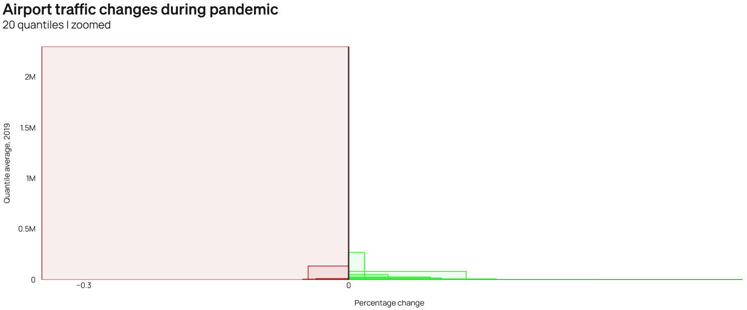
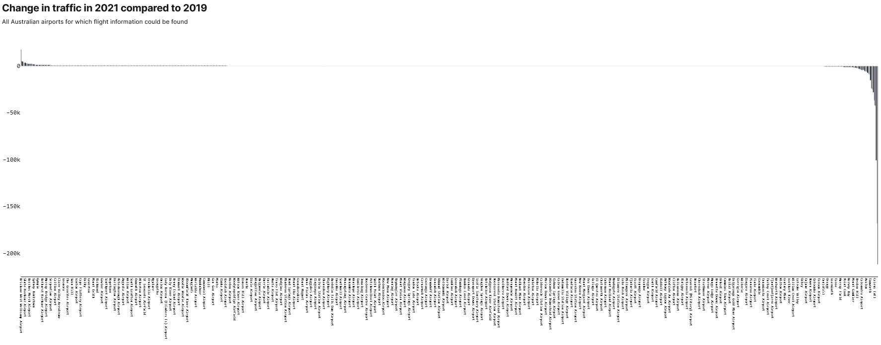
Analysing the data then produced the surprising result that just over half the country's airports had experienced an increase in traffic.
Data for 2019 and FY20 could be found for over 1,000 airports (excluding those with no traffic in either period).
Of these, 505 saw an increase in traffic for the two periods, though as the histogram below shows, the changes were often marginal when compared to the losses.
dfDROPNA = dfMATRIX.copy()
dfDROPNA = dfDROPNA.dropna(subset=['total_2019', 'total_FY2020'])
dfDROPNA = dfDROPNA[(dfDROPNA['total_2019'] > 0) & (dfDROPNA['total_FY2020'] > 0)]
dfDROPNA = dfDROPNA.reset_index(drop=True)
dfDROPNA['change_group'] = np.where(dfDROPNA['total_2019'] < dfDROPNA['total_FY2020'], 'busier', np.where(dfDROPNA['total_2019'] == dfDROPNA['total_FY2020'], 'equal', np.where(dfDROPNA['total_2019'] > dfDROPNA['total_FY2020'], 'quiter', '???')))

fig = px.histogram(dfDROPNA[dfDROPNA['change_group'] != 'equal'], x="change_amount", color = 'change_group', marginal="rug", nbins=100) #   log_x=True  marginal="rug", log_y=True
customChartDefaultStyling.styling(fig)
fig.update_layout(height = 500)
fig.show()

busier_airports = dfDROPNA.copy()[dfDROPNA['change_group'] == 'busier']
busier_airports['change_%'] = round(busier_airports['change_amount'] / busier_airports['total_2019'] * 100, 2)
busier_airports.sort_values(by=['change_amount'], ascending = False)busier_airports

busier_airports = dfDROPNA[dfDROPNA['change_group'] == 'busier']
busier_airports.shape[0] / dfDROPNA.shape[0]

>>> 0.5044955044955045

How do illustrate a trend in traffic data when the numbers are so vastly different and disproportionate?
One approach was to focus on the details, to compare like with like, and to normalise the data, such as in the sparklines above.
At the other end of the scale, comparing major airports -- which are regional hubs -- indirectly told the story of their state's smaller airfields, as well as how they compared against other major hubs.


I also borrowed the idea of 'box-scatter' plots from Bloomberg, which illustrated how the losses dwarfed the gains (see below), while a Marimekko (previous section) chart put a different perspective on how significant the changes were (though may have overemphasised the role of medium airports, as this list included the likes of Adelaide International).
A map-style scatter line-scatter, showing traffic over a week in which Melbourne was locked down, highlighted how quiet the city had become (but also how much 'base-level' traffic still went through the airport).

Most Australian airports were busier during the last financial year than pre-pandemic, an analysis of air traffic data has revealed, with FIFO workers in the west driving much of the demand.
That's despite lockdowns grounding flights, decimating profits across the aviation industry and turning the country's busiest airports, like Sydney and Melbourne, into virtual mausoleums.
While the overall number of planes in the air has been drastically reduced, at many of the country's smaller airports, runways have been busier in FY20-21, the first since the arrival of COVID, than in 2019, the year that preceded it.
The uptick in flights across regional Western Australia has mirrored the buoyancy in the price of resources and the state’s renewed appetite for mining exploration.
At Boolgeeda, the Pilbara airport which services Rio Tinto’s Brockman 4 iron ore mine, Virgin is landing up to a dozen times a day at the moment.
Callion Airport, which sat disused in 2019, has welcomed hundreds of flights this year as Ora Banda ramps up its Davyhurst Gold Mine.
And traffic at Ravensthorpe, which services First Quantum’s nickel mine west of Esperance, is this year already around 70 per cent above 2019 levels.
An analysis of data from flightaware.com shows they are among hundreds of Australian airports - most of them in regional WA - that have seen an increase in traffic during the pandemic.
The number of extra flights these airports are receiving are a fraction of those the industry has lost.
But in WA, they reflect one of the big positives in the economy at large, and are one of the few glimmers of light in an otherwise gloomy time for aviation.
“Talking to major airlines, WA’s about the only line item in black for them at the moment,” said Rob Carruthers, the Director of Policy and Advocacy at the Chamber of Minerals and Energy Western Australia.
“Qantas is running a bunch more Airbus A320s, whereas previously they were running smaller aircrafts.
“The charter flights that are often direct to private mine sites have increased pretty considerably since pre-pandemic times.
“We’ve worked pretty closely with [the aviation industry] during the pandemic. We’ve done everything that we can to keep on going, and they responded amazingly.”
Keeping the industry COVID-free and in full swing helped the state deliver a $5.6 billion surplus in this month’s budget.
It’s also been a small win for Perth Airport, the hub for most of these flights. Arrivals and departures have fallen less drastically there than at its major east coast counterparts.

Through parts of the pandemic, Perth has even had the busiest runways in the country. And while Sydney and Melbourne slumped to previously unthinkable lows, it notched up its busiest June for regional passenger numbers on record, the airport said.
Almost 4.5 million regional passengers passed through the airport in the last financial year, it said, an 11 per cent jump on the comparable period prior to the pandemic.
“The resources sector relies heavily on its FIFO workforce, and those workers rely on Perth Airport to get them safely on their way to where they are needed and to help bring them home again,” its Chief Operating Officer, Scott Woodward, said.
Despite "some big financial losses” - overall passenger numbers are down almost two-thirds - the airport has "done the right thing by Western Australia by keeping our runways and terminals operating", Woodward said.
“Perth Airport has made significant sacrifices to remain operational during Covid to keep the State’s FIFO workforce flying.”
Over east, domestic holiday makers helped Ballina's Byron Gateway airport record the second biggest increase in arrival and departure last financial year (when compared to 2019), behind only Toowoomba’s Wellcamp.
Airports at Hamilton Island and Shute Harbour in Queensland's Whitsundays also saw strong growth in that period.
But those gains are well and truly dwarfed by losses elsewhere, Tourism & Transport Forum Chief Executive Margy Osmond says.
“While there certainly have been some key tourism destinations that have experienced greater numbers of passengers through their airports, this was mainly due to travel within their own states due to the uncertainty around domestic borders.
“It was also prior to the latest round of state lockdowns, which still remain in place.”
She says passenger numbers to the Sunshine Coast have been down as much as 95% in recent months, with similar losses in Cairns and Far North Queensland.
“What the sector needs from both federal and state governments is a continued clear pathway to both interstate and international reopening well before the end of the year, so Australians can plan their summer holiday travel with certainty and confidence and start making bookings today."
Could the correction in iron prices also see the skies go quiet over Western Australia? Rob Carruthers doesn’t think so.
“I expect the production landscape to remain strong through the mid-term. All the major producers have strong guidance around maintaining and incrementally increasing production.
“Clearly the demand for iron ore is going to be predominantly met by Western Australia producers in the short and medium term.”