-
App Folder
- manage.py - script for creating dashboard visualization with Dash
- decision_tree.py - script for analyzing data using a decision tree classification algorithm
- install.sh - shell script for creating the virtual environment
- requirements.txt - text file of required libraries to install in virtual environment
- regression.ipynb - jupyter notebook file for regression analysis
- visualization_report.ipynb - jupyter notebook file for cumulative visualization report
-
Data Folder
-
get_data_from_atlas.py - script for getting data from Chicago Health Atlas
-
food_data.csv - main file data file for dashboard visualizations and decision tree analysis
-
poverty_and_crime.csv - data file used for additional visualizations in Visualization_report jupyter notebook
-
several other draft csv files and draft jupyter notebooks for data visualizations
-
crime Folder
- get_data_from_portal.py - script for getting data from Chicago Data Portal
- total_crime.csv - used in visualizations in visualization_report.ipynb
- several csv files related to crime data
-
project_visualizations folder
- visualization_report.ipynb - cumulative visualization report
- several other csv files necessary for creating visualizations
-
Language requirements: Python 3.8.5 Required Libraries: see requirements.txt
Code to run from the command line from within the app directory:
-
bash install.sh -
source env/bin/activate -
python3 decision_tree.py & python3 manage.py -
Navigate to the address from the previous step, e.g. http://127.0.0.1:8500/, in a web browser.
-
jupyter notebook regression.ipynband follow one of the links starting with http://localhost: (e.g. http://localhost:8888/?token=59fa90841a008fbc90400d4ebdca537ae241d9ced4f6f0cf) or http://127.0.0.1: (e.g. http://127.0.0.1:8888/?token=59fa90841a008fbc90400d4ebdca537ae241d9ced4f6f0cf) in a web browser and select "regression.ipynb"(Note: statsmodels package may need to be installed locally; for some group members this package was causing problems in loading the notebook)
-
(Optional):
jupyter notebook visualization_report.ipynband follow one of the links starting with http://localhost: or http://127.0.0.1: in a web browser and select "visualization_report.ipynb"(Note: You may need to run the notebook file chunk by chunk in order to see the visualizations because of how Plotly works)
-
The result from running decision_tree.py is a dictionary where the keys are the following strings:
all variables,adult_fruit_and_vegetable_servings_rate,adult_soda_consumption_rate,low_food_access,poverty_rate, andpopulation). The value associated withall variablesis the performance rate for a model that uses all attribute variables in successfully predicting the crime rate. That is, how well did a model using all attributes in food_data.csv do at predicting the target class? We found that a model with all variables predicted the crime rate correctly about 55% of the time. Values associated with the remaining keys show how well a model did at predicting the crime rate correctly excluding that variable (key). For example, thepoverty_ratekey is associated with a value of about 41%, meaning a model built without the poverty rate attribute predicted the crime rate correctly 41% of the time. -
The result from running manage.py creates an interactive dashboard. You can interact with the dashboard to choose a variable and explore it in greater details by selecting from the left sidebar drop down menu. You will see a more complete description of the selected variable below the dropdown menu. For example,

-
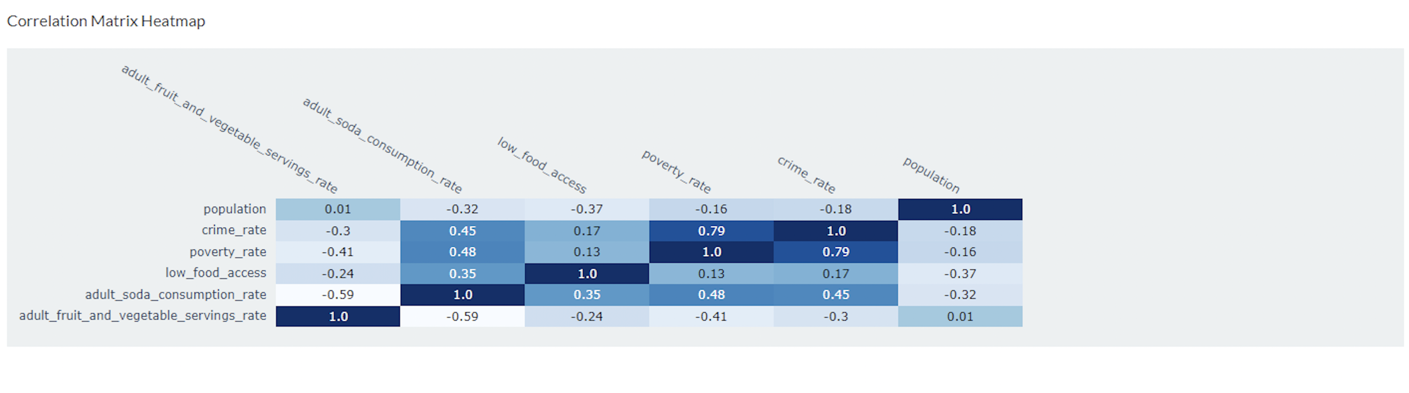
In addition to interactive visualizations, the dashboard also includes a correlation matrix heatmap, which visualizes the correlations between the following variables: adult fruit and vegetables servings rate, adult soda consumption rate, low food access, poverty rate, crime rate, and population
- The result from running the regression analysis substantiates our findings. Running a regression of
crime_rateonadult_fruit_and_vegetable_servings_rate,adult_soda_consumption_rate,low_food_access,poverty_rate, andpopulationshows that, again,poverty_rateis the most statistically significant explanatory variables andadult_soda_consumption_rate, though not significant, appeared to have some influence. Notably, a model with those only two variables succeeded in predicting crime rates with the highest R2, adjusted R2, and the lowest AIC and BIC.