Don't mess with user's font-size or line-height #8423
Conversation
Change the template expansion so that unless fontsize or linestretch are set, browser defaults are used.
|
I recognize that the following isn't quite the same thing, but the principle applies. I'm technically a "low vision" user. I have my font size set to 20 and my minimum font size set to 20. This breaks countless sites and tools, because they've made assumptions about font sizing and layout that don't play well with accessibility tools. Any one person's idea of a "just right" size is too small for some and too big for others. Pandoc should honor what's in its input, and never insert its own opinions about "good" size. Browsers do a spectacular job of handling unspecified sizing in such a way as to accommodate users with various accessibility needs. |
|
LGTM; pinging @mb21 to get a second (well, third) opinion. |
|
Thanks @tarleb... so, this PR is changing exactly two things:
The browser settings are too small for historical reasons (smaller screens), but cannot be changed to not break existing websites. Obviously, the exact values are a matter of taste, but they were discussed at length here: https://groups.google.com/g/pandoc-discuss/c/1oCCbois1G4/m/mazyChM-AwAJ – please read that thread to understand the thinking that led to these settings. Note that pandoc's current CSS makes the text more legible than the browser defaults for the majority of users. Also, all modern browsers support zooming out or into the page, so users are not at all left to the mercy of what's set by the CSS sent from the server. @snan Is there a specific use-case I cannot think of where this CSS takes precedence over a user supplied setting? If so, can you describe and exactly what browser/setting etc? |
|
There are problems with setting font-size on web pages, and the most commonly recommended font-size is the default (which, as of this writing, is 16px, which of course device and browser vendors can change to something that makes more sense for their customers). I submitted this patch immediately after talking to a blind guy who uses pandoc to generate his web page (which he can't see himself, only listen to). He trusts in the defaults, that the defaults selected by pandoc should be good. "User-supplied settings" are almost meaningless to him. |
|
But can you describe a specific problem? The page you linked to seems outdated. From the pandoc-discuss thread I previously linked to:
I don't see how CSS should affect him at all? He'll use a screen-reader that basically reads out the HTML... |
I just wrote it the other day. 🤦🏻♀️
Completely irrelevant to what I wrote, which is don't set font-size. The widely recommended default is (equivalent to) 16px. Not touching font size at all accomplishes that in a more future-proof way.
Blind writers are publishing HTML for sighted readers and if those writers trust in the Pandoc defaults, that'll lead them to publish a non-standard large font size. My patch fixes that issue. |
|
From what I understand, the two issues are
So my understanding is that we can reconcile those two points by setting the default font size to |
No, pixel-based is not the issue. Leave the font at the browser default. |
|
I don't understand then. What are the downsides of setting slightly opinionated defaults, as long as accessibility is not affected. Please explain in more detail (and, if you want to do me a favor, with less swearing / drastic wording than the article above). |
|
OK, upon re-reading everything that was said here and elsewhere on the web, I now understand a little better. The choice is really between respecting user settings and making the site look better for the majority of users. I think I'm in favor of not setting the font-size, but line-height should be set regardless. |
| @@ -1,7 +1,9 @@ | |||
| $if(document-css)$ | |||
| html {$if(linestretch)$ | |||
| html { | |||
| $if(linestretch)$ | |||
| line-height: $linestretch$;$endif$ | |||
There was a problem hiding this comment.
I think this $endif$ can go on the next line without messing up spacing (might need testing). If so, this looks better:
$if(linestretch)$
   line-height: $linestretch$;
$endif$
Same approach for fontsize and the others.
|
I think I'd be in favor of making the default styles for HTML less opinionated and more minimalistic. For LaTeX, for example, we just stick with the default styles (even though for my own output I might prefer different settings). But if we go in that direction there are a number of other things that should probably be reconsidered: e.g., the hard setting of max-width 36em (at least we should offer a One thing I don't like about our current setup is that it doesn't distinguish between things that are really essential for pandoc, such as and things that are more stylistic preferences, which the user might want to override. Currently, if you want to override the default CSS, you need to provide a CSS file using One option would be to have a more minimal default CSS, and change the behavior of |
What swearing? There was no swearing. |
Personally I think everything except font-size and line-height is fine. I can make a better case for font-size whereas for line-height it's more subjective. |
I agree with the principle.
True, although one could argue that the "default" for browsers is no custom CSS, which is what pandoc had for a long time. Until we decided that browser's defaults are just a historical artifact that they need to keep for backwards-compatibility, but nobody actually likes anymore, and that we could improve the lives of most users by loading some minimal CSS with pandoc.
Exactly, it's quite a slippery slope and ultimately mostly subject to personal opinions.
We have the debate whether things should be overriden or somehow merged (and if so what should take precedence) already with metadata arrays and it's not always easy for the user to understand what's going on... Wouldn't it be perhaps enough to split the current
I would like to question this. There is a lot of outdated information floating around the web, both regarding px vs. relative units like em, and regarding the zoom behaviour of browsers, which has improved a lot over the last five or ten years. I could not reproduce any problem with setting the font-size (even setting it in pixels) in a any modern browser. Even after toggling the zoom behviour (in Firefox under menu |
For the sixth time: It's not about px vs em or rem! The method of setting it isn't the issue.Just leave font-size alone. |
I think max-width is especially necessary to keep in, while font-size is especially important to remove, and I'd prefer to remove line-height also. Those three are what I care about. Anything else, like the block quote line or font choice, is fine either way, gone or remaining, either is fine. |
|
@snan I think that was directed at me; it may not be relevant for the PR, but it is for general design decisions. @mb21 I based that statement on a note that I found on MDN. I don't know enough about this topic and current practices to judge the extend to which this holds nowadays.
|
|
It's so odd and jarring being asked over and over why px is worse than em/rem when what I've said all the time that all methods are equally bad. That's why I'm upset, because it's like being in a haunted house. I'm gonna try one more time to explain. Please, please, please note that it's two completely separate things:
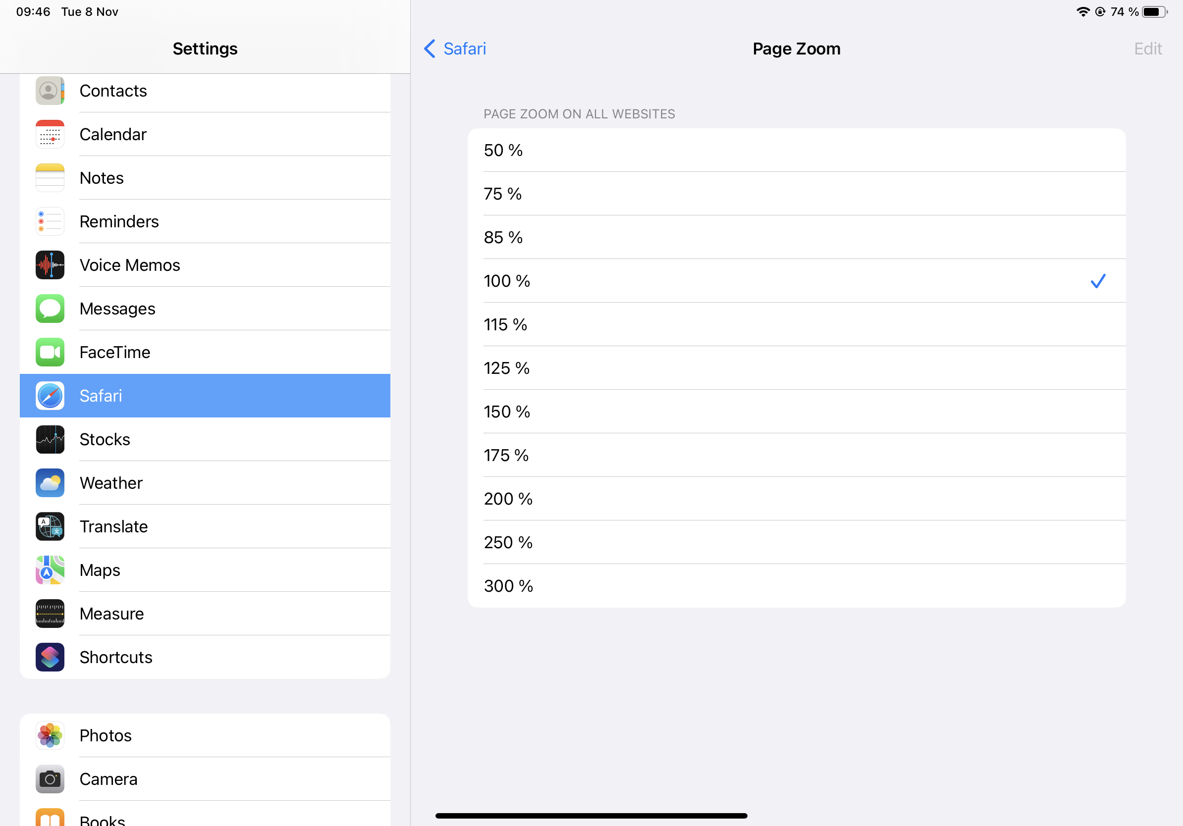
The problem doesn't have anything to do with px or em. Here is the issue. In the settings of most browsers, the user can set font-size or text zoom. Here is Safari on iPad for example:
Let's say they think 1.25% is peachy keen and so they set it to that. Now, everytime they come across a site that has, on the site-level, bumped it up to 20px. This user will, because of their 1.25 local browser setting, see that as 25px and will have to reduce that back down to 20px manually just for that website. (And that's not even possible on Safari since there's no 80% level.) When sites are increasing or decreasing the prose font size on the site-level, that leads to the web being a very bumpy ride of users always having to bump up and down and personally tweak everything. That is the problem. Rem or em or percentages doesn't fix that. I'm only talking about the main body font here, what I call "prose font size", for reading longer texts (but that's just what Pandoc is perfect for). Signage, headers, other things can be styled and resized, that's OK. Just let text for reading remain set for reading. To repeat myself a bit: If it were really true that 16px was too small, and on some devices it kinda is and on others it definitively isn't, there are three places to change that. Each and every end user can change the setting personally. That's a chore, but ultimately needs to remain possible since people's vision issues are different. Another possibility is that the browser vendors can change their default. The worst option, and why I sent this patch, is to do it on the site level, that every single website on planet Earth call each other up on the Friday night phone chain and agree to bump it up from 16px to 20px. Old Angelfire and GeoCities sites that haven't been updated since 1997 need to be ftp'd into one last time in order to add this. I think this is a very bad idea. I know there is precedent with the complete mess that was meta window viewport, but please let's not go through that again.
It has always been possible, even back in the nineties it was possible, modern browser or old browser, that's irrelevant. (Modern or old screen matters since 12px was where it was at on those old CRTs.) Now I'll explain why the whole em/ex thing happened. Please note that this has nothing to do with my patch and is a complete sidetrack. Back in the early days, when you were zooming in/out in webpages, sure, the text got bigger/smaller, but only the text did. Regardless of the unit the text was set in. Frame elements, images, borders, tables etc did not change. (Sounds to me like the "zoom text only" setting brings back that behavior.) As you might imagine, this led to wonky webpages. Text not fitting on their own backgrounds or in their own block elements. That was the origin of ex and em. The idea was that you'd use these for those non-text elements you wanted to be sized relative to your text's size. So if you had a container based around an image, you'd leave that container's size in px, but if you had a container based around some text, you'd want to size that container in ex or em. Ex was buggy in one of the early browsers (probably IE) so em it was. Of course, you could also use em to resize non-standard text relative to your main font's text (although
Back then the issue was actually that people were cranking it down. Verdana was in vogue, but that's a font that, because if it's much bigger ex-height and some less-than-thought-through pixel hinting decisions, looked a li'l too large at the then default 12px. So sites would set Verdana and then crank it down to 10px, leading the sites to look way too small for those that didn't have Verdana installed. That was bad. My motto, consistent over the years: "don't touch font-size", ended up being a good and future-proof motto. All those sites that set it to 10px or even hardcoded the default 12px, they look way too small in this era when 16px is the default. (And px is a resolution-derived size, which made sense in the days of pixel-hinted fonts but not so much now—again, rem/em/percent are also derived from resolution, indirectly—inches and mm aren't.) |
That's vague but correct, for things other than the prose font-size itself. Being able to zoom text was an accessibility feature back then (before smartphones and such made it something that concerns everyone) and you'd want some elements to be sized relative to the user's font size. (This was in the day when scaling images did not look very good and was not particularly fast, which is why the current method of setting a zoom factor for the entire page wasn't used.) |
|
@snan I do understand the argument, but one has to acknowledge that, given that many sites already set font sizes, it's not as straightforward as you make it out to be. If every site refrained from setting font sizes, then everyone could have a nice experience by adjusting zoom settings to suit their own preferences. But changing pandoc will not change the fact that many sites do set font sizes, and thus won't fix the "bumpy ride" problem. If most sites set larger font sizes, then we contribute more to bumpiness if we don't set them similarly. We have to figure out what's best for the actual world, not an ideal one. |
|
@mb21 yes, at the very least I think separating out the "essential" bits of styles.html into a separate partial is probably a good idea. I'd also suggest that those essential bits should still be included when |
That's also itself a meta-problem pandoc risks exacerbating by participating in the cold war of bumpiness. Fortunately, the most commonly given recommendation for prose text on the web seems to still be 16 px, which is also what the spec itself suggests. 16px also seems to be the most common size. For example, the web page we're on right now (GitHub's comment thread) uses 14px, which is even smaller. Apple uses 17px on their support pages. Pandoc's own user guide is on the larger side and uses 13pt which becomes 17.33px on screen. That's still much smaller than the 20px of Pandoc's defaults before my patch here. |
Commit changes the template expansion so that unless fontsize or linestretch are set, browser defaults are used.
I realize that this isn't gonna be an "sure, NP, that's a small fix" automatic merge and that it's gonna see some resistance, and it's an immediately visible change from how the template currently looks, but I think it's ultimately the right call.
I don't think huge letters and enormous leading is necessarily good, readable typography for prose text. Even if you do, there are four places prose text font-size can be set:
Which of those four places do you think is the absolute worst and most pessimal to mess with this setting? That’s right, 2. On the site side. Making this a site-specific tweak, making the new, partially adopted "de facto default" 20px, is gonna lead to the web becoming even more of a gross hodge-podge of styles.
Even if you disagree with that, the commit still respects the pandoc user's $fontsize and $linestretch variables. (Those settings are not good for the open web but maybe people are generating styled HTML for other things.)