📌 Below document is for v1. v2 version will be added soon
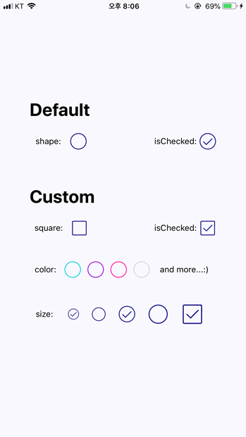
This is a simple React Native app built with expo which provides the preview page introduced in the npm package→'react-native-just-checkbox'. 'react-native-just-checkbox' is a CheckBox component for React Native where you can customize the size, the color, and the shape of a CheckBox component which supports both iOS and android.
If you want to use the npm package in your own project, please visit 'here(npm package link)' for installation and guides.
$ git clone https://github.com/jinnnnn-n/react-native-just-checkbox
$ cd react-native-just-checkbox
$ npm install # or yarn install
$ expo start # or yarn start
| PROPS | DESCRIPTION | TYPE |
|---|---|---|
| isChecked | initial state of the checkbox, DEFAULT: false | bool |
| checkBoxSize | size of the checkbox, DEFAULT: 30 | number |
| checkColor | color of the checkbox, follows 'React Native Named colors', DEFAULT: 'navy' | string |
| squareCheckBox | By default, we provide a circle-checkbox. By settting this props to true change the shape of the checkbox to square. No props are needed for the circle-checkbox. | bool |
| onToggle | function which is invoked when the checkbox is clicked | function |