A simple and lightweight vanilla JS (no dependencies) color dialog box with alpha selection.
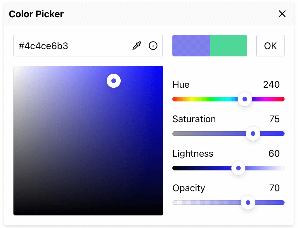
- HSLA Sliders for precise color adjustments
- Hex input supporting #rrggbbaa notation
- Integrated color picker
- EyeDropper tool (only for Chromium-based browsers)
- Quick access to ColorHexa, the color encyclopedia
- 🗜 Lightweight: Only 5.9 KB (minified and gzipped).
- ⚡ Fast: Built with standards based Custom Elements.
- 😎 Framework-agnostic: Can be used with any framework.
- 🛡 Bulletproof: Written in strict TypeScript with 100% test coverage.
- 📱 Mobile-friendly: Works well on mobile devices.
- 🧩 No dependencies
npm install color-dialog-box --save
You can also use one the following CDN:
<script type="module" src="https://unpkg.com/color-dialog-box"></script>ESM:
<script type="module" src="https://esm.sh/color-dialog-box"></script><button>Open the color picker</button>
<color-picker></color-picker>
<script type="module">
import 'color-dialog-box';
const open = e => {
picker.setAttribute('open', true);
};
const update = e => {
console.log(e.detail.hex);
};
bt.addEventListener('click', open);
picker.addEventListener('update-color', update);
</script>Note
You'll probably only want to add a single instance of
<color-picker>, even if you need to change the color of different parts of the document. See an advanced example for more details.
To set a default color, you can add a hex attribute to the <color-picker> element. For example:
<color-picker hex="#ff4400"></color-picker>By default, the color dialog box is hidden. To open it when the page loads, use the open attribute set to true:
<color-picker hex="#ff4400" open="true"></color-picker>color-dialog-box supports CSS Shadow Parts and CSS Variables for custom styling.
Supported part names:
dialog, header, wrapper, hex, preview, area, sliders
Example (of a dark theme) :
color-picker {
    --bg-primary: #212031;
    --bg-secondary: #343445;
    --border-color-primary: #494b6f;
    --border-color-secondary: #6d7bff;
    --bg-header: #15161b;
    --txt-color-primary: #fff;
}

color-picker::part(cancel),
color-picker::part(eyedropper),
color-picker::part(info) {
    filter: invert(1);
}You can change the labels by using the following attributes:
label-title, label-hue, label-saturation, label-lightness, label-opacity, label-ok
<color-picker label-hue="H" label-saturation="S" label-lightness="L" label-opacity="A"></color-picker>- ColorBeta: Advanced CSS Gradient Generator