HTPressableButton is designed for iOS developers to be able to spend time developing ideas, not building basic buttons. These stylish and flat-designed buttons can easily be modified and are perfect for almost any project. With no worry over color choice, HTPressableButton also includes beautiful color schemes that perfectly suit with your app.
Compatible with iOS 6.0++
Current Version: 1.0.1
HTPressableButton can be installed via Cocoapods
pod 'HTPressableButton'You may also quickly try the HTPressableButton example project with
pod try 'HTPressableButton'Another option is to use git submodules or just download it and include it in your project manually.
NOTE: Please be reminded to add the header file when implementing
#import "HTPressableButton.h"
#import "UIColor+HTColor.h"
UIColor+HTColor.h is not needed if you don't intend to use the color scheme provided (below).
IMPORTANT: You must specify the style of the button you wish to add to your app.
###Rectangular Button
    HTPressableButton *rectButton = [HTPressableButton buttonWithType:UIButtonTypeCustom];
    rectButton.frame = CGRectMake(30, 150, 260, 50);
    rectButton.buttonColor = [UIColor grapeFruitColor];
    rectButton.shadowColor = [UIColor grapeFruitDarkColor];
    rectButton.style = HTPressableButtonStyleRect;
    [rectButton setTitle:@"Rect" forState:UIControlStateNormal];
    [self.view addSubview:rectButton];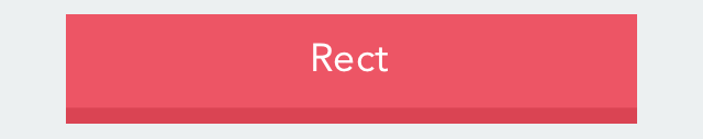
###Rounded Rectangular Button
    HTPressableButton *roundedRectButton = [HTPressableButton buttonWithType:UIButtonTypeCustom];
    roundedRectButton.frame = CGRectMake(30, 230, 260, 50);
    roundedRectButton.style = HTPressableButtonStyleRounded;
    [roundedRectButton setTitle:@"Rounded" forState:UIControlStateNormal];
    [self.view addSubview:roundedRectButton];
###Circular Button
    //Circular mint color button
    HTPressableButton *circularButton = [HTPressableButton buttonWithType:UIButtonTypeCustom];
    circularButton.frame = CGRectMake(110, 300, 100, 100);
    circularButton.style = HTPressableButtonStyleCircular;
    circularButton.buttonColor = [UIColor mintColor];
    circularButton.shadowColor = [UIColor mintDarkColor];
    [circularButton setTitle:@"Circular" forState:UIControlStateNormal];
    [self.view addSubview:circularButton];
NOTE: The default values of the buttons are:
| Attribute | Values |
|---|---|
| Font | Avenir |
| Font Size | 18 |
| Shadow Height | buttonSize * 0.17 //17% of the button height |
| Button Color | jayColor |
| Button Shadow Color | jayDarkColor |
###Additional Colors You can freely use the additional colors in the file UIColors+HTColor anywhere in your project by:
    [UIColor colorNameHere]

    [UIColor jayColor]
    [UIColor pinkRoseDarkColor]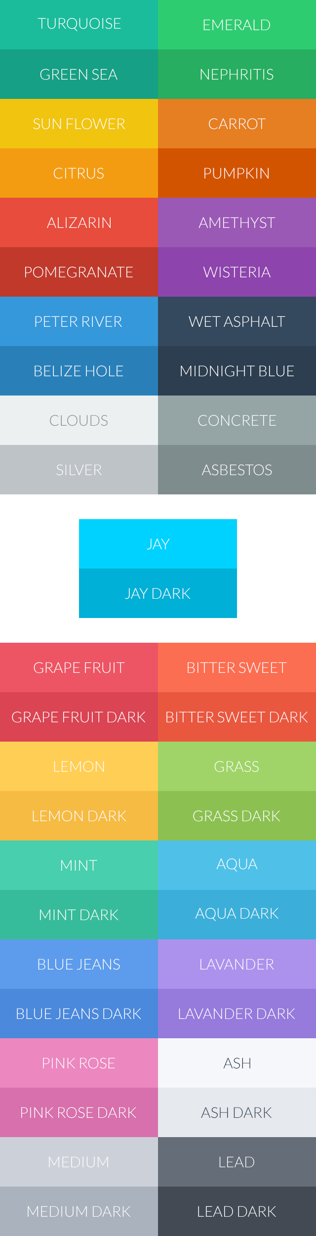
Welcome contributors! Don't hesitate to make a pull request. We also give special credit as below if you help contribute :)
We would love to see how we became a part of your project. Show your app!
This projected is licensed under the terms of the MIT license.
Inspired by: