CSS modal. No javascript.
See the demo: http://jorgechavz.github.io/pure-css-modal/
Via bower
bower install pure-css-modal
Add the CSS file to your project
<link rel="stylesheet" "bower_components/pure-css-modal/css/modal.css"/>Add this basic HTML to your site.
<div class="modal">
<input id="modal-trigger" class="checkbox" type="checkbox">
<div class="modal-overlay">
<label for="modal-trigger" class="o-close"></label>
<div class="modal-wrap">
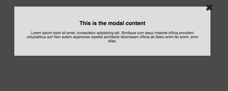
<label for="modal-trigger" class="close">✖</label>
<h2>This is the modal content</h2>
<p>
Lorem ipsum dolor sit amet, consectetur adipisicing elit. Similique cum sequi maxime officia provident voluptatibus aut! Non autem asperiores repellat architecto laboriosam officiis ab libero enim illo animi, error alias.
</p>
</div>
</div>
</div>Use a label as a trigger
<label for="modal-trigger">Launch modal</label>Add entrance direction to the modal by adding any of this classes to the modal-wrap div
| Class |
|---|
| from-top |
| from-bottom |
| from-left |
| from-right |
You can center the modal in the middle of the screen by adding the class a-center to the modal-wrap
| Class |
|---|
| a-center |
For example:
<div class="modal">
<input id="modal_trigger" class="checkbox" type="checkbox">
<div class="modal_overlay">
<label for="modal-trigger" class="o-close"></label>
<div class="modal_wrap from_top">
<label for="modal_trigger" class="close">✖</label>
<!-- YOUR CONTENT HERE -->
</div>
</div>
</div>You also can config the size of the modal by adding one of this classes
| Class |
|---|
| small |
| full |
For example:
<div class="modal">
<input id="modal_trigger" class="checkbox" type="checkbox">
<div class="modal_overlay">
<label for="modal-trigger" class="o-close"></label>
<div class="modal_wrap small from_top">
<label for="modal_trigger" class="close">✖</label>
<!-- YOUR CONTENT HERE -->
</div>
</div>
</div>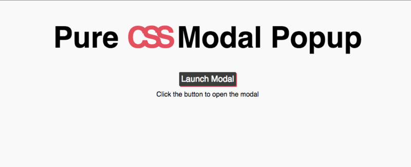
Jorge Chavez https://github.com/jorgechavz
The MIT License (MIT)
See LICENCE for details.