- How to analyze the architecture of a project starting from a wireframe.
- How to use the BEM architecture in a project.
- Apply styles for each breakpoint.
- Evaluate the quality of the design with Lighthouse.
Click this link to check the finished website
It is important to know that this course is the practical continuation of the Ultimate HTML and CSS Course.
You will create a complete real project that adapts to different screen sizes. This will be a project you can add to your portfolio to showcase your skills in Web Development.
Here are some of the tools you need to use:
- Figma: one of the most widely used software tools for building high-quality wireframes or prototypes is Figma.
Web projects are analyzed from the wireframes shared by the design team. Wireframes are prototypes that allow us to have a clear structure of what the real project will be, which we as developers will have to turn into code.
The project you will build can be found here.

It is a static landing page with a header, a footer, and four content sections. To see how it is designed, go to the tab above and select "Open in editor."

You will be able to see all the screens created by the design team, along with the color palette, buttons, fonts, images, etc. You can also see, by clicking on a section, the CSS code that Figma recommends. It is not about copying and pasting, but about reviewing the elements that compose it to use them in our code, such as the font, color, or sizes.

In responsive design, a design adapts to different views regardless of which device it was developed for first, and with this standard, we will create for mobile devices first.
- For Developers: Scaling is Easier
Converting a desktop view to a mobile view requires various considerations and can become complex as it often involves removing elements from the view, whereas it is generally easier to add them.
Mobile First, on the other hand, makes this experience more manageable, and at the code level, it is quite simple to scale from mobile to larger views, with the opportunity to add additional components in the process.
- For Users: Less is More and for More People
Yes, it is true that more people are browsing on mobile devices. Mobile First not only reaches more devices due to the wide variety of views available on the market but also reaches more people.
Simplicity in design helps make your communication effective towards your users, providing a pleasant browsing experience and, together with an accessible design, significantly increasing your reach.
This also adds value to your users with limited connection speeds and/or low-end devices.
- For Businesses: Better Search Engine Positioning
Google began working in early 2018 with an algorithm that gives greater relevance to sites optimized for mobile. This will not affect sites that have both desktop and mobile versions but will penalize those lacking a mobile alternative.
For SEO purposes, this can mean a lower user bounce rate if the content is attractive enough to retain users' attention.
Just as technology advances, we can also observe changes in frontend development trends that even become standards, such as Mobile First.
Initially, we developed for desktops where our website could be accessed from a desktop computer and laptop monitors. Then arose the need to adapt these sites to portable devices like smartphones and tablets.
As mobile site consumption increased, the need arose to develop first for these devices and then scale to larger screens. This evolution has led to some services being available as mobile-only, where the only way to access them is from a mobile device, such as financial applications, home delivery services, and more.
This popular social network has undergone various design transformations, one of the most important being its visualization across different devices.
By analyzing these screenshots, you can see how the mobile view remains quite simplified, and as the view size increases, other elements are added while maintaining common ones.
Mobile View (iPhone X)

Desktop Browser View

Reduced Desktop Browser View

Now you know why this standard is so important in your knowledge as a web developer. In addition to ensuring that your sites reach more devices and people, you are also making your code easier to scale and modify in the future.
Web architecture can be defined as the way in which the pages of a website are structured and linked to each other in a logical and coherent manner. An ideal web architecture helps users and search engines easily find what they are looking for on a website.
- A header with a logo, title, and a button.
- A section with a logo, text, and a table.
- A second section with titles, cards, text, and some icons.
- A third section with a background image and a title.
- A final section with cards, a title, text, and a price carousel.
- A footer with an image and text.
Thus, we could define the basic structure of the body of our index.html as follows:
<body>
    <header></header>
    <main>
        <section></section>
        <section></section>
        <section></section>
        <section></section>
    </main>
    <footer></footer>
</body>
Remember:
You should have your index.html and .css files within organized folders.
"index" is the filename that the browser reads first.
To abbreviate the writing of HTML code, you can use Emmet. In this case, to write the basic structure, use: header^main>section*4^footer
Let's learn how to download the resources or assets for a project from the prototype sent by the design team, in this case from Figma. It is important to have them ready when creating the code so that you only need to add them with the link.
Assets are all the static resources such as images, audio, documents, and others that we will use in our project.
First, enter the project prototype in Figma.
- To download any resource, click on it to see its details in the right panel.
- Go to the "Export" tab.
- Choose the format in which you want to download the resource, in this case, an image.
- In the "Preview" tab, you see the final result of the resource. * The image to download has a transparent background.
- Click on "Export".

If an asset is made up of many others and you want to download it as a single file, you need to select its group.

When selecting the group, follow the same steps as above to export from the right panel. Don't forget to check the preview to make sure you selected the group correctly.

And that's how we download all the images and other assets we need for our project. I recommend downloading images in .svg format whenever possible, as this is the best format for use on the web.
Here is a link to a folder where all the assets to be used are separated into folders. Download here.
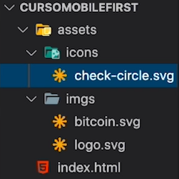
For this case, we will create an assets folder containing two folders to distinguish which ones we will use as icons and which as images.
Rename the files so they are easy to remember, eliminating spaces to avoid conflicts with the browser when interpreting them.
There are various types of fonts that make up the design of a project. Remember that as part of best practices in web development, you should not have more than two fonts. If you find more than two, you will need to communicate with the design team to reach a conclusion on which ones to choose.
The design team may have already provided you with a report containing this information, but if not, you can identify the font from the project in Figma. To do this:
- Click on the font to inspect.
- In the right panel, under the inspect tab, you will see details such as size, weight, and font type. You must consider all these details when searching for them.

This way, we check all the texts to ensure the number of fonts used.
One of the best websites to find fonts is Google Fonts. To download the fonts for our project, follow these steps:
- Copy the name found in the "Inspect" tab of the selected font. Click on the font.

- You will find various font weights. Select them based on the ones found during the inspection of our project by clicking on "Select this style." Repeat these steps with the other font if you find more than one.

- Once you have selected the fonts and weights that you will use, select the "Embed" tab in the right panel. Copy the link provided by Google Fonts.

To link the copied link from the previous step, open your index.html file and go to the head section. Paste the link just below the title tag.
The generated link for the project we are working on is the following:
<link rel="preconnect" href="https://fonts.googleapis.com">
<link rel="preconnect" href="https://fonts.gstatic.com" crossorigin>
<link href="https://fonts.googleapis.com/css2?family=DM+Sans:wght@400;500;700&family=Inter:wght@300;500&display=swap" rel="stylesheet">
Note: The link tag with the attribute value rel="preconnect" informs the browser that the page needs to establish a connection to another domain as quickly as possible. This way, when the browser needs to use the resources (in this case, the fonts), the resource download will be faster because the connection will already exist. This helps improve the page's performance.
Remember that Google itself indicates, right below the link it provides, how to call the font family you selected.

The link tag with the attribute value rel="preconnect" informs the browser that the page needs to establish a connection to another domain as quickly as possible. This way, when the browser needs to use the resources (in this case, the fonts), the resource download will be faster because the connection will already exist.
This helps improve the page's performance. More information here.

As part of best practices, there is an order in which it is recommended to write code within CSS. This will help you keep all sections organized and know where to go back to when you need to make a change or solve a problem.
- Positioning --> static, absolute, relative, fixed.
- Box Model --> margin, border, padding, content.
- Typography --> font types, sizes, etc.
- Visual Styles --> box-shadow, border-radius, gradient, etc.
- Others --> miscellaneous, CSS rules, and more.
In the Branding section of the design in Figma, we can see all the colors that are used. For now, the variables we will create will be based on these colors.

By clicking on the adjustment icon of each color, you can view the details. Here, we have the hexadecimal code that we need.

Remember, to declare a variable in CSS, we use the :root function and add a name to the variable that will contain the value we will use repeatedly in our code. Selecting all the colors, we would have:
:root {
    --bitcoin-orange: #f7931a;
    --soft-orange: #ffe9d5;
    --secondary-blue: #1a9af7;
    --soft-blue: #e7f5ff;
    --warm-black: #282623;
    --black: #201e1c;
    --grey: #bababa;
    --off-white: #faf8f7;
    --just-white: #fff;
}
Once the variable section is declared at the top, it is time to reset the default styles that the browser brings with the practices we already know.
* {
    box-sizing: border-box;
    margin: 0;
    padding: 0;
}
We will also change the font size to 62.5% to make it easier to use with REM measurements. And we will change the font style that we have embedded from Google Fonts.
html {
    font-size: 62.5%;
    font-family: 'DM Sans', sans-serif;
}
You have just applied the first styles by resetting the default ones, applying the font style, and creating the first variables of the project.
First, create an img tag inside the header for the logo. Then, a div container that contains:
h1for the main titlepfor the paragraph- An
atag for the call to action, which also contains aspantag for the small icon next to it.
The code would look like this:
<header>
    <img src="" alt="">
    <div>
        <h1>The next revolution in cryptocurrency exchange</h1>
        <p>Batatabit helps you navigate different prices and trends.</p>
        <a href="">Check out our plans <span></span></a>
    </div>
</header>
The next step is to apply classes to call them from CSS and start applying styles.
To name the classes of containers and contents, we will use the BEM methodology
BEM (Block, Element, Modifier) is an agile development methodology based on components. It divides the entire interface into reusable and scalable blocks.

This way, we can break down a section into multiple smaller sections and name them in this order and function.
- Since there won’t be another
imgtag within theheader, we can skip adding a class and refer to it specifically. - The
divtag is very common, so a class is necessary. We can name itheader–title-container, whereheaderis the main container andtitle-containeris the content. - The
h1tag is unique throughout the page, so there’s no need to add a class. - Buttons are also common, so we apply the class
header–button.
Don’t Forget:
- Set the image path in your img tag.
- Link your .css file to your index.html before starting to apply styles.
Remember, we are designing for mobile first, so our view should focus on that. When checking the results in the browser, make sure to have the Dimension: Responsive option enabled in the DevTools.
- Header
- Apply
position: relative. - Use
display: flexandflex-direction: columnto arrange it in columns. - Adjust the width to 100% of the screen and the height to 334px.
- Limit the width to a minimum of 320px.
- Center the text with text-align: center.
- Apply
header {
    position: relative;
    display: flex;
    flex-direction: column;
    justify-content: center;
    width: 100%;
    min-width: 324px;
    height: 334px;
    text-align: center;
}
- Img
- Define the dimensions of the logo with a width of 150px and a height of 24px.
- Set the top margin to 60px.
- Since we are using display: flex in the parent container, center the logo with align-self: center.
header img {
    width: 150px;
    height: 24px;
    margin-top: 60px;
    align-self: center;
}
- Div
- Call the container directly by the name of its class.
- Adjust the container's width to always remain 90% between 288px and 900px. That is, it won’t grow larger than 900px or shrink smaller than 288px.
- Set the height to 218px.
- Add a top margin of 40px.
- Center the text with
text-align: center. - Center the container with
align-self: center.
.header--title-container {
    width: 90%;
    min-width: 288px;
    max-width: 900px;
    height: 218px;
    margin-top: 40px;
    text-align: center;
    align-self: center;
}
You should be able to see our progress like this:

After implementing BEM, it’s time to apply the remaining styles to the header of our project, such as the gradient background, the h1, and p tags.
Let's go to the project prototype in Figma. By clicking on the background, we can see the colors it uses. In the CSS code section, we find a linear-gradient with the information we need. We copy it and add it to the header styles.
background: linear-gradient(207.8deg, #201E1C 16.69%, #F7931A 100%);

This code shows the color percentage distribution, giving 16.69% to black and 100% to orange. When rendering it in the browser, we see that the orange occupies more space than the black, each positioned in opposite corners.
Note: If you want to create gradients easily, I recommend using CSS Gradient. It's very simple and intuitive to use.
- We review the main title styles in the prototype, not to copy them, but just to take details like text size and weight.

-
We call the
h1tag using the containing class name.header--title-container. While we could just call theh1tag since there should only be one in the entire document, being specific is part of good practices. As you advance, you’ll use libraries like Bootstrap that may bring styles for certain tags. By being specific, the styles we apply won’t be affected by these. Always try to be specific. -
We adjust the font size with
font-size: 2.4rem (24px)and the weight withfont-weight: bold. -
We set the line height with
line-height: 2.6rem. -
We change the color using the corresponding variable,
color: var(--just-white).
.header--title-container h1 {
    font-size: 2.4rem;
    font-weight: bold;
    line-height: 2.6rem;
    color: var(--just-white);
}
- We call our paragraph tag from the containing class
.header--title-container.

- We add a top margin to separate it from the title with
margin-top: 25px. - We adjust the size with
font-size: 1.4remand the weight withfont-weight: 500. - We give it a line height with
line-height: 1.8rem. - We change the font color using the corresponding variable,
color: var(--soft-orange).
.header--title-container p {
    margin-top: 25px;
    font-size: 1.4rem;
    font-weight: 500;
    line-height: 1.8rem;
    color: var(--soft-orange);
}
In the browser, we should see this result:

You might have seen the button in the middle of two sections and thought: "How complicated!" But it’s not that difficult. It’s known as a floating button because it seemingly isn’t in any section but between two, giving the impression of floating in the air. The way to position it there is much simpler than it seems: by modifying its position.
Follow these steps:
- Call the button class from the container class with
.header–title-container .header–button. - Define its position as absolute. This makes it take the relative position of its direct parent (in this case, the header) and allows us to position the content anywhere within the container. Remember, only when the position is absolute can you add top, bottom, left, and right, because it’s fixed. This doesn’t happen if its position is relative.
- Center it with
left: calc(50% - 118px). This keeps it centered at 50%, but since the button is quite large, it subtracts 118px to the left, centering it. - Move the button down from the container with
top: 270px. - Add a top margin of 35px.
- Add internal padding with
padding: 15px. - Set its width to 229px and height to 48px.
- Give it the corresponding background color with the variable
--off-white. - Add a shadow to give it a floating effect.
- Remove any possible default border with
border: none.`` - Round the borders with
border-radius: 5px. Set the font size to 1.4rem and make it bold withfont-weight: bold``. - Remove the underline with
text-decoration: noneand give it a black color with the created variable.
.header--title-container .header--button {
    position: absolute;
    left: calc(50% - 118px);
    top: 270px;
    display: block;
    margin-top: 35px;
    padding: 15px;
    width: 229px;
    height: 48px;
    background-color: var(--off-white);
    /* Shadow */
    box-shadow: 0px 4px 8px rgba(89, 73, 30, 0.16);
    border: none;
    border-radius: 5px;
    font-size: 1.4rem;
    font-weight: bold;
    text-decoration: none;
    color: var(--black);
}
It would look like this:

- Call the span tag where we’ll create the icon from its container class with
.header–button span. - Set the display to inline-block to keep it in the same space as the accompanying text.
- Set its width to 13px and height to 8px.
- Add a left margin of 10px to separate it a bit horizontally from the text.
- Call the icon file with background-image.
If the file you want to call is in a different folder than your .css document, you need to call the main folder.
You place ../ in the URL to go to the previous folder and from there find the asset. In this case, the file is in a folder within the folder where the .css file is, so we would put url("./assets/icons/down-arrow.svg").
Remember that the URL always goes in quotes.
.header--button span {
    display: inline-block;
    width: 13px;
    height: 8px;
    margin-left: 10px;
    background-image: url("./assets/icons/down-arrow.svg");
}
Our final result would look like this:
We’ve finished the header! We learned and reviewed many important functions such as positioning content with flex, defining gradients, and using calc (which can save you from many symmetrical problems).
We begin the second section of our project. To create it, we first need to analyze the design provided to us so we can start laying it out in our index.html. Let’s get to it!
First, add an identifying class to the first of the four sections we have. Using the BEM methodology, class="main-exchange-container", create the first div container inside which we will place the image. Add the class backgroundImg.

Create the second div container for the h2 title and the p paragraph, in which we add the written content from the design. Add the class main-exchange-container--title, where main-exchange-container is the block and title is the element.
The tables that show the currency values are a section by themselves, so it is more correct to create a section instead of a div. Place the div inside it.
<section class="main-exchange-container">
    <div class="backgroundImg"></div>
    <div class="main-exchange-container--title">
        <h2>We make all exchange rates visible.</h2>
        <p>We bring real-time information from the world's most important exchanges and currencies.</p>
    </div>
    <section class="main-tables-container">
        <div></div>
    </section>
</section>
There are three elements to keep in mind:
Main
-
Adjust the width to 100% and the height to auto because the content we add will define the space it occupies.
-
Add
min-width: 320pxto prevent distortion at smaller sizes. -
Give it a background color using the variable --off-white.
main {
    width: 100%;
    min-width: 320px;
    height: auto;
    background-color: var(--off-white);
}
.main-exchange-container
-
Call the first main container we are working on and similarly adjust the width to 100% and the height to auto.
-
Add padding-top: 80px and padding-bottom: 30px to add space both above and below.
-
Align the text to the center.
.main-exchange-container {
    width: 100%;
    height: auto;
    padding-top: 80px;
    padding-bottom: 30px;
    text-align: center;
}
.main-exchange-container--title
-
Call the container of the text section and give it a width of 90%. Limit the minimum width to 288px and the maximum to 900px.
-
Add
margin: 0 autoso that, despite not occupying 100% of the width, it is always centered.
.main-exchange-container--title {
    width: 90%;
    min-width: 288px;
    max-width: 900px;
    margin: 0 auto;
}
So far, we will see this in the browser:

Now it's time to create various styles for the text section, as well as add the background image that we have in our assets. To do this, let's continue where we left off in the project's .css document.
Once you are in the project:
- Call the
divtag from the main section container. - First, we need to create the space it will occupy. Otherwise, we won't be able to see it. Add a width and height of 200px.
- Center the content with ``margin: 0 auto.
- Add a
margin-bottom: 50pxto give it some distance from the text. - Add the image with
background-image. background-size: coverallows the image to cover the entire width while maintaining its original proportion, meaning it won't exceed the limit.background-position: centerensures that we always have a view of the center of the image, regardless of the container size.background-repeat: no-repeatprevents the image from repeating if it is smaller than the container.
.main-exchange-container .backgroundImg {
    width: 200px;
    height: 200px;
    margin: 0 auto;
    margin-bottom: 50px;
    background-image: url("./assets/img/Bitcoin.svg");
    background-size: cover;
    background-position: center;
    background-repeat: no-repeat;
}
Within the text, you have two important elements:
Title
- Call the
h2tag from the main section container. - Add a
margin-bottom: 30pxto separate it from the paragraph. - Adjust its size to 2.4rem and make it bold with
font-weight: bold. - Give it a line height of 2.6rem.
- Color it with the
--blackvariable.
.main-exchange-container h2 {
    margin-bottom: 30px;
    font-size: 2.4rem;
    font-weight: bold;
    line-height: 2.6rem;
    color: var(--black);
}
Paragraph
- Call the
ptag from the main section container. - Add a
margin-bottom: 50pxto give it some distance from the end of the container. - Adjust its size to 1.4rem and give it a weight of
font-weight: 500. - Give it a line height of 1.6rem.
- Color it grey with
color: #757575. In this case, the color is not in a variable because it is used only once in the entire .css document.
.main-exchange-container p {
    margin-bottom: 30px;
    font-size: 1.4rem;
    font-weight: 500;
    line-height: 1.6rem;
    color: #757575;
}
In the browser, we will be able to see this rendered image:

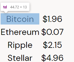
Let's create the code for the tables in our project. We see in the design a total of two tables.
- Go to the section we created earlier with the class
main-tables-container. - Inside the
div, create aptag for the text "Monedas". - Below, create another
divtag that will contain thetabletag, which is the table itself. - We work with two additional tags:
tr(table row) for the rows andtd(table data) for the data in each row. - Add the corresponding information based on the design we are working on.
<section class="main-tables-container">
    <div>
        <p>Monedas</p>
        <div>
            <table>
                <tr>
                    <td>Bitcoin</td>
                    <td>$1.96</td>
                </tr>
                <tr>
                    <td>Ethereum</td>
                    <td>$0.07</td>
                </tr>
                <tr>
                    <td>Ripple</td>
                    <td>$2.15</td>
                </tr>
                <tr>
                    <td>Stellar</td>
                    <td>$4.96</td>
                </tr>
            </table>
        </div>
    </div>
</section>
You will see that the information is organized as if it were an Excel table. Each cell occupies an equal space and is organized one below the other.
Start adding classes to apply styles.
- Name the first
divasmain-currency-tablebecause it is the table of current values. - Name the
ptag ascurrency-table--titleas the title of the container. - Name the
divcontaining the table ascurrency-table--container. - There is no need to add classes to the table tag or the rows, but the content does need them. For example, the first would be
table__top-left. We use a double underscore because, according to the BEM methodology, it differentiates an element (table) from a block and a modifier (top_left). - Add two classes to the price:
table__top-right and table-right. This is because the name column and the price column have different styles. This way, we can call a single class and apply styles to all that contain it. - Add the class
table-rightto all the cells with prices in the table. For the last cell, first place the classtable__bottom-right`` because it is the last one. - Add the class
table__bottom-leftto the last row of the table. As you can see, only the first and last rows have additional classes. - We only need the container where the information is updated. Create it outside the
divcontaining the table and add aptag for the text it contains. - Highlight the word shown in bold by placing it within the
btag. - Finally, add the class
currency-table--dateto the newly created container to apply styles to it.
<section class="main-tables-container">
    <div class="main-currency-table">
        <p class="currency-table--title">Monedas</p>
        <div class="currency-table--container">
            <table>
                <tr>
                    <td class="table__top-left">Bitcoin</td>
                    <td class="table__top-right table-right">$1.96 <span></span></td>
                </tr>
                <tr>
                    <td>Ethereum</td>
                    <td class="table-right">$0.07</td>
                </tr>
                <tr>
                    <td>Ripple</td>
                    <td class="table-right">$2.15</td>
                </tr>
                <tr>
                    <td class="table__bottom-left">Stellar</td>
                    <td class="table__bottom-right table-right">$4.96</td>
                </tr>
            </table>
        </div>
        <div class="currency-table--date">
            <p><b>Actualizado:</b> 19 de julio 23:45</p>
        </div>
    </div>
</section>
The rendered result in the browser would show:

- First, call the class of the main table container with
main-currency-table. - Give it a width of 70% so it doesn't take up the entire space.
- Limit the minimum width to
235pxand the maximum to500px. - Set the height to
360px. - Center the content with
margin: 0 auto. - Add the font used by the tables with
font-family: "Inter", sans-serif.
.main-currency-table {
    width: 70%;
    min-width: 235px;
    max-width: 500px;
    height: 360px;
    margin: 0 auto;
    font-family: "Inter", sans-serif;
}
- Instead of calling the class of the title and applying styles directly, remember we have two tables with different titles. Therefore, it's better to be specific by first calling the main table container and then the title like this:
.main-currency-table .currency-table--title. - Separate the title from the table with
margin-bottom: 15px. - Adjust the font size to
1.8remand make itbold. - Add a line height of
2.3rem.
.main-currency-table .currency-table--title {
    margin-bottom: 15px;
    font-size: 1.8rem;
    font-weight: bold;
    line-height: 2.3rem;
    color: var(--bitcoin-orange);
}
- Call the
divcontaining the table with.currency-table--container. - Give it a width of
90%of its parent container. - Set a minimum width of
230pxand a maximum of300px. - Adjust the height to
250px. - Center the content with
margin: 0 auto.
.currency-table--container {
    width: 90%;
    min-width: 230px;
    max-width: 300px;
    height: 250px;
    margin: 0 auto;
}
- Call the
tabletag from its parent container with.currency-table--container table. - Give it a width and height of
100%to occupy the entire space of the parent container.
.currency-table--container table {
    width: 100%;
    height: 100%;
}
- Call the
tdtag from its parent container with.currency-table--container td. - Give it a width of
50%as they take up half the space of the rows. - Adjust the font size to
1.6remand set the weight to500. - Add a line height of
1.9rem. - Change the color using the
--grey variable. - Add a background color using the
--just-whitevariable.
.currency-table--container td {
    width: 50%;
    font-size: 1.6rem;``
    font-weight: 500;
    line-height: 1.9rem;
    color: var(--grey);
    background-color: var(--just-white);
}
This would be our final result:

Remember we created specific classes for the buttons situated at the corners? Now it's time to call them.
- Let's start with the left side of the table. Call it from its container with
.currency-table--container .table__top-left. - Add
border-radius: 15px 0 0 0, where each of the four positions represents a corner of the box we are styling:top-left, top-right,bottom-right, andbottom-left, respectively. - Apply these values to each corner.
.currency-table--container .table__top-left {
    border-radius: 15px 0 0 0;
}
.currency-table--container .table__top-right {
    border-radius: 0 15px 0 0;
}
.currency-table--container .table__bottom-left {
    border-radius: 0 0 0 15px;
}
.currency-table--container .table__bottom-right {
    border-radius: 0 0 15px 0;
}
- Call the class we applied to all the text in the right column with
.currency-table--container .table__right. - Adjust the size to
1.4remand give it a normal weight. - Add a line height of
1.7rem. - Adjust the color to the one used in the design,
#757575.
.currency-table--container .table__right {
    font-size: 1.4rem;
    font-weight: normal;
    line-height: 1.7rem;
    color: #757575;
}
Looking at the design, we notice there are two types of arrows: up and down. So we need to split and apply these two classes to the span tags: up and down.
- Call the span tags with their class from the table container with
.currency-table--container .down. - Use
display: inline-blockto keep the icon on the same line as the text. - Give it a width and height of
15px. - Add
margin-left: 10pxto separate it from the text. - Call the image from its location with
background-image: url(""). - Adjust its size to the container with cover, center it, and specify that the image should not repeat.
- Apply the same styles for the class
.currency-table--container .up, just changing the icon URL.
.currency-table--container .down {
    display: inline-block;
    width: 15px;
    height: 15px;
    margin-left: 10px;
    background-image: url("./assets/icons/trending-down.svg");
    background-size: cover;
    background-position: center;
    background-repeat: no-repeat;
}
.currency-table--container .up {
    display: inline-block;
    width: 15px;
    height: 15px;
    margin-left: 10px;
    background-image: url("./assets/icons/trending-up.svg");
    background-size: cover;
    background-position: center;
    background-repeat: no-repeat;
}
This would be our result on screen:

- First, give it a width of
190pxand a height of30pxto create the space. - Center it with
margin: 0 auto. - Separate it from the table with
margin-top: 15px. - Create internal spacing with
padding: 8px. - Adjust its background color using the variable
--soft-orange. - Round the corners with
border-radius: 8px.
.currency-table--date {
    width: 190px;
    height: 30px;
    margin: 0 auto;
    margin-top: 15px;
    padding: 8px;
    background-color: var(--soft-orange);
    border-radius: 8px;
}
- To style the text, call the
ptag from the table container with.currency-table--date p. - Adjust its size to
1.2remand give it a line height of1.5rem. - Finally, change the color using the variable
--warm-black.
.currency-table--date p {
    font-size: 1.2rem;
    line-height: 1.5rem;
    color: var(--warm-black);
}
This would be the result:

At the start, we find a floating logo that we already learned to position with position: absolute. We have some other icons that we can place in span tags and several containers with text boxes.

The image only covers the first box, as the following ones have the same structure.
- Open the second section and give it a class based on its content. Since it details what the Batatabit product is, the name could be
main-product-detail. - Create the class for the main title container with
product-detail--title. - Create the tags we previously found in the design, such as
span,h2,p,section, andarticle. - Create the class
product-detail--batata-logofor the span tag that will contain our logo.
Within the first article:
- The first
ptag will be the card title, and its class name will beproduct--card-title, following the block-element structure. - The second
ptag will be the card body, and its class name will beproduct--card-body. - Finally, add the content inside each text tag.
<section class="main-product-detail">
    <span class="product-detail--batata-logo"></span>
    <div class="product-detail--title">
        <h2>We created an unmatched product.</h2>
        <p>Reliable and designed for daily use.</p>
    </div>
    <section class="product-cards--container">
        <article class="product-detail--card">
            <span class="clock"></span>
            <p class="product--card-title">Real-time</p>
            <p class="product--card-body">Our API takes minute-by-minute information about the rates that most determine behavior.</p>
        </article>
    </section>
</section>
In the base structure of the benefits section, we laid out the necessary tags and their respective classes to start applying styles.
- We call the section container class with
.main-product-detail. - We assign it a
position: relative. This is because the floating logo container will be created withposition: absolute. For an element withposition: absoluteto be positioned correctly, it looks for the first parent container that hasposition: relative. That's why we set it here so that it remains within this container. - We set its width to
100%and limit it to a minimum of320px. - We set the height to
autoso that it adjusts to the content. We add padding of20pxat the top and bottom and10pxon the sides.
.main-product-detail {
    position: relative; /* This is to ensure that the floating logo container, which will be created with position: absolute, is positioned correctly. */
    width: 100%;
    min-width: 320px;
    height: auto;
    padding: 20px 10px;
    background-color: var(--warm-black);
}
- We call the class directly of the
spantag for the logo with.product-detail--batata-logo. - We assign it a
position: absoluteso that it floats above other elements. - We set its width to
40pxand height to25px.
To center it between the two sections:
- We lift half of the logo outside of the container with
top: -10px. - We center it with
left: calc(50% - 20px), where50%places it in the middle, but it’s not centered yet. This is because the logo has dimensions (40pxto be precise), and since we want it exactly in the middle, we subtract half of its width (20px), positioning it right in the center. - We call the image with
background-image: url("").
.product-detail--batata-logo {
    position: absolute; /* Ensures it floats above other elements */
    width: 40px;
    height: 25px;
    top: -10px; /* Lifts the logo halfway out of the container */
    left: calc(50% - 20px); /* Centers the logo by adjusting for its width */
    background-image: url("./assets/icons/batata.svg");
}
Consider these three elements:
Container:
- We call the class of our title container with
.product-detail--title. - We adjust its width to occupy
90%of its main container. - We set the minimum width to
288px. - We set the height to
autoso that it occupies what the text needs. - This is a good practice so that the text reacts well regardless of how much it is compressed by the width.
- The center it with
margin: 0 auto. - We separate the text from the top edge with
margin-top: 50px. We center the text withtext-align: center.
.product-detail--title {
    width: 90%;
    min-width: 288px;
    height: auto; /* Adjusts to the content's height */
    margin: 0 auto; /* Centers the container */
    margin-top: 50px; /* Separates the text from the top edge */
    text-align: center; /* Centers the text */
}
H2:
- We call the
h2tag from its direct container with.product-detail--title h2. - We apply
margin-bottom: 20pxto separate it from the paragraph below. - We adjust the font size to
2.4remand apply aboldweight. - We set the line height to
2.6rem. - We change the color with the variable
--just-white.
.product-detail--title h2 {
    margin-bottom: 20px; /* Separates it from the paragraph below */
    font-size: 2.4rem;
    font-weight: bold;
    line-height: 2.6rem;
    color: var(--just-white);
}
Paragraph:
- We call the
ptag from its direct container with.product-detail--title p. - We apply
margin-bottom: 20pxto separate it from the sections below. - We adjust the font size to
1.4remand apply a weight of500. - We set the line height to
1.8rem. - We change the color to
#808080as indicated in the Figma design.
.product-detail--title p {
    margin-bottom: 20px; /* Separates it from the sections below */
    font-size: 1.4rem;
    font-weight: 500;
    line-height: 1.8rem;
    color: #808080; /* As specified in the Figma design */
}
Observing the Result in the Browser You should see a structure similar to this:

We remembered an important aspect of position: absolute and its direct relationship with its parent having position: relative.
After applying the styles in the benefits section, we will create the styles for the cards in the second section we are working on.
Of course, we start with the container and then the content.
- We call the class of the container of the first card with
.product-detail–card. - We adjust its width to
90%and height to150px. - We set a minimum width of
288pxand a maximum of400px. This is to prevent it from growing too much and getting distorted on very large screens. - We add a top and bottom margin of
15pxand make it auto on the sides to center it. - We add a padding of
15px. - We set a background color of
–-blackto contrast with the main container's color. - We round its corners with
border-radius: 5px. - We create a shadow for the box with
box-shadow: 0 4px 8px rgba(0, 0, 0, 0.16).
.product-detail--card {
    width: 90%;
    min-width: 288px;
    max-width: 400px;
    height: 150px;
    margin: 15px auto;
    padding: 15px;
    background-color: var(--black);
    border-radius: 5px;
    box-shadow: 0 4px 8px rgba(0, 0, 0, 0.16);
}
- We call the class of our
spantag from its container class. - We set
display: inline-blockso that the icon occupies a line of space. - We set its height and width to
20px. - We add a
margin-bottom: 10px. - We add the icon with
background-image: url(""). - We adjust it to cover the entire box, center it, and ensure the image does not repeat.
.product-detail--card .clock {
    display: inline-block;
    width: 20px;
    height: 20px;
    margin-bottom: 10px;
    background-image: url("./assets/icons/clock.svg");
    background-size: cover;
    background-position: center;
    background-repeat: no-repeat;
}
Consider the following two elements:
Title:
- We call the tag that contains our title by its class name with
.product–card-title. - We set a
margin-bottom: 15px. - We adjust the font size to
1.8remand set it tobold. - We adjust the line height to
1.8remand set the color with the variable–-just-white.
.product--card-title {
    margin-bottom: 15px;
    font-size: 1.8rem;
    font-weight: bold;
    line-height: 1.8rem;
    color: var(--just-white);
}
Body:
- We call the tag that contains our body text by its class name with
.product–card-body. - We adjust the font size to
1.4remand set it to a weight of500. - We adjust the line height to
1.8remand set the color to#808080.
.product--card-body {
    font-size: 1.4rem;
    font-weight: 500;
    line-height: 1.8rem;
    color: #808080;
}
The card would look like this:
You might have encountered an issue with one of the containers where the content overflowed, causing an overflow.
This type of problem occurs because we defined an absolute height for the boxes. Pixel measurements are absolute values that do not change regardless of the container's size, while percentages are relative values that adapt to the screen size. However, in this case, all we need to do is add a minimum width, below which it cannot shrink further.
For this, we go to the container class of the cards .product-detail–card and limit the minimum width to 150 pixels, like so:
min-height: 150px;
This way, it will always have a minimum height of 150px, but if it needs more, it will grow.
The analysis of this section is very simple. We only find a couple of elements that we need to create: a title and a background image.
The first thing is to open the next section in our index.html and add a class to identify it. We create an h2 to apply the title.
<section class="bitcoin-img-container">
    <h2>Learn about it today</h2>
</section>
- We call the section by its class with
.bitcoin-img-container. - We adjust the width to
100%of the screen and limit it to320px. - We give it a height of
50%of the screen height withheight: 50vh. - We call the background image with
background-image: url(""). - We center the image with respect to the container with
center. - It is important to set
background-repeat: no-repeatso that the image does not duplicate when moving to larger dimensions, such as a laptop.
.bitcoin-img-container {
    width: 100%;
    min-width: 320px;
    height: 50vh;
    background-image: url("./assets/img/bitcoinbaby2x.jpg");
    background-position: center;
    background-size: cover;
    background-repeat: no-repeat;
}
- We call the
h2tag from its container with.bitcoin-img-container h2. - We add a top padding of
60px. - We adjust the font size to
2.4remand set it tobold. - We give it a line height of
2.6rem. - We change its color with the variable
–just-white.
.bitcoin-img-container h2 {
    padding-top: 60px;
    font-size: 2.4rem;
    font-weight: bold;
    line-height: 2.6rem;
    color: var(--just-white);
}
Our result in the browser would be the following:

As you can see, when reducing or enlarging the width, the section we created always occupies half the screen's height, stretching the image to the side edges.
We are in the last section of our project where we will be creating the HTML structure to later apply the necessary styles. First, let's analyze the visual content to determine the tags we will use.
We have several elements to observe:
- A primary container with the main title and description.
- Then a section for the three cards with the prices, each card in its own article container.
- Inside each card, we find text in a floating box, another with the payment type, another with the price, another with the plan description, and finally, a button with an icon beside it.
Example of section design:

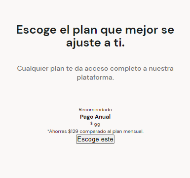
Knowing the tags we need to use, we start laying out our structure:
<section id="plans" class="main-plans-container">
    <div class="plans--title">
        <h2>Choose the plan that best suits you.</h2>
        <p>Any plan gives you full access to our platform.</p>
    </div>
    <section class="plans-container--slider">
        <article class="plans-container--card">
            <p class="recomended">Recommended</p>
            <div class="plan-info-container">
                <h3 class="plan-card--title">Annual Payment</h3>
                <p class="plan-card--price"><sup>$</sup> 99</p>
                <p class="plan-card--saving">*Save $129 compared to the monthly plan.</p>
                <button class="plan-card--ca">Choose this <span></span></button>
            </div>
        </article>
    </section>
</section>
Remember that you can create the entire structure with a single line of code using Emmet, like this:
(div>h2+p)+section>article>p+div>h3+p*2+button
-
We add an ID to the main section to link it with the "See our plans" button that we designed in the header section. We use the same name for both the button anchor and the section ID.
-
We create a sup tag for the dollar sign displayed next to the price. This tag defines a piece of text that should be shown, for typographic reasons, higher and usually smaller than the main text.
-
We add descriptive names to each generic tag and fill in the spaces with the respective content. And thus, we finish creating the structure of this last section. Now let's go for those styles.
Now we are going to apply styles to our plans section. This time, we will work on the main container and the text box. We will apply styles to the cards section later.
- Call the main section with its class
.main-plans-container. - Set its width to
100%and limit it to a minimum of320px. - Create a bottom internal spacing of
70px. - Center all contained text with
text-align: center.
.main-plans-container {
    width: 100%;
    min-width: 320px;
    padding-bottom: 70px;
    text-align: center;
}
- Call the main text container with its class
.plans–-title. - Set its width to
90%and limit it to a minimum of288px. - Set the height to
autoso it automatically adjusts based on the space occupied by the text. - Center it with
margin: 0 autoto account for the remaining10%width. - Create a bottom margin of
50pxto separate it from the cards.
.plans--title {
    width: 90%;
    min-width: 288px;
    height: auto;
    margin: 0 auto;
    margin-bottom: 50px;
}
- Call the
h2tag from its direct container with.plans–-title h2. - Adjust the font size to
2.4remand set its weight tobold. - Add a line-height of
2.6remand change its color with the--blackvariable.
.plans--title h2 {
    padding-top: 50px;
    font-size: 2.4rem;
    font-weight: bold;
    line-height: 2.6rem;
    color: var(--black);
}
- Call the
ptag from its direct container with.plans–title p. - Adjust the font size to
1.4remand set its weight to500. - Add a line-height of
1.8remand change its color to#757575.
.plans--title p {
    padding-top: 30px;
    font-size: 1.4rem;
    font-weight: 500;
    line-height: 1.8rem;
    color: #757575;
}
This would be the result we get in the browser:
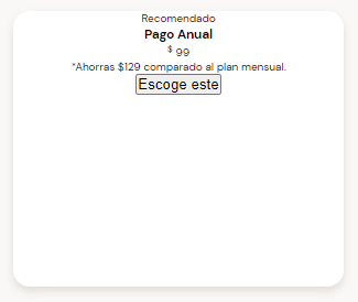
It's time to work on the cards for the plans section. As you know, there are a total of three cards with very similar information. They have practically the same structure.
First, call the class of the card container with .plans-container–-card.
- Use
position: relativeto ensure that the floating text stays within this container. - Set its width to
70%so that part of the other two cards can be seen. - Limit its minimum width to
230pxand its maximum width to300px. - Set its absolute height to
250px. - Add a top margin of
50pxand a bottom margin of0px. Center the box withauto. - Create a top and bottom padding of
0, and15pxon the sides. - Change the background color of the card to contrast with the background color of its container using the
--just-whitevariable. - Round the corners of the card with
border-radius: 15px. - Generate a shadow for the box with
box-shadow.
.plans-container--card {
    position: relative;
    width: 70%;
    min-width: 230px;
    max-width: 300px;
    height: 250px;
    margin: 50px auto 0;
    padding: 0 15px;
    background-color: var(--just-white);
    border-radius: 15px;
    box-shadow: 0 4px 8px rgba(89, 73, 30, 0.16);
}
This is the result we can observe in the browser:
The container is now finished. If you notice, when the width of the screen is enlarged or reduced, the container grows and shrinks up to a limit, always staying centered. We still need to add some styles so you can start creating the other two cards. Great!
The next step to finish your plans section is to add styles to the cards. Let's go to our stylesheet.
Consider the following elements:
- Call the class of the paragraph with
.recommended. - Set its position to
absoluteto move it within the container. - Adjust its width to
120pxand height to31px. - Move it up out of the container with
top: -15px. - Center the box with
left: calc(50% - 60px). - Set the font size to
1.2rem. - Add padding on all sides with
padding: 6px. - Adjust the background color with the variable
--bitcoin-orangeand the text color with--just-white. - Round the corners of the box with
border-radius: 8px.
.recommended {
    position: absolute;
    width: 120px;
    height: 31px;
    top: -15px;
    left: calc(50% - 60px);
    font-size: 1.2rem;
    padding: 6px;
    background-color: var(--bitcoin-orange);
    border-radius: 8px;
    color: var(--just-white);
}
- Call the class of the h3 tag with
.plan-card–-title. - Add top padding with
padding-top: 30px. - Set the font size to
1.4remand font weight to500. - Add a line height of
1.8rem. - Adjust the text color with the variable
--black.
.plan-card--title {
    padding-top: 30px;
    font-size: 1.4rem;
    font-weight: 500;
    line-height: 1.8rem;
    color: var(--black);
}
- Call the class of the p tag with
.plan-card–-price. - Add top and bottom padding of
5pxand0on the sides. - Set the font size to
5.2remand font weight tobold. - Add a line height of
5.3rem. - Adjust the text color with the variable
--black.
For the dollar sign:
- Call the
suptag from its container class with.plan-card-–price sup. - Set the font size to
1.2remand font weight to300. - Position the sign at the top with
vertical-align: 25px.
.plan-card--price {
    padding: 5px 0;
    font-size: 5.2rem;
    font-weight: bold;
    line-height: 5.3rem;
    color: var(--black);
}
.plan-card--price sup { font-size: 1.2rem; font-weight: 300; vertical-align: 25px; }
- Call the paragraph tag with its class
.plan-card–saving. - Set the font size to
1.2remand change its color to#757575.
.plan-card--saving {
    font-size: 1.2rem;
    color: #757575;
}
So far, this would be our result on the screen:

To finish this section, we just need the call to action, and then we can move on to creating the slides between the cards. The button we have now is the typical one generated by the button tag. To change it, let's go to our project's stylesheet.
- Call the class of the button with
.plan-card–ca. - Set its width to
150pxand height to48px. - Add a top margin of
20px. - Change its background color to
#faf8f7according to the design provided. - Set the border thickness to
2px and give it the color of the--bitcoin-orangevariable. - Slightly round the corners with
border-radius: 4px. - In case the font we set at the beginning of the document is not applied, bring it and paste it into the current style with
font-family: 'DM Sans', sans-serif. - Adjust the font size to
1.4remand font weight tobold. - Set the line height to
1.8remand the color to the--blackvariable.
.plan-card--ca {
    width: 150px;
    height: 48px;
    margin-top: 20px;
    background-color: #faf8f7;
    border: 2px solid var(--bitcoin-orange);
    border-radius: 4px;
    font-family: 'DM Sans', sans-serif;
    font-size: 1.4rem;
    font-weight: bold;
    line-height: 1.8rem;
    color: var(--black);
}
- Call the
spantag containing our icon from the button class with.plan-card–ca span. - Use
display: inline-blockto keep it on the same line as the text. - Set its width and height to
20px. - Insert the icon with a
background-image: url(""). - To place the icon at the same height as the text, use
vertical-align: text-bottom.
.plan-card--ca span {
    display: inline-block;
    width: 20px;
    height: 20px;
    background-image: url("./assets/icons/orange-right-arrow.svg");
    vertical-align: text-bottom;
}
This is the result we would see rendered in our browser:
And with this, we finish the styles for this card! All that's left is the slide that is generated horizontally.
Now that you have finished applying styles to the cards, we need to create this horizontal scroll that is generated when navigating between them.
As a front-end developer, you will often use frameworks to speed up your creation process, such as to create these types of effects. However, for this occasion, we will use only CSS with the intention of understanding how they are constructed.
First, for our container to generate the scroll between the cards, they need to have it. We center all the cards to create a scroll with scroll-snap-align: center. Place this line just below the position: relative of our card container.
.plans-container--card {
    position: relative;
    scroll-snap-align: center;
    ...
}
- Call the class of the card container with
.plans-container–-slider. display: flexalready generates a horizontal scroll, but it overflows the container and creates an overflow outside.- Set its height to
316px, greater than the card containers. - Generate a scroll on the x-axis with
overflow-x: scroll. This property sets what is shown when content overflows the left and right edges of a block-level element. It can be nothing, a scrollbar, or the extra content. overscroll-behaviorsets what a browser does when it reaches the limit of a scroll area.- To make the view center on each card as if they had a magnet when scrolling over them, use
scroll-snap-type: xproximity.
.plans-container--slider {
    display: flex;
    height: 316px;
    overflow-x: scroll;
    overscroll-behavior-x: contain;
    scroll-snap-type: x proximity;
}

In the browser, we can see that the cards are stuck to each other. In CSS, there is a new property called gap that helps us solve this problem.
Currently, gap is supported by almost all browsers. However, to use a new property, we must at least confirm that it has 95% availability to avoid giving users a bad experience.
You can check on the Can I Use website, among other things, the number of browsers in which a property is available. In this case, to solve it, let's go to the card container and look for the margin property.
.plans-container--card {
    ...
    margin: 50px auto 0;
    ...
}
Change the auto attribute to 15px.
.plans-container--card {
    ...
    margin: 50px 15px 0;
    ...
}
And we would have this result:

And so, we have completely finished this last section of plans. You might be wondering about the navigation icons on the sides. Of course, there is still more that can be done using JavaScript and adding interactions on click, but we'll leave that to you. You already know how to build a scroll using only CSS, and that's pretty cool.
We only have one last section left in our project. This is the footer section.
Let's go to our HTML file and start structuring it.
The footer is divided into two fairly simple sections: one with social media links and another with the company logo. Knowing this, we can create the tags we need.
- In the first section, add the names of the social media platforms shown in the design. Add
#to the link address to prevent the page from refreshing when clicking on it. - In the second section, include the image with an img tag. Add a description of the image for accessibility.
- Add classes to each of the sections with left and right, respectively.
<footer>
    <section class="left">
        <ul>
            <li><a href="#">LinkedIn</a></li>
            <li><a href="#">Crunchbase</a></li>
            <li><a href="#">Hackernews</a></li>
        </ul>
    </section>
    <section class="right">
        <img src="./assets/img/logo-footer.svg" alt="Batatabit Logo">
    </section>
</footer>
Keep the following elements in mind:
Call the footer tag directly to apply styles.
- Use
display: flexso that both sections are side by side. - Set its width to
100%and its height to150px. - Set the background color using the
--bitcoin-orangevariable.
footer {
    display: flex;
    width: 100%;
    height: 150px;
    background-color: var(--bitcoin-orange);
}
- Call the section tag from the
footertag to work with both sections. - Maintain
display: flex. - Center the boxes with
justify-content: center. - Align the elements inside the containers with
align-items: center.
footer section {
    display: flex;
    width: 50%;
    justify-content: center;
    align-items: center;
}
- Call the
ultag from the.leftclass of the footer tag to be specific. - Set the font size to
1.4remand its weight to500. - Set the line height to
1.8rem. - Remove the bullet points from the elements with
list-style: none.
footer .left ul {
    font-size: 1.4rem;
    font-weight: 500;
    line-height: 1.8rem;
    list-style: none;
}
- For each list item, add a top and bottom margin of
10pxand0on the sides. - Remove the underlining from the texts generated by the a tag with
text-decoration: none. - Change the text color with
--just-white.
.left li {
    margin: 10px 0;
}
.left a {
    text-decoration: none;
    color: var(--just-white);
}
In this section, we need to analyze what we have worked on to identify which parts and dimensions require repositioning certain objects. Let's go to the view provided by the browser.
As you know, we need a minimum of designs for three versions: mobile, tablet, and desktop. That means three CSS files linked in our index.html file. We place them in the following order:
- Main stylesheet (styles.css)
- Stylesheet for tablet (tablet.css)
- Stylesheet for desktop (desktop.css)
As you can see, they are added from the smallest to the largest size because we are working from a Mobile First approach. In this case, there are few elements in our project, so adding one more view will suffice to achieve good results.
<link rel="stylesheet" href="./styles.css">
<link rel="stylesheet" href="./css/tablet.css" media="(min-width: 930px)">
It is important to specify in the media property the minimum width the screen needs to be to download this file. This way, we prevent the user from having to download all the files when only one is needed.
Now let's work on the sections that need a few adjustments.
On larger screens, there is too much space around the tables. Placing them side by side helps to reduce vertical scrolling and provides a more comfortable view for the user.
To do this:
- Call the class of the tables container with
.main-tables-container. - Use
display: flexto arrange the tables together. - Set the width to
930pxto prevent it from growing beyond that. - Center the tables with
margin: 0 auto.
.main-tables-container {
    display: flex;
    width: 930px;
    margin: 0 auto;
}
We have the same problem as before. There is too much leftover space, and we need to rearrange the elements.
To do this:
- Call the class of the card container with
.product-cards–-container. - Arrange them within the box width using
display: flex. - Arrange the boxes in columns with
flex-wrap: wrap. - Limit the box's growth to
930pxto ensure no more than two columns are created. - Center the tables with
margin: 0 auto.
.product-cards--container {
    display: flex;
    flex-wrap: wrap;
    width: 930px;
    margin: 0 auto;
}
As we can see, the plan cards remain on the left side of the screen when exceeding 930px in width. This is because they use display: flex to function.
So, without changing it, we add a simple line of code to the same container's class:
- Center the content with
justify-content: center.
.plans-container--slider {
    justify-content: center;
}
It is often easier to design from the smallest and then grow according to the screen's needs rather than doing it the other way around.
Now, we just need to evaluate the page we have created to check for accessibility issues and best practices. Great!
Remember, we cannot improve what we cannot measure. For this, we will use the Lighthouse tool, which helps us measure accessibility, performance, best practices, among other things. You won't have to worry about installing anything, as it is embedded in Chrome's DevTools.
- Open the project in your browser.
- Right-click on any part of the project. Click on “Inspect” to open the DevTools.
- Expand the tab section and select “Lighthouse”.
- You will see various options that can be analyzed. You can select all or the ones you need. Only one report can be generated per mobile or desktop version. If you want both, generate another report with the missing option.
- Once you have made your selection, click on “Generate Report”. Wait for it to finish generating.
- Analyze the results.
Keep in mind that you should not get frustrated by imperfect results. As long as it is above 90%, it means your page is well-constructed. This is because many factors determine these statistics, such as a poor internet connection, a bad computer, or some other issue beyond your control.
The lowest value is performance, or the loading speed of our page. Review the reasons by clicking on the same value.
All the details that were found will be displayed. Go to the opportunities section.
When expanding each of the suggestions made by the tool, we find that the image in the wildcard section is somewhat heavy. It even recommends compressing it to improve the score.
We could also, for example, select a smaller image size for mobile and another for desktop. This way, only the one the user needs will be downloaded.
This part is very important. Lighthouse recommends better adjusting the contrasts of certain paragraph tags for people with vision problems. In this case, you could increase the opacity of certain fonts whose background has a similar color.
When analyzing the desktop version, we see how the performance increases significantly. This is because a computer can have much more computing power than a mobile device, as in this case. If you applied many styles and personal elements, it is likely that the performance part will be lower.
Take into account the recommendations made by Lighthouse as it is a way to improve your page in these aspects and make it much easier and more comfortable to use for the majority of users. Make this tool a superpower to improve your projects!
This project was developed by Juan Cumbe. If you have any questions or suggestions about the project, feel free to contact me via e-mail or my Linkedin profile.