
A component render control HOC for different states with zero dependencies.
- Table of Content
- Intention
- Installation
- Examples
- Render Flow
- API - withRenderCtrl (WrappedComponent, [StateComponents]) - RenderCtrlProvider - EnhancedComponent
- License
In react development we often face a problem of dealing with different states for some data-driven components. In most cases, those states include:
- Ideal State. The happy path for the component, everything is fine.
- Loading State. Component shows something to indicate it is loading.
- Error State. Component shows something went wrong.
- Empty State. Component shows something to indicate it is empty.
For those components, you would like to show a proper hint to users base on state of the component. The code may look something like the following:
container.js
import MyComponent from 'path/to/my/component';
import ErrorHint from 'path/to/error/hint';
import LoadingSpinner from 'path/to/loading/apinner';
import EmptyHint from 'path/to/empty/hint';

class Container extends React.Component {
  render() {
    return (
      // ...
      {
        isComponentError
        ? <ErrorHint />
        : isLoading
          ? <LoadingSpinner />
          : data.length > 0
            ? <MyComponent data={ data } />
            : <EmptyHint />
      }
      // ...
    )
  }
}
The code above is not ideal, because
- Nested Ternary operator. If there are several components all implement this kind of logic, it is not easy to understand at a galance.
- Spreading logics. This kind of similar logic can be generalized and be handled in a single place instead of spreading all over the code base.
- Verbose importing. If
<ErrorHint />,<LoadingSpinner />,<EmptyHint />are the same across the whole project, you still have to import all of them to wherever they are used. It makes the code more verbose. - Lower cohesion. If
<ErrorHint />,<LoadingSpinner />,<EmptyHint />are specific for the component, then they should be located in thecomponent.jsinstead of in thecontainer.jsfor higher cohesion.
To address these problems, I think Provider Pattern would be a good solution. Provider provides global Loading, Empty, Error Components and uses Higher-Order-Component to wrap the component you would like to implement render logic. Like the following,
index.js
<RenderCtrlProvider
  ErrorComponent={ () => <div>default error hint</div> }
  EmptyComponent={ () => <div>default empty hint</div> }
  LoadingComponent={ () => <div>default loading hint</div> }
>
  <YourApp />
</RenderCtrlProvider>
YourComponent.js
class YourComponent extends Component {
  //...
}

export default withRenderCtrl(YourComponent, {
  // your customized loading for this component
  LoadingComponent: () => <div>I am loading</div>
});
container.js
class Container extends Component {
  // ...
  render() {
    return (
      // ...
      <YourComponent
        isError={ isComponentError }
        isLoading={ isLoading }
        isDataReady={ data.length > 0 } // or other logics indicate data is ready
        // other props of "YourComponent"...
      />
      // ...
    );
  }
}
This appoarch alleviates the problems we mention above.
npm install react-render-ctrl or yarn add react-render-ctrl
The State Components in the following mean
LoadingComponentErrorComponentEmptyComponent
You can use the Higher-Order-Component withRenderCtrl directly without using RenderCtrlProvider, if you don't need to config your default state components.
YourComponent.js
import React from 'react';
import { withRenderCtrl } from 'react-render-ctrl';
// ...
class YourComponent extends React.Component {
  // ...
}
export default withRenderCtrl(YourComponent, {
  ErrorComponent: () => <div>something went wrong</div>,
  EmptyComponent: () => <div>it is very empty</div>,
  LoadingComponent: () => <div>I am loading</div>
});
container.js
class Container extends React.Component {
  // ...
  render() {
    return (
      // ...
      <YourComponent
        isError={ something.went.wrong }
        isLoading={ api.isFetching }
        isDataReady={ data.length > 0 && data[0].value }
      />
      // ...
    );
  }
}Since you are not directly pass props to container which is connected with redux, you can set your isDataReady props in the mapStateToProps function.
import React from 'react';
import { withRenderCtrl } from 'react-render-ctrl';
// ...
class YourComponent extends React.Component {
  // ...
}
function mapStateToProps(state) {
  return  {
    //...
    isDateReady: state.data.length > 0 && data[0].value
  }
}
export default connect(mapStateToProps)(withRenderCtrl(YourComponent, {
  ErrorComponent: () => <div>something went wrong</div>,
  EmptyComponent: () => <div>it is very empty</div>,
  LoadingComponent: () => <div>I am loading</div>
}));
container.js
class Container extends React.Component {
  // ...
  render() {
    return (
      // ...
      <YourComponent
        isError={ something.went.wrong }
        isLoading={ api.isFetching }
        isDataReady={ data.length > 0 && data[0].value }
      />
      // ...
    );
  }
}If you need to config your default state components, you have to implement <RenderCtrlProvider /> in the root of your application.
index.js
ReactDOM.render(
  <RenderCtrlProvider
    ErrorComponent={ () => <div>default error hint</div> }
    EmptyComponent={ () => <div>default empty hint</div> }
    LoadingComponent={ () => <div>default loading hint</div> }
  >
    <YourApp />
  </RenderCtrlProvider>
  ,
  document.getElementById('root')
);
In your component you don't need to pass state components as argument to the withRenderCtrl function.
YourComponent.js
import React from 'react';
import { withRenderCtrl } from 'react-render-ctrl';
// ...
class YourComponent extends React.Component {
  // ...
}
export default withRenderCtrl(YourComponent);
container.js
class Container extends React.Component {
  // ...
  render() {
    return (
      // ...
      <YourComponent
        isError={ something.went.wrong }
        isLoading={ api.isFetching }
        isDataReady={ data.length > 0 && data[0].value }
      />
      // ...
    );
  }
}As above, you still can provide customized state components to YourComponent. It will overwrite the default state components.
YourComponent.js
import React from 'react';
import { withRenderCtrl } from 'react-render-ctrl';
// ...
class YourComponent extends React.Component {
  // ...
}
export default withRenderCtrl(YourComponent, {
  ErrorComponent: () => <div>customized error component</div>,
  EmptyComponent: () => <div>customized empty component</div>,
  LoadingComponent: () => <div>customized loading component</div>,
});
container.js
class Container extends React.Component {
  // ...
  render() {
    return (
      // ...
      <YourComponent
        isError={ something.went.wrong }
        isLoading={ api.isFetching }
        isDataReady={ data.length > 0 && data[0].value }
      />
      // ...
    );
  }
}
You can also pass specific props to you customized Component, like:
class Container extends React.Component {
  // ...
  render() {
    return (
      // ...
      <YourComponent
        isError={ something.went.wrong }
        isLoading={ api.isFetching }
        isDataReady={ data.length > 0 && data[0].value }
        errorComponentProps={ { errorMsg: 'something went wrong' } }
      />
      // ...
    );
  }
}
then your errorComponent knows what to show base on the errorComponentProps.
It works like:
<YourCustomizeErrorComponent
  { ...errorComponentProps }
/>
So do loading and empty Components
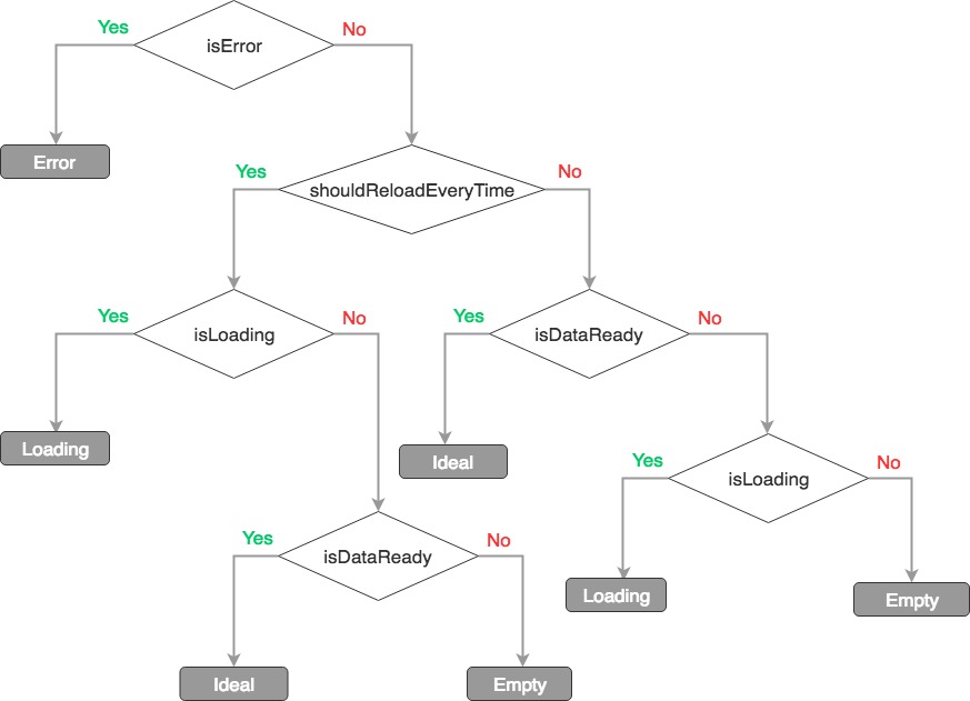
Squares with gray background are state components
// Arguments Type
WrappedComponent: ReactComponent,
StateComponent: {
  ErrorComponent: ReactComponent,
  EmptyComponent: ReactComponent,
  LoadingComponent: ReactComponent
}| props | type | default | description |
|---|---|---|---|
ErrorComponent |
element |
null |
|
EmptyComponent |
element |
null |
|
LoadingComponent |
element |
null |
EnhancedComponent is the return of withRenderCtrl.
| props | type | default | description |
|---|---|---|---|
isError |
bool |
false |
|
isLoading |
bool |
false |
|
isDataReady |
bool |
false |
|
errorComponentProps |
Object |
{} |
props for customized error component to show specific information |
loadingComponentProps |
Object |
{} |
props for customized loading component to show specific information |
emptyComponentProps |
Object |
{} |
props for customized empty component to show specific information |
shouldReloadEverytime |
bool |
false |
always show <LoadingComponent /> while isLoading is true even if data is ready |
debug |
bool |
false |
log debug info in the console while process.env.NODE_ENV !== 'production' |
initial version
- update legacy Context API implement to the new Context API
- add typescript typing file
MIT