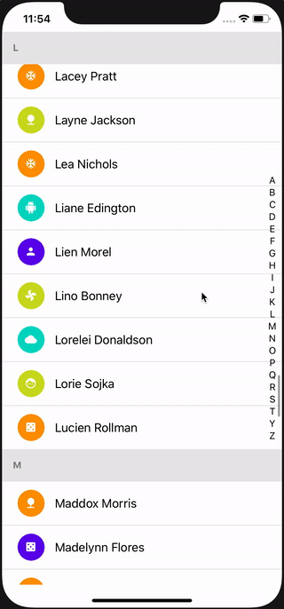
This is a wrapper to the SectionList, adding support for alphabets on the side, which can be dragged or clicked, to scroll the list to the corresponding section.
yarn add react-native-lexical-list
or
npm install react-native-lexical-list
import LexicalSectionList from "react-native-lexical-list";

export const TestList = () => {
  const sections = [
    {
      title: "A",
      data: ["Alison", "Arthur", "Amy"],
    },
    {
      title: "B",
      data: ["Ben", "Bob", "Barney", "Batman"],
    },
    {
      title: "C",
      data: ["Charlie", "Chaplin"],
    },
  ];

  return (
    <LexicalSectionList
      sections={sections}
      itemHeight={24}
      alphabetListOptions={{ itemHeight: 18 }}
      renderItem={({ item }) => <Text>{item}</Text>}
      renderSectionHeader={({ section: { title } }) => <Text>{title}</Text>}
    />
  );
};All of the SectionList props can be passed to LexicalSectionList.
The sections must have a title field as shown above. This is used to display items in the AlphabetList on the side
and also in the section headers. The data field can be an array of any type.
Following are the additional props added to LexicalSectionList:
| Prop | Type | Required | Desc |
|---|---|---|---|
| alphabetListOptions | object | Yes | Props to be passed on to the AlphabetList component. See AlphabetList Props below. |
| itemHeight | number | Yes | Height of rows of the SectionList. See getItemLayout below. |
| sectionHeaderHeight | number | No | See getItemLayout below |
| sectionFooterHeight | number | No | See getItemLayout below |
| separatorHeight | number | No | See getItemLayout below |
| listHeaderHeight | number | No | See getItemLayout below |
| disableScrollToTopOnDataUpdate | boolean | No | When the value of the sections prop changes, the list scrolls to the top by default. This is useful for when the list is updated using search filtering. |
| style | StyleProp<ViewStyle> | No | Container style |
| listStyle | StyleProp<ViewStyle> | No | This is passed on to the underlying SectionList as style prop |
When the user chooses an alphabet, to be able to scroll list to the correct position, SectionList
requires us to supply a getItemLayout method. As
explained in this post, it is tricky to
implement it for SectionList (as opposed to FlatList). An open source
function (from the writer of that post) has
been used, which requires item height, and optionally four other parameters. Visit the
npm page for full documentation.
initialNumToRender and maxToRenderPerBatch are
SectionList props (which means they can be passed to
LexicalSectionList as well), whose default values in react-native are 10 each. But because this kind of a lexical list is
generally used with small amount of data to be rendered within each row, for a lot of rows, these values have been
set to 100. This results in fast scrolling with much less blank spots, at the cost of a little higher memory usage.
If you are rendering a lot of stuff within each item of the list, or are doing lengthy computations for each item, you
might want to lower this number.
LexicalSectionList contains a SectionList and an AlphabetList. If you don't want the full thing, you can use the
AlphabetList component by itself. It can be seen as a draggable list of strings or numbers, which returns the
currently selected item and its index in a callback function.
import { AlphabetList } from "react-native-lexical-list";

...

<AlphabetList
  data={["A", "G", "H"]}
  itemHeight={18}
  itemStyle={{ fontWeight: "bold", color: "blue" }}
  onItemSelect={(alphabet) => console.log(alphabet)}
  containerStyle={{
    backgroundColor: "green"
    alignSelf: "center",
  }}
/>;| Prop | Type | Required | Desc |
|---|---|---|---|
| data | (string or number)[] | Yes | Items to display in the AlphabetList. Generally these would be alphabets, but doesn't have to be. |
| itemHeight | number | Yes | Height of each item in the AlphabetList, for accurate touch detection. It is recommended to use alignItems/justifyContent: 'center' with fixed height instead of using margins (padding should be fine). |
| itemStyle | StyleProp<TextStyle> | No | Styles for the list item text |
| containerStyle | StyleProp<ViewStyle> | No | Styles for the AlphabetList container |
| indicatorStyle | StyleProp<ViewStyle> | No | Styles for the currently selected item indicator that pops up on the side while scrolling |
| indicatorTextStyle | StyleProp<TextStyle> | No | Styles for the indicator text |
| onItemSelect | function that takes parameters (item: string or number, index: number) and returns nothing |
No | A callback function that is called each time the item selection changes |