
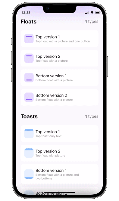
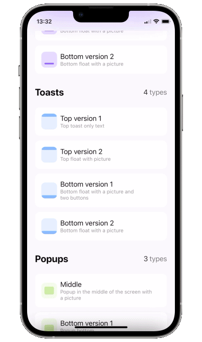
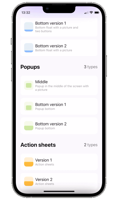
| Floaters | Toasts | Popups | Sheets |
|---|---|---|---|
|
|
|

|
We are a development agency building phenomenal apps.


- Add a binding bool to control popup presentation state
- Add
.popupmodifier to your view.
struct ContentView: View {

    @State var showingPopup = false

    var body: some View {
        YourView()
            .popup(isPresented: $showingPopup, autohideIn: 2) {
                Text("The popup")
                    .frame(width: 200, height: 60)
                    .background(Color(red: 0.85, green: 0.8, blue: 0.95))
                    .cornerRadius(30.0)
            }
    }
}Please keep in mind that the popup calculates its position using the frame of the view you attach it to. So you'll likely want to attach it to the root view of your screen.
Unfortunately popup can not be displayed above navigation bar - Apple doesn't provide API for that. So if you want the popup to be fullscreen, you might want to attach it to the root view of your app.
isPresented - binding to determine if the popup should be seen on screen or hidden
view - view you want to display on your popup
type - toast, float or default. Floater has parameters of its own:
verticalPadding- padding which will define padding from the top or will be added to safe area ifuseSafeAreaInsetis trueuseSafeAreaInset- whether to include safe area insets in floater padding
position - top or bottom (for default case it just determines animation direction)
animation - custom animation for popup sliding onto screen
autohideIn - time after which popup should disappear
dragToDismiss - true by default: enable/disable drag to dismiss (upwards for .top popup types, downwards for .bottom and default type)
closeOnTap - true by default: enable/disable closing on tap on popup
closeOnTapOutside - false by default: enable/disable closing on tap on outside of popup
backgroundColor - Color.clear by default: change background color of outside area
dismissCallback - custom callback to call once the popup is dismissed
To implement a sheet (like in 4th gif) enable dragToDismiss on bottom toast (see example project for implementation of the card itself)
.popup(isPresented: $show, type: .toast, position: .bottom, dragToDismiss: true) {
    // your content
}To try PopupView examples:
- Clone the repo
https://github.com/exyte/PopupView.git - Open terminal and run
cd <PopupViewRepo>/Example/ - Run
pod installto install all dependencies - Run open
PopupViewExample.xcworkspace/to open project in the Xcode - Try it!
To install PopupView, simply add the following line to your Podfile:
pod 'ExytePopupView'To integrate PopupView into your Xcode project using Carthage, specify it in your Cartfile
github "Exyte/PopupView"
dependencies: [
    .package(url: "https://github.com/exyte/PopupView.git", from: "1.0.0")
]Drop PopupView.swift in your project.
- iOS 13+
- Xcode 11+