UI builder framework for FHEM — http://fhem.de/fhem.html with a clear intention: Keep it short and simple!
- jQuery v1.7+
- font-awesome http://fortawesome.github.io/Font-Awesome
- jquery.gridster http://gridster.net
- jquery.toast
- and more All requires are included in the lib folder.
- copy the whole tree into the corresponding folder of your FHEM server /<fhem-path>/www/tablet
- rename the index-example.html to index.html or create your own index.html
- Tadaaa! A new fhem ui in http://<fhem-url>:8083/fhem/tablet/index.html
or just use 'update all https://raw.githubusercontent.com/knowthelist/fhem-tablet-ui/master/controls_fhemtabletui.txt' on the FHEM commandline (or input field of FHEMWEB)
Just configure the index.html to change the dashboard for your needs.
Change the wiget container according your rooms
<li data-row="2" data-col="2" data-sizey="3" data-sizex="3">
    <header>KUECHE</header>
    <div class="sheet">
        <div class="row">
            <div class="cell" data-type="thermostat" data-device="KuecheHeizung_Clima"></div>
            <div class="cell">
                <div data-type="switch" data-device="HerdLicht_Sw"></div>
                <div>HerdLicht</div>
            </div>
        </div>
        <div class="row">
            <div class="cell" data-type="thermostat" data-device="KuecheHeizung2_Clima"></div>
            <div class="cell" data-type="symbol" data-device="KuechenFenster"></div>
        </div>
    </div>
</li>
Change the widgets you have and want to see on the dashboard
<div data-type="thermostat" data-device='WohnzimmerHeizung_Clima'></div>Currently there are more then 20 types of widgets in the base installation.
- thermostat : dial for heater thermostates to set desired value and show current value
- switch : Toggle any command to FHEM (e.g. on / off)
- label : show state as text (colourable)
- symbol : show state as an icon (e.g. window open)
- push : send one single command to FHEM e.g. up / down
- volume : dial to set a single value (e.g. 0-60)
- homestatus : selector for 4 states (1=home,2=night,3=away,4=holiday)
- dimmer : toogle button with a setter for on value
- slider : vertical/horizontal slider to select between min/max value
- image : insert an image, the URL is given by a reading
- weather : insert an icon or image, represending a weather literal
- circlemenu : Cover multiple widgets behind a single widget
- select : Combobox to provide a list for selection
- pagetab : Element to smoothly exchange the whole page with another page
- pagebutton : Simple element to jump to another page and is shown as ON on destination Page
- level : vertical/horizontal bar to show values between min/max value
- rotor : slider to switch automatically between multiple widgets at one position
- swiper : touch slider for multiple widgets at one position
- progress : round symbolic display for percent values
- simplechart : simple XY line chart for one value (reads directly from fhem log file)
- popup : a popup dialog which open on click on another widget
- readingsgroup : displaying a readingsgroup defined in fhem
- datetimepicker : select a date and time value from calendar
- eventmonitor: for debugging - shows all events which normal widgets 'see'
- chart : multistyle chart for multiple values (reads directly from FHEM log file)
- highchart : multistyle chart for multiple values
- checkbox : Toggle any command to FHEM (e.g. on / off)
- range : vertical bar graph to show a values range between min/max value and high/low limits with different colors
- colorwheel : select a color from a wheel
- link : link or button link element
- spinner : is a control element to adjust a value by clicking on the up or down icon
- departure : a pulic transport departure schedule widget
- slideout : a slide out menu plugin, usable for mobile phone pages.
- medialist : a list of media elements e.g. songs in a playlist
- notify : popup browser notifications for reading changes
- theme : plugin to actives css stylesheet themes
By default the ui gets/sets the fhem parameter 'STATE' (not 'state').
All widgets have individual parameter settings. Set following attributes according your needs. Attributes with defaults are optional and does not have to be set.
-
A general command to FHEM looks like this <command> <device> <reading> <value>
-
e.g. set MyLamp dim 75
-
widget attributes data-cmd data-device data-set data-set-on
receive data
- data-get : Reading name
- data-get-on : Value for ON
- data-get-off : Value for OFF
send data
- data-set : Reading name
- data-set-on : Value for ON
- data-set-off : Value for OFF
####All widgets
- data-type : widget type
- data-device : FHEM device name (call FHEM's 'list' command to get all names)
- class : CSS classes for look and formatting of the widget
####Switch widget
- data-get : name of the reading to get from FHEM (default 'STATE')
- data-set : name of the reading to set from FHEM (default '')
- data-cmd : name of the command (<command> <device> <reading> <value>) (e.g. setstate, set, setreading, trigger) default: 'set'
- data-doubleclick: timeout to wait for x millisecondes click or touch. '0' disables the doubleclick feature. (default '0')
- data-lock : name of the reading containing a boolean value for the lock (readonly) parameter (default )
- data-warn : name of the reading to be shown as a red warn overlay (default )
- data-warn-on : value(s) that show the warn badge (default 'true|on|[1-9]{1}[0-9]*')
- data-warn-off : value(s) that hide the warn badge (default 'false|off|0')
- data-warn-color : forecolor for warn badge (default '#aaa')
- data-warn-background-color : background color for warn badge (default '#aa2200')
- data-warn-icon : name of the font-awesome icon to be shown instead of the warn text. (default: '')
- data-warn-fixed : number of digits after the decimal point (default: 0)
- data-hide : name of the reading to hide/show the widget (default 'STATE')
- data-hide-on : value for HIDE (default 'true|1|on')
- data-hide-off : value for SHOW (default '!on')
- data-hideparents: jquery selector to hide element's parents too
- data-reachable : name of the reading containing a integer value to indicate whether the device is reachable or not (default )
- data-timeout . : millisecondes until the switch falls back into the initial position (default: 0 [disabled])
dual state notation
- data-get-on : value for ON status to get or an array of states (default 'true|1|on|open|ON')
- data-get-off : value for OFF status to get. (default 'false|0|off|closed|OFF')
- data-set-on : value for ON status to set. (default: value of data-get-on)
- data-set-off : value for OFF status to set. (default: value of data-get-off)
- data-icon : name of the font-awesome icon. (default: fa-lightbulb-o)
- data-background-icon : name of the font-awesome icon for background (default 'fa-circle')
- data-on-background-color : color for ON state or DEVICE:READING for dynamic setting (default '#aa6900')
- data-off-background-color : color for OFF state or DEVICE:READING for dynamic setting (default '#505050')
- data-on-color : color for ON state or DEVICE:READING for dynamic setting (default '#aa6900')
- data-off-color : color for Off state or DEVICE:READING for dynamic setting (default '#505050')
multi state notation
-
data-states : array of states
-
data-set-states : array of states to set.
-
data-icons : array of icons related to the data-states array
-
data-background-icons : array of background icons related to the data-states array
-
data-colors : array of colors related to the data-states array
-
data-background-colors : array of background colors related to the data-states array
-
class : readonly, compressed, invert
data-get-on and data-get-off accept also RegEx values. e.g. data-get-on="[0-9]{1,3}|on" means set switch on if STATE is a numeric value or 'on'. data-get-off="!on" means accept all but the data-get-on value (negation) data-set-off="" suppress sending off
class 'invert' inverts foreground and background color
data-lock: the widget gets locked if the corresponding FHEM reading has the value 1, on or true.
data-[on|off]-color: the expected format for color value via reading is RGB (with ot without #)
See examples of Switch
####Symbol widget
- data-get : name of the reading to get from FHEM (default 'STATE')
- data-warn : name of the reading to be shown as a red warn overlay (default )
- data-warn-on : value(s) that show the warn badge (default 'true|on|[1-9]{1}[0-9]*')
- data-warn-off : value(s) that hide the warn badge (default 'false|off|0')
- data-warn-color : forecolor for warn badge (default '#aaa')
- data-warn-background-color : background color for warn badge (default '#aa2200')
- data-hide : name of the reading to hide/show the widget (default 'STATE')
- data-hide-on : value for HIDE (default 'true|1|on')
- data-hide-off : value for SHOW (default '!on')
- data-hideparents: jquery selector to hide element's parents too
- data-lock : name of the reading containing a boolean value for the lock (readonly) parameter (default )
- data-reachable : name of the reading containing a integer value to indicate whether the device is reachable or not (default )
dual state notation
- data-get-on : value for ON status to get or an array of states (default 'true|1|on|open|ON')
- data-get-off : value for OFF status to get. (default 'false|0|off|closed|OFF')
- data-icon : name of the font-awesome icon. (default 'ftui-window')
- data-background-icon : name of the font-awesome icon for background (default '')
- data-on-background-color : fix color attribute for ON state or DEVICE:READING for dynamic setting (default '#aa6900')
- data-off-background-color : fix color attribute for OFF state or DEVICE:READING for dynamic setting (default '#505050')
- data-on-color : fix color attribute for ON state or DEVICE:READING for dynamic setting (default '#aa6900')
- data-off-color : fix color attribute for Off state or DEVICE:READING for dynamic setting (default '#505050')
multi state notation
-
data-states : array of states
-
data-icons : array of icons related to the data-states array
-
data-background-icons : array of icons related to the data-states array
-
data-colors : array of colors related to the data-states array
-
data-background-colors : array of colors related to the data-states array
-
class : compressed
The CSS class 'compressed' forces the switch or symbol to a height and width of 1em instead of 2em. This saves space around the switch/symbol
data-get-on,data-get-off and data-states accept also RegEx values. The value for one icon can also contain an additional animatation CSS name, e.g. "fa-exclamation-triangle fa-blink" for a blinking symbol
data-[on|off]-color: the expected format for color value via reading is RGB (with ot without #)
See examples of Symbol
####Label widget
- data-get : name of the reading containing label text
- data-part : RegEx or number (which word) for filtering shown text
- data-fix : keeping a specified number of decimals. (default '-1' -> non-numeric)
- data-factor : a numbers to be multiplied by the numeric reading value (default '' )
- data-color : fix color attribute or DEVICE:READING for dynamic setting of label color (default '')
- data-colors : a array of color values. The used element for the label color defines the matching element of the limits array
- data-classes: a array of class names. The used element class defines the matching element of the limits array
- data-limits : a array of numeric or RegEx values for comparing with the current value
- data-limits-get : name of the DEVICE:Reading to retrieve the value for comparing with the limits array (default: data-device:data-get)
- data-limits-part : filter for the value. part number of the space separated value or an RegEx (default '-1' -> all)
- data-unit : add a unit after a numeric value.
- data-substitution: multiple functions to replace the original value (see descriptions below)
- data-pre-text: include this text before reading text
- data-post-text: include this text after reading text
- data-hide : name of the reading to hide/show the widget (default 'STATE')
- data-hide-on : value for HIDE (default 'true|1|on')
- data-hide-off : value for SHOW (default '!on')
- data-hideparents: jquery selector to hide element's parents too
- data-refresh : auto refresh interval in secondes (default '0', 0 means no auto refresh)
- class : small, large, big, bigger, thin, red, green, blue, orange, darker, timestamp, w1x, w2x, w3x, circleborder squareborder, bg-limit, icon, square, round, truncate
Use data-color OR data-colors + data-limits, not both.
With class="bg-limit" it changes the background color not the forecolor according data-limits
class="icon square" or class="icon round" forces the label to a fix width and height in icon style
Special layout can be achieved by overwriting of following classes in the fhem-tablet-ui-user.css:
.label-precomma .label-comma .label-aftercomma .label-unit
e.g.: .label-aftercomma{ font-size:40%; left: 4px; top: -25px; position: relative; }
Build-in classes are: aftercomma-top and unit-top
Functions for data-substitution:
-
Array of replacements e.g.: data-substitution='["on","Lampe ist an","off","Lampe ist aus"]'
-
RegEx-substitution to apply on the value. Standard regex notation (s/regex/subst/modifier) is expected e.g. data-substitution="s/no soundplayer active//g"
data-substitution="s/(:00)$//g" - 20:15 instead of 20:15:00
data-substitution="s/\b0*([1-9][0-9]*|0)\b/$1/g" - 4 instead of 0004 (removes leading zeros)
-
data-substitution="weekdayshort"
-
JS functions data-substitution="toDate().ddmm()" - convert to day:month
data-substitution="toDate().hhmm()" - convert to hour:minutes
data-substitution="toDate().hhmmss()" - convert to hour:minutes:secondes
data-substitution="toDate().eeee()" - convert to name of the week day
data-substitution="toDate().ago()" - convert to time span (long format)
data-substitution="toDate().ago('hh:mm:ss')" - convert to time span (short format)
data-substitution="toString().toHoursFromSec()" - convert to hours from secondes
data-substitution="addFactor(x)" - calculation (e.g. "addFactor(0.0001).toFixed(1)")
If you use class="timestamp" together with data-substitution="toDate().ago()" it is recommended to define data-refresh="xx" in secondes to refresh the value from time to time, in case the reading timestamp refresh rate is low.
The use the label features only with a fixed label text, then use class="fixedlabel"
See examples of Label
####Select widget
-
data-get : name of the reading that get the selected item of the list
-
data-set : name of the reading to set on FHEM (<command> <device> <reading> <value>) (default '')
-
data-list : name of the reading to get a :-separated list from FHEM
-
data-items: a array of fix items to show in the selection box and send to FHEM (alternative if data-list is empty)
-
data-alias: a array of fix names or a reading name which delivers such an array to show only in the selection box as an alias to the real items
-
data-cmd : name of the command to send to FHEM (<command> <device> <reading> <value>) (e.g. setstate, set, setreading, trigger) default: 'set'
-
data-quote : characters to enclose the send value. (default '')
-
data-delimiter : character which delimites list item. (default ':')
-
data-part : RegEx or number (which word) for filtering the get reading
-
data-size : number of visible options in the drop-down list. (default '1')
-
class : wider, w1x, w2x, w3x, large, big, notransmit
####Input widget
- data-get : name of the reading that get the selected item of the list
- data-set : name of the reading to set on FHEM (<command> <device> <reading> <value>) (default '')
- data-cmd : name of the command to send to FHEM (<command> <device> <reading> <value>) (e.g. setstate, set, setreading, trigger) default: 'set'
- data-value: default value
- class : wider, w1x, w2x, w3x, large, big, notransmit, autoclear, autoselect
data-device, data-get can be references (jQuery seletor) to select-widgets to change the source dynamically
####Push widget
- data-set : name of the reading to set on FHEM (<command> <device> <reading> <value>) (default '')
- data-set-on : value (or an array of values) to send after the the button get released (or when pressed, if data-on-off is set) (default 'on')
- data-set-off : value to send after the the button get released. (default '')
- data-background-icon : name of the font-awesome icon for background (default 'fa-circle')
- data-cmd : name of the command (<command> <device> <reading> <value>) (e.g. setstate, set, setreading, trigger) default: 'set'
- data-doubleclick: timeout to wait for a second click or touch. '0' disables the doubleclick feature. (default '0')
- data-countdown: secondes for the countdown progress control (default: autodetect from 'on-for-timer' command)
- data-icon : name of the font-awesome icon. (default 'ftui-window')
- data-background-icon : name of the font-awesome icon for background (default '')
- data-off-background-color : fix color attribute for OFF state or DEVICE:READING for dynamic setting (default '#505050')
- data-off-color : fix color attribute for Off state or DEVICE:READING for dynamic setting (default '#505050')
- data-warn : name of the reading containing a integer value to be shown as a red warn overlay (default )
- data-hide : string to compare with current value. hide element when it's value equals data-hide. Or a DEVICE:READING to determine hiding from reading value
- data-hideparents: jquery selector to hide element's parents too
- data-lock : name of the reading containing a boolean value for the lock (readonly) parameter (default )
- data-reachable : name of the reading containing a integer value to indicate whether the device is reachable or not (default )
'data-set-on' can also be an array of values to toggle between this values
####Knob widget
- data-get : name of the reading containing the status value (default 'STATE')
- data-set : name of the reading to set on FHEM (<command> <device> <reading> <value>) (default '')
- data-cmd : name of the command (<command> <device> <reading> <value>) (e.g. setstate, set, setreading, trigger) default: 'set'
- data-get-value : RegEx to retrieve the value or part number of the space separated input to get the value (default '-1': all of the input)
- data-set-value : Format of the value to send to FHEM (default '$v': the value only)
- data-min : minimal value to set (default 0)
- data-max : maximal value to set (default 70)
- data-initvalue : (default 10)
- data-step : (default 1);
- data-angleoffset : (default -120);
- data-anglearc : (default 240);
- data-bgcolor : Color of background (default '#505050');
- data-fgcolor : Color of ticks (default '#666');
- data-nomcolor : Color of value (default '#ffffff');
- data-displayNominal : Show the value (default true);
- data-font : (default '"Helvetica Neue", "Helvetica", "Open Sans", "Arial", sans-serif');
- data-font-weight
- data-unit : add a unit after the center value.
- data-lock : name of the reading containing the boolean value for the lock (readonly) parameter (default )
- class : mini, small, large, readonly

####Thermostat widget all parameters from knob widget plus following additional parameters
-
data-get : name of the reading containing the status value (default 'desired-temp')
-
data-temp : name of the reading for measured temperature of thermostates (default 'measured-temp')
-
data-set : name of the reading to set on FHEM (<command> <device> <reading> <value>) (default 'desired-temp')
-
data-valve : name of the reading for valve position of thermostates
-
data-get-value : RegEx to retrieve the value or part number of the space separated input to get the value (default '-1': all of the input)
-
data-mode : name of the reading for mode of thermostates
-
data-min : minimal value to set (default 10)
-
data-max : maximal value to set (default 30)
-
data-mincolor : Color of min temp (default '#4477ff');
-
data-maxcolor : Color of max temp (default '#ff0000');
-
data-actcolor : Color of current temp text (default '#999');
-
data-nomcolor : Color of value (default '#ffffff');
-
data-step : step size for value adjustment e.g. 0.5 (default 1)
-
data-off : value to send to get the thermostat switch off (for this, dial the knob to then minimum value)
-
data-boost : value to send to force boost mode (for this, dial the knob to then maximum value)
-
data-height : vertical size of the widget (default 100)
-
data-width : horizontal size of the widget (default 100)
-
data-touch-height : vertical size of the widget during changes (default: the normal size - 100)
-
data-touch-width : horizontal size of the widget during changes (default the normal size - 100)
-
data-touch-position : position of the value during moving on touch devices (default 'left')
-
class : mini, small, big, bigger, readonly
// special for MAX! WandThermostat date-mode: if the value, retrieved from this reading equals 'auto' then such a command is created "set wz_WandThermostat desiredTemperature auto ". Other values creates something like this "set wz_WandThermostat desiredTemperature "
####Volume widget all parameters from knob widget plus following additional parameters
- data-get : name of the reading to get from FHEM (default 'STATE')
- data-set : name of the reading to set on FHEM (<command> <device> <reading> <value>) (default '')
- data-cmd : name of the command (<command> <device> <reading> <value>) (e.g. setstate, set, setreading, trigger) default: 'set'
- data-get-value : RegEx to retrieve the value or part number of the space separated input to get the value (default '-1': all of the input)
- data-set-value : Format of the value to send to FHEM (default '$v': the value only)
- data-min : minimal value to set (default 0)
- data-max : maximal value to set (default 70)
- data-bgcolor : Color of background (default '#505050');
- data-fgcolor : Color of ticks (default '#666');
- data-nomcolor : Color of value (default '#ffffff');
- data-tickstep : distance between ticks (default 4|20)
- data-unit : add a unit after the desired value.
- class : mini, small, big, bigger, hue-tick, hue-front, hue-back, dim-tick ,dim-front, dim-back, readonly
class hue-tick : draw ticks in color range class hue-front : draw handle in color range class hue-back : draw background in color range class dim-tick : draw ticks in brightness range class dim-front : draw handle in brightness range class dim-back : draw background in brightness range
####Homestatus widget all parameters from knob widget plus following additional parameters
-
data-get : name of the reading to get from FHEM (default 'STATE')
-
data-set : name of the reading to set on FHEM (<command> <device> <reading> <value>) (default '')
-
data-get-on : array of states using for get (default ['1','2','3','4'])
-
data-set-on : array of states using for set. (default: value of data-get-on)
-
data-alias : array of fix names to show only in the UI as an alias to the real states
-
data-icons : array of icons related to the data-get-on array
-
data-bgcolor : Color of background (default '#505050');
-
data-fgcolor : Color of ticks (default '#666');
-
data-nomcolor : Color of value (default '#ffffff');
-
data-mincolor : Color of background icons (default '#4477ff');
-
data-maxcolor : Color of the active icon (default '#ff0000');
-
data-version : name of the status model e.g. 'residents','roommate','guest' (default NULL)
-
class : small, readonly
The default version has 4 states: '1','2','3','4' The default aliases are 'Home','Night','Away','Holiday'; data-version='residents' or 'roommate' or 'guest' has 5 states ('home','asleep','absent','gone','gotosleep') They have these aliases 'Home','Night','Away','Holiday','Retire'
####Slider widget
-
data-get : name of the reading to get from FHEM (default 'STATE')
-
data-set : name of the reading to set on FHEM (<command> <device> <reading> <value>) (default '')
-
data-cmd : name of the command (<command> <device> <value>) (e.g. setstate, set, setreading, trigger) default: 'set'
-
data-min : minimal value to set (default 0)
-
data-max : maximal value to set (default 100)
-
data-step : step value (default 1)
-
data-on : value or RegEx where the slider moves to max (default 'on')
-
data-off : value or RegEx where the slider moves to min (default 'off')
-
data-get-value : RegEx to retrieve the value or part number of the space separated input to get the value (default '-1': all of the input)
-
data-set-value : Format of the value to send to FHEM (default '$v': the value only)
-
data-width: width for horizontal sliders (default '120px', for mini '60px')
-
data-height: height for vertical sliders (default '120px', for mini '60px')
-
data-color : color for quantity range (default '#aa6900')
-
data-background-color : color for range bar (default '#404040')
-
data-handle-diameter : size for the handle (default 20)
-
data-touch-diameter : size for the handle on movement (default the normal size)
-
class : mini, horizontal, negated, value, textvalue, FS20, tap, big, bigger, large
The slider supports tap to target only if the CSS class 'tap' is added. $v is a placeholder for the numeric value, it will be replaced be the real value at runtime. class 'FS20' convert values 0-100 to values which are excepted by FS20 dimmers. class 'value' enables a text element which shows the value
####Level widget
- data-get : name of the reading to get from FHEM (default 'STATE')
- data-min : minimal value to set (default 0)
- data-max : maximal value to set or name of the reading which helds the max value (default 100)
- data-on : value where the slider moves to max (default 'on')
- data-off : value where the slider moves to min (default 'off')
- data-part : part number of the space separated value to show or an RegEx
- data-colors : a array of color values to affect the colour of the label according to the limit value
- data-limits : a array of numeric or RegEx values to affect the colour of the label
- class : mini, horizontal,big,bigger,large
####Progress widget
- data-get : name of the reading to get from FHEM (default 'STATE')
- data-max : maximal value to set or name of the reading which helds the max value (default 100)
- data-progress-width: width of the circle line in percent (default 15)
- data-unit : add a unit after the center value.
- class : novalue, percent
####Dimmer widget
- data-get : name of the parameter that contains the status value (default 'STATE')
- data-get-on : value for ON status to get. (default 'on')
- data-get-off : value for OFF status to get. (default 'off')
- data-get-value : RegEx to retrieve the value or part number of the space separated input to get the value (default '-1': all of the input)
- data-set : name of the reading to set on FHEM (<command> <device> <reading> <value>) (default '')
- data-set-on : string for ON status to set. (default: value of data-get-on)
- data-set-off : string for OFF status to set. (default: value of data-get-off)
- data-set-value : Format of the value to send to FHEM (default '$v': the value only)
- data-cmd : name of the command (<command> <device> <value>) (e.g. setstate, set, setreading, trigger) default: 'set'
- data-cmd-value : name of the command for value changing via slider (<command> <device> <reading> <value>) (e.g. setreading) default: 'set'
- data-dim : name of the reading responsible for DIM (<command> <device> <reading> <value>) (default: '')
- data-icon : name of the font-awesome icon. (default: fa-lightbulb-o)
- data-max : numeric value for the maximal value to tune (default '100')
- data-min : numeric value for the minimal value to tune (default '0')
- data-step : numeric value for each increase/descrease (default '1')
- data-lock : name of the reading containing the boolean value for the lock (readonly) parameter (default )
- class : FS20
To change the dim value: push the button and slide up or down.
In simple mode (no 'data-dim' parameter is given) the dimmer toggles between OFF value and the DIM value.
In extented mode ('data-dim' parameter is given) the DIM value is send to /received from this reading
and the button is only used for ON / OFF.
$v is a placeholder for the numeric value, it will be replaced be the real value at runtime class 'FS20' convert values 0-100 to values which are excepted by FS20 dimmers
data-lock: the widget gets locked if the corresponding FHEM reading has the value 1, on or true.
####Image widget
- data-get : name of the reading to get an URL from FHEM (default 'STATE')
- data-path : first part of the URL of the image to show (default '')
- data-suffix : last part of the URL of the image to show (default '')
- data-size : width of the image in px or %, the height scales proportionally. (default: 50%)
- data-url : URL of the image to show
- data-refresh : Interval in seconds for image refresh for usage together with data-url (default: 900)
- data-opacity : opacity of the image 0-1 (default 0.8)
- data-height : height of the image (default 'auto')
- data-width : width of the image (default 100%)
- data-fhem-cmd : on click FHEM command
- data-state-get: name of the parameter that contains the status value
- data-states : array of states
- data-classes : a array of class names. The additional added class is defined by the matching element of the states array compared to state-get value
- data-refresh-get: name of the parameter that contains the refresh interval in seconds
- data-hide : name of the reading to hide/show the widget (default 'STATE')
- data-hide-on : value for HIDE (default 'true|1|on')
- data-hide-off : value for SHOW (default '!on')
- data-hideparents: jquery selector to hide element's parents too
- class : nocache
If 'data-url' is not set, then the URL for image src is built from: data-path + valueof data-get + data-suffix Use data-url + data-refresh or data-device + data-get, not both.
####Weather widget
- data-get : name of the reading to get the weather literal from FHEM (default 'STATE')
- data-imageset : collection of images to display current weather situation. Possible values: 'meteocons', 'kleinklima', 'meteoconsdirect', 'weathericons' (Default: 'meteocons')
- data-image-path: path to the images of the selected imageset (default: /images/weather/)
- data-warn : name of the reading to be shown as a red warn overlay (default )
- data-warn-on : value(s) that show the warn badge (default 'true|on|[1-9]{1}[0-9]*')
- data-warn-off : value(s) that hide the warn badge (default 'false|off|0')
- data-color : fix color attribute or DEVICE:READING for dynamic setting of label color (default '#dcdcdc')
- device-type : YahooCode, WindDirection (default: '')
####CircleMenu widget
- data-item-diameter : diameter of the circle (default 52)
- data-circle-radius : radius of each item, in pixel (default 70)
- data-speed : time to fade (default 500)
- data-border : style of border - 'round','square' (default 'round')
- data-item-width : fixed size for width in px (default value of data-item-diameter)
- data-item-height : fixed size for height in px (default value of data-item-diameter)
- data-direction : position of the items in relation to the center (default full). Options are: top | right | bottom | left | top-right | top-left | bottom-right | bottom-left | top-half | right-half | bottom-half | left-half | full | vertical | vertical-top | horizontal
- class : keepopen, noshade
####Playstream widget
- data-url : URL of the Radio stream or a reading name containing an URL
- data-get : name of the reading to get the control state from FHEM (default 'STATE')
- data-get-on : value for PLAY status to get. (default 'on')
- data-get-off : value for STOP status to get. (default 'off')
- data-volume : name of the reading to get the volume value (0-100) (default: volume)
####Pagetab widget
- data-url : URL of the new page to show
- data-icon : name of the font-awesome icon. (default 'fa-power-off')
- data-background-icon : name of the font-awesome icon for background (default '')
- data-on-background-color : color of ON state (default '#aa6900')
- data-off-background-color : color of OFF state (default '#505050')
- data-on-color : color of ON state (default '#aa6900')
- data-off-color : color of Off state (default '#505050')
- data-get-on : array of status to assign a special icon-list from data-icons
- data-icons : array of icons related to the a data-get-on array
- data-return-time : time in secondes for the maximal remain time on secondary tabs (default 0 -> endless)
- data-text : text for label
- class : warn, activate (as additionals for data-icons), labelright
data-return-time has to be placed on the main pagetab (the first one > index 0)
####Pagebutton widget
- data-url : URL of the new page to show
- data-active-pattern : RegEx to define active state (default null)
- data-parent : selector (e.g. id) of the element, which must be loaded before
- data-fade-duration : time in millisecondes or 'slow'/'fast' to fade to next page (default 'slow') all other parameters like switch widget -class : blank,nocache,default,prefetch,
class 'blank' force to open the given URL on a new window class 'nocache' force to reload the page every time class 'default' buttons are activated by default class 'prefetch' force to load the page in background before first activation to save time
####Rotor widget
- data-delay : time in millisecondes to wait until next list item get shown. (default: 3500)
- class : fade, rotate (default: '' means no animation)
####Swiper widget
- data-get : name of the reading (default 'STATE')
- data-states : array of states for reading to page assignment
- data-width : fixed size for width (in % or px)
- data-height : fixed size for height (in % or px)
- data-autoplay : delay between transitions (in ms). If this parameter is not specified, auto play will be disabled
- data-tabclass : CSS class name of the dedicated tab elements (default 'swipertab')
- data-startpage : number of the first shown page
Parameter for page elements of the swiper
- data-hash : reference value for URL hash on which the page get activated
- class : nopagination, navbuttons, hashnav
class="nopagination" - do not show the page-change dots class="navbuttons" - show the navigation buttons left and right class="hashnav" - change the selected page via URL hash value class="noswipe" on page elements prevents page from swiping
For navigation via hash value see demo_tabs_with_swiper.html
####Simplechart widget
- data-logdevice : name of the logdevice (e.g. FileLog_WohnzimmerHeizung)
- data-logfile : name of the logfile (e.g. WohnzimmerHeizung-2015.log) (default '-' means current logfile)
- data-get : name of the reading which triggers the update (default 'STATE')
- data-columnspec : definition for how to find the values (e.g. "4:meas.*")
- data-minvalue : min Y value to show or an array of values for dynamic minY (default 10)
- data-maxvalue : max Y value to show or an array of values for dynamic maxY (default 30)
- data-yticks : value distance between Y tick lines (default 5)
- data-xticks : time range between each X tick line (default 360 minutes)
- data-daysago : number of days back from now (default 0)
- data-caption : name of the chart to show as text
- data-yunit : unit of the value to show beside of each Y ticks
- data-width : fixed size for width (in % or px)
- data-height : fixed size for height (in % or px)
- class : fullsize, noticks
The chart gets updated every time the data-get reading is changed and after each shortpoll interval (15 min).
####Chart widget
- data-logdevice name of the logdevice (e.g. FileLog_WohnzimmerHeizung) or array of names if more than one graph shall be displayed
- data-logfile name of the logfile (e.g. WohnzimmerHeizung-2015.log) or or array of names if more than one graph shall be displayed (default '-' or omitting this data means current logfile)
- data-columnspec definition for how to find the values (e.g. "4:meas.*:1:int") or or array of columnspecs if more than one graph shall be displayed
- data-style name of the graph style to be used (e.g. 'SVGplot l0' or 'ftui l0dash') or or array of styles if more than one graph shall be displayed using different stlyes. The standard fhem plot styles can be used furthermore there are some more predefined styles existing (details see css file). Own styles can be specified e.g. in the fhem-table-ui-user.css file.
- data-ptype name of the plot type (e.g. 'lines' or 'fa-cog') or or array of plottypes if more than one graph shall be displayed. All fhem plot styles are supported. Additionally it is possible to specify symbols (currently supported are font awesome ('fa-...'), open automation ('oa-...') and fhem symbols ('fs-...')) (default 'lines')
- data-uaxis name of the axis to be used ('primary' or 'secondary') or or array of axis' to be used if more than one graph shall be displayed. The 'primary' axis is labelled on the left side, the 'secondary' axis is labelled on the right side (default 'primary'
- data-legend caption of the graph (used in the legend and at the cursor) or an array of legend texts if more than one graph shall be displayed.
- data-minvalue min Y value to Show or an array of values for dynamic minY for primary axis. A value of 'auto' means that the value is calculated from the data displayed dynamically (default 10)
- data-minvalue_sec min Y value to Show or an array of values for dynamic minY for secondary axis. A value of 'auto' means that the value is calculated from the data displayed dynamically (default 'auto')
- data-maxvalue max Y value to Show or an array of values for dynamic maxY for primary axis. A value of 'auto' means that the value is calculated from the data displayed dynamically (default 30)
- data-maxvalue_sec max Y value to Show or an array of values for dynamic maxY for secondary axis. A value of 'auto' means that the value is calculated from the data displayed dynamically (default 'auto')
- data-yticks value distance between Y tick lines (related to primary axis). A value of 'auto' means that the value is calculated from the data displayed dynamically. (default 'auto')
- data-xticks time range between each X tick lines (in minutes). A value of 'auto' means that the value is calculated from the data displayed dynamically (default 'auto')
- data-daysago_start number of days back from now for the start of the plot (0 means the plot starts from today 0:00). Additionally the x-axis start value can be set here unsing standard data formats like ('2013-10-23'), the time portion of the string is only used when data-nofulldays is 'true'. (default 0)
- data-daysago_end number of days back from now for the end of the plot (-1 means the plot ends today 24:00). Additionally the x-axis end value can be set here unsing standard data formats like ('2013-10-23'), the time portion of the string is only used when data-nofulldays is 'true'. (default -1)
- data-nofulldays switch to activate/deactivate rounding of the xaxis start and end values to full days ('true' or 'false') 'false'
- data-ytext text to be shown besides the primary y axis.
- data-ytext_sec text to be shown besides the secondary y axis.
- data-yunit unit of the value to show beside of each Y ticks for primary y axis.
- **data-crosshair ** switch to activate/deactivate the crosshair cursor ('true' or 'false') (default 'false')
- data-cursorgroup number to define coupling of the crosshair cursor. The cursors of all charts having the same number are coupled and move together.
- data-scrollgroup number to define coupling of the scrolling (shift and zoom). All charts having the same number are scrolled (shifted and zoomed) together.
- data-showlegend switch to activate/deactivate the initial display of the legend window ('true' or 'false') (default 'false')
- data-yunit_sec unit of the value to show beside of each Y ticks for secondary y axis.
- data-width fixed size for width (in % or px)
- data-height fixed size for height (in % or px)
- class fullsize, noticks, nobuttons
data-logfile can be omitted in this case the default value "-" will be used. This means that the current logfile is going to be used.
There are several buttons that control the dynamic behaviour of the chart. The <-, ->, + and - buttons shift and zoom the displayed data. The "legend" and "cursor" buttons are switching on and off the display of the legend window and the crosshair cursor respectively.
When the legend window is displayed, a click on the legend text shows/hides the respective graph. The legend window can be dragged to other positions on desktop browsers (currently not yet working for iOS and Android).
The crosshair cursor currently only works dynamically on desktop browsers. On iOS and Android you have to tap on the screen to set the cursor to a new position.
####Popup widget
- data-get : name of the reading where to get the alert value from (default 'STATE')
- data-get-on : value which trigger to open the dialog (default 'on')
- data-get-off : value which trigger to close the dialog (default 'off')
- data-width : fixed size for width (in % or px)
- data-height : fixed size for height (in % or px)
- data-left : fixed position from left of the screen in % or px (default: middle of screen)
- data-top : fixed position from top of the screen in % or px (default: middle of screen)
- data-draggable : allow moving of the dialog (default 'true')
- data-return-time : time in secondes until the popup closes automatically (default 0 -> never)
- data-mode : (default 'animate')
data-mode types are: 'animateTop', 'animate', 'fade'
class="interlock" on popup elements prevents popup from closing manually. Closing could only be triggered through data-get-off
It's important that a <div class="dialog"> inside the widget can be found. See the basic structure of popup
####Datetimepicker widget All parameters like Label Widgets plus these:
- data-format : date and time format of the output (default 'Y-m-d H:i')
- data-theme : color scheme: normal, dark (default 'dark')
- data-timepicker : show the time picker (default: true)
- data-datepicker : show the date picker (default: true)
- data-min-time : e.g. '12:00' (default: false)
- data-max-time : e.g. '18:00' (default: false)
- data-step : step for time in minutes (default '60')
- data-set-value : Format of the value to send to FHEM (default '$v': the value only)
####Readingsgroup widget
-
data-get : name of the reading which should trigger the update (default 'STATE')
-
data-max-update : Specify a minimum number of seconds between an update of the widget to avoid high load on the system
Formatting will be taken from the corresponding readingsGroup formatting. If the readingsgrouop uses css references, images or similar pieces, then the corresponding files / links need to be also reachable / included
html <div data-type="readingsgroup" data-device="battery" data-get="BadHeizung:batteryLevel"></div>
####Eventmonitor widget
- data-width : fixed size for width (default '750px')
- data-height : fixed size for height (default '450px')
- device-filter : (default '.*')
- reading-filter : (default '.*')
- max-items : (default '100')
Place this widget for debugging purpose within a normal page and klick it to see the events which updates all widgets.
<div data-type="eventmonitor">EM</div>####Checkbox widget All parameters like Switch widgets
- class small, large

####Range widget
-
data-high : name of the reading to get the high value from FHEM (default 'STATE')
-
data-low : name of the reading to get the low value from FHEM (default '')
-
data-max : value for the maximal value on the scale (default '30')
-
data-min : value for the minimal value on the scale (default '-10')
-
data-limit-high : value for the upper limit, where the range bar changes the color (default '20')
-
data-limit-low : value for the lower limit, where the range bar changes the color (default '0')
-
data-color : rgb value or color name for the normal range of the value bar (default 'orange')
-
data-color-high : rgb value or color name for the upper range of the value bar (default 'red')
-
data-color-low : rgb value or color name for the lower range of the value bar (default 'blue')
-
data-width : fixed size for width (default '8px')
-
data-height : fixed size for height (default '220px')
-
class : nolabels
See examples of Range
####Colorwheel widget
- data-get : name of the reading where to get the rgb color value from (default 'STATE')
- data-set : (default '')
- data-cmd : (default 'set')
- data-width : (default 150)
- class : roundIndicator,barIndicator,lineIndicator
####Link widget
- data-color : rgb value or color name for the text and icon (default 'orange')
- data-background-color : rgb value or color name for the back (default null)
- data-border-color : rgb value or color name for the border (default null)
- data-icon-left : name of the left icon (default null)
- data-icon-right : name of the right icon (default null)
- data-width : width of the link (default 'auto')
- data-height : height of the link (default 'auto')
- data-url : URL as a adress to jump to (default '')
- data-get : name of the reading where to get the url from (default null)
- data-lock : name of the reading containing the boolean value for the lock (readonly) parameter (default )
- data-url-xhr : URL as a adress to call in background (default '')
- data-fhem-cmd : a FHEM command to call (default '')
- data-text-align : alignment of text ['left','center','right'] (default 'center')
- data-active-pattern : RegEx to define active state. Match check will be done against current document location (default null)
- data-active-color : rgb value or color name for the text and icon in case active-pattern is matching (default same as data-color)
- data-active-background-color : rgb value or color name for the back in case active-pattern is matching (default same as data-background-color)
- data-active-border-color : rgb value or color name for the border in case active-pattern is matching (default same as data-border-color)
- data-fade-duration : time in millisecondes or 'slow'/'fast' to fade to next page (default 'slow')
- class : blank,
class 'blank' force to open the given URL on a new window
####Spinner widget
- data-color : rgb value or color name for the level bar (default 'orange')
- data-gradient-color :
- data-background-color :
- data-icon-left-color : rgb value or color name for the left icon (default '#aaa')
- data-icon-right-color : rgb value or color name for the right icon (default '#aaa')
- data-text-color : fix color attribute or DEVICE:READING for dynamic setting for the text element if shown (default '#ccc')
- data-icon-left : name of the left icon (default '-')
- data-icon-right : name of the right icon (default '+')
- data-width : fixed size for width (in % or px)
- data-height : fixed size for height (in % or px)
- data-max : numeric value for the maximal value to tune (default '100')
- data-min : numeric value for the minimal value to tune (default '0')
- data-step : numeric value for each increase/descrease (default '1')
- data-unit : string to attach after the numeric value for the text element if shown (default '')
- data-get-value : RegEx to retrieve the value or part number of the space separated input to get the value (default '-1': all of the input)
- data-shortdelay : ms til repeat start if button is pressed (default '80')
- data-longdelay : ms until the command is send after button is released (default '500')
- data-off : value which represents the OFF mode
- data-on : value which represents the ON mode
- data-lock : name of the reading containing the boolean value for the lock (readonly) parameter (default )
- class : valueonly,value,circulate,positiononly, small,large
####Departure widget
- data-color :
- data-cmd : (default 'get')
- data-background-color : rgb value or color name for the widget background (default '#C0C0C0')
- data-icon-color : rgb value or color name for the left icon (default '#aa6900')
- data-text-color : fix color attribute (default '#ddd')
- data-icon : name of the left icon (default 'H')
- data-title : name of the station (default: get reading name)
- data-width : fixed size for width (in % or px, default '200px')
- data-height : fixed size for height (in % or px, default '250px')
- data-refresh : auto refresh interval in secondes (default '120', 0 means no auto refresh)
- class : DVB,VVO,DB,alternate,deptime
deptime: show departure time insteat of minutes alternate: show background of every second line half transparent DVB,VVO,DB: fix style schemas
####Slideout widget
- data-panel : selector for the main content element (default 'main#panel')
- data-menu : selector for the menu element (default 'nav#menu')
- data-label : selector for the label element, which shows the name of the current sub menu (default '#linkname')
- data-position : position of the menu (default 'left')
- data-icon : name of the 'open-the-menu' icon (default 'fa-bars')
- data-icon-color : rgb value or color name for the 'open-the-menu' icon (default '#222')
- class
see examples in index_nav_fixed_mobil.html or index_nav_mobil.html
####Medialist widget
- data-get : name of the reading where to get the JSON object which contains the full list (default 'STATE')
- data-set : name of the reading to set after a click on an list item (default 'play')
- data-cmd : (default 'set')
- data-pos : name of the reading to retrieve the current item position 0-n (default 'Pos')
- data-width : fixed size for width (in % or px, default '90%')
- data-height : fixed size for height (in % or px, default '80%')
- data-background-color :
- data-color :
- data-text-color :
- class : autoscroll, index1
class="index1" force to provide index 1 based values for data-pos. 1,2,3,4 instead of 0,1,2,3
data-get JSON-Object: [ {"Artist":"abc", "Title":"def", "Album":"yxz", "Time":"123", "File":"spotify:track:123456", "Track":"1", "Cover":"https://...." }, {"Artist":"abc", ... ]
####Classchanger widget
- data-get : name of the reading containing the status value (default 'STATE')
- data-get-on : value expected for ON status. (default 'on')
- data-get-off : value expected for OFF status. (default 'off')
- data-on-class : name of the CSS class to add in case of ON status. (default 'on')
- data-off-class : name of the CSS class to add in case of OFF status. (default 'off')
- class
####notify widget
- data-get : name of the reading containing the notification text (default 'STATE')
- data-filter: RegEx for filtering events to notify
- data-part : RegEx or number (which word) for filtering shown text
- data-fix : keeping a specified number of decimals. (default '-1' -> non-numeric)
- data-substitution: multiple functions to replace the original value (see label widget)
- data-pre-text: include this text before reading text
- data-post-text: include this text after reading text
- data-mode : kind of notification - notification, toast-error, toast (default 'notification')
####controller widget
- data-get : name of the reading to get from FHEM (default 'STATE')
- data-set : name of the reading to set on FHEM (<command> <device> <reading> <value>) (default '')
- data-cmd : name of the command (<command> <device> <value>) (e.g. setstate, set, setreading, trigger) default: 'set'
- data-min : minimal value to set (default 0)
- data-max : maximal value to set (default 100)
- data-step : step value (default 1)
- data-on : value or RegEx where the slider moves to max (default 'on')
- data-off : value or RegEx where the slider moves to min (default 'off')
- data-width: width for controller (default '4em')
- data-height: height for controller (default '11em')
- data-color : color for quantity range (default '#fff')
- data-background-color : color for range bar (default 'rgba(40,40,40,0.5)')
- data-icon : name for the fix icon
- data-icon-color : color for the fix icon
####contolbutton widget
- data-get : name of the reading to get from FHEM (default 'STATE')
- data-set : name of the reading to set from FHEM (default '')
- data-cmd : name of the command (<command> <device> <reading> <value>) (e.g. setstate, set, setreading, trigger) default: 'set'
- data-get-on : value for ON status to get or an array of states (default 'true|1|on|open|ON')
- data-get-off : value for OFF status to get. (default 'false|0|off|closed|OFF')
- data-set-on : value for ON status to set. (default: value of data-get-on)
- data-set-off : value for OFF status to set. (default: value of data-get-off)
- data-icon : name of the font-awesome icon. (default: fa-lightbulb-o)
- data-background-icon : name of the font-awesome icon for background (default 'fa-circle')
- data-on-background-color : color for ON state or DEVICE:READING for dynamic setting (default '#aa6900')
- data-off-background-color : color for OFF state or DEVICE:READING for dynamic setting (default '#505050')
- data-on-color : color for ON state or DEVICE:READING for dynamic setting (default '#aa6900')
- data-off-color : color for Off state or DEVICE:READING for dynamic setting (default '#505050')
####scale widget
-
data-orientation : 'horizontal'
-
data-width :
-
data-height :
-
data-min : 0
-
data-max : 100
-
data-font-size : 12
-
data-tick : 1
-
data-value-interval : 50
-
data-extra-tick : 10
-
data-tick-color : '#eee'
-
data-limits-get :
-
data-limits :
-
data-colors :
-
data-color : #aa6900
-
class : 'notext' -> prevent scale text
####reload widget
- data-get : name of the reading to get from FHEM (default 'STATE')
- data-set : name of the reading to set from FHEM (default '')
- data-cmd : name of the command (<command> <device> <reading> <value>) (e.g. setstate, set, setreading, trigger) default: 'set'
- data-get-on : value for reload (default '1')
- data-set-off : value to reset to (default: '0')
The layout, look and behavior can be influenced by the class attribute.
Positioning
"sheet > row > cell"-Layout
This is a table like layout which centers all widgets very easy.
- sheet : start a new sheet with new rows and new cells
- row : new row within the current sheet
- cell : new cell within the current row (column)
- cell-1-x : new cell within the current row. Fix width X of Y - e.g. cell-1-3 (33%), cell-1-4 (25%)
- cell-x : new cell within the current row. Fix width Percent - e.g. cell-20 (20%), cell-40 (40%)
- left-align : align the widget left within the cell
- right-align : align the widget right within the cell
- bottom-align : align the widget bottom within the cell
- top-align : align the widget top within the cell
- center-align : align the widget center within the cell
<li data-row="1" data-col="3" data-sizey="2" data-sizex="2">
    <header>Sheet > Row > Cell</header>
    <div class="sheet">
        <div class="row">
            <div class="cell" data-type="symbol" data-device="dummy1"></div>
            <div class="cell" data-type="symbol" data-device="dummy2"></div>
        </div>
        <div class="row">
            <div class="cell" data-type="symbol" data-device="dummy3"></div>
            <div class="cell" data-type="symbol" data-device="dummy4"></div>
        </div>
    </div>
</li>
"row > col"-Layout
This is a line orientated layout which allows different number of columns per row. The height of the row is determined by the largest element.
- row : new row within the current sheet
- col : new column within the current row. Auto width.
- col-1-x : new column within the current row. Fix width X of Y - e.g. col-1-3 (33%), col-1-4 (25%)
- col-x : new column within the current row. Fix width Percent - e.g. col-20 (20%), col-40 (40%)
<li data-row="1" data-col="5" data-sizey="2" data-sizex="2">
   <header>row > col</header>
   <div class="row">
       <div class="col" data-type="symbol" data-device="dummy1"></div>
       <div class="col" data-type="symbol" data-device="dummy2"></div>
   </div>
   <div class="row">
       <div class="col" data-type="symbol" data-device="dummy3"></div>
       <div class="col" data-type="symbol" data-device="dummy4"></div>
   </div>
</li>
"hbox / vbox"-Layout
- vbox : vertical box - items one above the other
- hbox : horizontal box - items side by side
- card : a main box
- phone-width : do not shrink under phone width
- full-height : 100% viewport height
- full-width : 100% width
- grow-0 : dont let the box grow
- grow-1 : standard box grow
- grow-2 : let the box grow twice
- grow-3 ...9 : let the box grow 3 ...9 times
- items-top : how to align items in a hbox/vbox
- items-center : how to align items in a hbox/vbox
- items-bottom : how to align items in a hbox/vbox
- items-space-between : how to align items in a hbox
- items-space-around : how to align items in a hbox
<li data-row="1" data-col="1" data-sizey="2" data-sizex="2">
    <header>vbox > hbox</header>
    <div class="vbox">
        <div class="hbox">
            <div class="red" data-type="switch" data-device="dummy1"></div>
            <div class="green" data-type="switch" data-device="dummy2"></div>
        </div>
        <div class="hbox">
            <div class="blue" data-type="switch" data-device="dummy3"></div>
            <div class="orange" data-type="switch" data-device="dummy4"></div>
        </div>
    </div>
</li>
Common Positioning classes
- inline : positioning elements in a row, no line break
- newline : positioning elements at a new row, line break
- top-space : 15px extra on top (top-space-2x -> 30px; top-space-3x -> 45px)
- left-space : 15px extra on left (left-space-2x -> 30px; left-space-3x -> 45px)
- right-space : 15px extra on right (right-space-2x -> 30px; right-space-3x -> 45px)
- top-narrow : -15px closer on top (top-narrow-2x -> -30px; top-narrow-10 -> -10px)
- left-narrow : 15px closer on left (left-narrow-2x -> 30px; left-narrow-3x -> 45px)
- right-narrow : 15px closer on right (right-narrow-2x -> 30px; right-narrow-3x -> 45px)
- centered : horizontal centered (set this class to parent div)
- wider : 15px extra space for the widget all around
- narrow : shorter distant to the widget above
- fullsize : 100% in width and height
- compressed : forces switches/symbols to a height and width of 1em instead of 2em to have less space around the icon
- w1x, w2x, w3x : set the widget to a fix width: 1x, 2x, 3x width
- doublebox-v : container to place 2 small widgets (e.g. switch) one above the other
- doublebox-h : container to place 2 small widgets (e.g. switch) side by side
- triplebox-v : container to place 3 small widgets (e.g. switch) one above the other
Foreground Colors
- red : foreground color red
- green : foreground color green
- blue : foreground color blue
- lightblue : foreground color lightblue
- orange : foreground color orange
- gray : foreground color gray
- lightgray : foreground color lightgray
- white : foreground color white
- black : foreground color black
- mint : foreground color lightgray
- yellow : foreground color lightgray
Background Colors
- bg-red : background color red
- bg-green : background color green
- bg-blue : background color blue
- bg-lightblue : background color lightblue
- bg-orange : background color orange
- bg-gray : background color gray
- bg-lightgray : background color lightgray
- bg-white : background color white
- bg-black : background color black
- bg-mint : background color mint
- bg-yellow : background color yellow
- bg-gray-trans : background color gray and half transparent (in contrast to class="half-transparent" only the background gets transparent not the content too)
Label or Symbol Size
- mini : 50%
- tiny : 60%
- small : 80%
- normal : 100%
- large : 125%
- big : 150%
- bigger : 200%
- tall : 350%
- great : 450%
- grande : 600%
- gigantic : 144px
Font style
- thin : font thin
- bold : font bold
- darker : forecolor in gray
- truncate : short a string if necessary and add ... instead
- smallicon : makes the inner icon 70% of size related to its outer icon
Others
- readonly : changing of state is not allowed
- blink : blink animatation for label or symbol widget
- rotate-90 : rotate (e.g an image) for 90 degres
- circleborder : draws a round border around labels
- autohide : Hides an element in case of an invalid reading (not available for this device)
- notransmit : suppress send to FHEM after changes
- half-transparent : makes the whole element half transpoarent including the content
- transparent : makes the element total transpoarent. Nothing is shown, also each child gets tranparent
The icon libraries get automatically included according to the used icon suffix.
-
Built-in icons Built in icons have the ftui- prefix. Currently available are: ftui-window, ftui-door
-
Font-Awesome Select one of over 500 icons from http://fortawesome.github.io/Font-Awesome/icons. Just enter the icon name (with suffix "fa-"), all icons are available. e.g. data-icon="fa-volume-up"
-
Material Icons Select one of over 1000 icons from https://design.google.com/icons/. Just enter the icon name (with suffix "mi-"), all icons are available. e.g. data-icon="mi-local_gas_station"
-
FHEM and OpenAutomation This font icons has the prefix 'fs-' and 'oa-'
-
Weather-icons Select icons from authors page https://erikflowers.github.io/weather-icons/ This font icons has the prefix 'wi-'
It is possible to specify color value in Hex or RBG style.
- Hex: #A3CFA3
- RBG: rgb(163, 207, 163)
Try to avoid flashy color like #ff0000 for red or #00ff00 for green. It is always better to stay below #D0 (208) values for each primary color.
Recommended colors:
- Orange: #aa6900
- Red: #ad3333
- Green: #32a054
- Blue: #6699FF
- Gray: #8C8C8C
You could use this color picker: http://www.w3schools.com/tags/ref_colorpicker.asp
Prepared color schemas are available in css folder and can be included with a additional link at the end of the css link list.
<link rel="stylesheet" href="/fhem/tablet/css/fhem-blue-ui.css" />These schemas change all widgets together. It is also possible to change only color of single widgets by adding one of these CSS classes 'red', 'green', 'blue', 'orange', 'ligthblue', 'gray'
Following settings can be added into to the HTML header
Gridster
To disable drag&drop for gridster set this value to 1
<meta name='gridster_disable' content='1'>Add or change this meta tag to set the amount of Gridster columns and rows. These values are used for calculation of gridster_base_width and gridster_base_height
<meta name="gridster_cols" content="12">
<meta name="gridster_rows" content="9">
Add or change this meta tag to to adjust the size of a Gridster base to set the size of tiles manually. The gridster_cols and gridster_rows definitions (if determined) will be ignored.
<meta name="gridster_base_width" content="116">
<meta name="gridster_base_height" content="131">
Add this to adjust the size of the Gridster margin
<meta name="gridster_margin" content="4">Additional settings for Gridster are:
- gridster_min_cols
- gridster_starthidden
- gridster_resize (auto resize -> values: 0|1)
Polling settings
To disable longpoll set this setting to "0". Default is '1' -> longpoll on
<meta name="longpoll" content="1">To set longpoll type, select "websocket", "ajax". Default is "websocket". Older browser needs "ajax". If your browser dont support WebSockets, then the fall back "ajax" will be used.
<meta name="longpoll_type" content="websocket">Define a special event filter. e.g. if you use a dedicated FTUI Room for you FTUi devices, then you select this Room here.
<meta name="longpoll_filter" content=".*">This setting affects the maximal allowd time range (in seconds) without any incomming longpoll event. After this time the connection is considered as disconnected and a reconnect is tried.
<meta name='longpoll_maxage' content='240'>Interval for shortpolls (full refresh) in secondes.
<meta name="shortpoll_interval" content="900">Define a filter for shortpoll. Default is NULL (Autofilter from widgets devices + readings)
<meta name="shortpoll_filter" content="">Interval for shortpolls (full refresh) in secondes if longpoll is disabled (longpoll_type="0")
<meta name="shortpoll_only_interval" content="30">To change the folder where FHEM can be reached for polling
<meta name='fhemweb_url' content='/fhem/'>General settings
To enable verbose level, set values greater then 0 (1-5)
<meta name="debug" content="1">Number of Toast messages maximal displayed at the same time. Default is 5. To disable Toast messages set this value to 0
<meta name='toast' content='1'>Position of the toast: top-left, top-right bottom-left and bottom-right, top-center, bottom-center and mid-center
<meta name='toast_position' content='bottom-left'>To change the folder where FHEM can be reached for sending
<meta name='fhemweb_url' content='/fhem/'>To change the time for jQuery animation. 0 is usfull for slow devices.
<meta name='fade_time' content='0'>To change the language for time/date functions
<meta name='lang' content='de'>To enable basic server authorization
<meta name='username' content='myUser'>
<meta name='password' content='myPass'>
Caution! Currently FHEM doesn't support authorization and lonpoll=websockt Use longpoll=1 (ajax) instead.
Mobil zooming
To prevent auto scaling and gesture zooming on mobil devices, add this meta tag to HTML page header
<meta name="viewport" content="width=device-width, initial-scale=1.0, maximum-scale=1.0, user-scalable=no" />Home Screen App
To start your page in full screen mode from Home Screen on an iOS Device, you have to add this hints to you header
<meta name="apple-mobile-web-app-capable" content="yes" />
<meta name="apple-mobile-web-app-status-bar-style" content="black" />See Live-Demos for widgets here: http://knowthelist.github.io/fhem/tablet/demo_widgets.html
Position grid
Two main boxes left and right. The first row of the left box has 3 columns. The second row has 2 columns.
<li data-row="1" data-col="4" data-sizex="5" data-sizey="3">
   <header>EXAMPLE3</header>
   <div class="row top-space">
        <div class="col-1-2">
            <div class="row top-space">
                <div class="col-1-3">
                    <div data-type="switch" data-device="Switch1" data-icon="fa-music"></div>
                    <div data-type="label" class="">Station1</div>
                </div>
                <div class="col-1-3">
                    <div data-type="switch" data-device="Switch2" data-icon="fa-music"></div>
                    <div data-type="label" class="">Station2</div>
                </div>
                <div class="col-1-3">
                    <div data-type="switch" data-device="Switch3" data-icon="fa-music"></div>
                    <div data-type="label" class="">Station3</div>
                </div>
             </div>
             <div class="row top-space">
                 <div class="col-1-2">
                     <div data-type="symbol" data-device="Switch1" data-icon="fa-battery-4"></div>
                     <div data-type="label" class="">Value1</div>
                 </div>
                 <div class="col-1-2">
                     <div data-type="symbol" data-device="Switch1" data-icon="fa-battery-4"></div>
                     <div data-type="label" class="">Value2</div>
                 </div>
              </div>
        </div>
        <div class="col-1-2">
            <div data-type="volume" data-device='Volume1' class="" ></div>
        </div>
   </div>
</li>
####Thermostat Configure as data-device='...' that item which delivers temp and desired-temp as reading.
Default parameters are:
data-get="desired-temp" data-temp="measured-temp" data-set="desired-temp"
Therefor for HomaMatic HM-CC-RT-DN this is sufficient.
<div data-type="thermostat" data-device="KH_Clima"></div>The long format looks like this:
<div data-type="thermostat"
     data-device="KH_Clima"
     data-get="desired-temp"
     data-temp="measured-temp">
</div>
Example for MAX!:
<div data-type="thermostat" data-device="HZ_Tuer"
	data-valve="valveposition"
	data-get="desiredTemperature"
	data-temp="temperature"
        data-set="desiredTemperature">
</div>
Example to realize a thermostat off and boost function. It sends 'off' if the dial is set to min value and 'boost' if the max value get selected.
<div data-type="thermostat" data-device="W_HEIZUNG"
	data-min="4" data-off="off"
	data-max="31" data-boost="boost">
</div>
The wigets will show the valve value only in case of a valid data-valve attribute.
The default for data-valve ist null. That means, a empty data-valve attribute hides the valve label for the widget.
###Label Example for HM-WDS40-TH-I Funk-Temperatur-/Feuchtesensor innen
STATE T: 20.0 H: 61
<div data-type="label" data-device="THSensorWZ"
data-part="2" data-unit="°C" class="big"></div>
<div>Temperatur</div>
<div data-type="label" data-device="THSensorWZ" data-part="4"
data-unit="%" class="big"></div>
<div>Luftfeuchte</div>But the same result can reached by getting single readings:
humidity	58
temperature	20.1
<div data-type="label" data-device="THSensorWZ"
data-get="temperature" data-unit="°C" class="big"></div>
<div>Temperatur</div>
<div data-type="label" data-device="THSensorWZ"
data-get="humidity" data-unit="%" class="big"></div>
<div>Luftfeuchte</div>Example for how to influence the color of the label according to value limits
<div data-type="label"
data-device="OutTemp"
data-limits='[-73,10,23]'
data-colors='["#6699FF","#AA6900","#FF0000"]'
data-unit="°C"
class="big">
</div>Fixed label
<div class="fixedlabel"
     data-type="label"
     data-device="BadWandlicht"
     data-states='["on","off"]'
     data-colors='["orange","gray"]'>Bad</div>
Example for how to create a widget for shutter via push: show state and set up/down
<div data-type="switch"
     data-device="wzRollo"
     data-get-on="up"
     data-get-off="down"
     data-icon="fa-bars" >
</div>
Example for how to create a label for a time value in short format with usage of RegEx
<div data-type="label"
     data-device="dummy1"
     data-part="(\d\d\.\d\d\.).*">
</div>
Example for how to show two labels in one line.
<div class="">
   <div type="label" device="OnSunrise" class="inline"></div>bis
   <div type="label" device="OnSunset" class="inline"></div>
</div>
###Push Example for how to create a push button widget to trigger all devices on:
<div data-type="push"
     data-device="LightAll"
     data-cmd="trigger"
     data-set-on="on">
</div>
Example two square buttons horizontal
<div>
    <div class="doublebox-h">
        <div data-type="push" data-device="Rollo"
        	 data-icon="fa-angle-up" data-background-icon="fa-square-o"
        	 data-set-on="up">
        </div>
        <div data-type="push" data-device="Rollo"
        	 data-icon="fa-angle-down" data-background-icon="fa-square-o"
        	 data-set-on="down">
        </div>
    </div>
</div>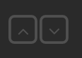
Example two square buttons vertical
<div>
    <div class="doublebox-v">
        <div data-type="push" data-device="Rollo"
             data-icon="fa-chevron-up" data-background-icon="fa-square-o"
             data-set-on="up">
    	</div>
        <div data-type="push" data-device="Rollo"
        	data-icon="fa-chevron-down" data-background-icon="fa-square-o"
        	data-set-on="down">
        </div>
    </div>
</div>
Example for a push button to switch a lamp on for 5 minutes. The control shows a progress circle while countdown is running. The countdown time is auto detected via the on-for-timer command. A other value can be set with the parameter data-countdown
<div data-type="push" data-device="MyLamp" data-set-on="on-for-timer 300" ></div>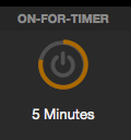
###Switch
Example for a default switch widget to switch on/off to STATUS of MyDevice
<div data-type="switch" data-device="MyDevice"></div>The same switch but with inverted color
<div data-type="switch" data-device="MyDevice" class="invert"></div>Example for a switch to send 0/1 to a dummy device
<div data-type="switch" data-icon="fa-rss" data-device='isAutoHomeStatus'
     data-get-on="1" data-get-off="0" data-set-on="1" data-set-off="0"
     class="green small invert"></div>
Example for how to create a widget for MILIGHT via toggle button. Usage of RegEx pattern for state request:
<div data-type="switch"
            data-device="MILIGHT_Zone1_Wohnzimmer"
            data-get-on="on.*"
            data-get-off="off"></div>
Example for a button group to toggle between 4 different values for one device
<div>
 <div data-type="switch" data-device="dummy1"
      data-get-off="!on" data-set-off="" data-icon="fa-home"
      data-get-on="Home"></div>
 <div>Home</div>
 <div data-type="switch" data-device="dummy1"
      data-get-off="!on" data-set-off="" data-icon="fa-bed"
      data-get-on="Sleep"></div>
 <div>Sleep</div>
 <div data-type="switch" data-device="dummy1"
      data-get-off="!on" data-set-off="" data-icon="fa-car"
      data-get-on="Away"></div>
 <div>Away</div>
 <div data-type="switch" data-device="dummy1"
      data-get-off="!on" data-set-off="" data-icon="fa-suitcase"
      data-get-on="Holiday"></div>
 <div>Holiday</div>
</div>
Example for a big homestatus button to toggle between two states
<li data-row="1" data-col="1" data-sizex="2" data-sizey="2">
    <header>HOMESTATUS</header>
    <div data-type="switch"
         data-device="dummy3"
         data-set-on="Anwesend"
         data-set-off="Abwesend"
         data-states='["Anwesend","Abwesend"]'
         data-icons='["fa-home", "fa-car"]'
         data-colors='["white", "white"]'
         data-background-colors='["green", "red"]'
         class="bigger top-space"></div>
</li>
###Symbol
Example for a simple window symbol
<div data-type="symbol" data-device="SchlafzimmerFenster" class="narrow big"></div>Example for a tristate icon
<div data-type="symbol" data-device="dummy1"
 data-states='["wert1","wert2","wert3"]'
 data-icons='["fa-arrow-up","fa-user","fa-arrow-down"]'
 data-colors='["SeaGreen","SlateBlue","IndianRed"]'
 class="big">
</div>
Example for a tristate icon with blink and spin animation
<div data-type="symbol" data-device="dummy1"
  data-states='["Wert1","Wert2","Wert3"]'
  data-icons='["fa-exclamation-triangle fa-blink","fa-exclamation-circle","fa-cog fa-spin"]'
  data-colors='["Crimson","GoldenRod","SeaGreen"]'
   >
</div>
Example for a battery level control with RegEx
<div data-type="symbol" data-device="WohnzimmerHeizung" data-get="batteryLevel"
    data-states='["3.[0-9]","2.[789]","2.[456]","2.[123]","((2.0)|([01].[0-9]))"]'
        data-icons='["fa-battery-4","fa-battery-3","fa-battery-2","fa-battery-1","fa-battery-0"]'
    data-colors='["#505050","#505050","#505050","#ad3333","#ad3333"]'>
</div>
Example for a battery level control with greater-equal compare and 90° rotated symbols
<div data-type="symbol" data-device="BadHeizung" data-get="batteryLevel"
	data-states='["0","2","2.4","2.7","3.0"]'
	data-icons='["oa-measure_battery_0 fa-rotate-90","oa-measure_battery_25 fa-rotate-90","oa-measure_battery_50 fa-rotate-90","oa-measure_battery_75 fa-rotate-90","oa-measure_battery_0 fa-rotate-90"]'
	data-colors='["#ad3333","#ad3333","#505050","#505050","#505050"]'>
</div>
Example for a door symbol which shows a warning sign in case of an open state
<div data-type="symbol" data-device="Eingangstuer"
	 data-states='["open","closed"]'
	 data-icons='["ftui-door warn","ftui-door"]'
	 data-colors='["#999","#555"]' >
</div>
###Weather
Example for how to use a label to show a weather icon according reading literal
<div data-type="weather"
     data-device="Weather"
     data-get="fc0_weatherDay"
     class="big">
</div>
The weather literal could be delivered by a FHEM module like PROPLANTA, OPENWEATHER, Weather.
Add 'big' or 'bigger' to CSS class to get a bigger weather icon.
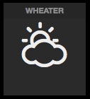
###Slider Example for how to create a widget for a slider to set values from 10 to 90:
<div data-type="slider"
     data-device='Dummy1'
     data-min="10"
     data-max="90">
</div>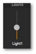
###Level Example for how to create a widget for a double level control with additional labels
<div>
	<div data-type="level" data-device='Tablet'  data-get='powerLevel'
		data-limits='["[12]*[0-9]","[3456][0-9]","([789][0-9]|100)"]'
		data-colors='["#dd3366","#ffcc00","#55aa44"]'
		class="horizontal left" >
	</div>
	<div data-type="label" data-device='Tablet'
		 data-get='powerLevel'
		 data-unit="%" class="top-space left"></div>
</div>
<div>
	<div data-type="level" data-device='dummy1'
		data-limits='["20","70","95"]'
		data-colors='["#dd3366","#ffcc00","#55aa44"]'
		class="horizontal left" >
	</div>
	<div data-type="label" data-device='dummy1' data-unit="%"
		 class="top-space left"></div>
</div>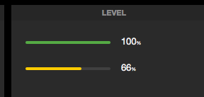
###Progress Example for how to create a widget for a percent display
<div data-type="progress" data-device="dummy1" data-get='pct'></div>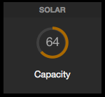
###Volume Example for how to create a widget for a HueDevice to set hue values:
<div data-type="volume" data-device='dummy1'
	data-min='0'
	data-max='65535'
	data-tickstep='4'
	data-get='hue'
	data-set='hue'
        class="small hue-tick" ></div>
Following CSS classes are available to influence the look: hue-tick|hue-front|hue-back or dim-tick|dim-front|dim-back|rgb This classes can be combined (e.g. class="small hue-tick hue-front")
###Dimmer Example for how to create a widget for a dimmer via toggle button incl. dimmer. Usage of RegEx pattern get all values for state on:
<div data-type="dimmer"
     data-device="MyDimmer1"
     data-get-on="[0-9]{1,3}|on"
     data-get-off="off">
</div>
To change the dim value: push the button and slide up or down
Example for how to create a widget for a HUEDevice for on/off, percent and hue adjustment:
<div data-type="volume" data-device="HUEDevice1" data-min="0" data-max="65353" data-get="hue" data-set="hue" class="hue-tick mini wider" ></div>
<div>Color</div>
<div data-type="dimmer" data-device="HUEDevice1" data-get-on="!off" data-get-off="off" data-set="pct"></div>
<div>Brightness</div>
Example for the same HUEDevice but with separat reading for dim
<div data-type="dimmer" data-device="HUEDevice1"
     data-get="onoff"
     data-get-on="1" data-get-off="0"
     data-set=""
     data-set-on="on" data-set-off="off"
     data-dim="pct">
</div>
Example for a FS20 Dimmer in simple mode (toggles between OFF value and the DIM value)
<div data-type="dimmer" data-device='myFS20Dimmer'
     data-set-on="dim$v%"
     data-set-off="dim0%"
     data-set-value="dim$v%"
     data-get-on="dim([1-9]\d?)?%"
     data-get-off="dim0%"></div>
###Image Example for how to add an image to the dashboard which its URL is delivered by a FHEM module like PROPLANTA:
<div data-type="image" data-device="Wetter1"
	 data-get="fc0_weatherDayIcon"
         data-size="40px">
</div>
Example for how to grab a live image every 5 secondes
<div data-type="image"
     data-size="95%"
     data-url="http://vusolo2/grab?format=jpg"
     data-refresh="5">
</div>
Example for how to update a web image every 15 secondes
<div data-type="image"
   data-size="95%"
   data-url="http://lorempixel.com/400/200"
   data-refresh="15"
   class="nocache">
</div>
###Homestatus Example for how to individualize the homestatus widget:
<div data-type="homestatus" data-device='hs_normal' class="small" ></div>

<div data-type="homestatus" data-device='hs_extra'
        data-get-on='["home","asleep","absent","gone","gotosleep"]'
        data-alias='["Home","Night","Away","Holiday","Retire"]'
        data-icons='["fa-fire","fa-film","fa-plus","fa-car","fa-tint"]'
        data-version='residents'>
###Pagetab Example for a tab menu to switch smoothly between multiple pages. Multiple pagetabs in a template file: menu.html
<html>
<body>
    <header>MENU</header>
    <div>
        <div data-type="pagetab" data-url="index.html"  data-icon="fa-home" ></div>
        <div data-type="pagetab" data-url="index_2.html" data-icon="fa-sliders"></div>
        <div data-type="pagetab" data-url="index_3.html" data-icon="fa-music" ></div>
        <div data-type="pagetab" data-url="index_4.html" data-icon="fa-hotel" ></div>
        <div data-type="pagetab" data-url="index_5.html" data-icon="fa-music" ></div>
        <div data-type="pagetab" data-url="index_6.html" data-icon="fa-database"></div>
        <div data-type="pagetab" data-url="index_7.html" data-icon="fa-fax" ></div>
    </div>
</body>
</html>
Example for a tab menu item, which shows also the numeric value of a reading
<div data-type="pagetab" data-device="MyFaxDevice"
		data-get-on='["0","1"]'
		data-icons='["fa-fax","fa-fax warn"]'
                data-url="index_fax.html"></div>
</div>
Example for a tab menu item, which also activate the new page in case of 'on' status
<div data-type="pagetab" data-device="myDoorBell"
		data-get-on='["0","(?:[1-9][0-9]*)","on"]'
		data-icons='["fa-fax","fa-fax warn","fa-fax warn activate"]'
                data-url="index_door.html"></div>
</div>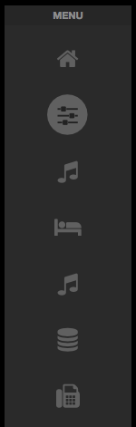
###Rotor Example for a rotor widget, which switches between two days of weather forecast
<div data-type="rotor" class="fade">
 <ul>
  <li>
	<div data-type="label" class="darker">Heute</div>
	<div data-type="weather" data-device="AgroWeather" data-get="fc0_weatherDay" class="big"></div>
	<div data-type="label" data-device="AgroWeather" data-get="fc0_weatherDay" class=""></div>
        <div data-type="label" data-device="AgroWeather" data-get="fc0_tempMax" data-unit="" class="large"></div>
  </li>
  <li>
	<div data-type="label" class="darker">Morgen</div>
	<div data-type="weather" data-device="AgroWeather" data-get="fc1_weatherDay" class="big"></div>
	<div data-type="label" data-device="AgroWeather" data-get="fc1_weatherDay" class=""></div>
        <div data-type="label" data-device="AgroWeather" data-get="fc1_tempMax" data-unit="" class="large"></div>
  </li>
 </ul>
</div>
###Swiper Basic schema for a swiper widget, which switches between multiple DIVs
<div data-type="swiper"  data-height="220px" data-width="400px" class="">
    <ul>
        <li><div class="">Page1</div></li>
        <li><div class="">Page2</div></li>
        <li><div class="">Page3</div></li>
        <li><div class="">Page4</div></li>
        <li><div class="">Page5</div></li>
     </ul>
</div>
###Simplechart Example for simplechart widget: two charts inline
<li data-row="4" data-col="4" data-sizex="8" data-sizey="3">
<header>CHARTS</header>
    <div data-type="simplechart"
    	data-device="WohnzimmerHeizung"
		data-logdevice="FileLog_WohnzimmerHeizung"
		data-columnspec="4:meas.*:1:int"
		data-minvalue="10"
		data-maxvalue="30"
        data-width="250px"
        data-height="120px"
		data-yticks="4"
		data-daysago="0"
                data-caption="Wohnzimmer" class="inline">
    </div>
    <div data-type="simplechart"
	    data-device="KuecheHeizung"
		data-logdevice="FileLog_KuecheHeizung"
		data-columnspec="4:meas.*:1:int"
		data-minvalue="12"
		data-maxvalue="28"
        data-width="250px"
        data-height="120px"
		data-yticks="6"
		data-daysago="2"
                data-caption="Küche" class="inline">
    </div>
</li>
Example for simplechart widget: one chart fill the whole gridster element
<li data-row="4" data-col="4" data-sizex="8" data-sizey="3">
<header>CHART</header>
	<div data-type="simplechart"
		data-device="WohnzimmerHeizung2"
		data-logdevice="FileLog_WohnzimmerHeizung2"
		data-logfile="WohnzimmerHeizung2.log"
		data-columnspec="4:temp:1:int"
		data-minvalue="10"
		data-maxvalue="30"
		data-yticks="4"
		data-daysago="0"
		data-caption="Wohnzimmer" class="fullsize">
	</div>
</li>
Example for chart widget
<li data-row="4" data-col="9" data-sizex="10" data-sizey="3">
  <header>CHART</header>
    <div class="normal"
         data-type="chart"
         data-device="WohnzimmerHeizung"
         data-logdevice='["FileLog_WohnzimmerHeizung","FileLog_WohnzimmerHeizung","FileLog_WohnzimmerHeizung"]'
         data-columnspec='["4:measured-temp","4:desired-temp","4:ValvePosition"]'
         data-style='["ftui l0fill","ftui l0dot","ftui l2dash"]'
         data-ptype='["lines","lines","lines"]'
         data-uaxis='["primary","primary","secondary"]'
         data-legend='["Measured", "Desired", "Valve"]'
         data-yunit="°C"
         data-ytext="Temperature"
         data-minvalue="auto"
         data-maxvalue="auto"
         data-yunit_sec="%"
         data-ytext_sec="Percentage"
         data-yticks="auto"
         data-minvalue_sec="0"
         data-maxvalue_sec="100"
         data-daysago_start="0"
         data-daysago_end="-1"
         data-crosshair="true"
         data-cursorgroup="1"
         data-scrollgroup="1"
         data-showlegend="true"
         data-xticks="auto">
    </div>
</li>
Cover a lot of other button behind one single button
<div class="col-1-2">
    <div data-type="circlemenu" class="">
        <ul>
          <li><div data-type="push" data-icon="fa-wrench"></div></li>
          <li><div data-type="push" data-device="AvReceiver" data-set-on="subwoofer-temporary-level -6" data-icon="">-6</div></li>
          <li><div data-type="push" data-device="AvReceiver" data-set-on="subwoofer-temporary-level -2" data-icon="">-2</div></li>
          <li><div data-type="push" data-device="AvReceiver" data-set-on="subwoofer-temporary-level 0" data-icon="">0</div></li>
          <li><div data-type="push" data-device="AvReceiver" data-set-on="subwoofer-temporary-level 3" data-icon="">2</div></li>
          <li><div data-type="push" data-device="AvReceiver" data-set-on="subwoofer-temporary-level 9" data-icon="">9</div></li>
          <li><div data-type="push" data-device="AvReceiver" data-set-on="subwoofer-temporary-level 12" data-icon="">12</div></li>
        </ul>
    </div>
    <div class="">Woofer</div>
</div>
Create a simple button to play a webradio stream directly on the tablet
<div data-type="playstream" data-url="http://radioeins.de/stream"></div>
<div data-type="label" class="darker">Radio eins</div>
Use a FHEM dummy device to start/stop stream and set volume
<div data-type="playstream" data-url="http://radioeins.de/stream"
	 data-device="dummy1"
	 data-get-on="play" data-get-off="stop"
     data-volume="volume">
</div>Create two comboboxes to select the inputs of a two zone AV receiver. List for Zone2 is fix, list for Zone1 will be received from FHEM.
<div class="wider">
          <div data-type="label" class="inline wider">Zone2</div>
          <div data-type="select" data-device="AvReceiverZ2" data-items='["Airplay","Webradio","BD/DVD","PHONO"]' data-get="input" data-set="input" class="w2x" ></div>
          <div></div>
          <div data-type="label" class="inline">Zone1</div>
          <div data-type="select" data-device="AvReceiver" data-list="inputs" data-get="input" data-set="input" class="w2x" ></div>
</div>
###Input
<li data-row="1" data-col="4" data-sizex="2" data-sizey="2">
    <header>SELECT</header>
    <div data-type="select" data-items='["dummy1","dummy2","dummy3","dummy4"]' id="sendDev" class="notransmit w3x"></div>
    <div data-type="select" data-items='["STATE","warn1","warn2","webCmd","room"]' id="sendParam" class="notransmit w3x"></div>
    <div data-type="input" data-device="#sendDev" data-get="#sendParam" id="sendValue" data-value="127" class="notransmit w3x centered"></div>
    <div data-type="link" class="round centered"
         data-width="80" data-height="40"
         data-color="white"
         data-background-color="green"
         data-icon="fa-feed"
         data-device="#sendDev"
         data-set="#sendParam"
         data-value="#sendValue">
        OK
    </div>
</li>Basic structure for a popup:
<div data-type="popup" data-height="150px" data-width="250px">
  <div><!-- click object to open the popup --></div>
  <div class="dialog">
	  <header>DIALOG</header>
	  <div><!-- widget(s) inside the popup dialog --></div>
  </div>
</div>
Create a Link in the UI which opens a dialog with sub widgets .
<div data-type="popup" data-height="200px" data-width="400px">
<div data-type="link" class="large thin">Show Temperatur</div>
<div class="dialog">
<header>DIALOG</header>
<div class="top-space">
<div class="inline">
<div data-type="label" data-device="THSensorWZ" data-get="temperature" data-limits='[-73,19,23]' data-colors='["#6699FF","#aa6900","#bb6242"]' data-unit="°C" class="bigger thin"></div>
<div>Temperatur</div>
</div>
<div class="inline">
<div data-type="label" data-device="THSensorWZ" data-fix="0" data-part="4" data-limits='[0,40,60]' data-colors='["#bb6242","#aa6900","#bb6242"]' data-unit="%" class="bigger thin"></div>
<div>Luftfeuchte</div>
</div>
</div>
</div>
</div>Create a mini chart in the UI which opens a dialog with the full size of the chart.
<div data-type="popup" data-width="450px">
	<div data-type="simplechart"
	 	  data-device="OutTemp"
		  data-logdevice="FileLog_OutTemp"
		  data-columnspec="4:temp"
		  data-minvalue="-25"
		  data-maxvalue="35"
		  data-height="50"
		  data-width="100">
	</div>
	<div class="dialog">
		<header>BIG-CHART</header>
		<div data-type="simplechart"
	 		  data-device="OutTemp"
			  data-logdevice="FileLog_OutTemp"
			  data-columnspec="4:temp"
			  data-minvalue="-25"
			  data-maxvalue="35"
			  data-yticks="5"
			  data-height="150">
		</div>
	</div>
</div>Create a Label in the UI which opens a datetime picker.
<div class="left" >
    <div data-type="label" class="inline thin" >Start:</div>
    <div data-type="datetimepicker" data-device="dummy1" class="inline large thin orange"></div>
</div>
Create a Label in the UI which opens a time picker.
<div class="cleft" >
    <div data-type="label" class="inline thin" >Bad:</div>
    <div data-type="datetimepicker" data-device="dummy1"
         data-datepicker="false" data-format="H:i"
         class="inline large thin orange"></div>
</div>
Example of range widgets to visualize max and min temperature value as a range bar. Temperatures below zero are shown in blue, values above 2 become red.
<div class="container">
    <div data-type="range" data-device="AgroWeather" data-low="fc0_tempMin" data-high="fc0_tempMax" data-max="5" data-min="-5" data-limit-low="0" data-limit-high="2" class="inline left-space"></div>
    <div data-type="range" data-device="AgroWeather" data-low="fc1_tempMin" data-high="fc1_tempMax" data-max="5" data-min="-5" data-limit-low="0" data-limit-high="2" class="inline left-space nolabels"></div>
    <div data-type="range" data-device="AgroWeather" data-low="fc2_tempMin" data-high="fc2_tempMax" data-max="5" data-min="-5" data-limit-low="0" data-limit-high="2" class="inline left-space nolabels"></div>
</div>
Example for a button-like link. Usable for a popup opener
<div data-type="link" class="round"
     data-color="grey"
     data-border-color="grey"
     data-icon="fa-server">Details</div>
Example for a huge button-like link. Usable to trigger a fhem command
<div data-type="link" class="round"
     data-width="130" data-height="50"
     data-color="white"
     data-background-color="red"
     data-icon="fa-lock"
     data-fhem-cmd="set AllDoors locked">
    Lock Doors
</div>
Example for medialist usage
<div data-type="medialist"
     data-device="MPD1"
     data-get="playlistinfo"
     data-pos="Pos"
     data-set="play"
     class="autoscroll">
</div>Example for classchanger usage
<div data-type="classchanger"
     data-device="dummyDevice"
     data-get="myReading"
     data-get-on="yes"
     data-on-class="border-red"
     class="container bg-gray">

  <div data-type="symbol"
       data-device="myDummy1"></div>

  <div data-type="symbol"
       data-device="myDummy2"></div>

</div>Example for a value spinner. Per default the value is visualized as a level bar
<div data-type="spinner"
     data-device="dummy1">
</div>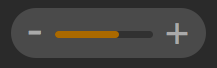
Example for a special value spinner. The value is visualized as a dual color level bar
<div data-type="spinner"
    data-device="dummy2"
    data-min="10"
    data-max="30"
    data-gradient-color='["blue","red"]'>
</div>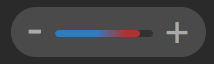
Example for a special value spinner. The value is visualized as numeric text with °-unit
<div data-type="spinner"
    data-device="dummy3"
    data-min="10"
    data-max="30"
    data-unit="°"
    class="valueonly">
</div>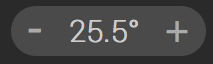
If you use themes, you have to avoid fix color definition. Use classes instead:
Example to call a command directly to FHEM. This calls "set dummy1 off"
<div onclick="ftui.setFhemStatus('set dummy1 off');">All off!</div>Example to call a Perl function directly to FHEM. This calls the myUtils_HeizungUpDown function located in 99_myUtils.pm: myUtils_HeizungUpDown("WZ.Thermostat_Climate","up")
<div onclick="setFhemStatus('{myUtils_HeizungUpDown("WZ.Thermostat_Climate","up")}')"
class="big">+</div>Include re-usable code.
Load a whole extern gridster element
<li data-row="1" data-col="1" data-sizex="1" data-sizey="4" data-template="menu.html"></li>Load a re-usable widget group
<div data-template="template_div.html"></div>Load a re-usable weather slide for swipe widget with parameters
<div data-type="swiper" data-height="250px" data-width="450px">
<ul>
    <li data-template="templates/wetter.html" data-parameter='{"par01":"fc0_tempMax","par02":"fc0_weatherDay","par03":"fc0_tempMin","par04":"fc0_date"}'></li>
    <li data-template="templates/wetter.html" data-parameter='{"par01":"fc1_tempMax","par02":"fc1_weatherDay","par03":"fc1_tempMin","par04":"fc1_date"}'></li>
    <li data-template="templates/wetter.html" data-parameter='{"par01":"fc2_tempMax","par02":"fc2_weatherDay","par03":"fc2_tempMin","par04":"fc2_date"}'></li>
    <li data-template="templates/wetter.html" data-parameter='{"par01":"fc3_tempMax","par02":"fc3_weatherDay","par03":"fc3_tempMin","par04":"fc3_date"}'></li>
 </ul>
 </div>
The weather template file contains this
<html>
<body>
<div class="left">
<div data-type="label" data-device="AgroWeather" data-get="par01" data-unit="°C " class="bottom gigantic inline verticalLine"></div>
<div class="inline">
<div data-type="label" data-device="AgroWeather" data-get="par02" class="large"></div>
<div data-type="weather" data-device="AgroWeather" data-get="par02" class="bigplus thin"></div>
min: <div data-type="label" data-device="AgroWeather" data-get="par03" data-unit="°C" class="inline medium"></div>
</div>
</div><div class="row"></div>
<div class="left">
<div data-type="label" data-device="AgroWeather" data-get="par04" data-substitution="toDate().eeee()+','" class="left large darker"></div>
<div data-type="label" data-device="AgroWeather" data-get="par04" data-substitution="toDate().ddmm()" class="left large darker"></div>
</div>
</body>
</html>You can thank the creator of this versatile UI:
![[paypal]](https://www.paypalobjects.com/de_DE/DE/i/btn/btn_donateCC_LG.gif)
Many many thanks to all donators!
This project is licensed under MIT.