First pass at the demo #258. It has issues on Y-Axis alignment and c… #259
Conversation
…t and cursor hover whitespace.
|
@leeoniya pls review |
|
hey @bluemonk3y thanks for the PR :) first, please don't be offended if i don't end up merging this, as it might be a bit too specific for your use case. i'll help you figure out alignment issues though so you can use that feedback for yourself in either case. i haven't reviewed in full yet, but some general intial comments:
i'm still a bit confused about how this data is presented based on your description in liquidlabsio/fluidity#65 (comment) what this demo shows doesnt really look like latency buckets (unless the bucket size is 1), which in theory would not overlap as they do here, but look more like the heatmap i mentioned in liquidlabsio/fluidity#65 (comment). the overlap + hover combo results in not-great UX, in my opinion, since it becomes impossible to isolate what you're hovering. it feels like there needs to be some dynamic aggregation (from raw data) into buckets that would be determined from vertically fittable non-overlapping ranges during zooming. if there is overlap, then it should be from the raw data (rather than aggregated) and each block should be identical in color to allow their densities to overlay and multiply. but at that point you don't want hover, since it becomes mostly unusable. i think for a demo i'd like to generate a few hundred raw datapoints per timestamp using a realistic-looking normal or skewed normal distribution: https://stackoverflow.com/a/49434653/973988 function randn_bm(min, max, skew) {
let u = 0, v = 0;
while(u === 0) u = Math.random(); //Converting [0,1) to (0,1)
while(v === 0) v = Math.random();
let num = Math.sqrt( -2.0 * Math.log( u ) ) * Math.cos( 2.0 * Math.PI * v );
num = num / 10.0 + 0.5; // Translate to 0 -> 1
if (num > 1 || num < 0) num = randn_bm(min, max, skew); // resample between 0 and 1 if out of range
num = Math.pow(num, skew); // Skew
num *= max - min; // Stretch to fill range
num += min; // offset to min
return num;
}we can then use this data to generate two types of heatmaps:
this PR seems to be something in between these two and the result is a bit awkward to interpret and interact with for me at least (even if the positioning is fixed). |
|
Thanks Leeoniya/Uplot.
No offense taken - just wanting to get it pointed in the right direction!
Due to the volume of data being viewed it would be impossible to
aggregate on the client. For context, the source data will be classifying
that latency of up to 30k events per second. Ideally need to support a
visible range of an hour. That's not to say the client shouldn't massage
the data for viewing. In order to calculate the data in the first place,
the Z value is used to aggregate into units otherwise the volume will
explode (there should not be any overlap). Does that make sense?
Let me see if I can generate some better-looking data and do the Y axis
bucketing/aggregation to prevent overlap and provide better visual
interaction.
…On Fri, 12 Jun 2020 at 06:57, Leon Sorokin ***@***.***> wrote:
hey @bluemonk3y <https://github.com/bluemonk3y> thanks for the PR :)
first, please don't be offended if i don't end up merging this, as it
might be a bit too specific for your use case. i'll help you figure out
alignment issues though so you can use that feedback for yourself in either
case.
i haven't reviewed in full yet, but some general intial comments:
- you might want to use hsla instead of rgba for computing the heatmap
color since it's much more suitable & logical for human-friendly hue,
lightness and saturation transitions.
- color range should probably not be part of data but passed to the
plugin as config.
i'm still a bit confused about how this data is presented based on your
description in liquidlabsio/fluidity#65 (comment)
<liquidlabsio/fluidity#65 (comment)>
what this demo shows doesnt really look like latency buckets (unless the
bucket size is 1), which in theory would not overlap as they do here, but
look more like the heatmap i mentioned in liquidlabsio/fluidity#65
(comment)
<liquidlabsio/fluidity#65 (comment)>.
the fact that there is overlap results in not-great UX, in my opinion,
since it becomes impossible to isolate what you're hovering.
it feels like there needs to be some dynamic aggregation (from raw data)
into buckets that would be determined from vertically fittable
non-overlapping ranges during zooming.
if there is overlap, then it should be from the raw data (rather than
aggregated) and each block should be identical in color to allow their
densities to overlay and multiply. but at that point you don't want hover,
since it becomes mostly unusable.
i think for a demo i'd like to generate a few hundred raw datapoints per
timestamp using a realistic-looking normal or skewed normal distribution:
https://stackoverflow.com/a/49434653/973988
function randn_bm(min, max, skew) {
let u = 0, v = 0;
while(u === 0) u = Math.random(); //Converting [0,1) to (0,1)
while(v === 0) v = Math.random();
let num = Math.sqrt( -2.0 * Math.log( u ) ) * Math.cos( 2.0 * Math.PI * v );
num = num / 10.0 + 0.5; // Translate to 0 -> 1
if (num > 1 || num < 0) num = randn_bm(min, max, skew); // resample between 0 and 1 if out of range
num = Math.pow(num, skew); // Skew
num *= max - min; // Stretch to fill range
num += min; // offset to min
return num;}
we can then use this data to generate two types of heatmaps:
1. one with the raw data without hover and same-colored translucent
rects (or circles) that color-multiply over each other.
2. another for data that's been aggregated (either statically or
on-demand during zoom) into non-overlapping latency buckets of some fixed
or configurable pixel height (let's say 5px). this version will be
hoverable per latency bucket and will display a summary of how many values
were aggregated into that rect. these buckets will be colored using an hsla
progression of some kind based on the aggregation stats.
this PR seems to be something in between these two and the result is a bit
awkward to interpret and interact with for me at least (even if the
positioning is fixed).
cc @mcrumm <https://github.com/mcrumm> @davydog187
<https://github.com/davydog187>
—
You are receiving this because you were mentioned.
Reply to this email directly, view it on GitHub
<#259 (comment)>, or
unsubscribe
<https://github.com/notifications/unsubscribe-auth/ACQLJJQZL6V4G233RNGIW5TRWG7V7ANCNFSM4N3KXDAQ>
.
|
|
yeah that makes sense. in reality the data (if it represents e.g. sporadic network requests) has to be bucketed along the temporal/x axis too. still, i think it would be good for the demo to do some gen and aggregation of the random data on the client to create a kind of aggregation & heat style playground without tweaking the agg behavior on a server to get the exact look you want for your data density. i think this demo should still contain 2 heatmap types - one with latency buckets / non-overlapping, hsla heat gradient and display aggregate info on hover. and another for raw data that's just a static rgba color with low alpha that visually aggregates by overlapping and color multiplying. both versions would still be x-bucketed to 1s, 1d or whatever. |
|
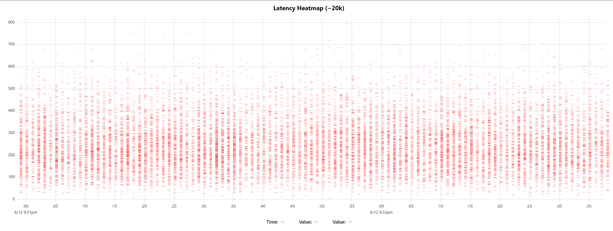
i've made a prototype today of the raw data heatmap with randomly skewed normal distributions. the total dataset size in this test is ~20k samples. the wall time for initial render is ~100ms (60ms script of which 30ms is fake data gen, and 40ms compositor & paint).
also made an aggregation function that can bucket in a custom multiple, (e.g. passing 10 will make buckets of 0-10,11-20, etc.). i'll try to get the aggregated heatmap version prototyped tomorrow and push a working branch to further work on cursor, tooltips, and heat scaling behavior. |
|
Wow, that looks so much better. The performance is impressive!
…On Sat, 13 Jun 2020, 03:43 Leon Sorokin, ***@***.***> wrote:
i've made a prototype today of the raw data heatmap with randomly skewed
normal distributions.
the total dataset size in this test is ~20k samples. the wall time for
initial render is ~100ms (60ms script of which 30ms is fake data gen, and
40ms compositor & paint).
[image: image]
<https://user-images.githubusercontent.com/43234/84557899-7dc0b380-acf4-11ea-8ced-d8c3c8f6c767.png>
also made an aggregation function that can bucket in a custom multiple,
(e.g. passing 10 will make buckets of 0-10,11-20, etc.). i'll try to get
the aggregated heatmap version prototyped tomorrow and push a working
branch to further work on cursor, tooltips, and heat scaling behavior.
—
You are receiving this because you were mentioned.
Reply to this email directly, view it on GitHub
<#259 (comment)>, or
unsubscribe
<https://github.com/notifications/unsubscribe-auth/ACQLJJT7VIUIFC6OK22U25TRWLRV3ANCNFSM4N3KXDAQ>
.
|
|
here are two heatmaps of the same data. the first is raw and the second is aggregated into 10ms buckets.
|

| [80, 50, 43], | ||
| [10, 12, 14, 18, 30, 50], | ||
| [70, 90, 13, 10, 12, 13], | ||
| [170, 190, 113, 110, 112, 113], |
There was a problem hiding this comment.
@bluemonk3y i'm trying to plug your data into my prototype and found this bit confusing, since i'm assuming that the latency values are unique and their counts would appear summed together. is there a specific reason for having 113 repeat here? the original description [1] appears to outline what i ended up with in the prototype so far, which would not have repeated latencies (or buckets).
(also, latencies in my dataset are sorted ascending for easier hover testing, so that'll also be a requirement of the input format).
|
Yes, y values / latencies dirks but be repeated. That was incorrect manual
entry.
…On Sun, 14 Jun 2020, 01:27 Leon Sorokin, ***@***.***> wrote:
***@***.**** commented on this pull request.
------------------------------
In demos/bar-heatmap.html
<#259 (comment)>:
> + hooks: {
+ draw: drawSeries,
+ }
+ };
+ }
+
+ const data = [
+ // dates
+ [1546300800,1546387200,1546473600,1546560000,1546819200,1546905600,1546992000,1547078400,1547164800,1547424000,1547510400,1547596800],
+
+ // latency ladder
+ [
+ [80, 50, 43],
+ [10, 12, 14, 18, 30, 50],
+ [70, 90, 13, 10, 12, 13],
+ [170, 190, 113, 110, 112, 113],
@bluemonk3y <https://github.com/bluemonk3y> i'm trying to plug your data
into my prototype and found this bit confusing, since i'm assuming that the
latency values are unique and their counts would appear summed together. is
there a specific reason for having 113 repeat here? the original
description [1] appears to outline what i ended up with in my prototype so
far, which would not have repeated latencies (or buckets).
(also, latencies in my dataset are sorted ascending for easier hover
testing, so that'll also be a requirement of the input format).
[1] liquidlabsio/fluidity#65 (comment)
<liquidlabsio/fluidity#65 (comment)>
—
You are receiving this because you were mentioned.
Reply to this email directly, view it on GitHub
<#259 (review)>,
or unsubscribe
<https://github.com/notifications/unsubscribe-auth/ACQLJJWCUIVLXGKHFDFM23TRWQKQNANCNFSM4N3KXDAQ>
.
|
|
can you provide a more realistic [and probably larger] dataset so that i have a good idea of what the final result will look like? |
|
Sure, I can generate simulated data but it's not in the right format yet. I
need to rewrite the format to suit the client. Real data from fluidity is
much lower volume. I will get to it over the next couple if days.
…On Sun, 14 Jun 2020, 01:57 Leon Sorokin, ***@***.***> wrote:
can you provide a more realistic [and probably larger] dataset so that i
have a good idea of what the final result will look like?
—
You are receiving this because you were mentioned.
Reply to this email directly, view it on GitHub
<#259 (comment)>, or
unsubscribe
<https://github.com/notifications/unsubscribe-auth/ACQLJJQNU7R4DNDJ4LBDN53RWQN7JANCNFSM4N3KXDAQ>
.
|
if it's simulated, then there's no need since i can generate that myself. it's difficult to simulate realistic data like below, but this is for a hard disk so in aggregate this type of useful detail would get washed out anyways.
whate might actually be interesting to do is a few per-series (e.g. per route) heatmaps of different hues that exhibit different median latencies on the same chart. this would be useful for comparing A/B tests when trying to tweak perf. although to me heatmaps are not terribly more insightful than a box and whisker timeseries plot (#179). the most interesting stuff in a heatmap would be spotting outliers that are unusually high-density, but real-world tmeseries heatmaps's outliers will likely always be low density and not too interesting. |

|
Yep, agree using time overlays with different hues will be amazing for
showing correlation (today v yesterday). The heatmap can provide a fidelity
that might be masked using medians and percentiles or box plots. (and they
look cool)
In other cases you want to use a hue against different meta data attibues.
For example, if you are showing latencies of payment streams you might show
error flows with a different colour. The being able to filter against
specific groups of attribues. Or filter out by z value. I. e filter
latencies below 100ms. Then allowing the user to click to a more detailed
view of a single cell or group of cells. (I hope that makes sense)
…On Sun, 14 Jun 2020, 19:22 Leon Sorokin, ***@***.***> wrote:
Sure, I can generate simulated data
if it's simulated, then there's no need since i can generate that myself.
it's difficult to simulate realistic data like below, but this is for a
hard disk so in aggregate this type of useful detail would get washed out
anyways.
white might actually be interesting to do is a few per-series (e.g. per
route) heatmaps of different hues that exhibit different median latencies
on the same chart. this would be useful for comparing A/B tests when trying
to tweak perf. although to me heatmaps are not terribly more insightful
than a box and whisker timeseries plot (#179
<#179>). the most interesting
stuff in a heatmap would be spotting outliers that are unusually
high-density, but real-world tmeseries heatmaps's outliers will likely
always be low density an not too interesting.
[image: image]
<https://user-images.githubusercontent.com/43234/84600695-dc934380-ae40-11ea-9e1e-43630e52bbf7.png>
—
You are receiving this because you were mentioned.
Reply to this email directly, view it on GitHub
<#259 (comment)>, or
unsubscribe
<https://github.com/notifications/unsubscribe-auth/ACQLJJU5M6RDTW5BN3O2S53RWUIN3ANCNFSM4N3KXDAQ>
.
|
|
so, the question of drill-down is probably worth asking and addressing. if we load 20k raw events and aggregate on the client, we can track which specific event ids end up being part of the buckets and show that somewhere on hover so one can be clicked for further digging. this becomes problematic if your bucket has more than a handful of events in it. however, i don't really want to over-complicate the demo since demos/plugins are not meant to be fully fleshed out but starting points for implementing the final needed things. even the bucketing/clustering can be much more sophisticated than simply doing incremental grouping. once we can hover the buckets and display the count for that bucket, this would be a good stopping point. we can leave out the tooltips and probably the column highlight, since i don't want to copy/paste that stuff into every demo and would prefer for the demos to be less code to look at. |
|
Sorry - having major hardware problems this week!
WRT drill-down, ideally, you want the user to zoom into less than 50 events
in the drill down, it might be better to provide the x-y range and allow
the click implementer to filter the data as required.
The reason I say this is because the intended use case I have in mind will
want to render over 1.8m events (30k per min - 60 minutes). They will be
pre-aggregated on the server where the 'z' dimension reflects the number of
items in that cell.
Removing highlighting and tooltips makes sense.
…On Sun, 14 Jun 2020, 22:19 Leon Sorokin, ***@***.***> wrote:
so, the question of drill-down is probably worth asking and addressing. if
we load 20k raw events and aggregate on the client, we can track which
specific event ids end up being part of the buckets and show that somewhere
on hover so one can be clicked for further digging. this becomes
problematic if your bucket has more than a handful of events in it.
however, i don't really want to over-complicate the demo since
demos/plugins are not meant to be fully fleshed out but starting points for
implementing the final needed things. even the bucketing/clustering can be
much more sophisticated than simply doing incremental grouping.
once we can hover the events and display the count for that bucket, that
would be a good stopping point. we can leave the tooltips and probably the
column highlight out, since i don't want to copy/paste that stuff to every
demo and would prefer for the demos to be less code to look at.
—
You are receiving this because you were mentioned.
Reply to this email directly, view it on GitHub
<#259 (comment)>, or
unsubscribe
<https://github.com/notifications/unsubscribe-auth/ACQLJJU63ER6V7S44CDJJGLRWU5ERANCNFSM4N3KXDAQ>
.
|
|
so if you're doing server-side aggregation, you'd would simply return bucket ranges and counts without details for rendering. then on zoom you would send the zoom range to the server and re-aggregate based on the new zoom range (still without individual event detail). only when you zoom sufficiently you will return bucket ranges, weights, plus event details and the buckets will become interactive to view the details on click or hover (assuming you're at your 50 event limit per bucket then)? or is your aggregator gonna know at every zoom request which buckets contain fewer than 50 datapoints and those would be interactive beyond displaying aggregation counts? |
|
Funny, I didn't think about going back to the server for aggregations after
the first set of data. U make good points about the ux.
I was thinking that at every range point it needs to know the z/weight
value to render the color - the same value can be shown to the user as a
tip.
At any range it should be able to provide basic hover info, on click, the
handler receives the x-y range info for the cell. The handier would be
responsible for filtering (a different vis - gant style showing more detail
and filtering, paging)
that would be useful enough to work with and see how to enhance. I'm sure
there is fancier stuff to add, like hue for different types of events
(failed/success, service name, or other).
…On Wed, 17 Jun 2020, 14:51 Leon Sorokin, ***@***.***> wrote:
so if you're doing server-side aggregation, you'd would simply return
bucket ranges and counts without details for rendering. then on zoom you
would send the zoom range to the server and re-aggregate based on the new
zoom range (still without individual event detail). only when you zoom
sufficiently you will return bucket ranges, weights, *plus* event details
and the buckets will become interactive to view the details on click or
hover (assuming you're at your 50 event limit per bucket then)? or is your
aggregator gonna know at every zoom request which buckets contain fewer
than 50 datapoints and those would be interactive beyond displaying
aggregation counts?
—
You are receiving this because you were mentioned.
Reply to this email directly, view it on GitHub
<#259 (comment)>, or
unsubscribe
<https://github.com/notifications/unsubscribe-auth/ACQLJJVFKOBNIR2VGWD6VP3RXDC7RANCNFSM4N3KXDAQ>
.
|
|
@leeoniya - would I be able to take a look at the prototype? I'm starting to hookup the front end and will get a feel for how the interaction is. (likely to take a few days) |
|
i will push a branch today with my test code |
|
@bluemonk3y have a look at the |
|
@leeoniya - awesome thank you! Will let you know how the UX goes. |
|
@leeoniya - making progress but hit a scaling snag. calling uPlot.setData(newData) - results in NaN when the plugin calls: u.valToPos(yVal, 'y', true). setData() resets scales, however, I was calculating them on initial creation. setData resets them so that 'y' scale has min=Infinity and max=-Infinity. How can I correctly the scale using my own minMax range function like I did upon initial creation? |
instead of (or in addition to) using scale.min/max for initial scale, provide a |
|
of course there is also the Lines 62 to 63 in ee065f6 |
|
Thanks @leeoniya - that worked. |
|
@bluemonk3y i've merged my heatmap code into the demos. given that this PR is inactive and stale, i'm going to close it. if you want to iterate on the heatmap demo code like adding a tool-tip, column highlight, box-hover, contribute some real data that isn't random, please open a new PR. thanks! |
First pass at demo #258. It has issues on Y-Axis alignment and cursor hover whitespace.