This is an introduction to R and RStudio for NFL fans people who want to play with NFL data to have information to look at, but may find nflscrapR too large and intimidating of a data set to start with!
My name is Lee Sharpe, and you can find me on Twitter at @LeeSharpeNFL. Feel free to reach out if you have questions! I want to credit Ben Baldwin and his excellent nflscrapR tutorial for the inspiration for this introduction.
While you can of course use a variety of tools for looking at data, I recommend downloading and installing both R and RStudio. Both are free and can be downloaded at these links:
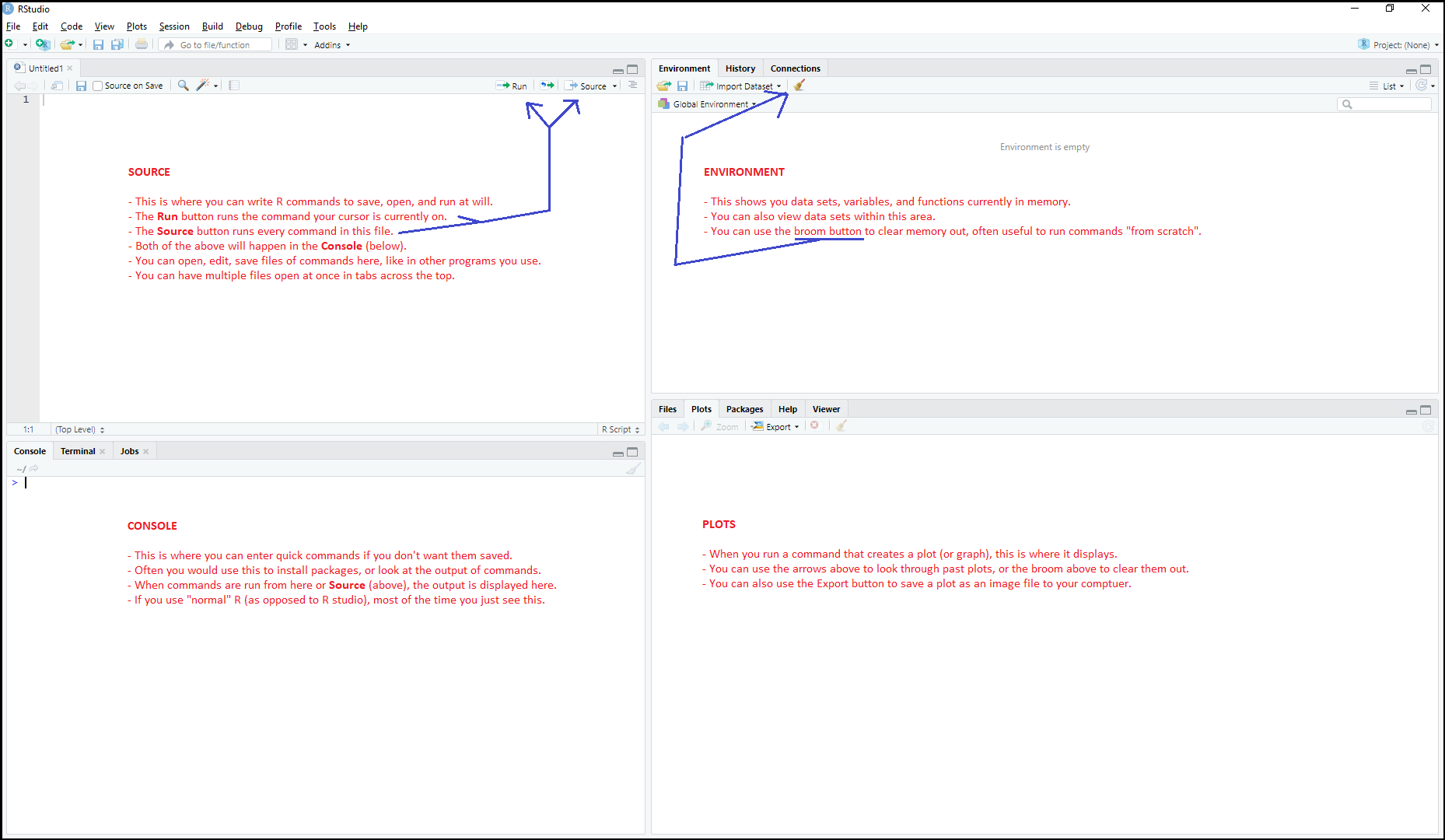
Once you have both installed, run RStudio. In the menu bar go to: File -> New File -> New R Script. You'll now see the four sections of R Studio, and can see what that they are each for. I've outlined them in the image below:
Before we begin, we have to install some R packages. R packages are helpful code other people have written that aren't part of base R. Fortunately, R has an easy way to install them. Run the following commands.
In this introduction, you'll frequently see code segments like the below. You can either copy/paste into the Console area directly, or you can enter them in Source section, and then use the Run or Source buttons to execute them. Either way, the output will be displayed in the Console area.
install.packages("tidyverse")
install.packages("ggplot2")
Now that these packages are installed, let's download some NFL Standings data and take a look at it by running the following:
library(tidyverse)
standings <- read_csv("http://nflgamedata.com/standings.csv")
standings %>% head()
The %>% operator sends the information on the left (the standings we downloaded) into the command on the right, which here is head(). The head() command looks at the first several rows. This is a good way to get a sense of the structure of the data. The output of the above will look like this:
# A tibble: 6 x 16
  season conf  division  team   wins losses  ties   pct div_rank scored allowed   net   sov   sos  seed playoff
   <dbl> <chr> <chr>     <chr> <dbl>  <dbl> <dbl> <dbl>    <dbl>  <dbl>   <dbl> <dbl> <dbl> <dbl> <dbl> <chr>
1   2002 AFC   AFC East  BUF       8      8     0 0.5          4    379     397   -18 0.352 0.473    NA NA
2   2002 AFC   AFC East  MIA       9      7     0 0.562        3    378     301    77 0.486 0.508    NA NA
3   2002 AFC   AFC East  NE        9      7     0 0.562        2    381     346    35 0.451 0.523    NA NA
4   2002 AFC   AFC East  NYJ       9      7     0 0.562        1    359     336    23 0.5   0.5       4 LostDV
5   2002 AFC   AFC North BAL       7      9     0 0.438        3    316     354   -38 0.384 0.5      NA NA
6   2002 AFC   AFC North CIN       2     14     0 0.125        4    279     456  -177 0.406 0.531    NA NA
Look at the fourth row. You can see the Jets had a 9-7 record, won their division, were the 4th seed for the AFC that year, and lost in the divisional round of the playoffs. The other teams shown have NA listed for seed and playoff which means "not applicable". Usually you can figure out why something wouldn't apply from context. In this case, it means those teams did not make the playoffs, so there's no seed or playoff result to show.
Think more about how this is strucutred. Each horizontal row corresponds to how well a certain team did in a certain season, and each veritcal column shows a different piece of information about that team's year. In R, this is called a data frame and data frames are all organized in this sort of way. Each row represents a different instance of something occuring (a team's season), called an observation, while each column represents a different piece of information about each of the observations (number of games won, or points scored).
Let's say you want to see how many times a team with a given playoff seed as has won the Super Bowl (since realignment in 2002, when this data set begins). This command first takes standings and filters it down only to the rows where the team won the Super Bowl that year. Second, it groups these rows by seed, so there's one row for each of the six playoff seeds. Finally, we want to count how many rows were collapsed into this each seed's new row, and we'll call that count.
standings %>% filter(playoff == "WonSB") %>% group_by(seed) %>% summarize(count=n())The output will look like this:
# A tibble: 6 x 2
   seed count
  <dbl> <int>
1     1     7
2     2     4
3     3     1
4     4     2
5     5     1
6     6     2
Wow, the team that won the Super Bowl was a 1st or 2nd seed most of the time. Those first round playoff byes sure do appear to be helpful!
It's worth noting this output also a data frame. Each row refers to a different seed's performance, and there are two columns: one identifying the seed, and the other identifying how many teams with that seed went on to win the Super Bowl.
Example: Are teams who score a lot of points more or less likely to be teams with a lot of points allowed?
Let's plot this data. We'll choose points scored to be the x-axis (or horizontal axis) while points allowed is the y-axis (or vertical axis). Then on the plot we can put a dot where each team falls. To help understand this data better, we'll also change the color of the dot based on their playoff outcome.
library(ggplot2)
ggplot(standings,aes(x=scored,y=allowed)) +
  theme_minimal() +
  geom_point(aes(color=playoff)) +
  xlab("Points Scored") +
  ylab("Points Allowed") +
  labs(title="Points Scored vs. Points Allowed")
We'll break down this commmand later, but for now let's look at the plot it creates that now appears in your Plots area:

Two things should pop out at you as you look at this data. First: Non-gray dots, indicating a playoff team, are mostly toward the lower-right hand corner of the graph. This indicates that playoff teams tend to be teams that have scored a lot of points (suggesting a good offense), and have allowed their opponents to score relatively few points (suggesting a good defense). This makes sense, of course. You expect teams that are good at both to be in the playoffs!
Second, teams are spread all over this graph. This indicates there's not a strong relationship between how many points team score and how many they allow, so knowing how many they score doesn't really help you know more about how many points they allow. This makes sense. As discussed above, points scored is mostly a reflection of how good the offense is, while points allowed is mostly a reflection of how good the defense is. And we can all think of examples of teams that were good on one side of the ball while being bad at the other.
Here's the command that created the plot again, except above each line I've written comments that begin with the pound sign/hashtag symbol #. These tell R to ignore whatever comes after them, which lets someone writing R explain what the code does within the code but without breaking it.
# ggplot makes a plot, and standings is the data used to make it
# aes tells R to allow us to reference columns within standings here
# x=scored, y=allowed indicated which columns are shown on the horizontal (x) and verical (y) axes
ggplot(standings,aes(x=scored,y=allowed)) +
  # this sets up a bunch of great visual defaults in terms of how the plot appears
  theme_minimal() +
  # this means each row in standings gets represented by a point or dot (at its x,y values above)
  # each playoff value will be assigned a color (with legend to the right)
  # each row's point will be colored based on the playoff value of that point
  geom_point(aes(color=playoff)) +
  # this label is what gets written at the bottom to explain what the x-axis represents
  xlab("Points Scored") +
  # this label is what gets written at the left to explain what the y-axis represents
  ylab("Points Allowed") +
  # this label is what gets written prominently at the top to explain the purpose of the overall plot
labs(title="Points Scored vs. Points Allowed")To understand this, we need to look at the outcomes of games, so we need a new data set. Let's import and use a command called select to examine certain columns, and head() to see the first several rows of those columns.
games <- read_csv("http://www.habitatring.com/games.csv")
games %>% select(season,week,location,away_team,away_score,home_team,home_score,result) %>% head()
The output will look like this:
# A tibble: 6 x 8
  season  week location away_team away_score home_team home_score result
   <dbl> <dbl> <chr>    <chr>          <dbl> <chr>          <dbl>  <dbl>
1   2006     1 Home     MIA               17 PIT               28     11
2   2006     1 Home     ATL               20 CAR                6    -14
3   2006     1 Home     NO                19 CLE               14     -5
4   2006     1 Home     SEA                9 DET                6     -3
5   2006     1 Home     PHI               24 HOU               10    -14
6   2006     1 Home     CIN               23 KC                10    -13
This tells us for each game when it happened and the final score. It also represents the score in another way which we'll make use of below: result which is defined as home team's score minus the visitor's score.
To measure home field advantage we need to filter out neutral site games. To do this, first we want to make a new version of the games data frame that that has only the games where location has the value Home. This is accomplished with the <- operator in the below command, which takes the result of whatever expression comes that comes it and puts that value in home_games, which you can use to refer to it moving forward.
home_games <- games %>% filter(location == "Home")What ranges of values does it contain, what's the average and median? The R command function summary makes this super easy to find. In R, you can use the $ between the name of the data frame and the name of a column in it to get R to look at that column.
summary(home_games$result)The output will look like this:
   Min. 1st Qu.  Median    Mean 3rd Qu.    Max.    NA's
  -46.0    -7.0     3.0     2.5    11.0    59.0     251
The first thing we see here is there are 251 games with a result of NA. Why would a result of a game be not applicable? Because it doesn't have a result yet! These are games that are scheduled, but haven't been played yet, so there's no results information. At the time I write this, the 2019 regular season has been added to this data, but the season has yet to begin. (And there are 251 here because the five neutral site games in 2019 were filtered out.)
For the games with results, what can we learn? Since this data set began in 2006, the most a visiting team has won by is 46 points, and the most a home team has won by is 59 points. The median value is 3.0 and the mean is 2.4. This means that over a large sample of games like this, this suggests that being at home gets you somewhere between 2.5 to 3 extra points. In fact, let's look at how this looks once we filter out the games played at neutral locations through a histogram.
ggplot(home_games,aes(x=result)) +
  theme_minimal() +
  geom_histogram(binwidth=1) +
  xlab("Home Team Net Points") +
  ylab("Share of Games") +
  labs(title="Distribution of Home Team Net Points")
In a histogram, the higher the bar at a given number, the more rows there are in the data with that number in the column in question. What can we see from this?
- In general, values closer to 0 are larger than values further from 0. This makes sense, there are more close games than there are blowouts (especially blowouts at a precise number).
- There are spikes at certain numbers. The biggest ones are at -14, -10, -7, -3, 3, 7, 10, 14. Hopefully it is obvious to you why this is: In the NFL, points are typically scored in 3s and 7s, and so spikes will occur around numbers that are naturally arrived at by scoring that many points.
- We can also see the home field advantage at work here. At each of the numbers listed above, the spike for the home team's positive number is greater than the spike for the visiting team's negative number, indicating the team wins more often.
- Zero happens rarely compared to the numbers surrounding it. Why would this be? Well, since this value represents the difference between the two teams' scores, a value of 0 would indicate a tie game! Since tie games are rare in the NFL due to overtime rules, this being a low value should be expected and not surprising.
This supports our earlier conclusion that homefield advantage is real!