Staired

The Staired layout is not an official Material grid layout but it's inspired from the layout of the Material Study called Shrine:

It is implemented as a specific GridDelegate and can be used with the Flutter built-in widgets called SliverGrid and GridView.
GridView.custom(
  gridDelegate: SliverStairedGridDelegate(
    crossAxisSpacing: 48,
    mainAxisSpacing: 24,
    startCrossAxisDirectionReversed: true,
    pattern: const [
      StairedGridTile(0.5, 1),
      StairedGridTile(0.5, 3 / 4),
      StairedGridTile(1.0, 10 / 4),
    ],
  ),
  childrenDelegate: SliverChildBuilderDelegate(
    (context, index) => Tile(index: index),
  ),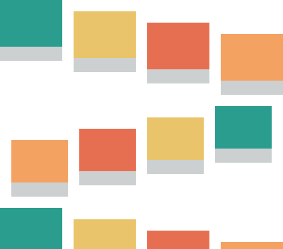
);Each tile is placed next to the previous one and its position is shifted by crossAxisSpacing pixels in the cross axis and mainAxisSpacing pixels in the main axis.
For example if we had four tiles to place in the cross axis, the layout would look like this:

Each space between each tile in the same run is the same:

This is why this layout is called Staired Layout.
Only the first run takes all the available place in the cross axis. The available space in the cross axis of all the runs after the first one, is decreased by crossAxisSpacing as you can see in the following picture:

The pattern is a list of StairedGridTile.
Each tile indicates:
- Its
crossAxisRatio, a number between 0 and 1, which indicates the ratio between the available space in the cross axis and the cross axis extent of the tile. - Its
aspectRatio, which is the cross axis extent of the tile divided by its main axis extent.
A run is made of all the consecutive tiles with a crossAxisRatio sum less or equals to 1.
To respect the Material Guidelines, you can also set a parameter called tileBottomSpace which adds a specifc amount of space below the tile. This space is intended to be used for displaying a text describing the tile. If you use this feature, your widget should have the same amount of pixels for this part.
This parameter can be set to indicate if the direction of the first run should be reversed (Defaults to false).
This layout uses the ambient TextDirection to know if it should create the grid from left-to-right
or right-to-left.
Just add a Directionality widget above the GridView (or CustomScrollView) to set the order in which the tiles are rendered.