Leafer's Interactive Prosper Loan Visualization investigates Prosper's loan data. Created by Marie Leaf. This project was inspired by professional work on a PwC innovation SaaS Suite. Pre-attentive graphics help users understand risk, return, and loan portfolio metrics from a holistic and interactive view.
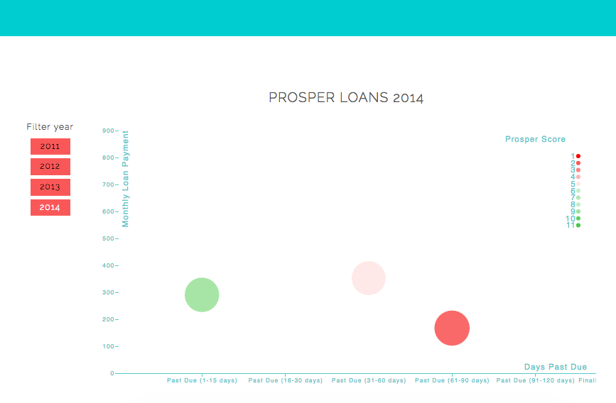
Extending the exploratory data analysis in Rstudio of the Prosper loan data, this project creates a visualized dashboard of all the loans to see trends and serve as a tool for lenders. The reader is able to cycle through the years of loan data. Loan circles are sized by principal outstanding amount, mapped by credit rating and estimated return. This could be a useful tool for lenders to know which loans to specifically track, which loans are at risk of late repayments (by looking at the Prosper Rating along the x axis). Users can snapshot see which loans to prioritize communicating or interacting with to ensure that they get paid on schedule.
This visualization could be rolled out and filtered by user, to provide a private dashboard for lenders.
Findings
High risk loans (operationalized by the Prosper Score), seem to have, on average, lower monthly payment amounts, but do not seem to be especially correlated with the days past due. This is important for lenders to be aware that time risk of repayment is not correlated with Prosper Risk overall.
From the data provided, the greatest amount of past due loans are highest in 2012, and 2013. This would make sense if we assume that severely past due loans in 2011 are either charged off, cancelled, or hopefully repaid at the point in time of the data capture. Loans in 2014 likely haven't matured to be categorized as past due.
2011 seems to have a higher volume of smaller past due loans. This may suggest either that following years were 'risk on' years where lenders increased the amount of principle lent, but this thesis would need to take in more context of the data (outside the scope of the purpose of this lender dashoard). This question would be appropriate to explore from the Prosper internal business intelligence point of view, but not necessarily for a user whose goal is to see which loans to focus on collecting.
Tabled iterations/Backlogged Ideas:
- Project data onto a hybrid graduated symbol/chloropleth thematic map to showcase relationships between geography, credit rating, loan size, and types of loans.
- communicate loan default rates
- filter loan by category
- run machine learning data for granular/nuanced customer segmenting with variables: ProsperPaymentsOneMonthPlusLate, TotalProsperPaymentsBilled, OnTimeProsperPayments
The plotted dots represent loans in the Prosper dataset.
The dot size represents principal outstanding amount. The size of the dot representing how big the principle outstanding amount was chosen to enable the user to quickly understand the magnitude of the principle outstanding. The monetary size of the loan being intrinsicly tied to the physical size of the object representing it, I believe, limits the users pre-attentive processing, and is the shortest visual path in communicating the most important monetary variable/feature.
The dots are plotted along an x axis, which at first represented the Prosper Score, but after receiving feedback from users, was changed to represent the days past due of the loan. This is appropriate, as temporal variables are usually shown from left to right. This design choice is more congruent with common users' mental models.
The y axis, represents monthly loan payment. This choice was made to help the user easily navigate the range of second order monetary value. For example, users can see which loans would be impactful to collect on if they are looking for faster repayments. Vertical axis are commonly used to denote monetary values, so again, this feature is intuitive.
The color of the dot represents the Prosper Score. Red indicates a lower Prosper Score, and Green indicates a higher Prosper Score. Red is commonly referenced as a warning indicator color.
The user is able to filter the loans by year. This enables a higher level temporal slicing to help the user understand which loans to attend to. Older loans could be more appropriate to focus on collecting, or may be at a point of considering alternate/further action other beyond personal collections, i.e. collections agent/reselling/charge off. The years filtering function, also serves to highlight the dynamic of risk exposure of the loans through the passing years.
Feedback 1 (Frequent P2P lender):
- the x axis should show the days past due, as an x axis usually shows temporal data
- the y axis should show the Prosper Score
- the monthly loan payment is a bit of an arbitrary number, that may confuse the user with an extra monetary variable
Feedback 2:
- the range size of the circles should be more emphasized
- the ProsperScore should be the color, as this is the leading risk factor
Feedback 3:
- the colors should not be monochromatic
- would be good to see how many months left - feature not implemented for lack of data
d3.js
visual encodings
design principles, gestalt principles
effective communication
author driven vs. reader driven narratives
Marie Leaf