Subpixel rendering of texts #1210
Comments
|
@puzrin I've noticed that However, IMO the |
|
I'd suggest to keep things separate. Offsets in in glyphs are for "floating" bitmaps. Instead of inventing fractional offsets, it's enouth to shift bitmap's content (and increase bounding box if needed). Bounding box base corner position can be always integer. When you receive font with subpixel data, the only difference is that bitmap has 3x density/pixels in selected direction. So, nothing to do with existing offset values. Explanations above are in context of data structures, not depending on implementation. Is this what you asked about? |
Still not fully clear. So do you suggest if |
|
Probably i did not understand your question. I replied about font data. If you asking about algorythm - i have no experience with those. If you wish to render subpixel font as ordinary one - that's not good idea. Proper image downscale needs filtering to keep result sharp. There are tons of reading about such topic in imagemagick docs. I say so as author of https://github.com/nodeca/pica. In short - any simple approach will give bad result, just don't do that. |
|
Okay, thanks. |
|
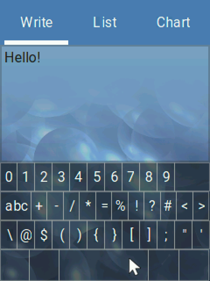
Just quick hacky experiment:
|


|
I note that 2, 3, 5, and 6 appear out of place on the keyboard (i.e. too far to the right). |
Thank you! Probably I make 1-pixel error in some cases. I'll investigate. |
|
Also the spacing of abc button looks a little off.... |
|
I'm not sure it's correct to check subpixel rendering via screenshot. AFAIK a real photo with high resolution needed, to show how things look in your eyes. Did result on your LCD improved significantly or not? |
|
@puzrin As far as I know, screenshots captured on Linux simply retrieve the raw values of the logical RGB pixels. Therefore, it shouldn't affect the subpixel rendering. Here's part of your comment scaled to 400% with no interpolation:
You'll have to click it to see it at proper size. |

|
@embeddedt By zooming into the image the result really won't be better. At first, I just wanted to see the red-ish pixels on the left and blue-ish pixels on the right. |
|
@puzrin Normal: with LCD flag: With LCD flag all letters have If I manually change the Manually fixed: Do you have any idea? |


|
Here is main draw code. We just extract bitmap & coords without change, those are integer. May be in subpixel mode we should care about |
|
May be |
|
I have no idea. It might have 1/3 or 1 resolution but IMO it shouldn't be the same for the 3 gylphs. I've asked Jon_Smirl from the Forum to comment on this. |
|
@kisvegabor please use version from master:
I hope, that should fix all issues you asked about. X seems to be in pixels. |
|
@puzrin |
|
I've pushed the code to @puzrin Can you add a flag to lv_font_t? E.g. For backward compatibility, it might be useful to add this option only if it's |
What about vertical orientation? There are 2 options, |
|
Do you insists on |
|
@kisvegabor I think |
|
Correct me if I'm wrong but as I see there are two options:
So we cannot do horizontal sub-pixel rendering on vertical RGB display with |
I do not insist on implementation. But i would insist on reserving value in data design. Since it's technically possible to have at least 2 types of subpixels layout (+ none), this should be expressed in lvgl writer somehow. For bin writer i planned store this info in "compression" byte, but now tend to add independent header field (this change will be breaking). |
Right. It would have to be vertical sub-pixel rendering. |
|
Landed non-breaking changes to 0.3.0 release of lv_convert, and pushed the rest to dev branch https://github.com/littlevgl/lv_font_conv/commits/dev @kisvegabor, i need your decision about |
|
Don't confuse portrait and landscape mode LCDs, both of those want horizontal subpixel rendering. The only time you would use vertical subpixels is if you mounted the LCD wrong or if your display rotates. Vertical subpixel rendering has little visible impact. Check your display with a microscope and make sure the color bars are running horizontally, if they are you have it mounted correctly. |
|
The current code is looking great. It should be sufficient for most users. As far as I know this is the first implementation of subpixel rendering for microcontrollers. If you want to improve it more -- play around with higher order filtering functions. These help but the improvements are not huge. Implement subpixel spacing and kerning. This doesn't improve legibility but it lets you pack more characters onto a tiny display without loss of legibility. |
|
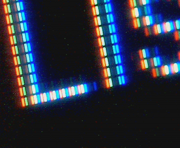
Now it is working, but something is inverted. jonsmirl@ares:/aosp/lv_font_conv$ ./lv_font_conv.js --font Roboto-Regular.ttf -r 0x20-0x7F --size 22 --format lvgl --bpp 3 --lcd -o lv_font_roboto_22.c Is this code BGR and I have an RGB display? |
|
Convertor calls looks correct. If you have issues with speed regressions - try Photo looks like everything except 0 & 255 is inverted. |
|
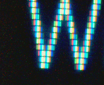
I figured out that I needed to remove #define LV_SUBPX_BGR 1 Here is non-subpixel 'W' List So it looks like it is working correctly! There are still some visible artifacts which can probably addressed with a higher order filter. |


|
@jonsmirl with what i see on screenshots, visual difference should be huge. Do you see it in normal scale? |
|
Here is photo from phone. This is cheapo 320x240 LCD. The word 'Chart' not in complete focus. It is hard to get everything in perfect focus.
|

|
There is an obvious improvement vs non-subpixel. Here is not subpixel. The difference is much more visible to human eye than camera. My cell phone camera is processing the picture and it looks better in photo than it does in real life. Zoom in on "Write" and you can see how much clearer.
|

|
Don't draw an opinion based photos. The camera is making the non-subpixel version look better than it really is. The camera processing is removing the brightness variations in various parts of the letters. I can easily see on display, but it is missing in photo. To my human eye, the subpixel display is far better than the old version. I do see some slight color fringing on 'i' which can be removed with a filter.The biggest change is that the brightness across the glyph is now uniform. With old code some parts of glyph were brighter than others and that was very noticeable. |
|
@jonsmirl yes, difference is notable. Could you add https://github.com/littlevgl/lv_font_conv/blob/master/lib/freetype/index.js#L194-L195 I'd like to understand, will difference be notable and will it break kerning significantly (without subpixel mode |
|
This is with strong autohint on 'W'. Not sure what is going on, I have to enable LV_SUBPX_BGR to get this one to display right. I don't see in difference in 'W'. Typically auto-hint does not reveal itself until font point size much lower. |
|
So in demo.c it makes a tabview with "Write List Chart" text. If I push the point down below 10 autohint will start to show up. |
|
What autohint does is start replacing the font glyphs with human designed specific pixels when the point size gets tiny. For example it ensures that the arm on an 'r' does not disappear. And it makes sure a 'k' does not turn into an 'h'. Things like that. |
You have to reconvert the font. You'll need to use the offline font converter as the online one hasn't been updated to support this feature. |
|
This is subpixel plus strong autohint and tiny points. Even tiny 7pt is still readable. |


|
On my TFT there wasn't a huge difference. But good to know that it's not the case on other TFTs. In Do you have any idea about updating filtering to avoid color bleeding? |
|
@kisvegabor #1210 (comment) - it's strange why @jonsmirl had to enable |
|
The lower the DPI of the display, the more subpixel rendering helps. The LCD I am using is 96DPI and it makes an obvious difference. I only had to turn BGR on when I turned on strong autohint. Maybe the fonts not getting generated right? Autohint is only needed on fonts below 10pt. Plus on below 10pt kerning doesn't really work so there is no conflict. |
|
I don't know how freetype output should be processed. I just send options and extract alpha bitmap. IMO if difference is not significant, we can forget about stronger autohinting and use light + subpixels. In this scope it could be useful to optimize decompressor (fixing it will add notable value). Here i explained details. |
|
Font's below 10pt are probably of limited usefulness on an embedded LCD. Main use would likely be displaying license info in tiny text so that it all fits. A font point is 1/72th in. So a 10pt font should be 10/72in high. If you don't know the DPI of the display you can't calculate this. Also note that the way we are doing things, a 10pt font on a 200DPI screen is half the size of a 10pt font on a 100DPI screen. Your desktop gets the screen DPI from the EDID. Since it knows the DPI it can make the 10pt font size consistent between the two screens. All of this is too complex for an embedded LCD that can't be swapped. What we have now is fine. When someone complains that 10pt is not the right size, now you have the answer - we are working in pixels instead of inches. |
I also don't know what might happen. It might be really worth a question on FreeType's mailing list.
True, subpixel rendering makes compression effective for normal-sized fonts too. The current algorithm is working but probably can be optimized to make it faster. However, I'd like to immerse in other things now. I leave it open for contribution 🙂 |
|
If there are plans to make lvgl do auto layout, then it needs to learn about display DPI. For example if you have two 6in square LCDs and one is 200DPI and the other is 100DPI, auto layout can not make them look the same without knowing the DPI. |
|
@jonsmirl However, the fonts will be really smaller. |
|
LV_DPI needs to scale the point size too and then select the closest matching font. How about swapping all of the default fonts for the subpixel ones in release 6 and see if anyone notices? This is trivial to undo, include the old fonts in the build and add a release note saying to copy them back if there are problems. |
|
using subpixel fonts has cost in two regards:
My idea is to add a subpixel version too for the 12px built-in font to make it easier for people to test. |
|
They are not three times larger if you are replacing an 8b gray scale with a 3b (x3=9b) subpixel. And are they really 3X larger with compression? A 2b subpixel (6b total) will likely look better than a 8b gray scale. And it should be smaller. |
@jonsmirl Fonts are not chosen by point size in LittlevGL; you manually have to choose the font you want. So we don't really operate in terms of point size (like FreeType and other libraries do). |
@jonsmirl If you set bpp=3 in the font converter then it will generate "3b (x3=9b) subpixel" as you mentioned. However, it's really 3 times larger than 3b/px.
With fonts with more pixels, the compressor becomes more effective. However, decompressing increases rendering time further.
You can try it out by setting bpp=2 |
|
You should compare 3bpp subpixel to 8bpp normal. And then compare 1bpp subpixel to 3bpp normal. Those pairs have similar accuracy. It is not a good comparison between 8bpp normal to 8bpp subpixel, doing that is gives much higher fidelity to the subpixel case -- it is not an equal comparison. I suspect the equivalent sub-pixel fonts may actually be a tiny bit smaller. |
Nobody uses 8b here. 4b max. > 4b does not give visual difference. 3b is enougth IMO.
With compression those are ~ 2x larger. Compression ratio increases on size grow. To see almost exact size for your particular case - run convertor with binary output and try with and without
I would not recommend 2b. Too bad precision. IMO 3b is optimal. |
|
It is not really 2b of precision, it is 2b per subpixel or 6b for the whole pixel. |
That's still more than 4b for the whole pixel. |
In continuation of the related topic on the Forum.
cc @puzrin
The text was updated successfully, but these errors were encountered: