A component darkmode injection in your document page with vue.js
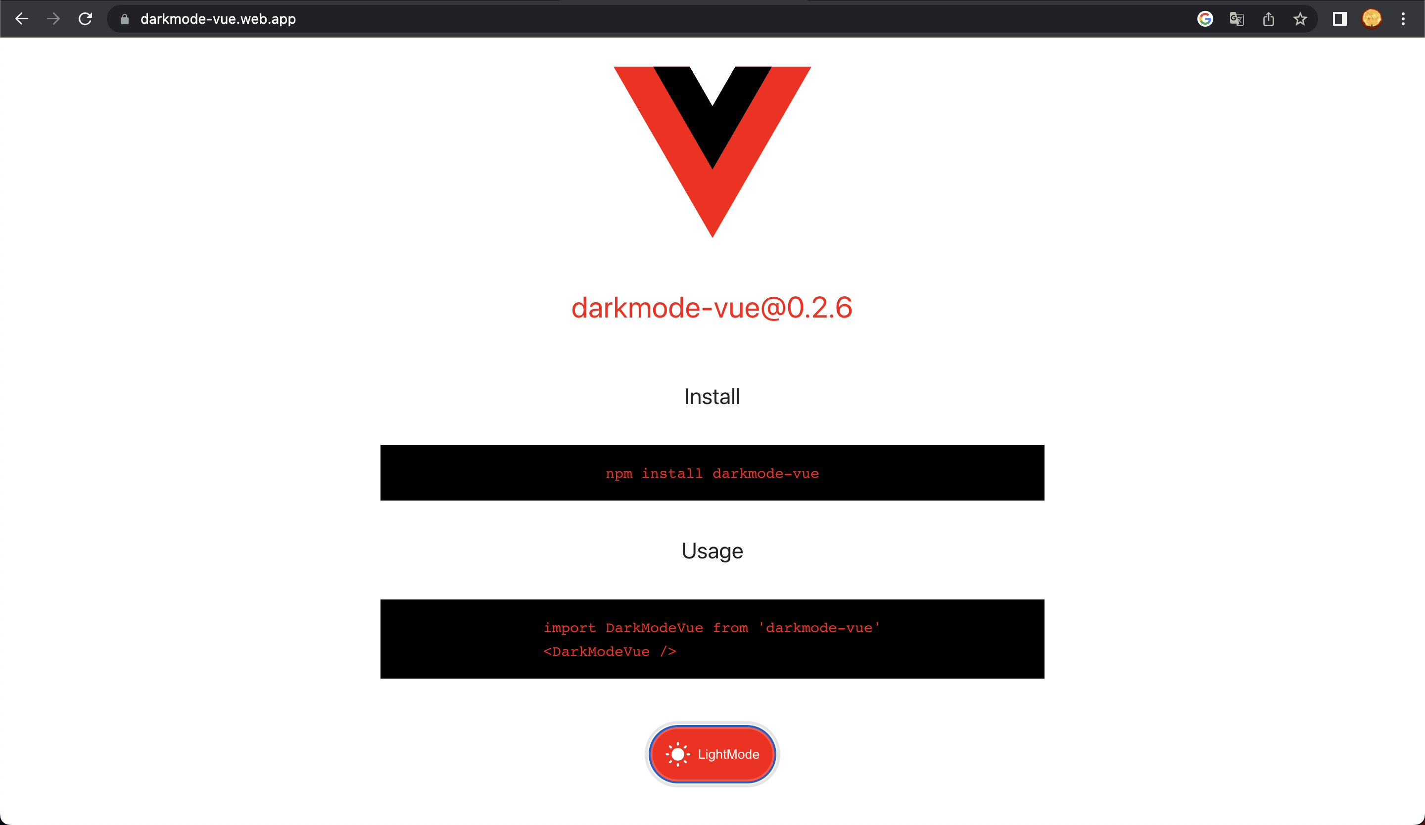
Install
npm install --save darkmode-vueUsage basic
import DarkModeVue from 'darkmode-vue';

<DarkModeVue />
Prop hiddenLabel
<DarkModeVue :hiddenLabel="true" />Prop hiddenIcon
<DarkModeVue :hiddenIcon="true" />Prop labelDark and labelLight
<DarkModeVue labelDark="Tema escuro" labelLight="Tema claro" />Slot change icon and label custom
<DarkModeVue>
  <template #iconDark>
    <svg></svg>
  </template>
  <template #iconLight>
    <svg></svg>
  </template>
  <template #labelDark>
    Off
  </template>
  <template #labelLight>
    On
  </template>
</DarkModeVue>
Usage useDarkModeVue with toggleMode and mode value
import { useDarkModeVue } from 'darkmode-vue';

const { mode, toggleMode } = useDarkModeVue();

<button @click="toggleMode">DarkModeVue {{ mode }}</button>
Style modification and usage in your styles
body {
  --dm-color-primary: #41b883;
  --dm-color-secondary: #34495e;
  --dm-color-text: #222;
  --dm-color-background: #fff;
}

body.darkmode {
  --dm-color-text: #fff;
  --dm-color-background: #222;
}
Create your variable colors and update this with class .darkmode.
If DarkModeVue usage in a page, a class in body document is update with class darkmode. In LocalStorage is created a key store with value current mode. Do you usage children body.darkmode styles for your application. I recomend create a variables colors in css and update this with toggle class of body document.