IPL dashboard using R Shiny
Indian Premier League is a famous cricket league played in India every year during the period between March and May. It is played in a professional T20 format of the game. It is played by 8 franchise representing 8 different cities across India. The league started in 2008 and it has been a big hit and it is the most attended league in the World. Each team should consist of 18 – 25 players, with a maximum of 8 overseas players. Statistics have always had a significant role in sports. Sports analytics is on the rise and will continue to play a significant role in how teams operate, pick their players, how they play the game, etc. The runs scored by a batsman, the wickets taken by a bowler, or the matches won by a cricket team – these are all examples of the most important numbers in the game of cricket. The teams and the individual players can dig deep into this data and find areas of improvement. It can also be used to assess an opponent’s strengths and weaknesses. Shiny is an R package that makes it easy to build interactive web apps straight from R. The dashboard is a visual representation of the overview of IPL from 2008 – 2019. The analysis is done on the performance of each players and the team.
- Visualizing the team and player performance from 2008 – 2019
- Linear regression model for match win
IPL is a very popular sport event widely accepted by everyone. But for a newbie, it's not easy to go through all the data's available to understand the overall status of the game. This was the idea behind making a dashboard to visualize the overall status of the game so far.
The data for the study was collected from kaggle.com. IPL was stared from 2008, so we have chosen the data from 2008 to 2019. The data was divided in 6 csv files, which covered all the details of IPL so far. So, data cleaning was an essential part before getting into further study.
The dataset collected from Kaggle had 6 csv files, which comprises of the data from 2008 to 2019. The study required to clean the dataset before entering into analysis. Data preprocessing was done using python. The csv files were imported to python and were altered and preprocessed using the preprocessing packages (SKLEARN) that python provides. After cleaning the data was exported as xlsx file and were taken to do the analysis on RT Studio.
Statistical analysis is the important thing before doing any kind of visualization. This was done by asking question to the final dataset that we had. Then we brought the question into the dashboard. Graphs were plotted on the basis of each seasons. It showed the top 10 major aspects of the play. This help the user to understand about each season. A linear regression plot was made on the wins and lose of each team. The model helped to understand the trend in winning and losing of the game. The equation used in the linear regression model is y=mx+c where m is the slope, y is the dependent variable, x is the independent variable and c is the y intercept. The slope m is calculated using the equation m=∑▒((x-x ̅)(y-y ̅))/〖(x-x ̅)〗^2
The best fitting regression model was figured out using the Least Squared Method. R^2=∑▒〖(y_p-y)〗^2/〖(y-(y)) ̅〗^2
The dataset was collected from kaggle.com. There was a total of 6 csv files which give a description about the data from 2008 – 2019.
Teams dataset gave us an overlook about all the teams that have played so far in IPL.
The players dataset gives an idea about the players (DOB, Country, etc.)
Team wise wins explained about the winning and losing count of each teams so far.
Matches dataset gives a detailed explanation of the matches that have taken place so far, i.e., venue name, umpires, etc.
Deliveries dataset explains about each delivery that have taken place. This is a very huge dataset comprising nearly 1,70,000 rows.
Most runs explain about the average strike-rate and runs scored by each batsman throughout the season.
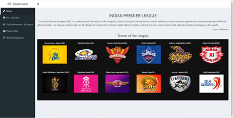
The aim of the project was to give a visual representation of IPL from 2008 –2019. We have made this dashboard accordingly that, for a newbie to IPL, he/she can easily figure out what an idea about IPL. The about part of the dashboard gives a brief description about IPL followed by a visual representation of teams and their logos.
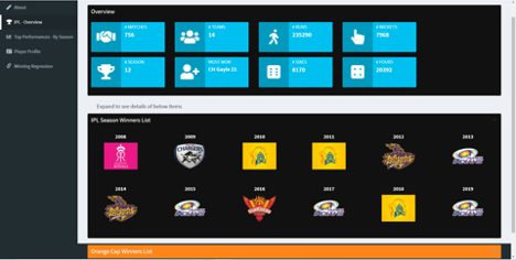
The IPL overview gives us an idea about the overall status from 2008 – 2019. It explains the aspects like total number of matches taken place, the number of matches etc. The best players of each visualized along with their photos.
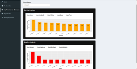
Top performance by seasons gives a picture on the details of the players who have performed well on that particular season. For the ease of visualization, we have selected the top 10 of each season. Bar plots were plotted for the easily understanding the count.
Player profile give an overview about the team in which he has played and their playing status (both batting and bowling).

Winning regression is a regression model created on the basis of winning and losing matches (home and away). This helps us to understand the trend in winning and can make future analysis on the winning chance of teams. It was observed that the number of wins is more when the matches are played in the home city.

IPL’s ability to grow and sustain in long term itself is an evidence of how much people love this sport. But for a newbie, studying all this i.e., from 2008 – 2019 is not a simple. The IPL dashboard visualizes the performances of each team and player from 2008 - 2019. It helps us to easily understand the overall overview of IPL. This project highlights the seasonal performance and a regression model for match winning. The winners of each seasons were visualized and best performance of each players by season were calculated. The overall performance by each team, put forward throughout these years, were shown in the dashboard. The linear regression plot helps us to understand the trend in winning and losing of the game. We can see a positive relationship between the dependent and independent variable. The greater number of wins takes place when the matches are played in the home city.
As a future analysis of this paper, we can do a multivariate regression-based model to calculate the points earned by each player based on their past performance. This can be used to compute the relative strength of each team which the people to select the teams. We can also make winning team prediction models which helps the financers and sponsors to choose the team.